Continuing the discussion from Darktable style presets (dtstyle.net):
I just wanted to separate this thread into it’s own topic to not fill up the darktable presets styles post.
Continuing the discussion from Darktable style presets (dtstyle.net):
I just wanted to separate this thread into it’s own topic to not fill up the darktable presets styles post.
@Carmelo_DrRaw “Do you think it would make sense to take inspiration from Krita’s interface (in particular for the handling of layers and filters)?”
Given that you’re primary interaction model is via layers, you may benefit from having a look at Phase One’s Capture One software https://youtu.be/B_8-msgCuJA
@patdavid Thanks! I also had the feeling of being “polluting” someone’s else garden…
@LightSweep I’m going to have a look at that asap. Thanks for the link.
From a first look to CaptureOne, I understand that they have a slightly different concept of layers: in CaptureOne a layer is a group of filters all applied through the same opacity mask. In some sense, they are equivalent to “layer groups” in photoflow.
It is clear that there is a general tendency to place the controls of the various filters in a side panel, instead of separate dialogs like in photoflow. I can probably start by changing that. The idea then would be to show the controls of the selected layer(s) below the widget with the layer tree. Selecting a layer group would automatically show the controls of all layers contained in the group.
What do you think?
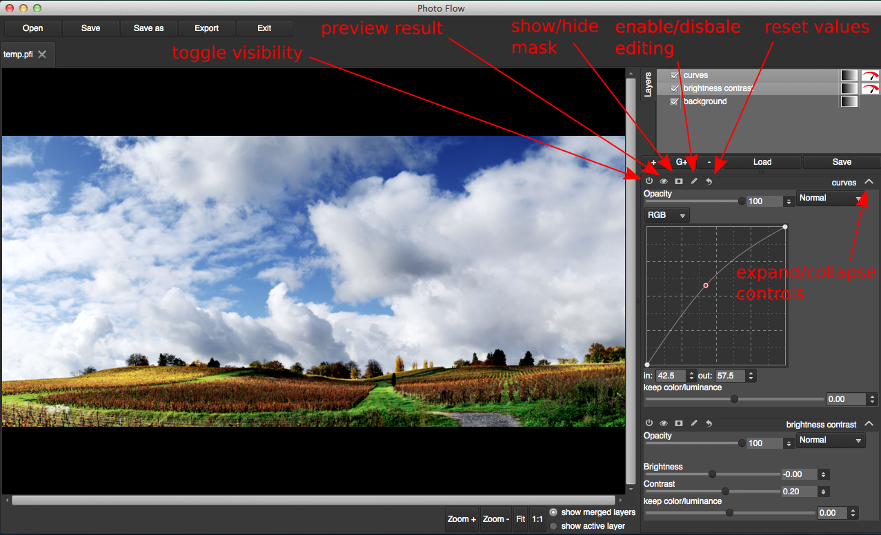
So I’ve been recently working on a new layout of the layers list and the tools controls, with the hope to make the interface more intuitive and improve the overall usability.
This new interface puts the controls of the various filters (sliders, curves, etc…) directly in the main window, instead of using separate dialogs. The idea is to reserve an area below the layer list, where the controls of all the selected layers are shown sequentially (in the same order as the layers).
Each group of controls belonging to the same filter has a sort of “tool” bar, where one finds buttons to toggle the visibility of the layer, activate/deactivate the layer mask, activate/deactivate the preview of the current settings, and to reset all the controls to their default values. The tool bar also contains an editable field with the layer name, and an expander button that shows or hides the rest of the controls.
Here is a preview of the new interface (with two layers selected):
What do you think?
Looks neat! Out of curiosity, what’s the difference in toggle visibility and preview result?
Also, what does the enable/disable editing do? Is it just some sort of lock against modifying the parameters?
Toggle visibility: switches on/off the layer completely (like the checkbox on the left of the layer name in the top layer list)
preview result: toggle between preview of the current settings and of the last “accepted” ones. This works fine with the present dialog-based interface, where you “accept” the settings by clicking OK to close the dialog. I still do not know how to fit that in the new interface, maybe I’ll simply drop this functionality for the moment
enable/disable editing: some tools need to interact and modify the preview area (like the crop tool or the freehand tool), and only one tool at a time can be allowed to do that. Enabling editing for one tool will automatically disable it for all others. I should definitely find something better than “enable editing” to explain that…
In any case, I’m still working to simplify as much as possible the logic behind all the controls, so any suggestion is welcome!
I’d suggest changing
and