This 5 stop boost

plus this darkened frame

in McGimp with a layer mask=

3 Likes
I really love this one. Would love to see your xmp file.
I looked around, but wasn’t able to find it on my drive… 
I’m honored that you would ask,
Harry
Do you maybe have the exported JPEG file? It seems that this forum strips the metadata from files, otherwise we could just extract the XMP from it.

I think there are several way of handling shots like this. I might try another but can’t get macrofusion to work. With that I would produce 3 different exposures from the raw file and blend them. The same thing can be done in the gimp with layers and masks etc. It’s hard to predict the result via macrofusion so in some ways GIMP is better but it takes longer.
I started off with a full sized flat image from the raw file via rawtherapee.

UnveilCastle.jpg.out.pp3 (9.3 KB)
I recollect briefly using tone mapping.
I then switched to Fotoxx to use it’s tone mapping. It has a curve that controls what contrast levels are tone mapped. Heavy sharpening first using a 5 pixel rad on the full sized image. Then tone mapping followed by selective curves work on the sky and land. This left a selection line on the high contrast boundaries. A blend brush has been added recently so I used that on the line. New tool and I think it could do neater job than this. Then reduction and the usual post reduction sharpening.

Lastly a bit more brightening in places using the gimp. The usual desaturated inverted layer in soft light mode but I also used curves on it so that mainly brightened dark areas.

At this point I would probably normally go through all of the steps again.

Sorry to bump this old thread up, but I just gave this picture another try with the latest RT… I used all the new tools that will be in 5.4, plus some old-but-still-good ones 

I think I’m happy with the results, but I am curious to hear some feedback (also negative, of course!).
5 Likes
I remember trying my hand at this one, but didn’t submit because I couldn’t get anything I liked.
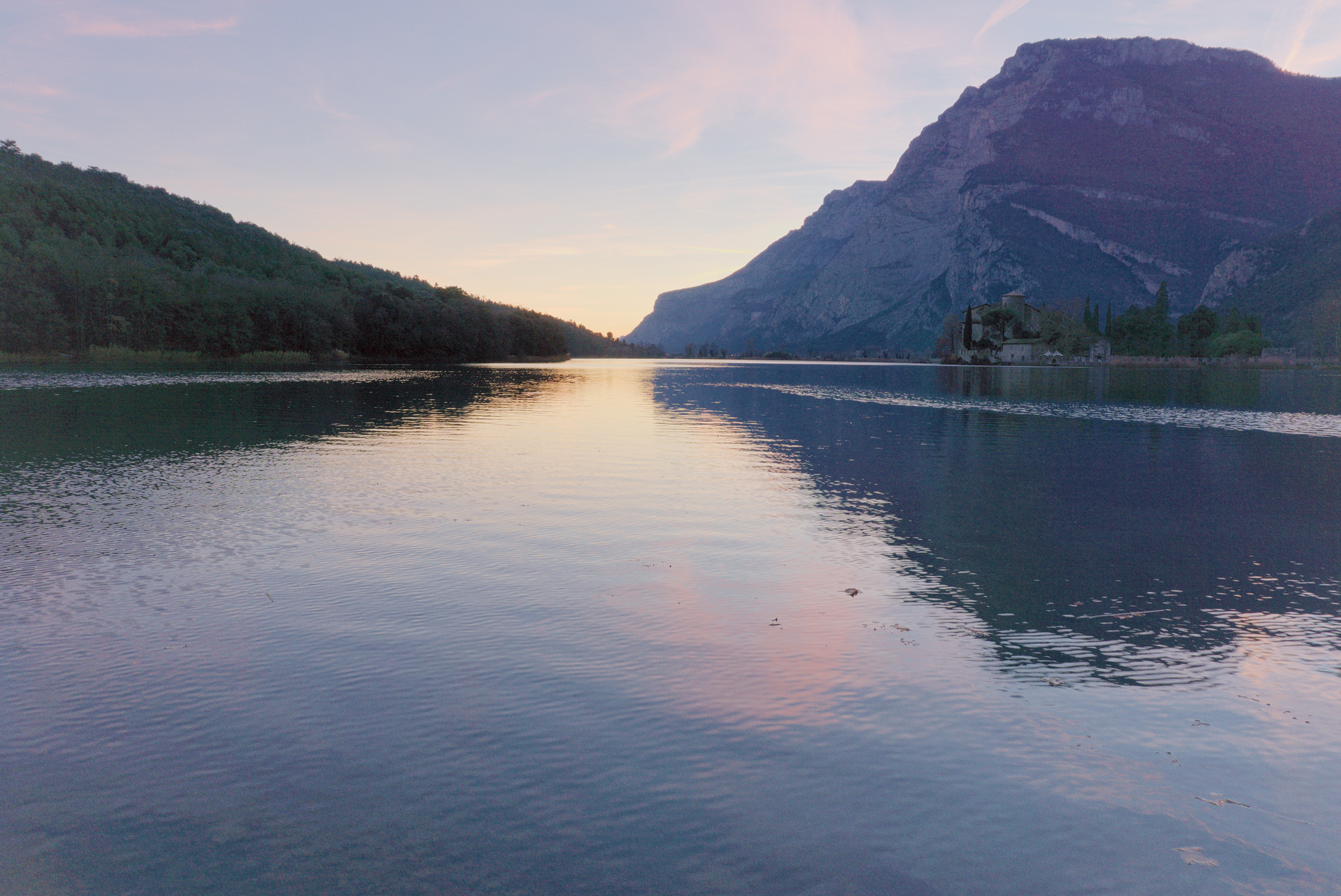
It’s a very difficult image to bring detail out of, probably going beyond the limits of what is achievable e.g. there’s very little information left in the trees on the left.
That said, I think this shows the power of the new tools. But ultimately the information isn’t there, so the trees still look blocky and the image still looks a bit grey.
The sky looks nice, and the halos aren’t intrusive. I like that the most distant parts still have a little haze, it looks natural, and I prefer natural. The closer part of the mountain still looks slightly too washed out, but this is partly to do with the greyness.
To clarify, I am nit picking, I couldn’t get anything close to what you have achieved. I think it is a very good attempt, and probably my favourite out of all the attempts posted.
Oh, and thank you for the new tools  I’m looking forward to 5.4.
hi @james,
thanks for the feedback! I agree with your assessment. in fact, I think this pic is really a good testbed for how far you can get in post processing. it’s also a very good example of how to not expose a shot  (when I wrote I’m happy, I meant given the context…)
btw, I have since returned to that place and got more decent results, maybe I’ll share one at some point
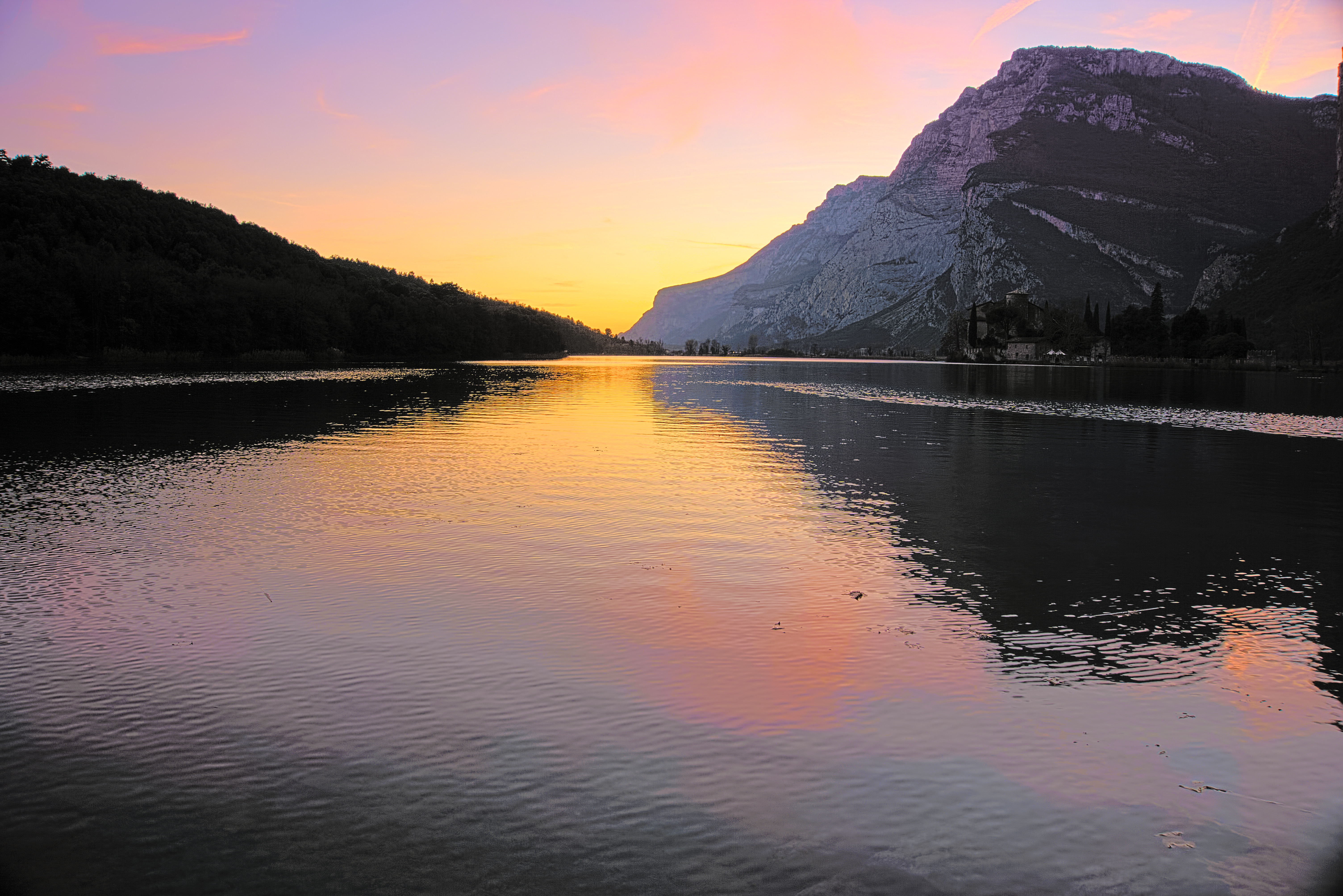
On my screen the sky in your image looks overexposed and the trees on the mountain (to the right of the castle) has reddish tinge. I also gave it another try and I am pleasantly surprised with my result (only compared to my own previous result), so I thought I will share it. The following is RT5.3 (standard branch).
DSC03922.jpg.out.pp3 (11.6 KB)

Hi @shreedhar, thanks for the feedback!
Looks fine to me (maybe a bit bright, but I wouldn’t say overexposed), but perhaps my screen is off…
Yes, that’s true. I should have tried something there too.
Actually on my screens yours looks very dark and @agriggio’s quite bright but not overexposed. I’m not picking, just want to give feedback. I know you like more subdued luminosity seeing also your flickr account.
Agreed. @shreedhar, your images tend to be on the dark (and sometimes saturated) side. I didn’t mention it before because when I turn on the brightness of my screen your contributions are quite marvelous. However, the default white background of the forum then becomes absolutely blinding  .
.
PS @agriggio I extracted the preview images to see what they looked like and found 4. Any idea what IDCPreviewImages are?

I suppose Sony’s stuff (my guess is that IDC stands for “Image Data Converter”, Sony’s own raw processor), but I’m not really sure…
@McCap @afre and @agriggio Thanks for your comments. I have a three and a half year old HP Envy Laptop and its screen changes brightness even if I move my neck very little!! So I am always unsure about the exact luminosiy of the photo!! I generally open a website like gmail and adjust my stance so that it looks OK and then freezing it in that particular position check my photo!! SO I was very careful with my words about brightness!!! Yes, personally I do like a brooding presence and colourful pictures. Glad that you all find it acceptable.
@agriggio, I think I adjusted the red curve in RGB channel to to get rid of red tinge and also the defringe tab on the green channel to get rid of nasty green fringe on the top of mountain on the right side. The overexposure of the sky was only at the horizon near the lake where all the yellow/orange shades are present. A very nice photo to keep going back to see one’s change of approach towards post-processing. An ideal PlayRaw image must have manageable flaws to be interesting (according to me). Here, the main subject being underexposed is the problem. Thanks a lot for sharing it.
What a pleasant image by @agriggio. I wasn’t confident enough to tackle this one back in February. I have learned much since then, although I still have a long way to go  .
.
@shreedhar My entry is an example of “maybe too dark”. On my sad screen (much worse than your Envy’s), I can see the castle clearly (still a bit dark). On my mobile device, I can barely distinguish it from the mountain.
-
PhotoFlow
a) Linear Rec.2020 with negative clipping. -
gmic
Here I generated 3 images: favoring highlights, shadows, neither.
a) Jedi: curve to remove linearity, increase local contrast (CLAHE).
b) Sith: gamma compression, increase local contrast, stretch chroma.
c) Bendu: simple exposure compensation. -
gmic + GIMP
Here I created a mask for the sky. First time I took masking a little more seriously (outside of using luminosity or chroma masking). The mountain trees weren’t easy to do initially. -
gmic
a) Moderated the Jedi and Sith with the power of Bendu.
b) Again, blended the two to recover the bright areas.
c) Prep for sharing (contrast, resize, frame, fp to jpg).
Enjoy!
[Edit: Sorry, I used the wrong mask, which clipped parts of the water. Problem with having too many intermediary files.]