How to start with ART?
After all, it’s very nice that you can use it to play, and I do.
ART has fewer controls than the others, great.
But still, there are five modules in “Exposure”, at least 4 of which are good for adjusting brightness and contrast well.
Does it really not matter which one you use to give an image the right tonal values?
After all, it would be pretty silly to raise the brightness in one module and then lower it again in another.
I have good experience with RT and some with dt - so I’m not asking about the very basics in general.
But how do you learn ART in a meaningful way and in which order.
Here it should be only about the first module “Exposure”. The rest will come later.
With what does it make sense to set the average gray value and the black and white point?
I am curious and look forward to your tips.
If you are using the automatch and it does a good job it might just be a small tweak on global exposure and then clean up in the tone eq after looking at the heat map.
If you have a really high dynamic range you might want to use the log tone mapping and use that to set up your image…
So for me I would say that is how I would use them. I am more used to using DT but I do mess around in ART esp when checking out colour issues as I can access the adobe dcp files easily…
If I may translate your thoughts freely: Do what and how you want, it must only meet your requirements. You can’t do much wrong?
Yes, that may be, but I think there must be a first, reasonable approach, so first the duty, then the freestyle.
So i was not talking free style… the default for ART is the automatch so it adds a curve to match the embedded jpg…you could be done…
If not then maybe you just need a touch of exposure and of course any usual extras…sharpening lens corrections noise etc…
If the image is good and then its just shadow and highlights etc then I would use the tone eq. I think you could argue since it covers the main tonal ranges then you could just always use this tool to clean up.
Now if the image is HDR or you abandon automatch then you can try the log tone mapping module or create your own tone curve and then go back to the tone eq…
This is what I would do…
Darktable has no automatch option so the first step is set the middle gray and then map DNR with filmic …so in this case the first step is pretty clear…
I guess the answer for ART is how do you start…do you start from the auto matched tone curve…
Basically exposure is global, tone equ adjust the individual tonal ranges and log tone mapping is a bit like filmic… you just decide what the image needs…
Yes, with dt there is a default to determine the mean gray value first, and then determine the white point and black point, all with Filmic RGB. This is all very logical and, in fact, simple.
Are there no such similar defaults with ART?
Well if you use the tone mapping module then it would I guess be similar and again it pivots back to where do you start…if you use the automatch then much of the basic tone and exposure will be there. Then you have as you do the issues with DT and the different looks provided by the different chroma modes and in ART its with the different curve styles which give very different results… It really is pretty logical. Do as you describe handle the tones. If you use the automatch then I guess you judge what it needs and tweak any or all of the white mid and black points…
Really you just edit a few and you come up with your own style of doing it… I like colorful contrasted images and so I almost always allow room to add the dehaze in ART or RT…it just really gives a deep contrasted colorful image but knowing that I like this I often have the image a bit lighter and less contrasted than I might if I went another route. I use the blend modes a lot in DT and you don’t have those in ART so I guess dehaze is my multiply blend mode… \
Hallo @priort
Well, I see, you have to find your own approach. And that can be done mainly by trying and looking and trying again.
At least I know now that there is no strict and logically founded procedure with ART. I will experiment eagerly and see what comes out with what.
I still have a question: Do you know what the Regularization slider does in the Tone Equalizer?
At 0, the image becomes soft and dull.
The hardness / diffusion of the tonal map. Check show tonal map and you will see its effect. When you set it to 0 the map will have really sharp edges which will kill contrast if you then raise shadows or darken lights. I personally always leave it at 4.
Hello @apostel338
Okay, I’m starting to understand more and more. The whole module: Tone Equalizer works with masks that selects certain ranges (from Black to Whites). And Regularzation determines how soft (4) or hard (0) the mask is.
Pirma, now I understood the whole Tone Equalizer. I like it very much.
Can you roughly say that the Tone Equalizer does nothing different than the curves, only here you are sure not to bend any curve so that unnatural effects are created?
I think the tone curves have a little more stuff going on under the hood than just than just brighten and darken several areas. They also have impact on colors and saturation. In their default mode Film-like they want to emulate the behaviour of analogue films.
And yes, the Tone Equalizer is great and for me an absolutely mandatory tool in ART.
I don’t use automatched tone curve, but the standard tone curve preset. I have no need to ever change this.
I first use exposure compensation to set the global brightness of the photo.
Then Tone EQ to work on dark and bright areas.
In White Balance if needed (or wanted by me) I set the color temperature (I like sunny photos to be warm). With artificial / indoor light, I always let it as shot. Of course it depends, if your camera makes a good whit balance. I’m happy with my Nikon.
And in Lab Adjustments I set the global contrast and chromaticity.
This is basically my default workflow. I have also local contrast active, but there is hardly any need to change its settings. All other stuff like lens correction, rotation, perspective etc. depending on the need.
Hello @apostel338
Does the profile fit for all tasks?
I will copy your text and work through it bit by bit. I want to understand the process.
But I see that you don’t do everything only with the Tone Equalizer, but start classically with the Exposure compensation. Do you also use Black point compensation? And then you do the details with Tone Equalizer.
If you still feel like it and have time, could you show me how you would develop my example that I uploaded at the beginning?
Maybe in two or three steps? Then I can better understand the way you go.
This color takes some getting used to - but it gives the image a strong mood. Yes, it often doesn’t make sense to do a perfect white balance in indoor shots, it takes away a lot of the athmosphere.
Thank you very much, I will study your settings carefully and certainly learn a lot.
Thanks
I guessed the light was impacting and so I went neutral… the subjects skin I used 80 70 60 rgb … I find in strange light and with people I just try to set the skin and see where the image goes…
I would guess this one is probably more natural. Of course it’s hard for me to judge the accurate colors of the scene. I’m used to getting quite good WB results with auto-settings of my camera so that I hardly ever have to care about that. But this combination of natural and artificial light can be tricky.
that’s a very open-ended question.
ART is pretty neutral regarding workflow, and supports many different editing styles (or at least that’s the claim
A simple strategy could be to use exposure compensation to set the average brightness of the picture the way you want it, and then tweak the contrast and tone mapping with the tone curve. In many cases, this might be all you need. You can then use the tone equaliser to tweak the balance between shadows, midtones and highlights. For trickier situation with harsh lighting and/or high dynamic range, both dynamic range compression and log tone mapping can be of use.
You don’t need to know the actual colors of the scene unless you do documentary photography.
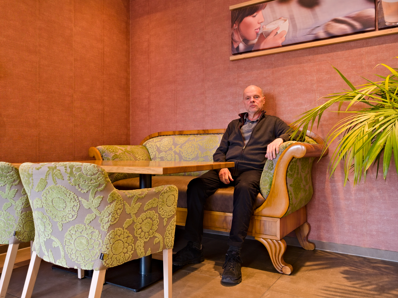
The scene is strange anyway, something artificial. Why is the man sitting here, has nothing on the table? The coffee is only in the picture in the background in the hands of the woman who is decorating the room.
So here in this photo is not about a truth content from the real world - but it is an image, an artificial creation, which is to create a mood, possibly a statement.
Which colors, which color cast is the right one? That fluctuates, depends entirely on one’s own mood. But this example of @apostel338 fits quite well.
Here is the finished image that I had processed three years ago with RT and Gimp.
 \
\