I’m happy with my colour workflow however I’m struggling to develop B&W images from the RAW files that are much better than the jpegs out of a Fujifilm X-E1.
On my Canon 5D mark 1 I can definitely get the RAWs to look much better than the jpegs.
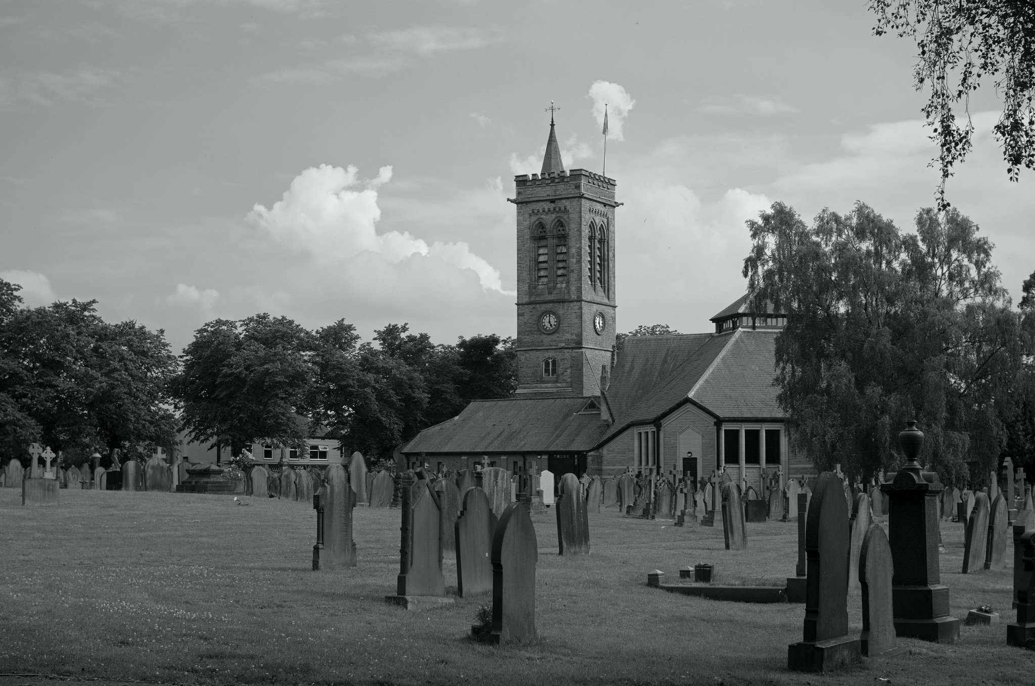
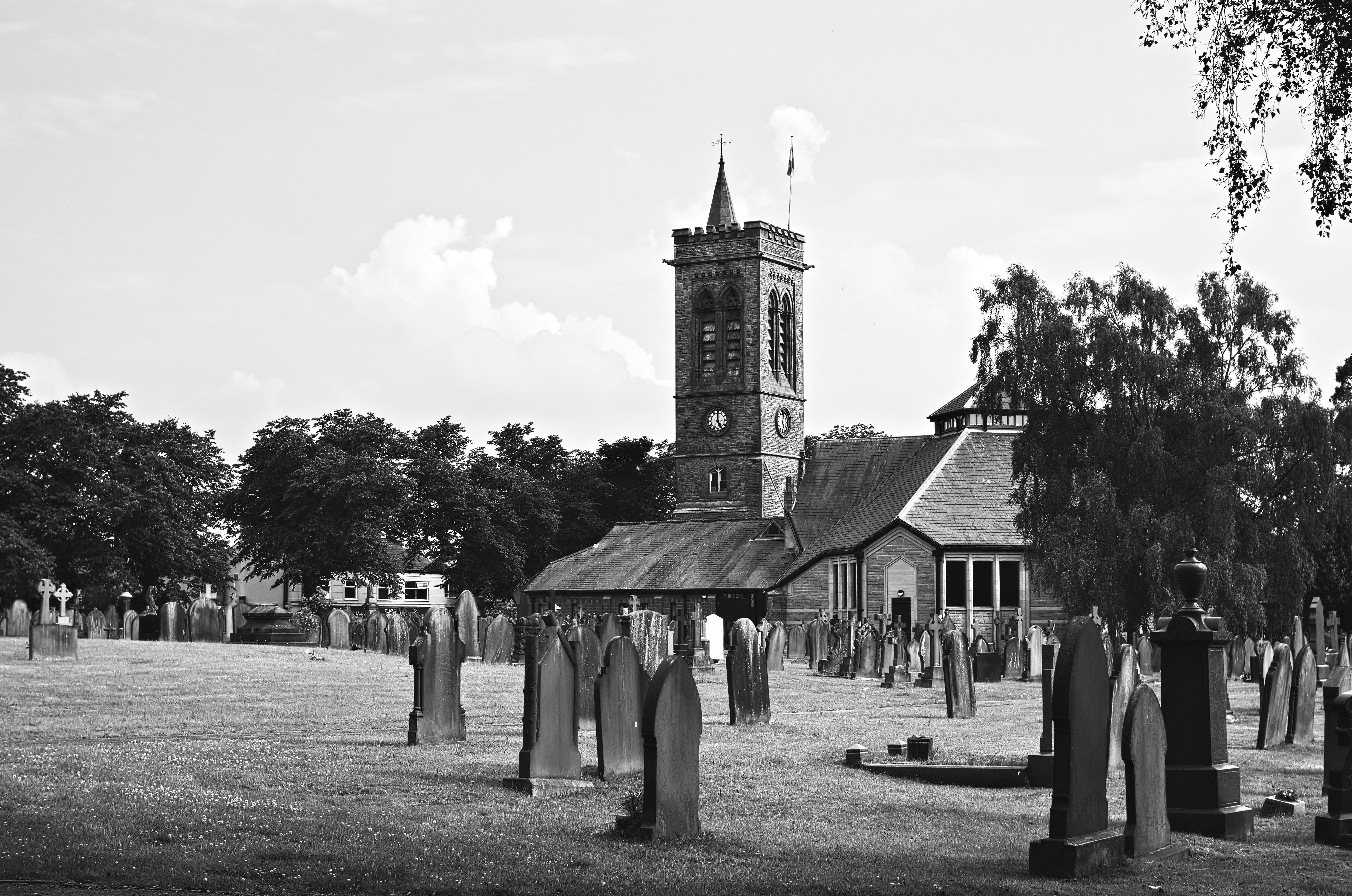
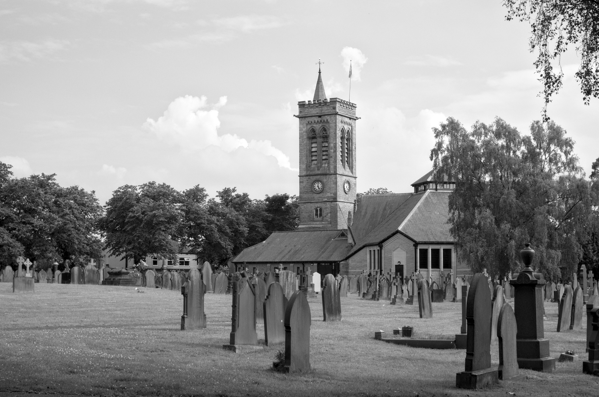
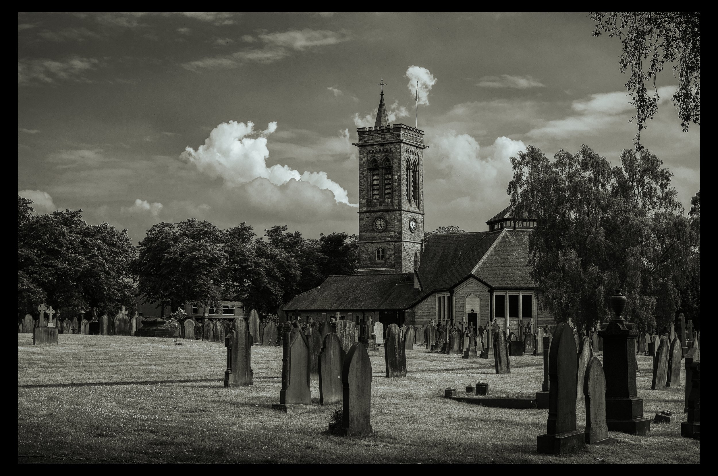
I’m looking to see what others would do with this image and for ideas in general please. Ideally I only want to spend a few minutes on each image.
Attached are :
The RAW
A jpeg developed from the RAW, with the grey tab of the colour calibration module simulating an orange filter
The xmp for the above
The in-camera jpeg with local contrast and a slight tweak to the exposure done via DT. The in-camera jpegs settings are monochrome with no filter and all the other options like highlights and shadows defaulted to zero.
I’ve ignored that the clouds in the in-camera jpeg are clipped.
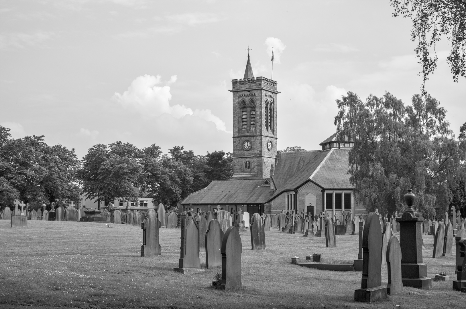
You can do a lot when you start playing with the RGB channel sliders.
You seem to be using darktable: Try setting the grey sliders in the color calibration module to the point that you are more or less satisfied with what you can do. Then switch to the individual R, G and B channels and start playing with those.
Remember: This is black and white, it doesn’t really matter if you add a mother-load of red/blue/green.
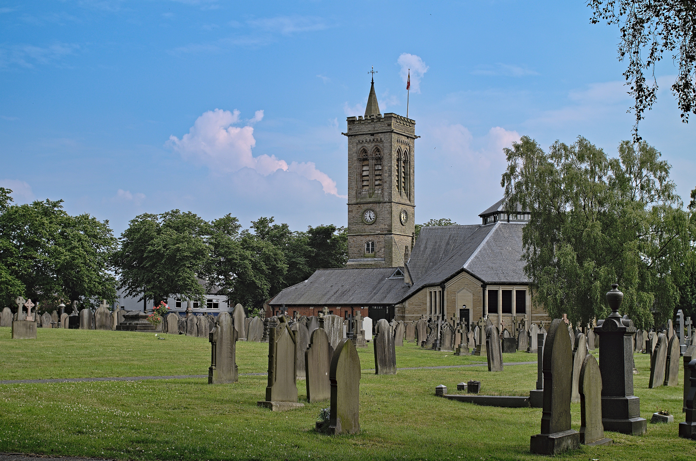
I personally start with a colour version that is as close to real as possible and then start the B&W process.
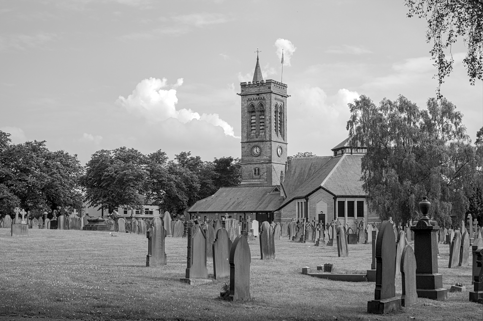
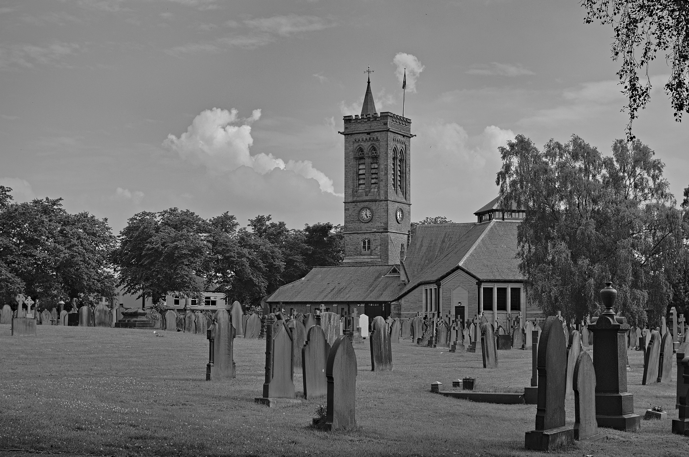
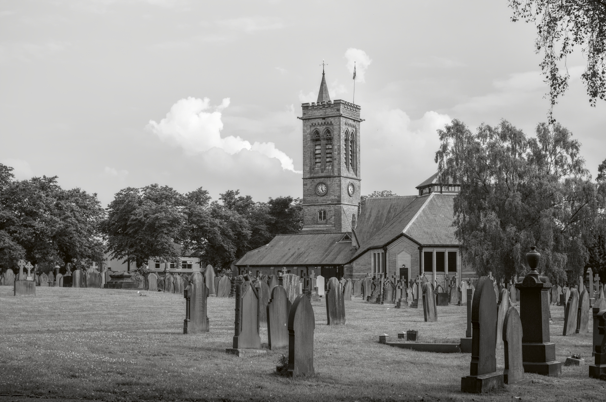
Thanks for sharing, here my try in RT 5.8 dev. With local adjustments i reduced the brightness of the thumbstone in the middle and the piece of paper in the gras the left half.
Thanks for sharing this shot!
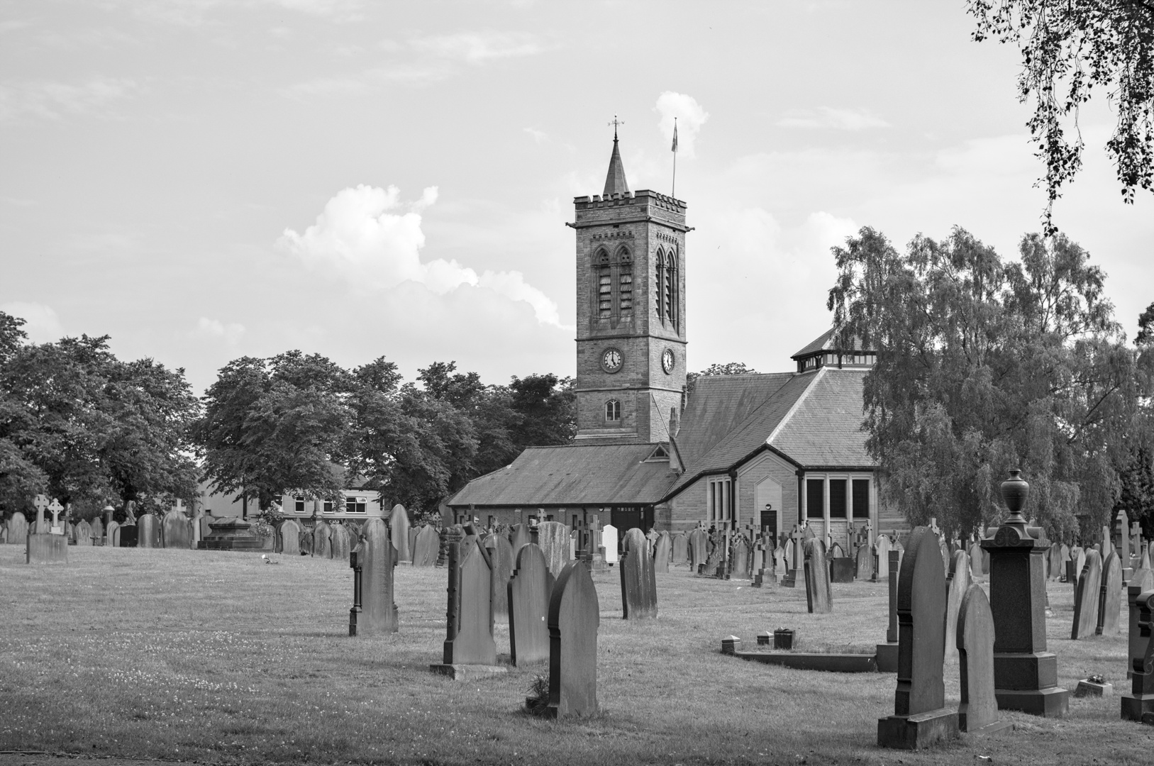
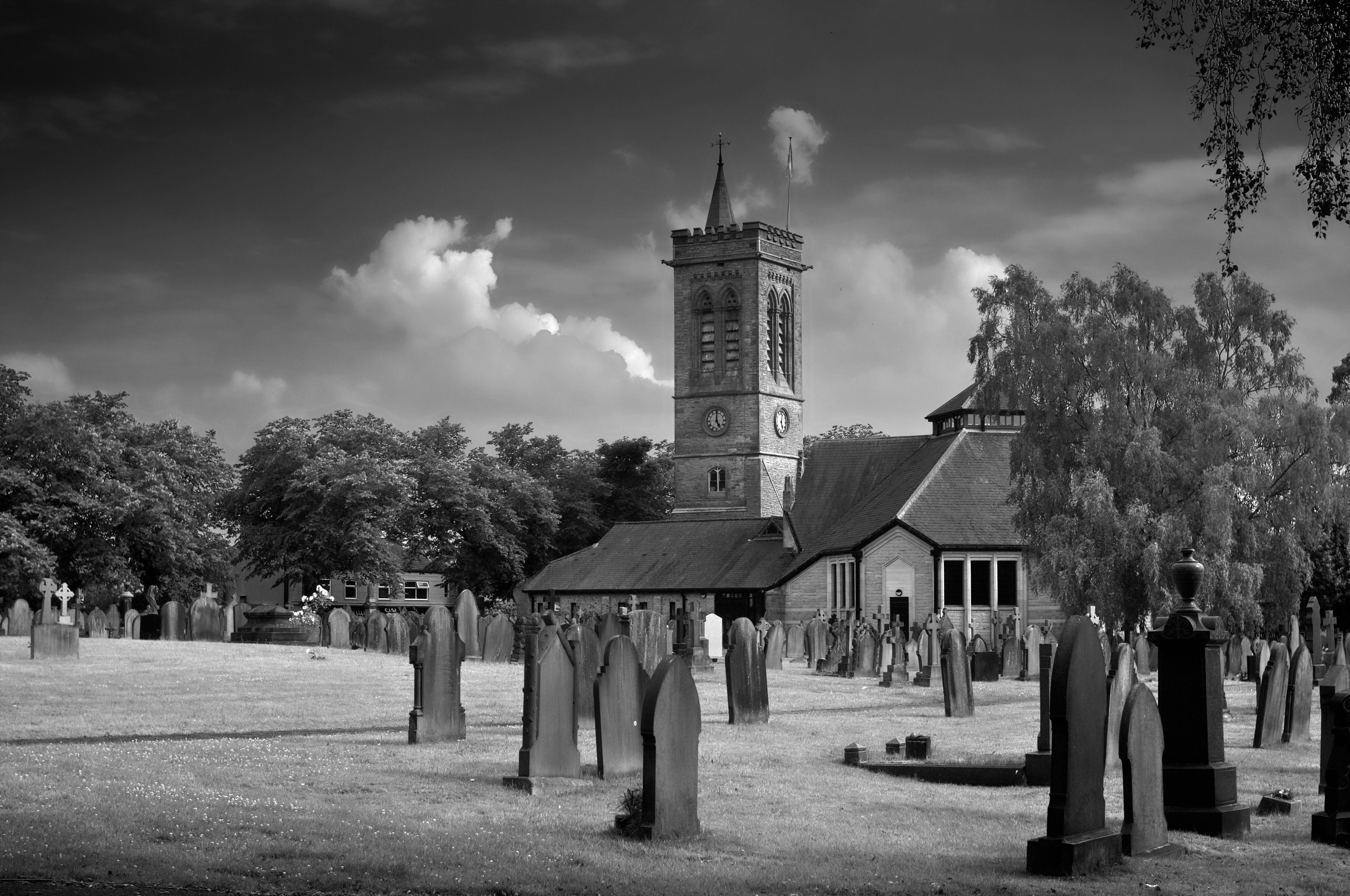
I first created a colour version using Provia LUT, then for BW desaturation and an additional “after” curve to increase contrast
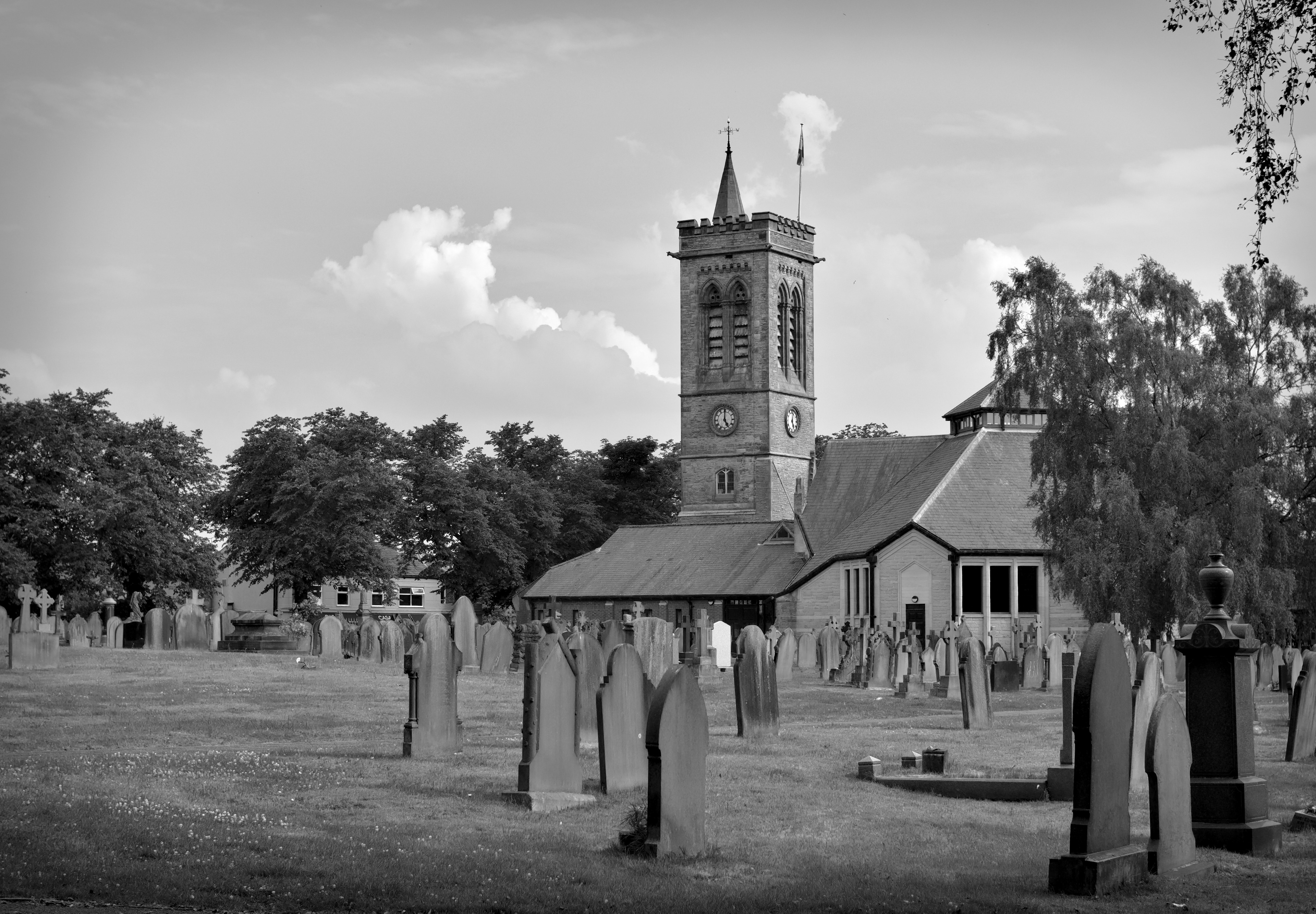
I have a Fuji too (X-T2) and they do some special stuff to make the JPEGs look extra nice. However, everything Fuji does in their special processing, you can do in darktable too.
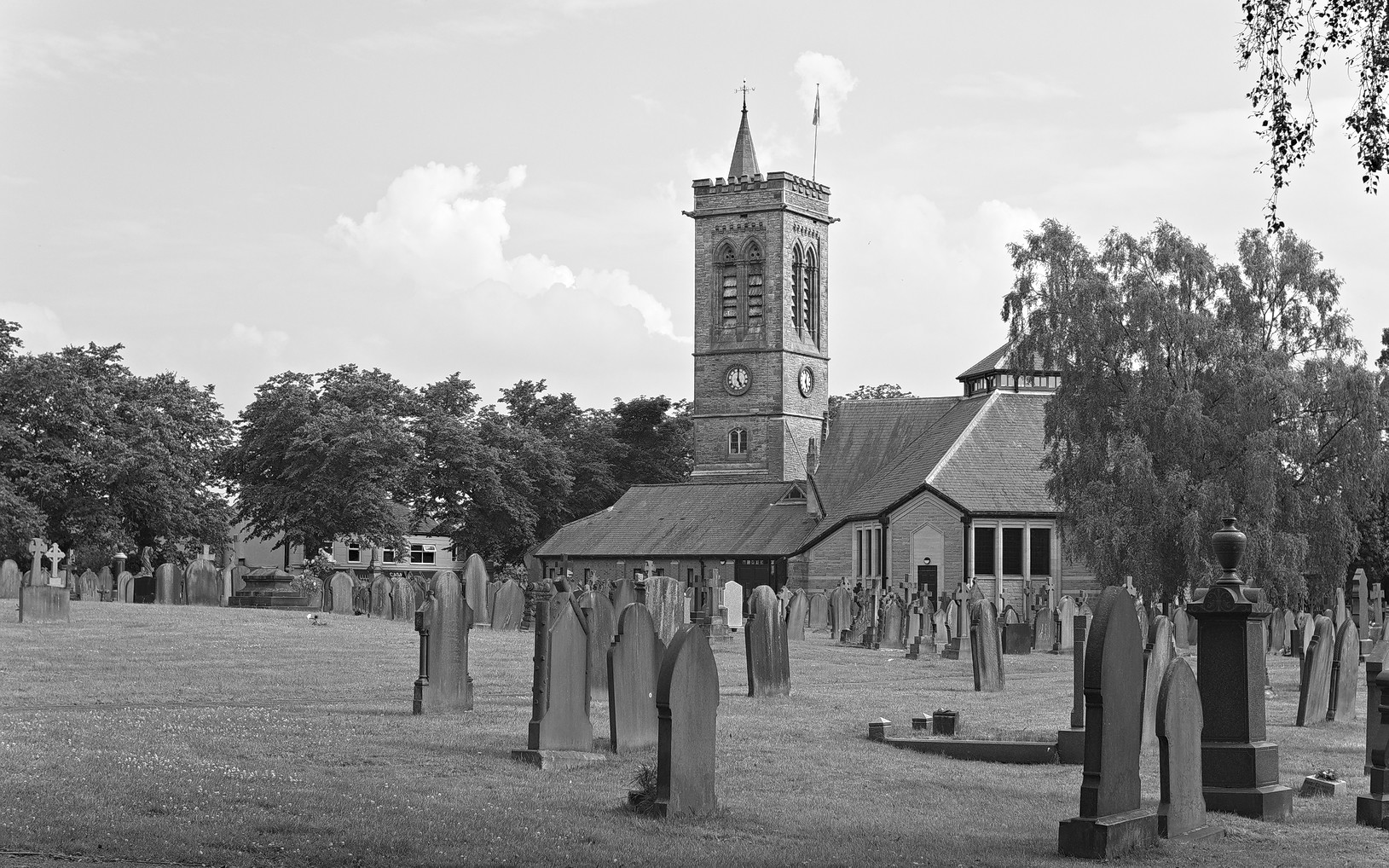
I think this comes close, with a just a little extra work on creating a little more drama in the highlights.
Color balance RGB was moved after the monochrome module for a little bit of warming up. (This file isn’t pure greyscale. A very slight warming or cooling of a black-and-white photo can help enhance the mood.)
Some of the modules have been named in the XMP, where it might not be obvious what they’re doing. (Contrast equalizer with a mask being used for sharpening, for example. And I have 2 copies of the local contrast module, both with masks, working on different parts of the image.)
I also did push filmic rgb where orange appeared in the highlights (which is generally not recommended), but I took care to ensure the actual highlights in the image weren’t clipped in the waveform (and by the way it looks).