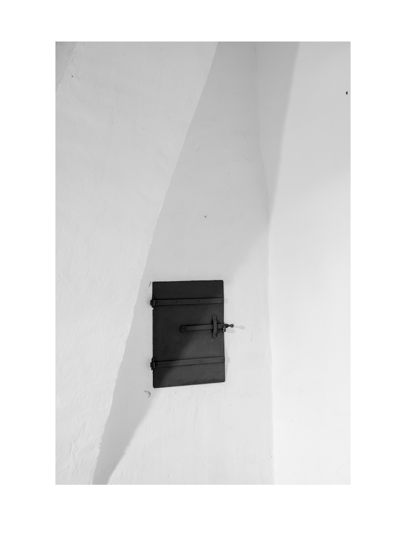
I photographed something very plain last Friday that I would like to share here. I like the simplicity of the composition. This is something that I am increasingly striving for.
[It’s a detail of a chimney in an old Manor House].
12 Likes
Oh, I really like this one!
You mind if I give 2 points of critique…?
No, please go ahead.
I really like the simplicity and the subtle monochrome shades in this one. Very nice.
Two things I do find distracting:
- The 4 (5?) blacks/dark spots. I think it would be cleaner, and in my opinion better looking if those are removed.
- The image seems to lean to the left. It is partially an illusion because the left side of the door is vertical, but have you tried rotating it clockwise just a tad?
1 Like
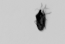
Yes, that might be. But I decided to leave “realty” untouched this time. The black spot on the top right is bug, by the way. You can only appreciate it at high resolution, but I lie it.
I’ll try that. But I might lose the bug ![]() .
.
Edit: bug at higher resolution
1 Like
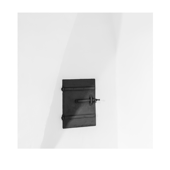
Try using GIMP/Krita. You can rotate on a fixed, self set point (the bottom left in this case). Then crop from there. This might leave the bug in place and “corrects” the leaning illusion.
EDIT: Like the framing too.
Just gave it a quick try: Normal rotation will do the trick, you only need a very small amount of rotation and you could use a small amount of shearing.
Anyway: Enough comments from me. Great shot and nice framing!
Very nice and subtle! The play of the shadows is great.
I agree with @Jade_NL this is in need of a crop and removing all the little black spots from the white. I’d use a square crop if it were mine.
I might also see what a bit more local contrast in the highlights looks like, to get some of the plaster texture to come out a bit more.
1 Like
I also tried a square crop first, which looked quite nice. But in the end a decides against it.

I like the original better. IMO the others want things too neat and perfect in an almost OCD way, whereas everything feeling just a tad off in the original helped make it more interesting. That said, this is not my style of photography, so I am the wrong audience.
2 Likes
Yep, I think it is.
1 Like
I think there is potential for more contrast. Excellent motive for b/w.
1 Like
Thanks to everybody for the comments and suggestions. I have thought about removing the black spots as @Jade_NL and @paperdigits suggested. But I find digital images are becoming increasingly “clean” and I’d like to keep a little more “character”. Also, the imperfections do have texture in higher resolution and give the image some „individuality“. Concerning the rotation/perspective correction issue, I actually like the revised version. But again, it appeared a little to perfect to me, so I agree with @Soupy in this respect. As stated already above, I played in earlier versions with a square crop as also suggested by @paperdigits. But I wanted to keep the long slant and the left corner. Otherwise the image might become to simple and “perfect”. I didn’t want to change the (local) contrast either, because I just like the slight shades of gray in the shadows. So again, I did not follow the proposal of @st.raw and others here.
Overall I’m probably pretty stubborn here but the discussion has made me think again intensely about what kind of photos I want to take.
Thanks a lot for that.
2 Likes
In the end the best image and edit is the one you like best. Nothing anybody can take away from that, especially after careful consideration of possible alternatives.
I do appreciate you taking the time and effort to look at the “tips and hints” given by me (and others).
1 Like
That’s great, sometimes you consider something new and decide against it. What is important is that you make that consideration again next time, that’s how you improve.
1 Like
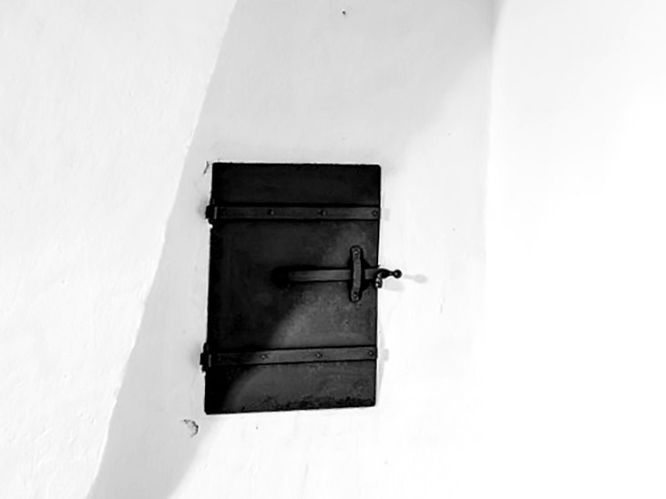
Nice picture. I was curious what some extra contrast on the door would be like. I think it adds to the geometry -

1 Like
Nice shot, I really like the tones and the simplicity.
I like the idea of having more contrast on the door, and I was also thinking that it might be interesting to play with global contrast to emphasize the different planes of the chimney walls. In my imagination, that and a square crop could make it look like the door is sitting on a folded sheet of white paper - but those are just the surrealist voices inside my head! 
Anyway, great work and thanks for sharing!
2 Likes
yes, exactly!
brighter whites could be nice too, letting the image fade (or almost) into the white background, something like this:
Just a quick question: are we actually allowed to edit images that are not part of a play raw and licensed accordingly? please let me know if that’s not ok, so I can edit the post and delete the image.
1 Like
I think it is better to edit only images that are under a free license. But I as the author have no problems with it in this case  .
.
Thanks for your suggestion.
1 Like