I am novice DT user.
When exporting from DT to JPEG format to be used in say Instagram or send to friends and family who will view the image on a mobile phone / tablet.
What is the best setting for the export module.
So far I have used JPEG set to 85 and output colour sRGB and Perceptual for the intent.
What I have found is that the image looks very good on my Computer screen but on a mobile phone etc it seems to lose some of the vibrancy. Is it my subjective view or am I doing something wrong ?
It may depend on your darktable theme: images developed using a dark theme may look bland when viewed with bright areas surrounding the images (say, on Instagram).
theme
Set the theme for the user interface. Aside from any aesthetic considerations, the recommended interface color for color evaluation is middle gray. Visual perception is affected by ambient brightness, and a low user interface brightness causes all kinds of illusions. Using a dark interface to retouch photos can therefore lead to excessive retouching (abuse of contrast and saturation) and to a photo that is too dark when printed. It is therefore highly recommended that you use one of the “grey” themes for retouching work as these are designed so that the user interface approximates middle gray (default “darktable-elegant-grey”).
So, if you mainly export for online viewing on platforms that use bright interfaces (e.g., Facebook or Instagram), you may want to edit using a bright theme. Alternatively, try darktable 4.2 user manual - color assessment.
Also, is your “output profile” in the darktable modules while editing also set to sRGB or something else (what you see on the screen then might not match your export)?
I’m not a color scientist, but I understand that color render “translations” among different applications and devices is quite a complex matter.
@rawnakc I joined Pixls around two months ago and I’ve already seen many posts like yours.
The flow of the color from you to others goes through a long chain of conversions and renders.
[Photographer’s eye] → Camera capture of the scene into a RAW file → Conversion from RAW luminosity data to colored pixels → In application editing → and JPEG export (with color profile included on not?, and which profile? [In your case sRGB]) → Color render by the monitor (depending on its production technology it can render colors comprised into the small sRGB color space/gamut or in a wider one, approximately similar to AdobeRGB color space. Moreover, as @danny pointed out, is the monitor well balanced?, is it profiled and calibrated? only via software, or via a “spider” hardware?).
Until this point everything looks OK… but now another chain of changes starts.
→ Uploading of the edited image to a social media platform. Does this platform respect the included color profile or does it ignore it? → Landing of the image in a different device (does it respect the original color profile or does it stretch or compress it into a different color space?) → Restitution to a browser (whatever the browser, it will also add its own interpretation of the color and it will render it following its own fabric parameters).
EDIT: I forgot to stress, again, what @kofa already suggested: Don’t underestimate the color/tone context of the background against which you are staring at the image! Try to avoid not neutral-color backgrounds and extremely light or dark backgrounds. In Darktable you probably should prefer a “grey” theme (not the darkest one), and check your edited image colors inside the white frame of “color assessment” view/module.
open the JPG in the darkroom, compare it with the snapshot of the raw.
Is there a difference? (Some difference is unavoidable, as the raw is rendered to the screen directly from the pipeline, while the JPG’s colours are first restricted to sRGB during the export. However, normally this should be minimal.)
Experiment #2:
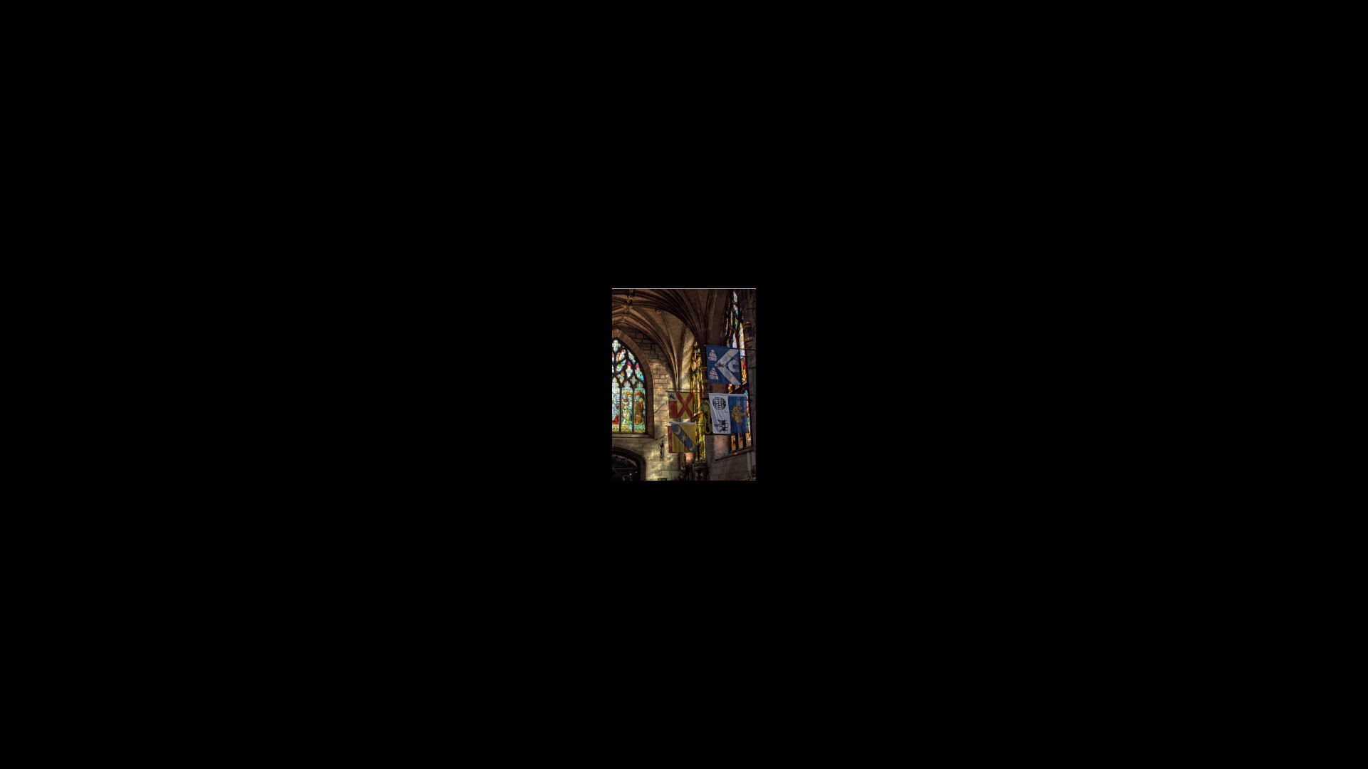
Toggle between the following images. It’s the same image (exported from this excellent PlayRaw), resized and surrounded by black or white background. This could simulate how an image looks on a bright vs a dark web page, or Instagram vs a dark-themed editor:
The OP mentioned phones and they do all sorts of things to image color. Even in basic settings for example my pixel if I recall has something like neutral normal and vivid and it has an srgb mode so I assume by default its not that and so will not correctly display an exported image… Samsung and others really amp up color as well so I think you can do your best to have the image leave calibrated and accurate but what happens in the wild is harder to control…