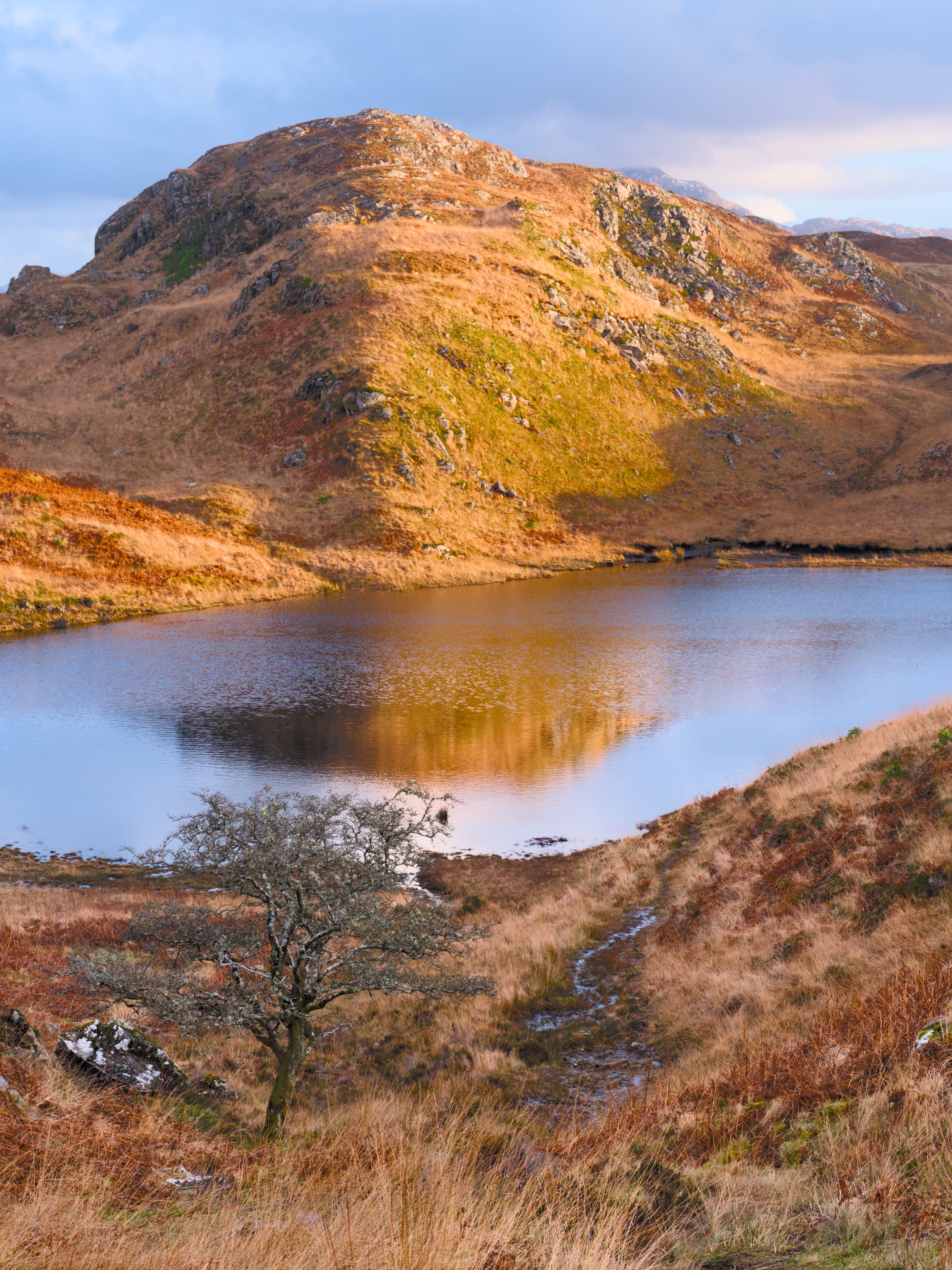
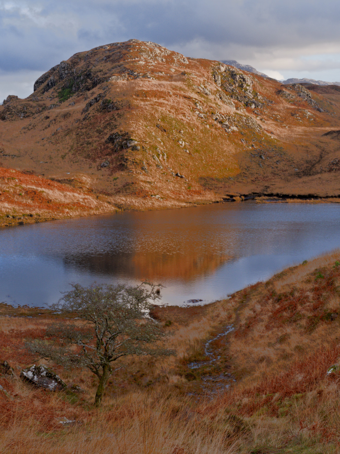
Nice. The sky in my second effort is too blue. Tried to control it through Color calibration but not so successfully. You’ve got it much more under control
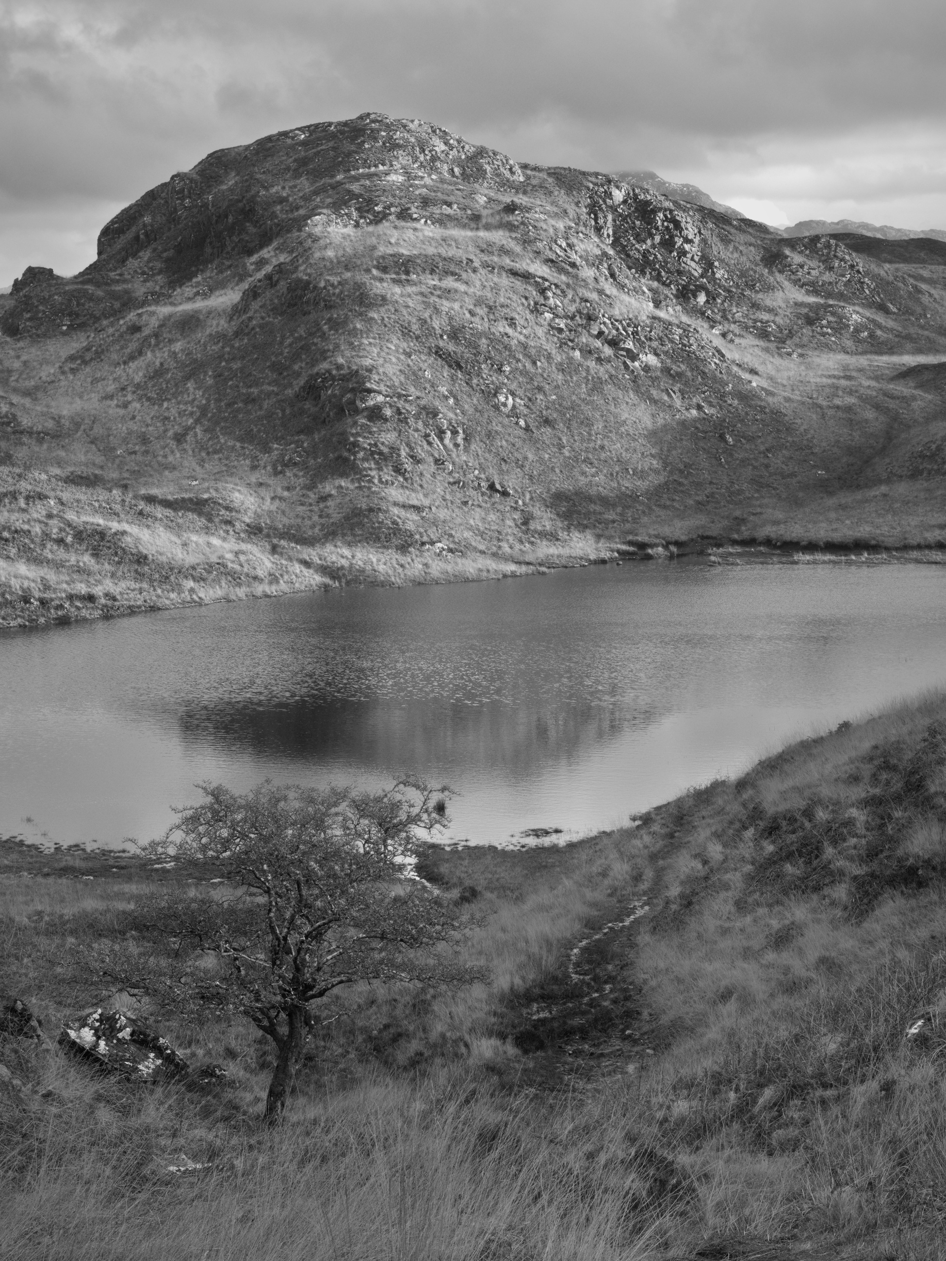
Great photo! I think I overdid it a little, but was looking for a high contrast look, whilst keeping the tree discernible. Would look really nice on print I believe.
Apart from that: this is exactly why I like this forum so much.
No, we do not have to agree with everything.
But, once in a while, a gem pops up which we can use for this or for that.
To return to old images can be great fun.
I bet that then, we “developed” those images to the very best
of our “thenability”. If we are able to tweak something more or
something else from them, using our “nowability” — then super
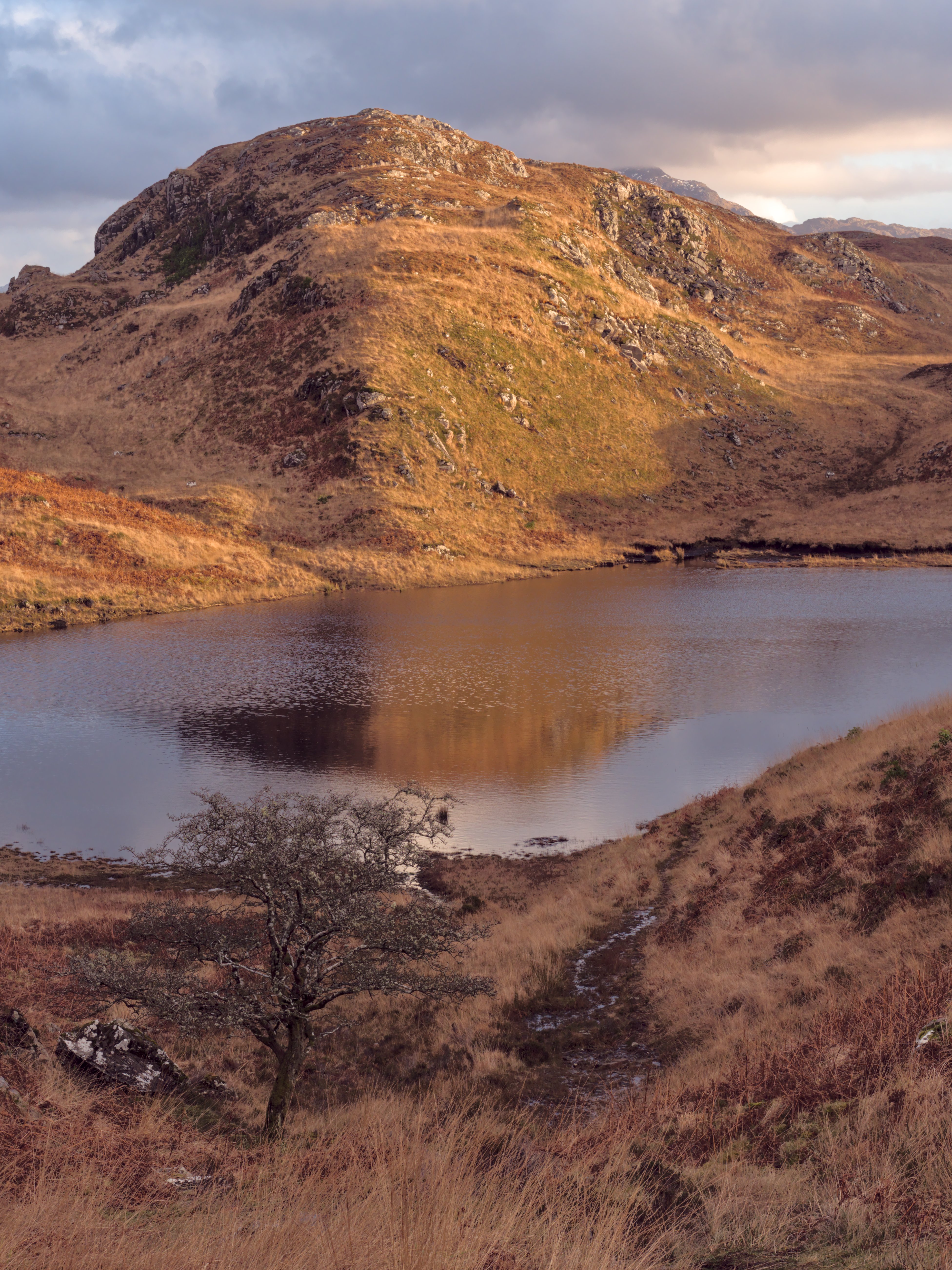
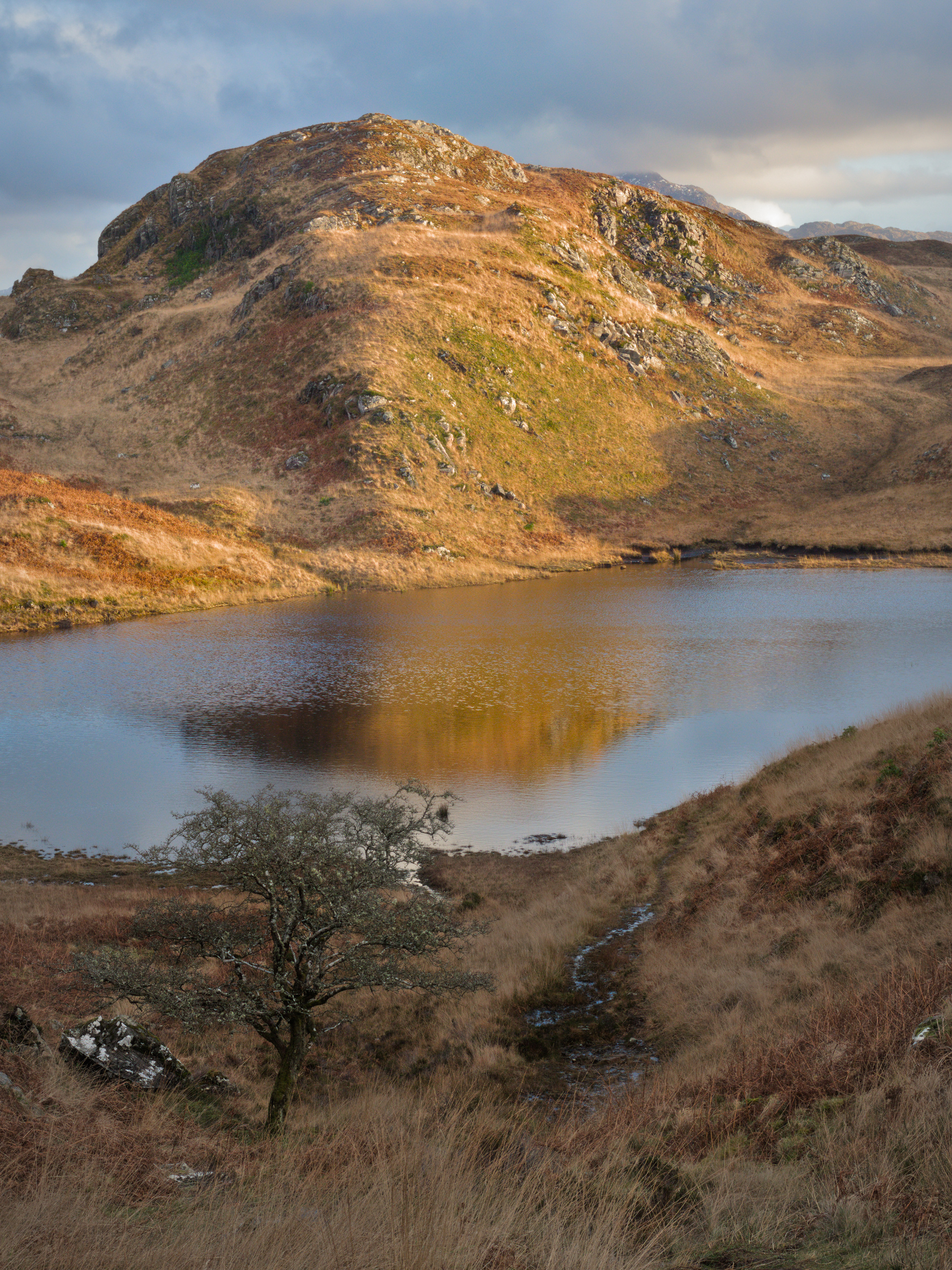
Oh dear. It’s multiple typos by me…. Should be lochan, Gaelic for small loch or lake. Strontium is the element named after the Scottish village of Strontian (where it was discovered) on the Sunart peninsula in the Western Highlands, where the picture was taken… thanks and sorry for the confusion!
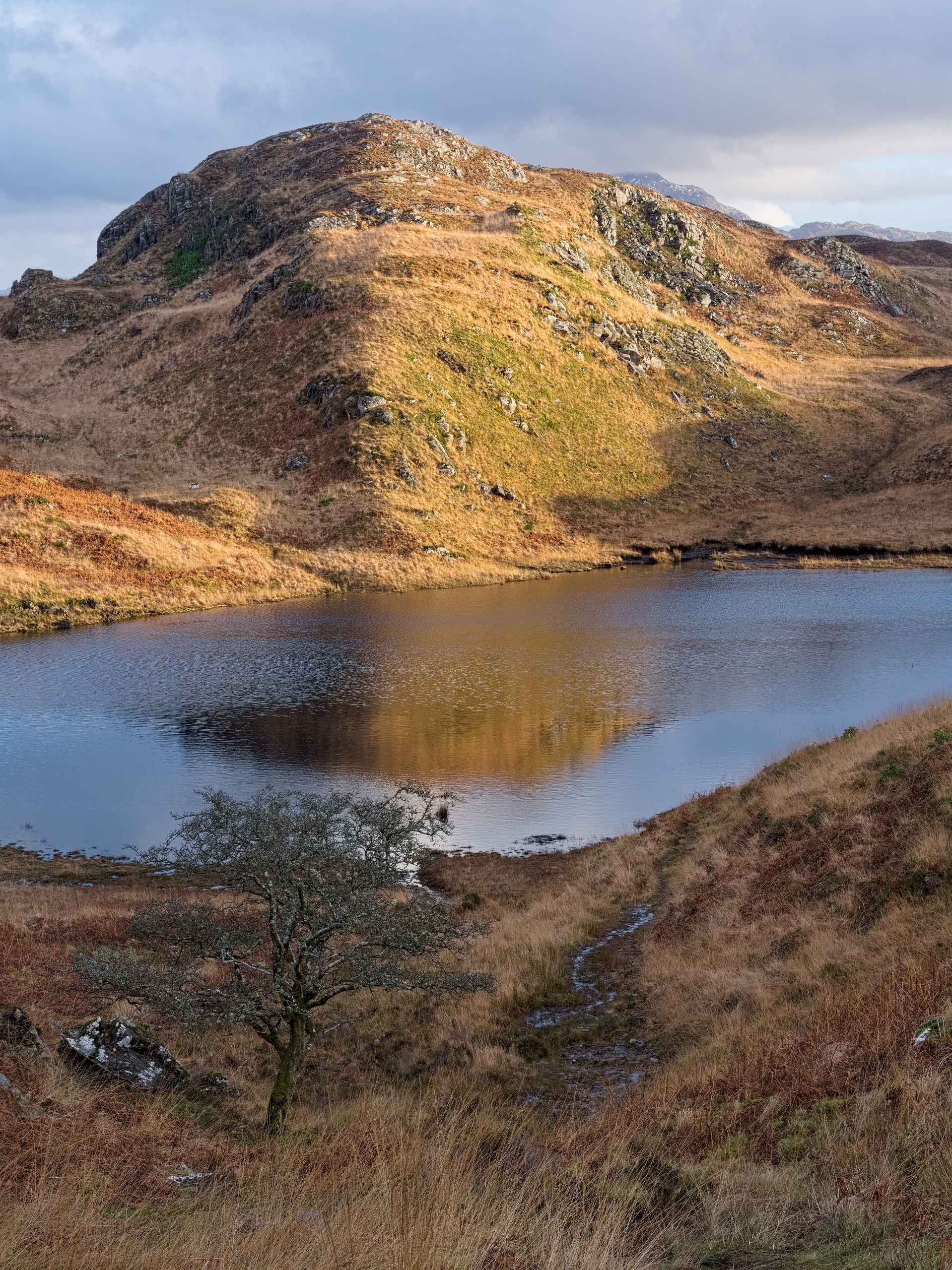
A lovely image.
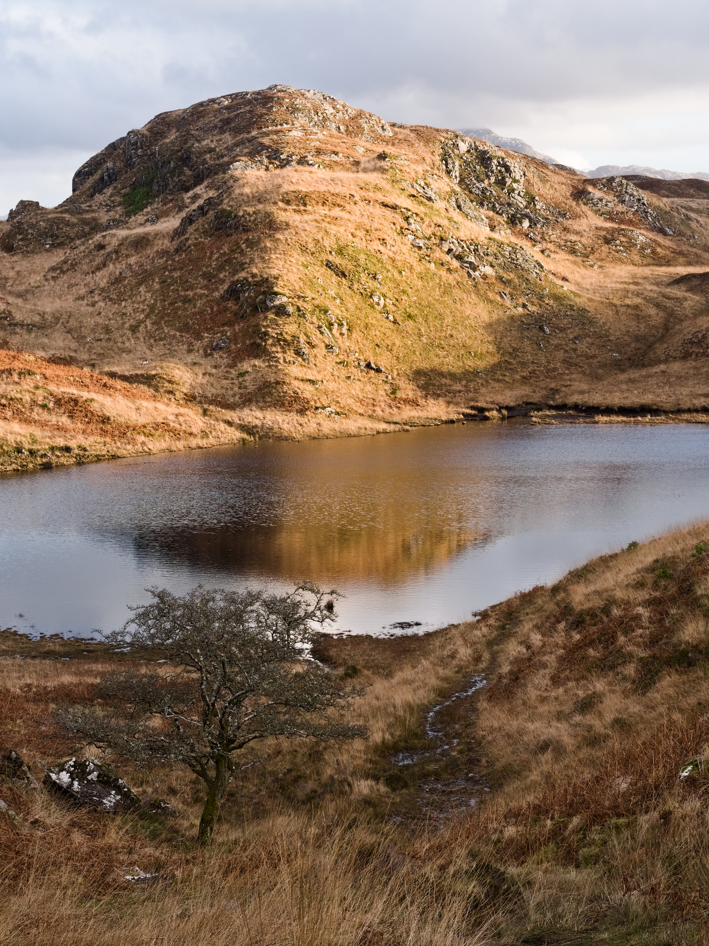
It gave me the opportunity to experiment, to see what I could do in different areas of the photograph. Now when I look at my result, I think it is greatly overdone, but here it is.
I like the sky in particular. My hill was a little pink, I realised after posting. It’s hard to judge after sitting in front of an edit for a while. Kind of need to walk away for a while and go back to it. Also seeing different versions really helps. There’s something to learn from all of them.