I’m pleased to inaugurate the “Critique” section with two macro shots I recently took. I love to do macro photography, and I would love even more to improve my composition skill to make better images!
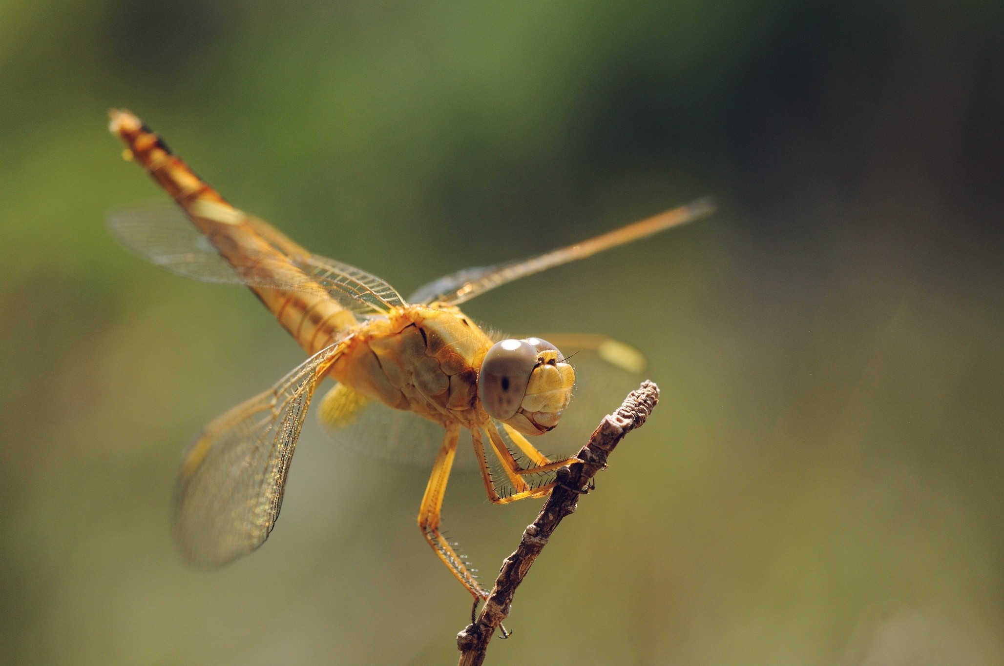
The first shot is a straight-out-of-camera picture of a dragonfly. That’s a quite conventional composition, however I opted for a back-lit point of view to try getting more “volume” and tonal variations in the dragonfly’s body:
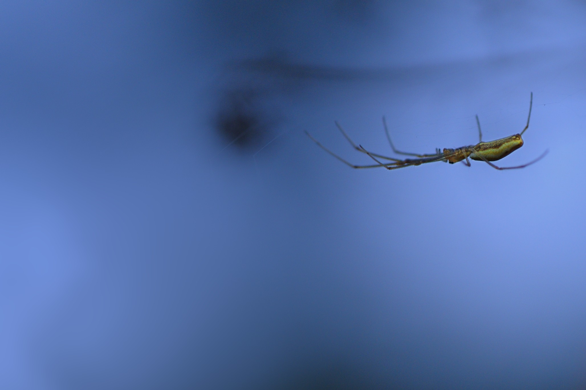
The second shot is a less conventional picture of a spider. In the post-processing I have selectively made the background more dark/blue and the spider a bit lighter, and then boosted a bit the color saturation:
Dragonfly: exposure is OK and tones are really nice, but there is some haziness/softness on the head. Could use a a little bit of sharpening perhaps?
Spider: colors are nice but the eye is dragged to the bottom left corner. Three possibilities:
Crop the picture differently
Blur the thing a bit more
With Gimp: reduce its opacity: duplicate the layer, do a rough selection on it, use the resynthesizer plugin to heal the selection (doesn’t need to be perfect). Then use the layer opacity to make the object reappear slightly.
@andabata is a bit of a macro expert, perhaps he can weigh in with some more technical critique?
Dragonfly
I love the dragonfly personally. I’m not sure I see quite the same level of haziness that @Ofnuts is describing? At least not in the full zoom of the image. I do see a slight bit of fuzziness directly behind the head - not sure if the focus plane just drops off there from your DOF or not.
The backlighting was a good choice, I think. The light filtering through the body and diffusing gives it a neat softness and tonal interest.
Spider
I agree with Ofnuts about the spider image. The object in the bottom left is drawing my eye there first, and in fact actually makes it hard to me to focus attention on the spider at all (it keeps pulling my eye back over there, if that makes sense). I’d either heal/clone it away, or blur it into irrelevance personally.
The crop seems like it could be tighter? I’m a fan of filling the frame unless the rest of the frame expands on the story (lends context or some other visual interest). Otherwise I tend to want to strip it away.
I do see faint webs in the image - is there any way to bump those up and make them more prominent? I’d bet it would be interesting to see the spider in the context of it’s web as well.
I do like the dragonfly quite a bit, and am constantly amazed at the images that macro shooters manage to capture. (I would personally be quiet proud of the dragonfly if I had taken it… ).
@Ofnuts & @patdavid: thanks for the feedback! For the dragonfly there is certainly some margin to optimize the sharpening, so I’ll try that.
For the spider picture, I see what you mean and I’ll try to follow the suggestions to make the bottom-left “spot” less distracting.
I’ll post the results some time tomorrow.
Thanks!
@patdavid: believe me, I’m quite proud of the dragonfly as well I have few more from the same day that are probably as good as this one, so I plan to make a collection of them on G+.
Oh my, now i feel that i must respond to @patdavid 's remark
Dragonfly, nice one. I prefer the focus slightly more on the nearest eye. Maybe a bit more room all around it. And i think you could got away with a slightly larger aperature. And ofcourse the obvious, the bright highlights of the full sun. (and that’s always a hard issue to deal with. portable clouds aren’t that available to make a good diffuser for the sun )
Regarding the spider, I think it’s all been said. A bit of fill flash would have helped with the spider web and make it a bit more attached to the world instead of floating around.
I’m no expert, but I do have an interest in macro. I agree with andabata’s ideas. I liked both images. On the dragonfly, the focus on the eye would have been my biggest concern. I may have tried to bring the body of the dragonfly more in line with the plane of the camera, just a bit. On the spider pic, I like the flash idea for the web and I would have cropped the image more. In my opinion, that is fine work for being hand held.
I like the general composition, colors and the position of the focal plane
Possible improvements:
Maybe try to add some more blue to the background to get slightly more color separation
As has been mentioned before I also think it could use a bit more sharpening.
Some local contrast enhancement on the parts that are in focus might work well
Maybe moving the subject a bit more to the top left would have worked well, it would then show more of the twig giving it a bit more context and a bit more of a leading line.
There are hot pixels left and possibly some color noise in the background I would denoise that (the background) a bit more
Here comes a modified version of the dragonfly, where I’ve played with the sharpening to get a sharper head. Basically I applied an RL deconvolution sharpening, and I doubled the strength of the effect around the head. I’ve not yet tried the latest suggestions (local contrast and adding blue to the background) mostly for lack of time… however, from a first try it seems that separating the dragonfly from the background is not a trivial job, and might rehire quite some manual masking. Unless someone has a better idea?
I’ve intentionally not applied any noise reduction to the images, as I’m still trying to find my way into the variety of options offered by OSS. I’ve tried with Darktable’s “profiled denoising” but I could not get anything close to what Capture NX can do on my D300 files. I’ll probably open a separate thread on this subject.
Makes shadows a bit more blue, highlights a bit more orange while protecting the colors on the yellow side of the lab spectrum a bit. Now I’m not exactly sure if I like the effect after having seen it but in the end that’s up to you to decide.
Regarding denoising, I haven’t really found a fire and forget solution so far. What I usually do is:
Remove color noise with DT profiled denoising set to wavelets, blend to color, twiddle with the parameters and opacity if necesary
For really high iso with color blotches I try to get rid of them using the equalizer
For luminance noise I then apply the DT profiled denoising set to non local means and blend it in via opacity, I find that removing all the noise (which is what it tried by default) to result in plasticy images, so the opacity gives it back some of the grain and detail.
If the noise is mostly in the shadows a use a parametric mask for that
If there are areas that I want to be smoothish I use the bilateral filter on them
That usually leads to good results but it’s quite a bit of work. For all the non high iso stuff I find that getting rid of the color noise is enough.
Thanks! I’ll try to repeat what you have done in Darktable, and play a bit with the parameters… I’m wondering if one can reach a similar result with basic RGB curves (mask excluded, of course…), or if the color correction module does fancier adjustments. Needs some experimentation
Here is the code: darktable/colorcorrection.c at master · darktable-org/darktable · GitHub
Looks like it operates in LAB by using a pair of A, B offsets for L=0 and L=1 and then linearly interpolates between them depending on the L value of the pixel. With the saturation just being a multiplication of the A,B value.
With that said, I still find it a shame that darktable doesn’t have RGB curves. Yes, LAB curves are cool, but they serve a different purpose.
Actually I just remembered another thing regarding the denoising in darktable - the preview when zoomed out is next to useless - you’ll have to export or view the image in the slideshow. And one more thing, the sharpening threshold is a bit low by default so if you are having noise issues you might want to bump that a bit.
I agree, RGB curves are the first thing I’ve implemented in photoflow, and still the tool I’using the most. Lab curves are great for doing color corrections independently of luminosity, but for separate editing of shadows and highlights one is probably better off with RGB.
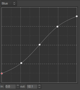
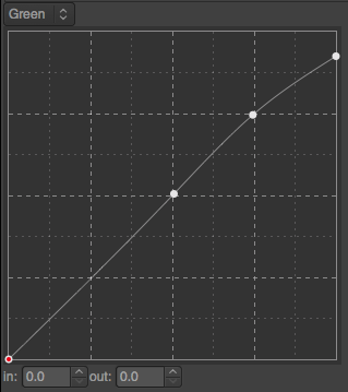
I have played with RGB curves on the dragonfly image, and I think I managed to get quite close to Darktable’s color correction result with the following two curves applied to the blue and green channels respectively:
The curves have been blended with the original image in color mode, to avoid reducing the overall contrast too much.
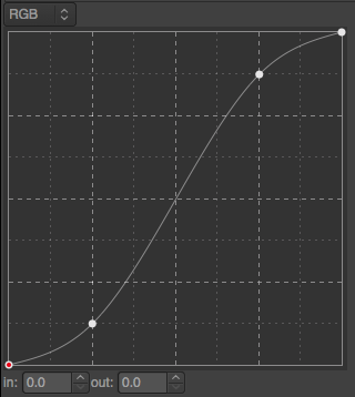
Next I have slightly increased the contrast with an S-shaped RGB curve with a quite low opacity (20% or so):
Here is the result, which I tend to prefer to the original:
I guess part of the issue is that (most?) RGB Colorspaces don’t cover all the colors they get in CIE XYZ or LAB and they want to avoid converting between the two for this reason. But that’s just a guess.
I like your improved version. It does pop a bit more.
I should look into the details of the code, but as far as I remember Darktable’s processing pipeline has an initial stage in RGB colorspace and then it goes into Lab. By the way, ProPhotoRGB goes beyond the CIELab gamut almost everywhere: Welcome to Bruce Lindbloom's Web Site
It should therefore be possible to introduce RGB curves at some early place in the pipeline… unless I missed some crucial aspect
After comparing your new version I have to say I like it more as well. It does “pop” a bit more in small contrasts to my eye (and the result is pleasing)!


 ).
). I have few more from the same day that are probably as good as this one, so I plan to make a collection of them on G+.