Actually, the module order was an accident ![]() .
.
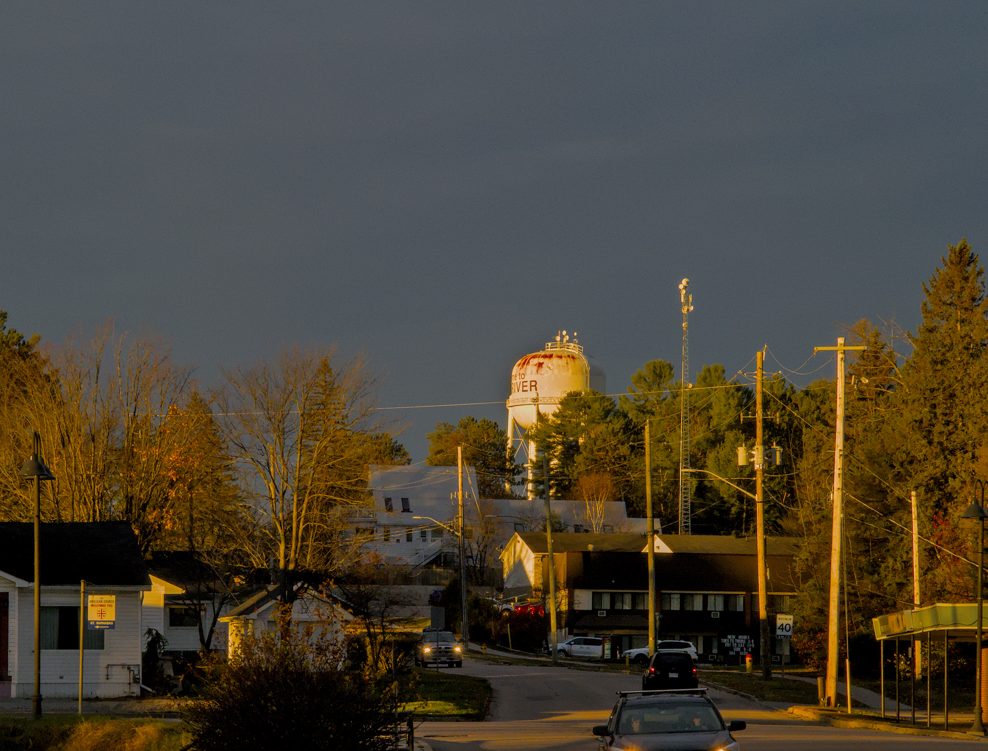
Spectacular light needs a spectacular edit. I take the comment of @sovereign as a compliment ![]() . Nevertheless, I appreciate your commitment to a constructive atmosphere in this forum.
. Nevertheless, I appreciate your commitment to a constructive atmosphere in this forum.
1 Like
I am glad you didn’t take it too seriously @Thomas_Do : emoticons exist for a reason 
Perhaps @paperdigits didn’t notice it.
Less is more: you pushed filmic too far, the dynamic range appears unnatural.
The tone curve you have chosen to apply afterwards makes it even less easy on the eyes.
@Soupy one thing I can say is that I never use the colour picker, never have in any software.
@bobm it is all too easy to be critical in hindsight, but thats the only way to improve, whether it be in photography or anything else. Four photos in one minute, but it takes less than a second to change the aperture. I probably would have forgotten too, but for that very reason I make an effort to reset the controls on my camera before I pack it up, someone else gave me that tip and it’s kept me out of trouble a couple of times.
for what its worth I don’t even want to think about how many fleeting opportunities I’ve missed over the years not having my camera on me when I easily could have been carrying it, so you’re in front in that regard.
Colour picker? I was talking about the spot tool in white balance module.
that’s what I meant, what does the spot tool use to make a white balance adjustment if not the colour value?
It adjusts the tint/temp and rgb sliders… just different methods of achieving the same thing.
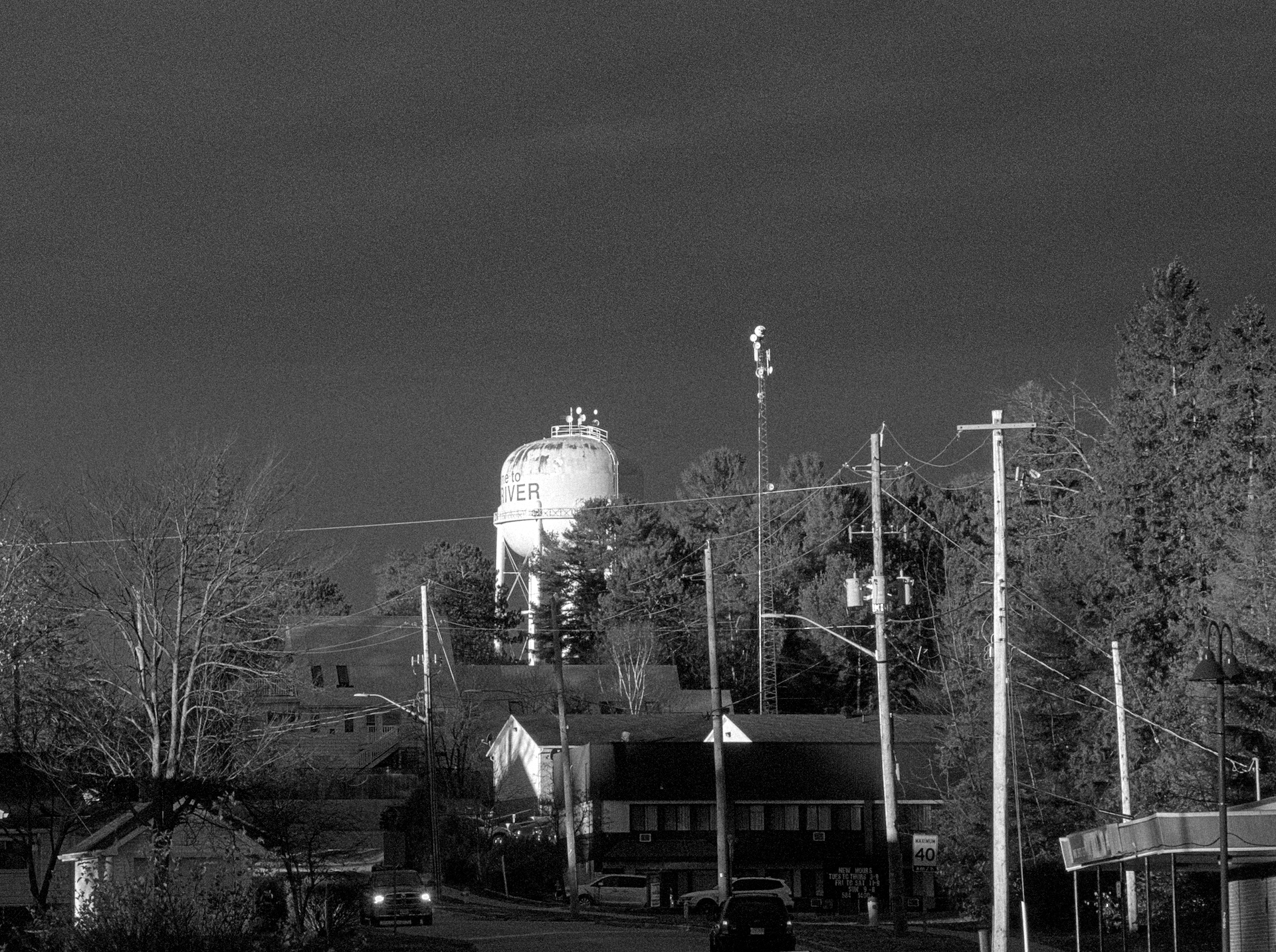
Thanks for posting this photo, always fun to compare my work with others
DT 3.2.1
2 Likes

As I mentioned already several times on this forum, I use the play raw category really to play with the posted raws. I do things, I would normally not do to my favorite shots ;-).
In this case I followed the idea of a kind of “surreal light” and tried to find how far I could push this concept. It was not ment to be “easy on the eyes”.
I understand your intention. I think in this case your development achieved the surreal look, but without semblance of realism: perhaps it’s just my personal taste, but it is there where you lost me in your interpretation. I challenge you for the next playraw to mix the best of the two worlds: creativity and naturalness. 
Oh please, one or the other ![]() . Sometime I post versions here, trying to be more “natural”, what in general means less contrast, (artificial) sharpness and color saturation. These often look more dull than other the edits.
. Sometime I post versions here, trying to be more “natural”, what in general means less contrast, (artificial) sharpness and color saturation. These often look more dull than other the edits.
Or I try something more extreme (see above). But both together? However, if I try, I will let you know.
1 Like
We all know that on internet what calls for attention is contrast, saturation and sharpness 
I agree with you that what seems “natural” might not be catchy on screen, but I prefer “not to over do it” and, in all honesty, time to time I fall short.
Still, a properly developed shot is plenty of opportunities for creativity: in the equation that defines the mood, the tint plays a big role. Movies often take advantage of the psychology of colors to “set the tone” … excuse me for the pun
1 Like
1 Like