These are 2 images from a large set that I have been making in an environmentally preserved old growth forest full with is a jumble of fallen giants and burnt stumps. I would like to show the impact and beauty that even these ‘dead giants’ have on visitors. I would like to get critique on the general direction of my software processing and depiction.

2 Likes
Old Growth Forests
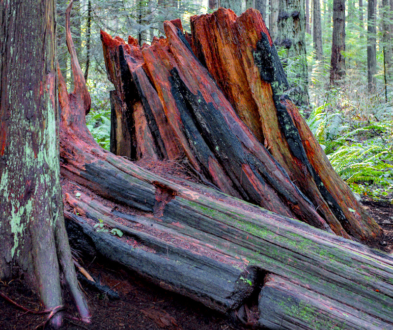
It’s rare, and refreshing, to see the ‘critique’ tag. For what it’s worth, here is my opinion. Photographically, I really like the first image. Very nice separation between foreground (red, in focus, light) and background (green, out of focus, dark). We also see just enough of the background trees to get a sense of scope, plus some nice dappled lighting. I only wonder if the reds/magentas have been pushed a bit far in editing, or if they really are that vibrant. The second image is a more interesting subject, but less pleasing photographically. The light is in the background not foreground, and is not really dappled. We also see less of the background, thus getting a bit less scope than the first image. Just my 2c. Looks a beautiful location to walk around and take photos.
1 Like
The tight crop evokes the feeling when someone is standing too close to me in line during the pandemic (or in general). 
I thank you for the feedback … it is difficult to get an outside and honest critique of experimental work … your time and comments are appreciated.
No, of course the colors are not, and not meant to, directly reflect nature. The last thing that I want is another picture-postcard. I am hoping to provide another and more personal view of Nature.
1 Like
Standing in the forest dwarfed by the size of the old-growth … in-your-face is just how it appears to me. Thanks for the comment.
I’d be interested to know just how large these stumps are. If they are really large, a person in the shots might help to provide a sense of scale.
I agree with Tim’s favorable comments about the first photo. Unlike him I’m not bothered by the reds. Instead, I find the green of the moss on the stump to be overly bright…just a pet peeve of mine.
1 Like
If confrontation is what you are going for, then this is perfect: The old guard is going away or gone, don’t you dare bulldoze the rest! Otherwise, the back-to-the-wall feeling conflicts with the serenity these forests tend to provide. In any case, the images are bold and I like that aspect.
I think that it is high time that we started to also consider content and creativity rather than totally focusing on ways to better record our subject.
Of course that would totally change the subject matter … would that not bother you?
Thanks for the feedback … all of you.
3 Likes
That all depends…if these were Giant Sequoia stumps, then a familiar object of a well known size nearby would help to emphasize the massive size of the stumps. If they were of more moderate size, then the addition of a person would probably detract from the scene. Honestly, if you hadn’t mentioned old growth, I wouldn’t have had any of these thoughts!
Agreed. Content and creativity is why I do this, and the processing is just a tool to that means.
I like the colors, but I’m having trouble discerning the burnt sections from the unscathed wood. I imagine there’s a sense of tragedy for the loss of old growth that’s somewhat missing
Also, I can’t really get a sense of the perspective of that stump against the forest. Perhaps a lower angle and some other reference point to get a feel for the size of the old giant
I don’t know that I could do any better, but that’s my take.
This is a case where being there is difficult to translate properly to a set of images. Indeed on a trip a few years back through northern California redwoods I notice that all of my images struggle to really impart the sense of scale that comes from being there.
If your subject is Old Growth, Forests - ask yourself how your images are relating this to your viewers. Does a viewer feel or know that the image represents that in some way? How do you know they’re old? Rings? Size? - if so then show us.
Or, borrowing the old adage from writing courses “Show, don’t tell.”.
I tend to agree about the scale. It’s impossible to really get a sense of it from these (but I agree that I’m not sure how you’d impart that sense of scale without something obvious in the frame).
3 Likes
A little trick is that you are always with someone on the road when you take such pictures. And then he appears discretely in the photos. You can also see it well in landscape paintings, which always include an animal or a group of animals or people.
2 Likes
Pat … you are totally correct and really this is my fault. All of the comments so far have really focused on the difference between the ‘title’ and the image. This is rather like walking into a gallery and not looking at a picture before reading the artist’s title. I should have more correctly used a title such as “Forest Impressions” … would that have helped?.
No comments on the use of color … interesting. Did everybody really expect that the color was close to nature? If a person (as Boris suggested) had been added with this color rendition would that have been acceptable?
1 Like
OK … so I offer another one out of the series … this time without any title. Anybody now think that a person casually leaning against this stump would help the image?

1 Like
Well, maybe if it was Ron Perlman as Hellboy…
1 Like
I think a person casually leaning against this stump would melt from the lava ![]()
More seriously, it proves you can capture the scale of these stumps without the addition of people.
I forgot to mention that I like your third image.
1 The erosion and various sizes of sticks and roots give me a sense of scale.
2 There are more layers to the frame than just foreground and background.
3 It isn’t as tight and therefore gives me room to breathe and explore with my eyes.
1 Like