I now have a nice LUT profile for my Z6, but nowhere to go for images to use it. So, I went back in the image repository looking for colors upon which to improve. Turns out that the best specimens were captured right here in the casa, no excursion required.
I may have posted this one before; this was one of the first photos I took right after receiving the camera. Probably the most significant change was in the green leaves at the top; they are more “green”, and less “yellow-green”. The purples and yellows did saturate a bit more, but their gradations already had resolved just fine.
Okay, this is an abstraction. I started with a nice color rendition, but the light called me to monochrome it. That always leads to messing with the contrast in ways that would just bork colors, and then a bit of re-coloring with a negative red curve to produce the bluish green cast. The LUT profile is buried in the early part of the toolchain, so it still counts, no?
However, you have to be careful not to self-condition your visuals too much in your hunt for perfect colour. I know this all too well.
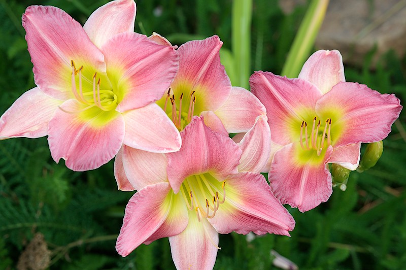
The first photo is already very nice from the light point of view. The low key brightness brings out the three-dimensionality of the flowers very well. The colour contrasts (pink, yellow and green) intensify this even more.
In the second photo, due to too much local contrast in the pink area, the flowers look a little “leathery and dry” and the yellow area could also shine a little more. I suppose a softer approach to the treatment could be more pleasant here.
On the third photo the pink colour (especially the light areas) stands out too much from the rest. Here maybe a little less saturation on pink would be better.
And yes, in the fourth photo monochrome fits very well.
As I was queuing the images to post, that very thing occurred to me. What I’d like to do is one of those overlay “wipe-things”, where you drag the line over the image to uncover the underlying image/cover with the top image. I’ve looked at some of the javascript/css things out there, but I’m not sure how to integrate that in a thread post.
If I don’t find traction with that, I’ll just post some side-by-sides of selected parts of the images, sometime this weekend. Of note is that the differences lie in the extreme colors; indeed, if you compare a “normal-colored” image rendered with matrix-vs-LUT profiles, there’ll not be many if any differences. It’s the out-of-gamut colors with respect to the destination colorspace that are transformed to something different…
I’ve experienced a bit of self-fulfillment already; the initial LUT profiles based on the cc24 reference did fine with the extreme blues I was chasing, but not so well with a rather reddish-purple flower. I then moved up my experiment with a larger reference, the 1600-patch munsell set, and things got better. Interestingly, the max DE of that profile was higher, about 3, so I think statistical comparisons are only good between profiles built to the same reference spectra.
Thanks, this was one of the very first images from the new camera, and I’ve used it a lot, including my desktop background at work. Really just a grab-shot of a grocery-store bouquet my wife brought home; funny how things like that can work out…
The yellow areas were my point of interest for this exercise, as they changed significantly moving from the matrix to LUT profile. I’m interested in that as yellow is a fairly spectral color along with green, and in the area where the camera is most spectrally-sensitive. The flowers are (were?, they’re gone now…) stressed from dry conditions; this summer we haven’t had the rain we usually get and my watering discipline is rather sad…
This one sometimes hurts my eyes, but the patterns are intriguing. Really, I didn’t mess with the color saturation anywere except in the choice of camera profile. The matrix profile had already yielded a “colorful” render, and the LUT profile bumped it up a bit.
I had some other white flower images I’d monochromed that primed the pump, so to speak. The re-toning was an interesting outcome; I sometimes try to put a bid of “cold” in a monochrome by adding a blue curve and dragging the lower point up just a scooch, or faux sepia with a red; I went for the sepia treatment, didn’t like it, so I dragged the bottom point to the right instead and got the subtractive result with an effective boost of the blue and green channels. I wrote that one down…
What’s your camera make/model? I’ve collected a lot of others’ measurements since starting this endeavor, it’s possible I already have data with which to make a LUT profile.
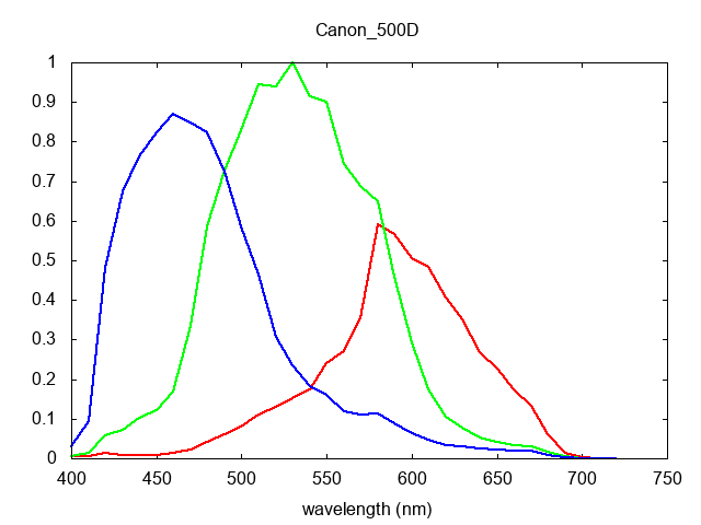
the camspec database has a 500D, 'bout the closest model number I can find. At least two Canons seem to have a similar sensitivity pattern, here’s a plot of the 500D:
Compared to the OpenFilmTools Canons at Open Film Tools SSFs, the red peak is a bit different, but the rest of the pattern is similar.
I think so, as I’d imagine they’d spec the bayer filtration on the sensor the same for all articles of a model in order to keep the corresponding processing firmware the same.
This stuff is cool. That should work for the 550D Canon tends to use the same sensor across many models especially in the Rebel series.
It is really amazing how good your colors look with this method the only way I can get colors this good in software with my 90D is if I use canon’s DPP4 which is really odd to use tbh.


 I don’t have hot pink apparel either. I like reds more.