I’m 72. A recent mid-March bout with Covid-19 greatly accelerated cataracts in both eyes. It’s six months later. Covid long-haul after effects are slowly but steadily receding.
I just finished the second of two cataract surgeries. Holy shit. Colors like this I haven’t seen in decades.
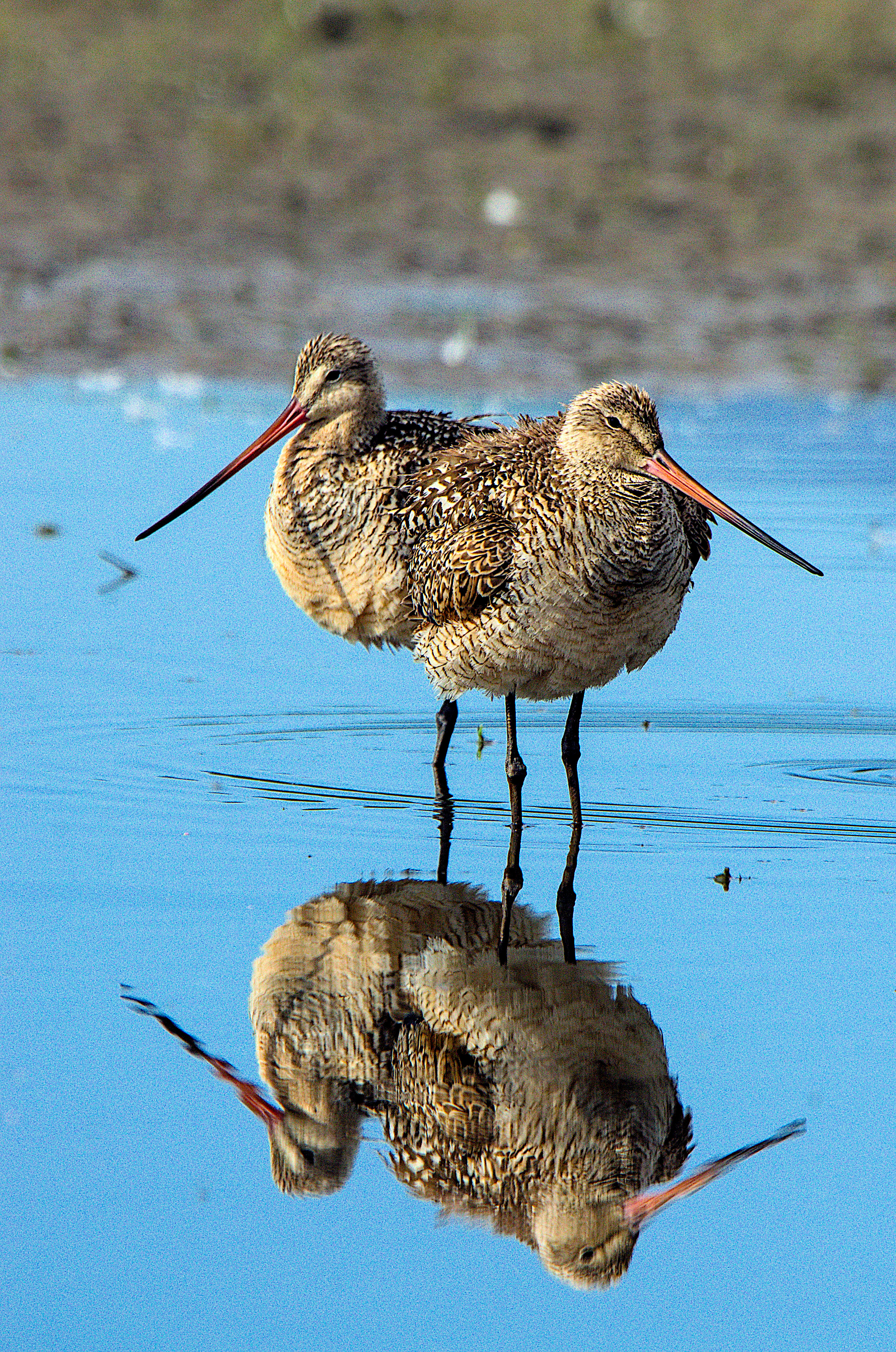
When I look at the best photos I’ve edited in recent years they all look like I was a little too heavy-handed on the saturation sliders. The difference between reality, perception and how the brain processes information…is hard to nail down.
A month ago this photo looked just fine to me. Now, with new bionic eyes, the blue is, far too exaggerated. The grainy noise in the background is new to me now too. I’ll have to re-edit this photo. And perhaps all the others too.
Cataract surgery is common for apprentice geezers in their early 70s. But colors like this I haven’t seen in a long time. Cataracts likely begin slowly at a much earlier age. Surgery happens when it gets out of hand. But what about those in their 50s? Who knows what grainy noise lurks in the minds of men.
Congratulation on your new bionic eyes. I have only one, so my vision is a bit lop-sided, but that’s okay.
Don’t be too hasty about judgements like “with new bionic eyes, the blue is, far too exaggerated”. Remember that “Colors like this I haven’t seen in decades”, and this applies to photos as well as real life. You can’t dial real-life saturation down to match your memory of what you saw through cataracts, and maybe you shouldn’t do this with photos either.
I reckon it took me a year to become fully accustomed to bionic eyesight, ie it became the new normal. Perhaps I was 90% of the way after 6 months, and 50% of the way after 3 months.
My first regard of the image was on my smartphone, where the blue is decidedly deep. At my computer now, this unmanaged screen renders it much less so. Actually, my first attention was to the three-legged, two-headed bird…
What I’d encourage you to do is insure your color management is up to speed, and then use images rendered there as the basis for evaluating your perception. If you take a raw and do whatever “neutral” processing you have available, with a color-managed display you’ll have a fairly colorimetric rendition of it for consideration, flat and dull as it may be.
Actually, I’d recommend this generally, for anyone trying to get a grip on their post-processing…
Edit: Oh, and I meant to point out that the deep blue rendition isn’t out of the bounds of reality, at least in my experience out in the American West…
You have to wait a few months to become accustomed to you new perception. In the mean time, don’t try to change your way to process.
The blue color is nice and doesn’t look irrealistic as I have mediterranean seashore photos with some intense blue water. On atlantic water looks green.
(author) This is an old photo. The blue may or may not be too intense. It sure looks different to me now than it did a month ago.
The background should be a bokeh blur but it’s all grainy. A month ago (and apparently several years ago too) I didn’t see it that way. Now I do.
Next time I’ll use masking to sharpen only the “bird” parts of the image. Applying sharpening to what’s already blurred…isn’t wise.
Poor eyesight is a bit like stupidity. In the one case you don’t know what you don’t know because you don’t know it. In the other case you don’t know what you can’t see because you can’t see it.
play raw. OK. Good idea. Tomorrow morning I’ll get it together. Tied up now.
RE> “color management”
Indeed. I need to get my act together. I bought a small piece of hardware from Color Hug a year ago. I need to find the time to dope it out.
That might actually explain why digital granddads usually produce pictures that look like a RuPaul drag race.
Well, enjoy your second youth. It might be fun and useful to document what kind of editing you find acceptable over time, just to keep track of how this perception evolves.
@pittendrigh, your experience is re-enforcing a conclusion I’m coming to, and that is color management and particularly display calibration is crucial to really getting consistent color in our renditions. Even with young eyes, the brain does so much to alter our real-time perception of color that it’s hard to rely on what we’re seeing to translate to what others will see. I recently read an article about Microsoft’s development of the split-screen Android phone they’re about to introduce; it wasn’t until they got back some working prototypes that they realized how differently individual OLED screens would render the same encoded colors. When stared at individually, they all looked “consistent”.
If one develops their raws to a linear RGB that is transformed with a suitable camera profile to the profiled display, they’ll be looking at a “colorimetrically consistent” rendering for further consideration. Flat and dull as it is, that’s an important starting point for modifying tone and color, so that one isn’t anchored in another mental expectation. It’s essentially how whatever cameras’ spectral performance is translated into color encodings consistent with the CIE 1931 color-matching reference, and is as close to “colorimetrically correct” as one could hope. Anything else, software-applied or mental, is an excursion…