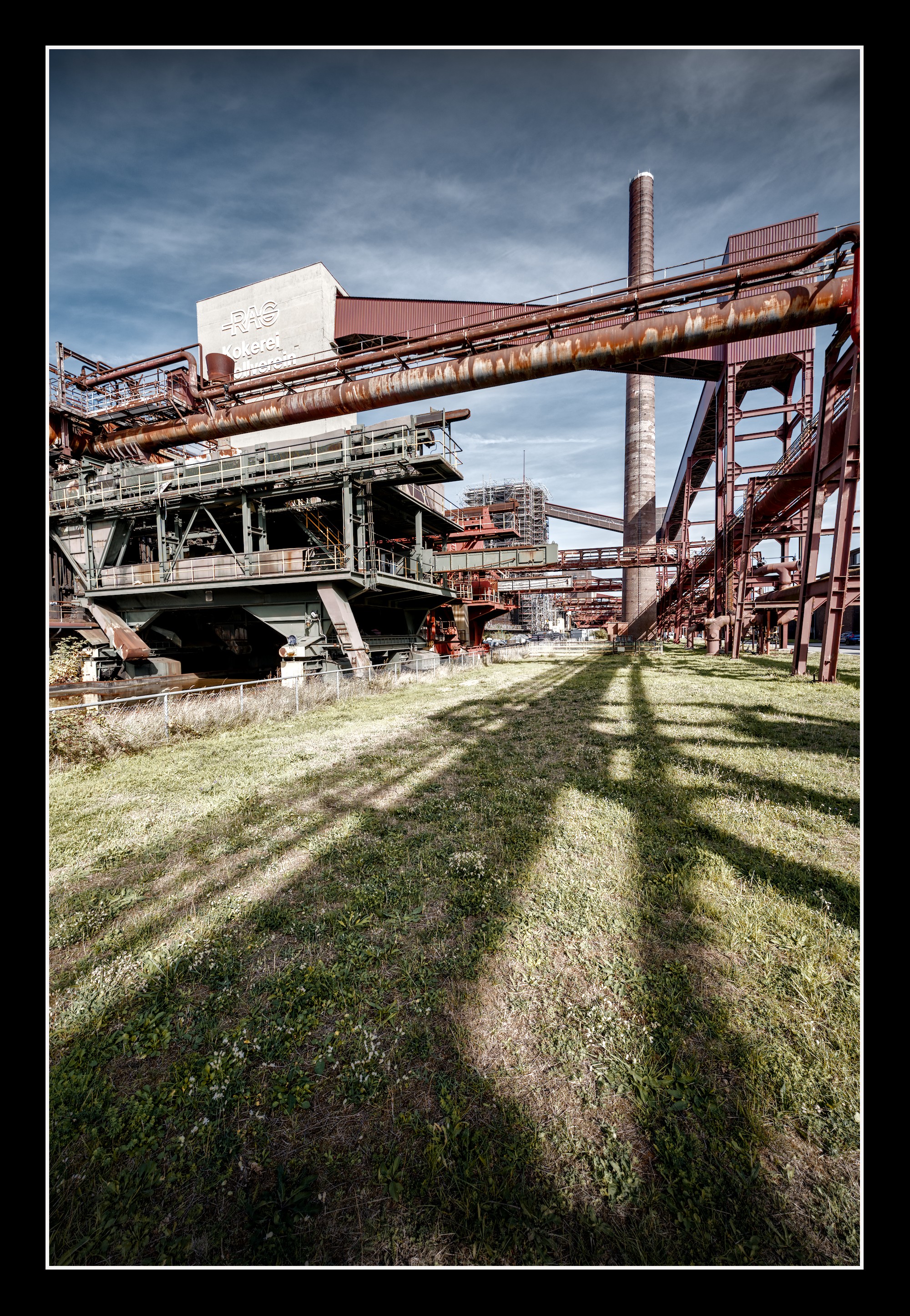
We are back from holiday. We made a nice trip through our beautiful neighbour country, the Netherlands. So many nice towns, so many friendly people. Great! Anyway you don’t get something to see from there, but on our way back to Germany, we decided to visit Zeche Zollverein.
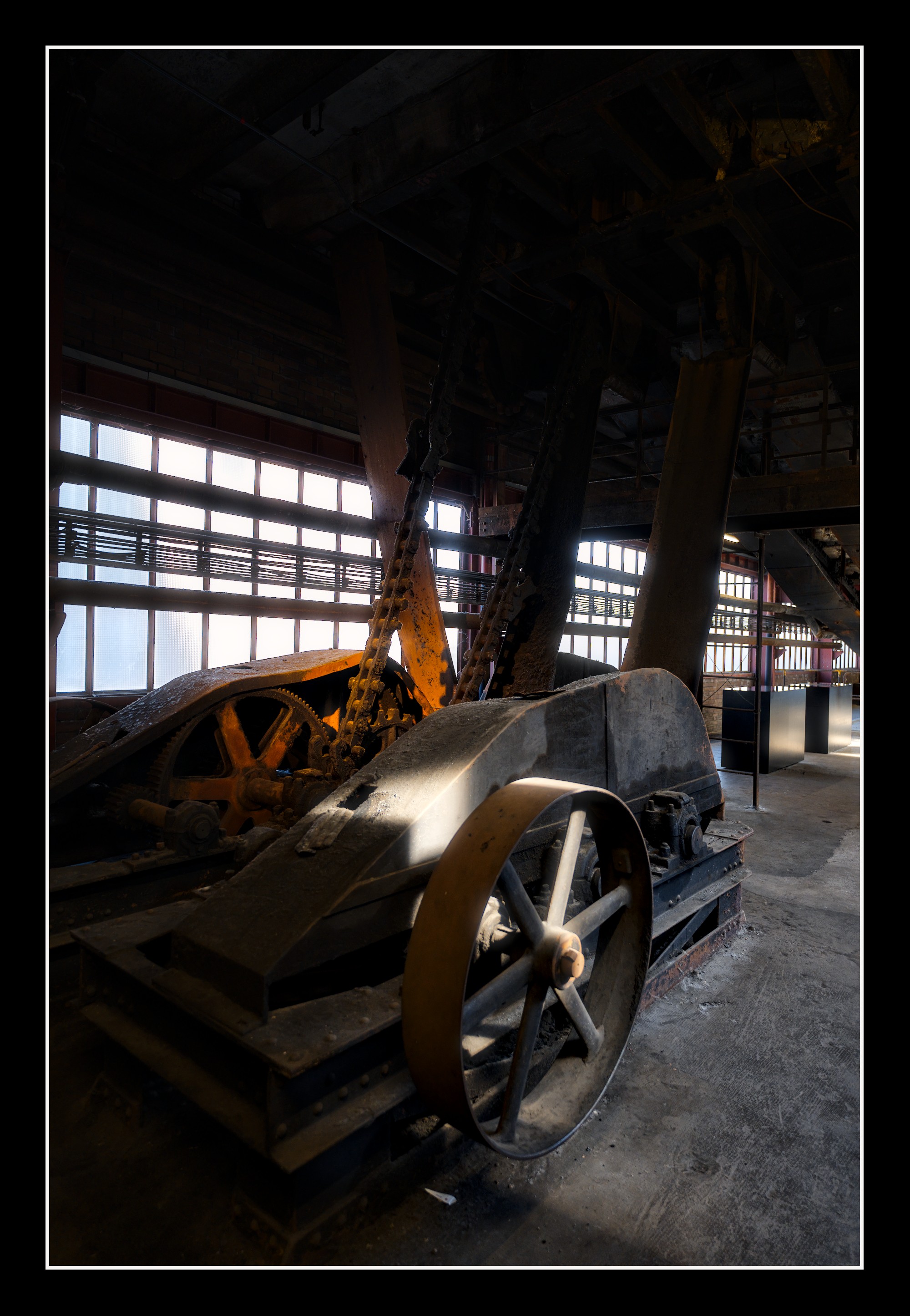
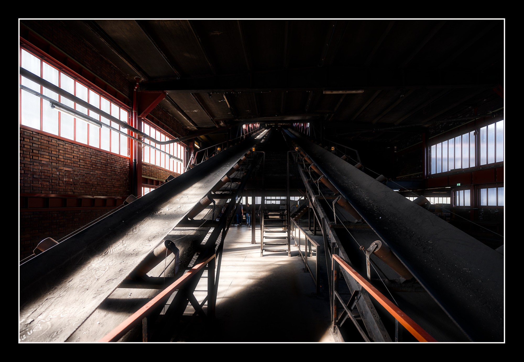
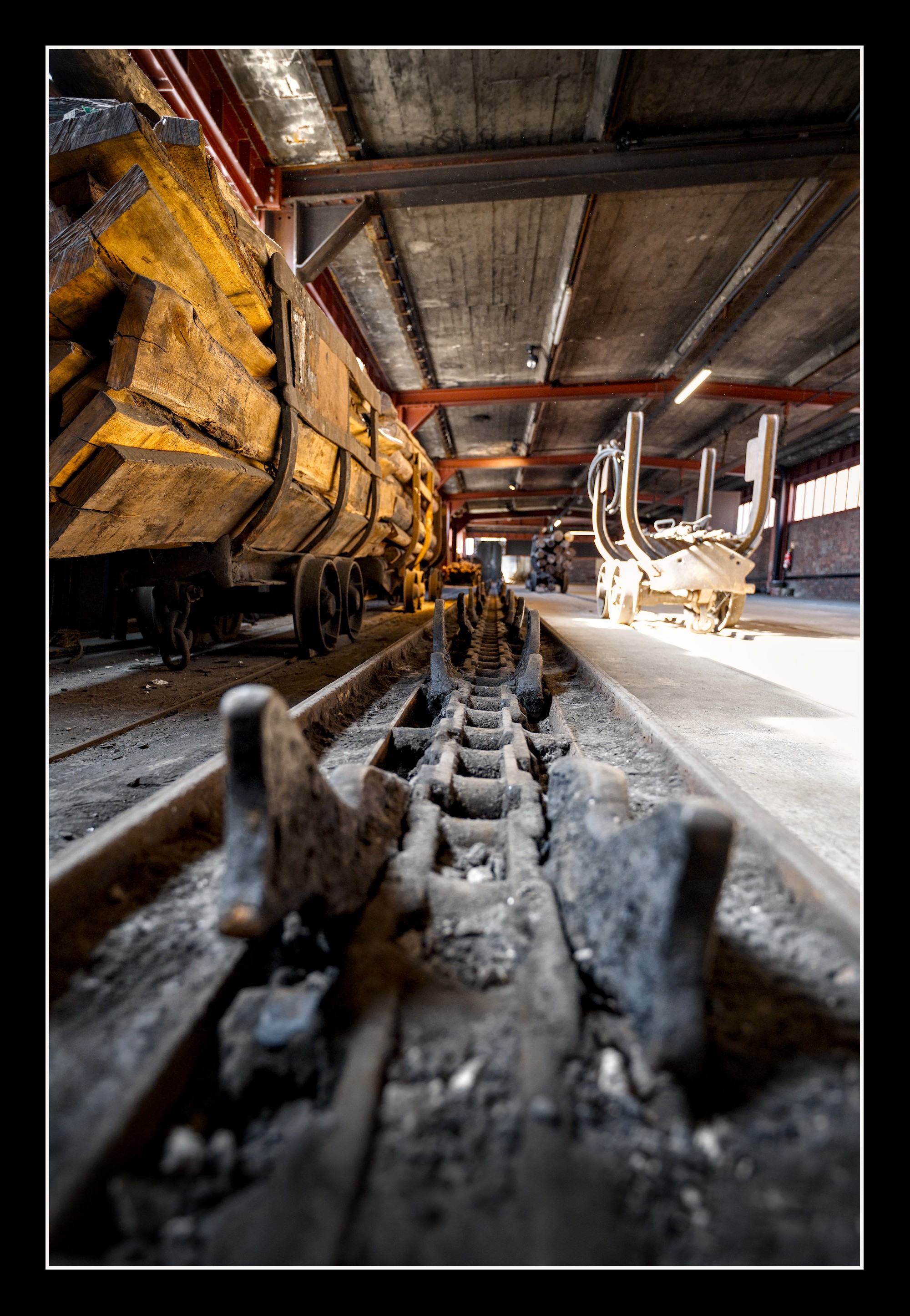
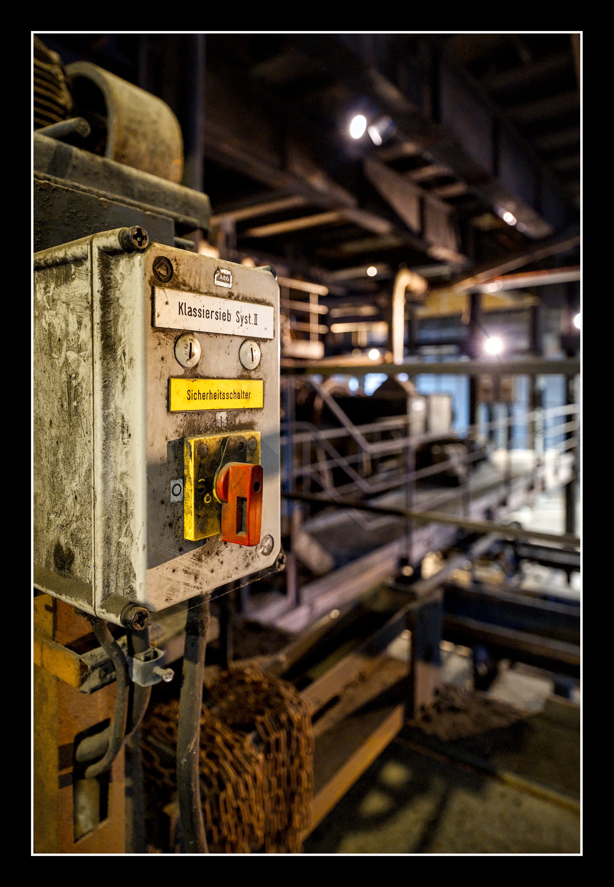
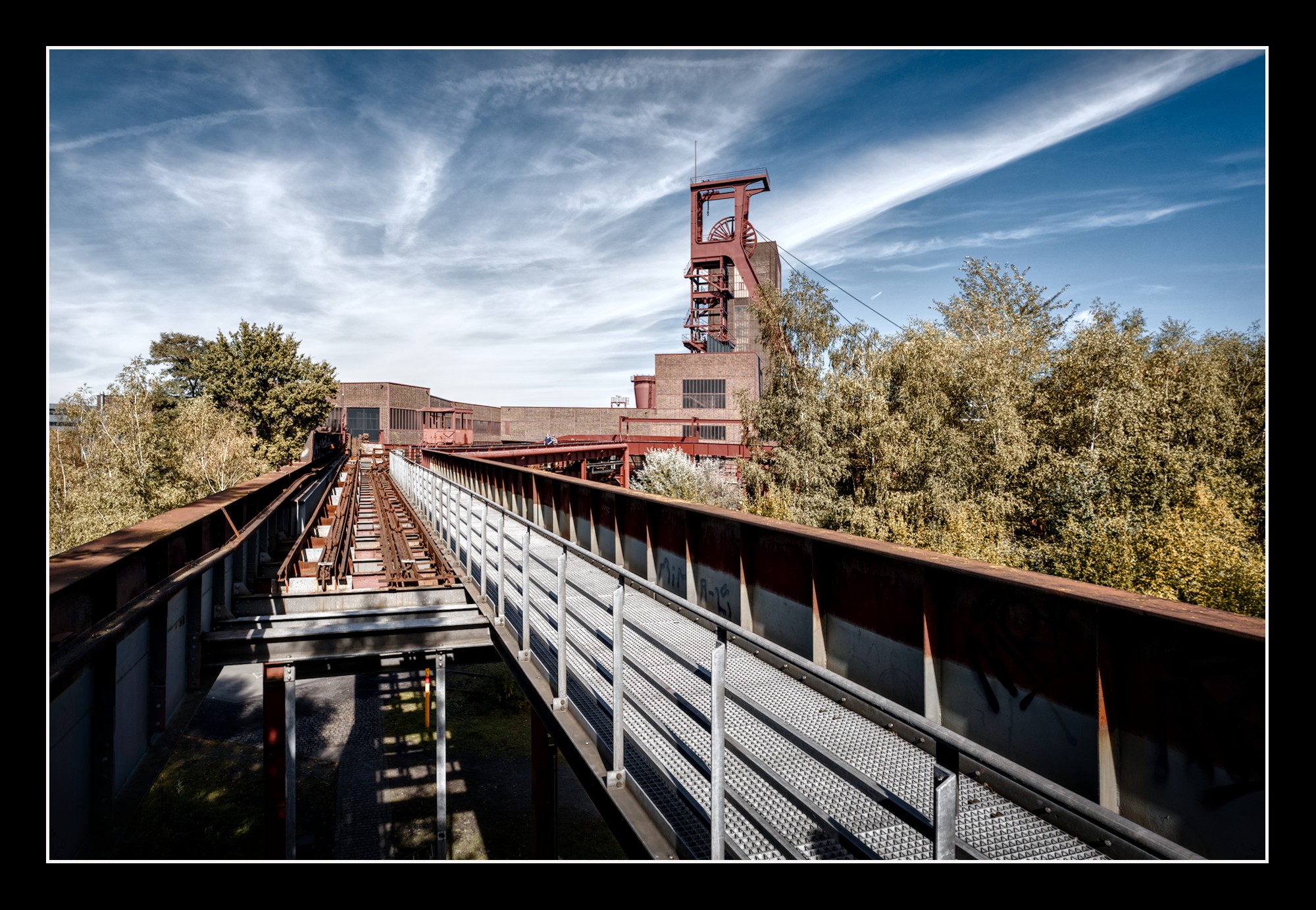
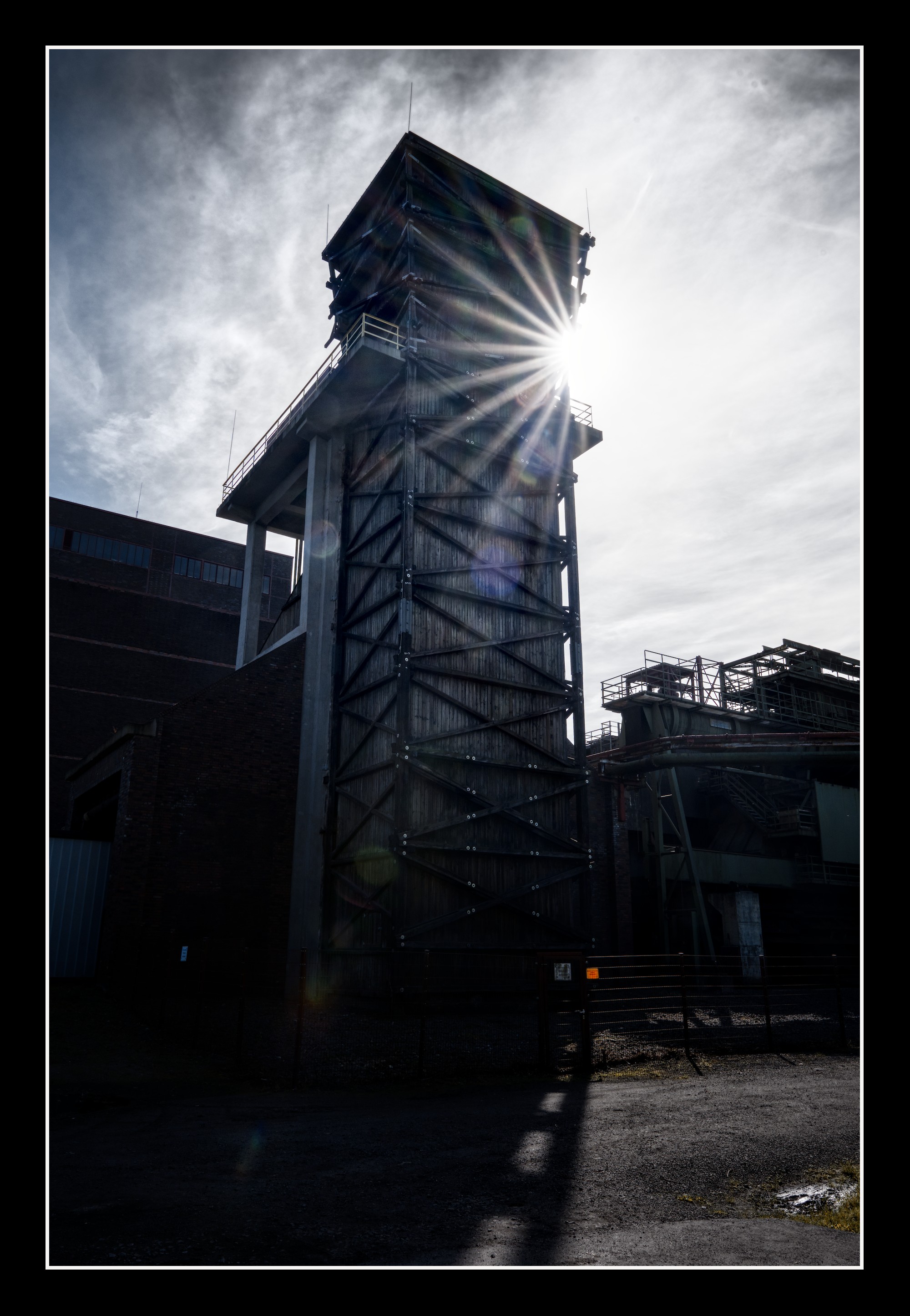
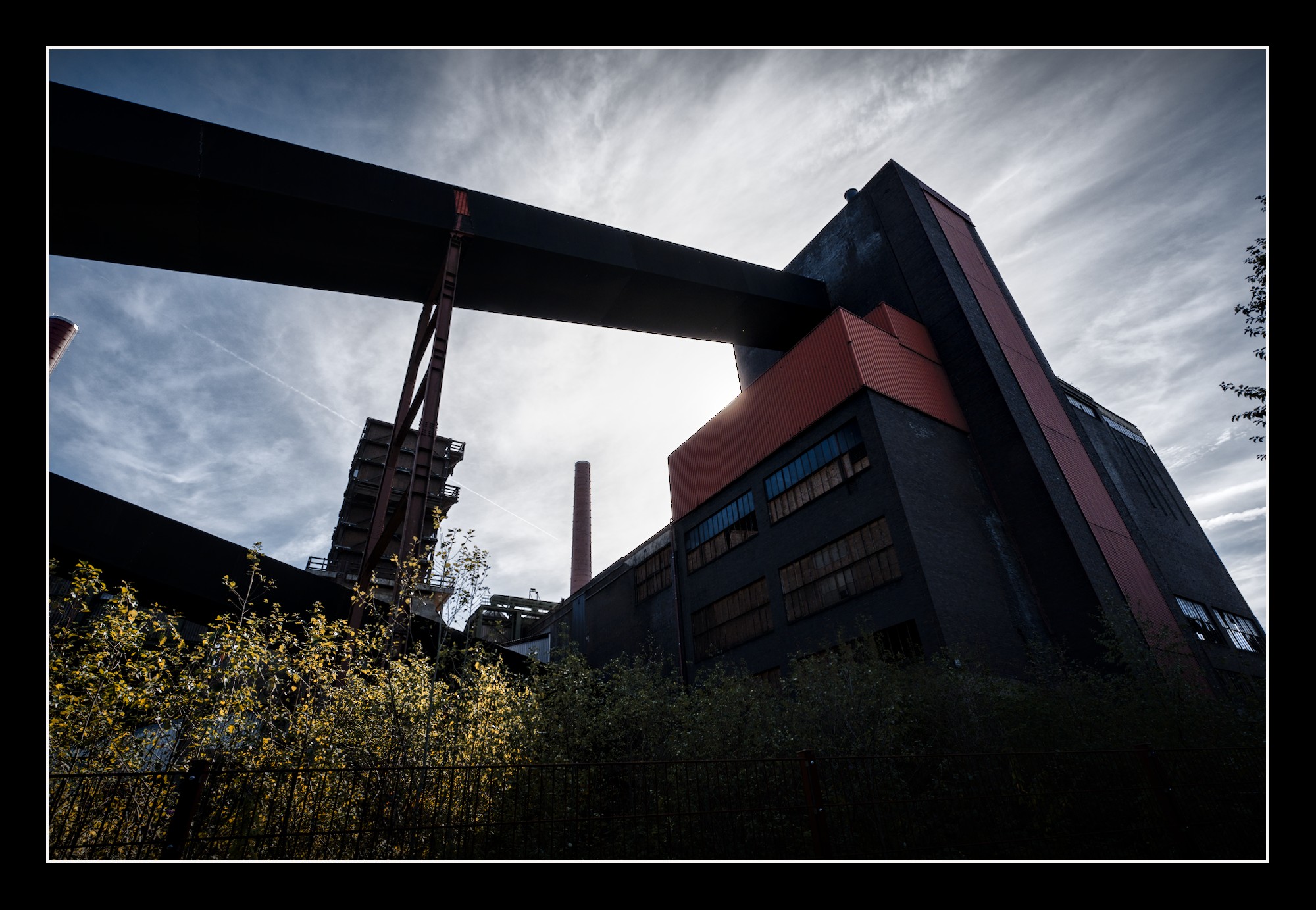
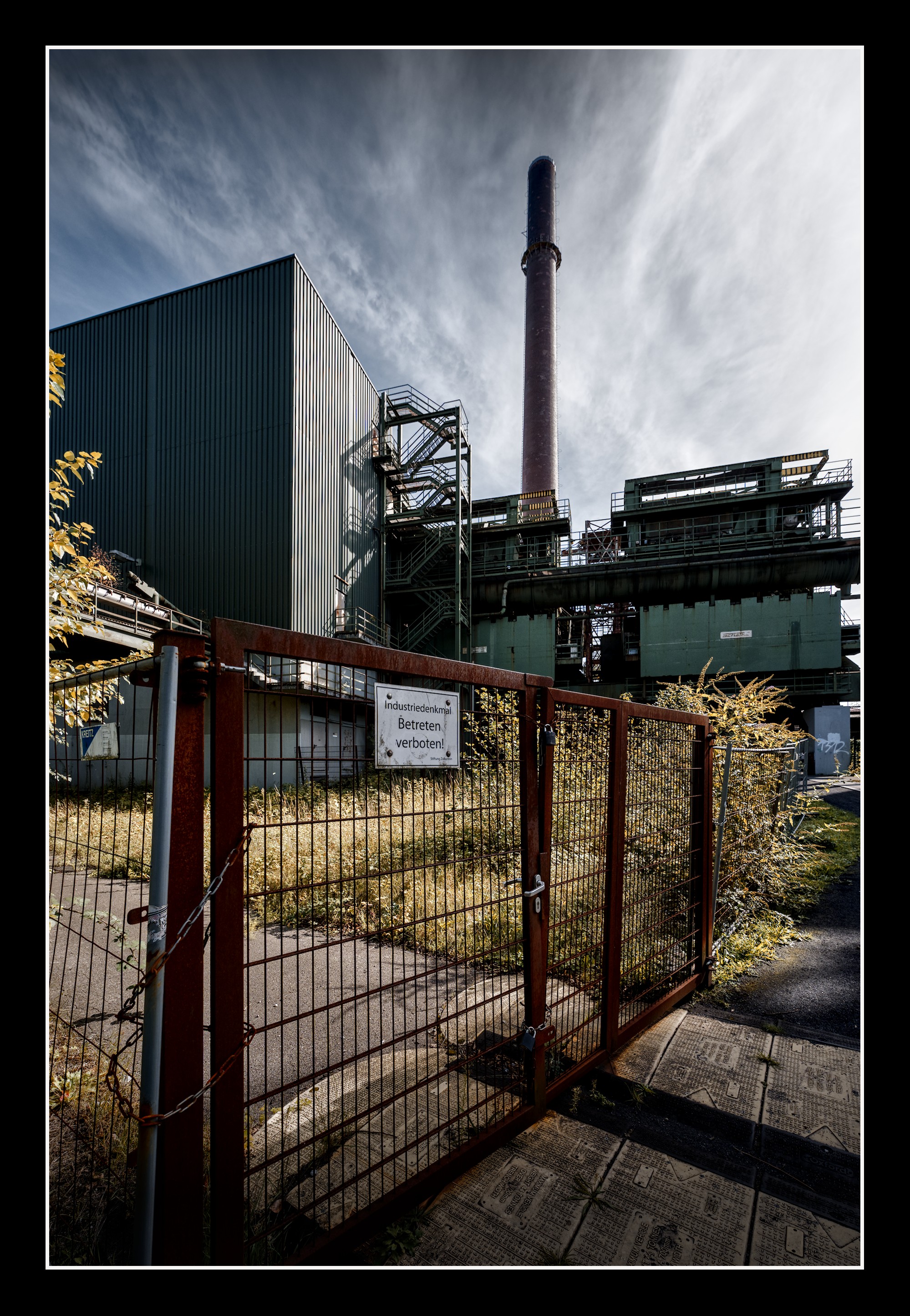
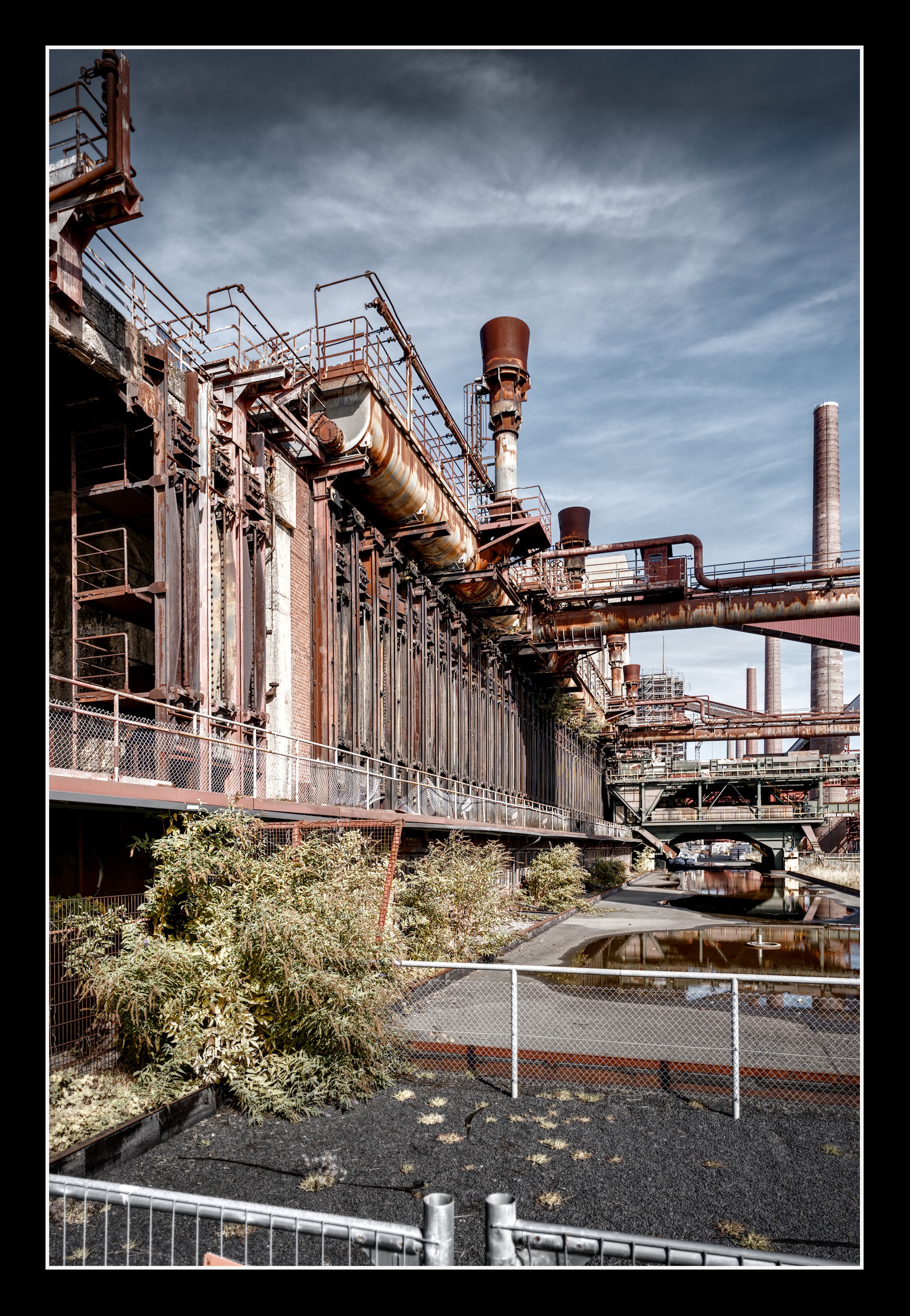
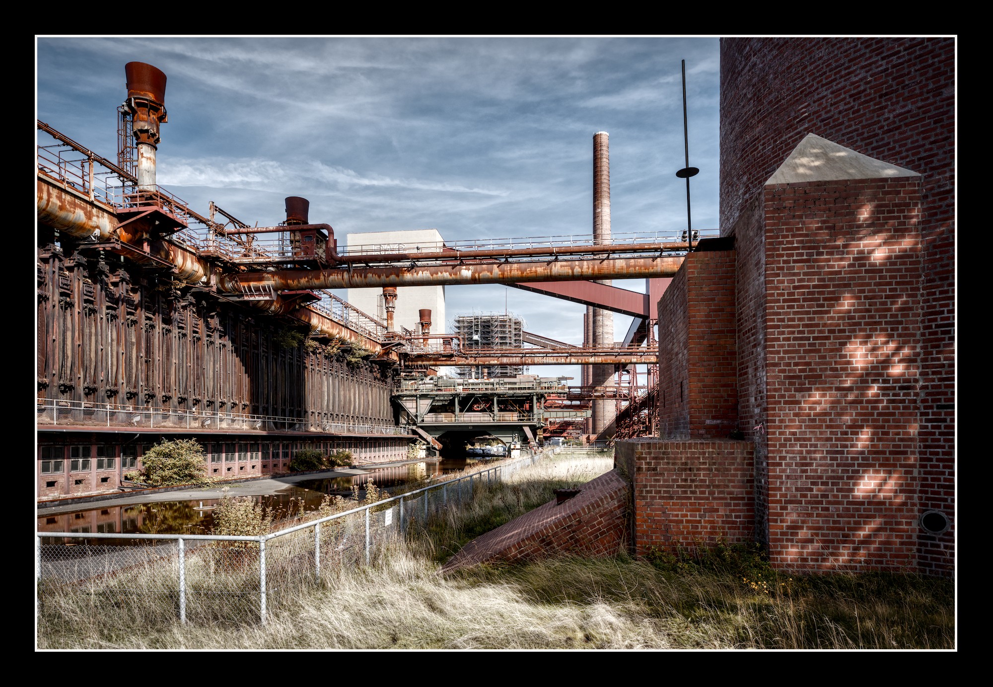
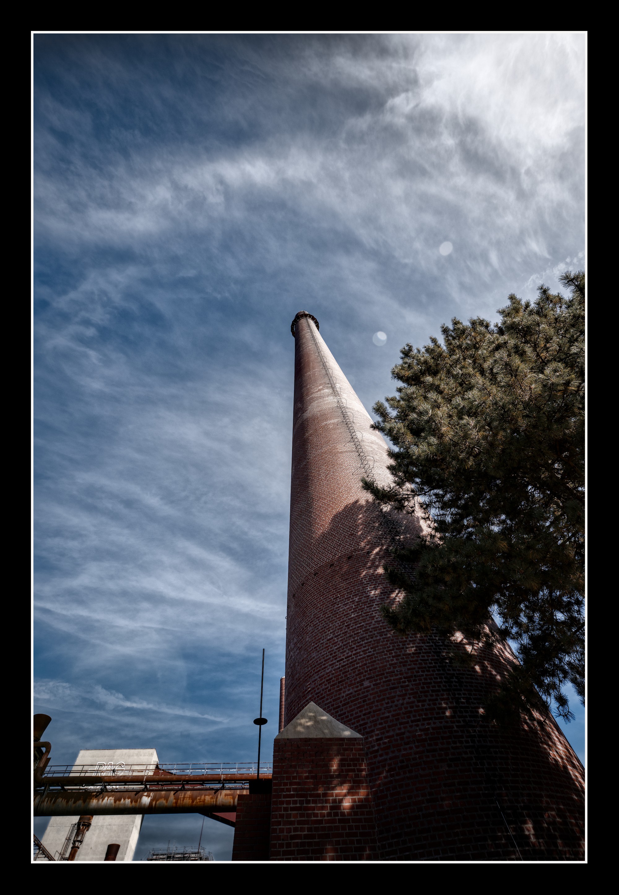
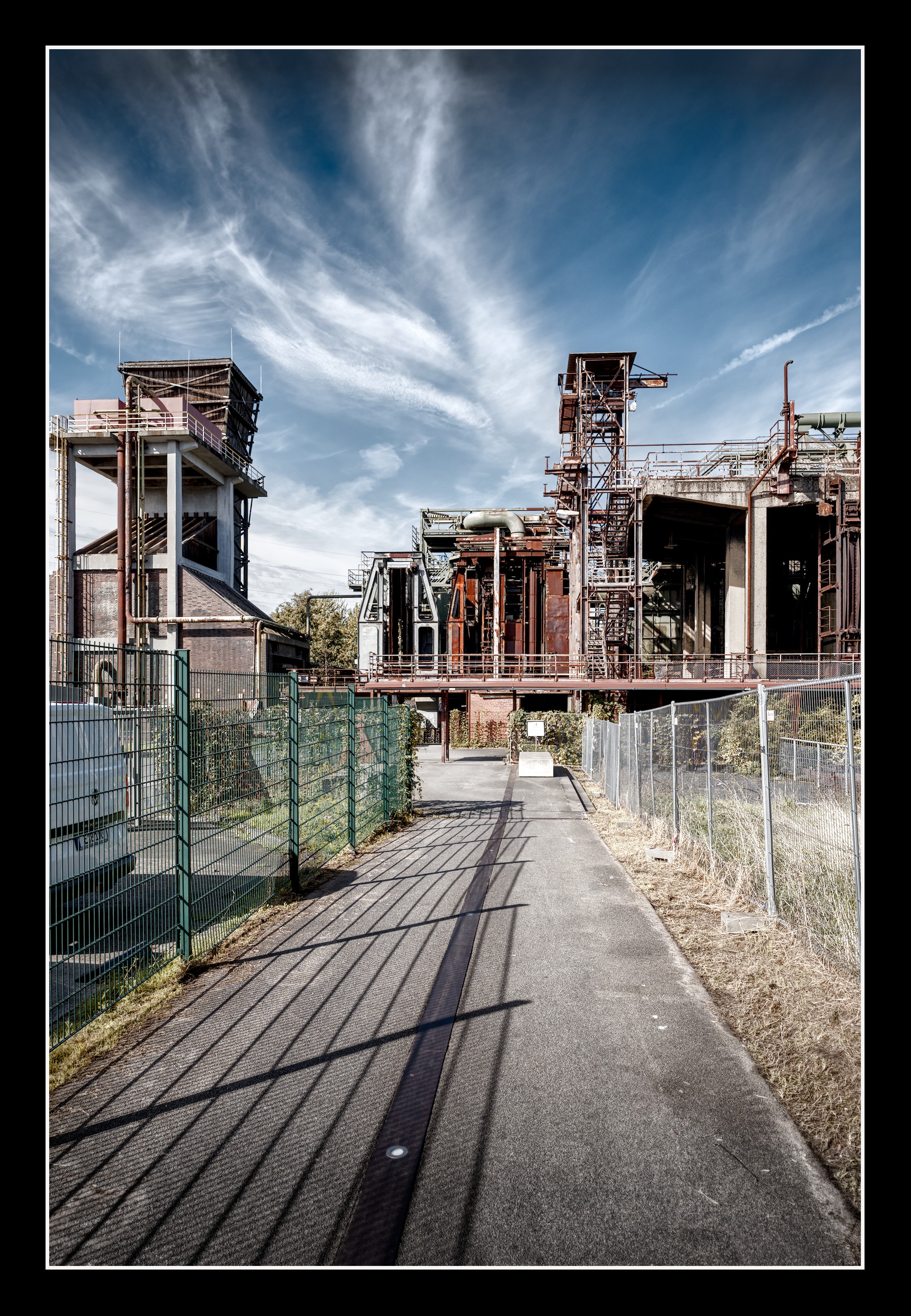
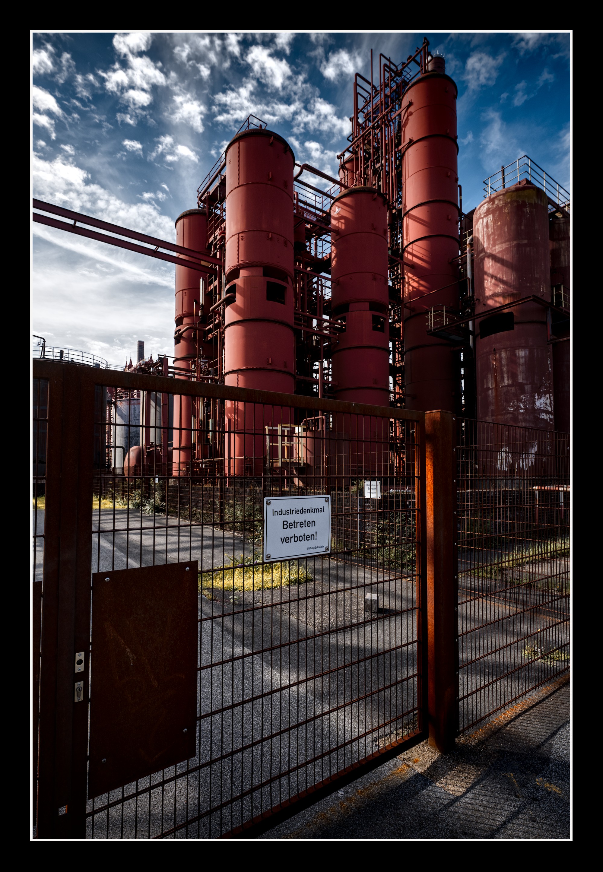
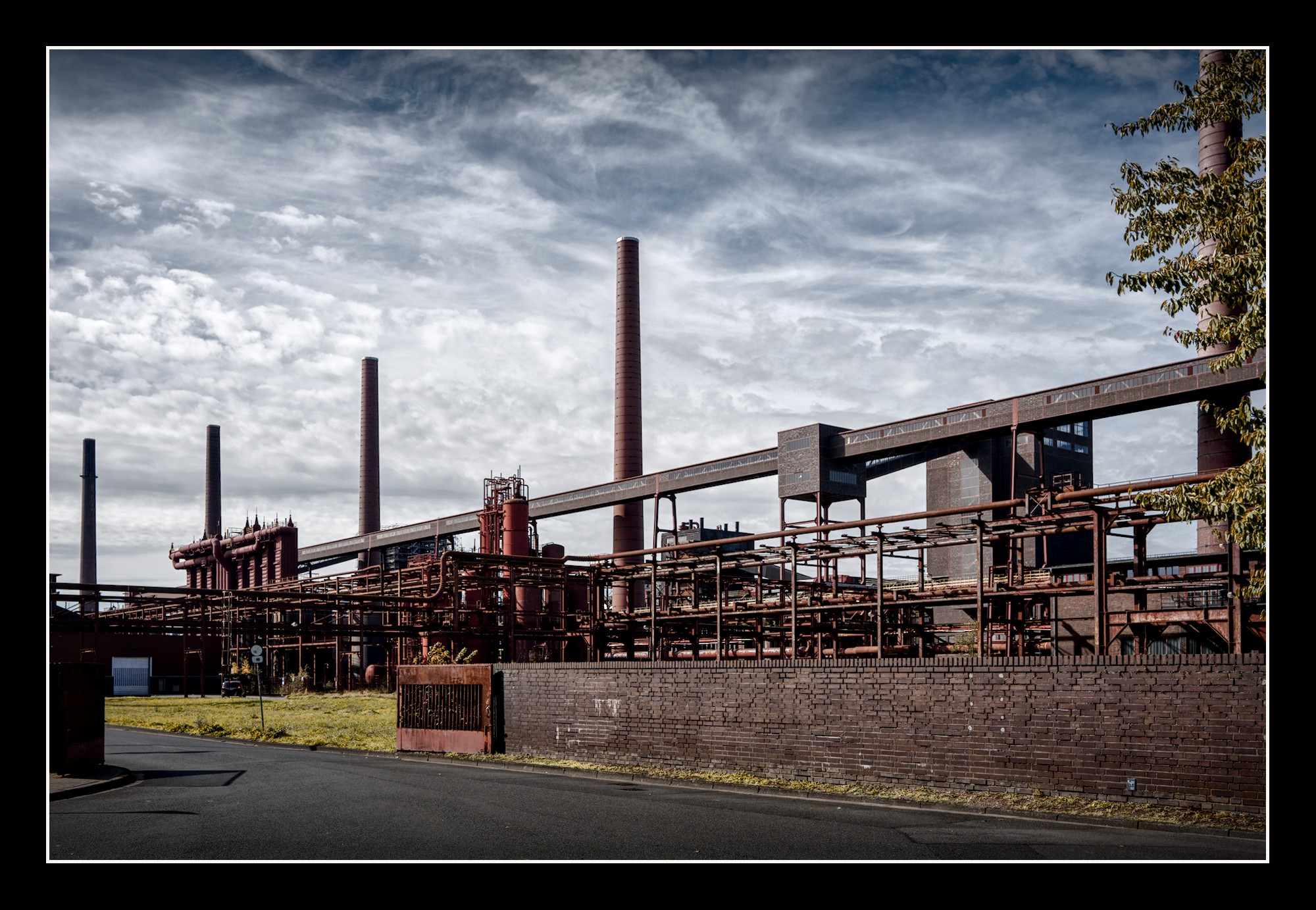
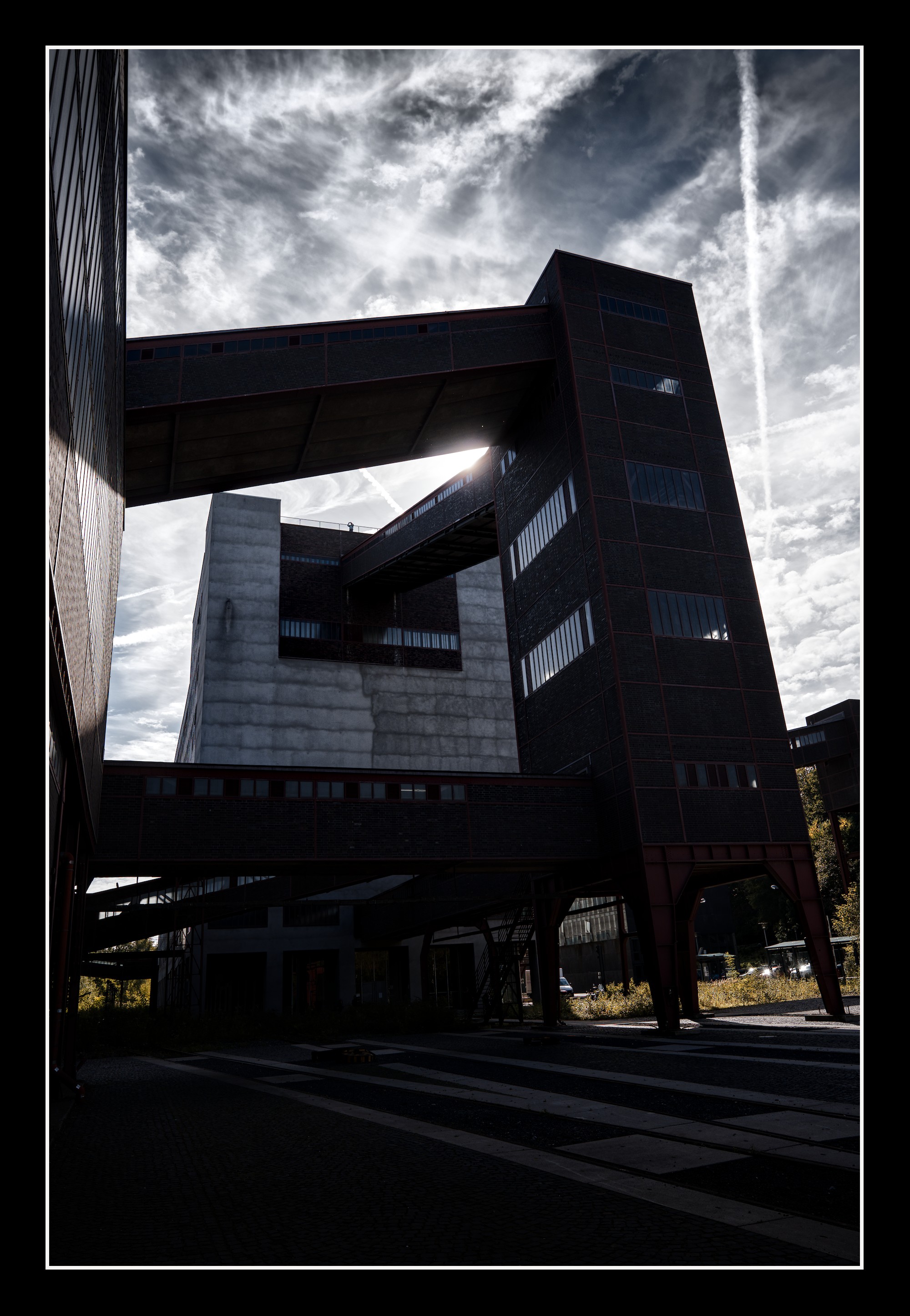
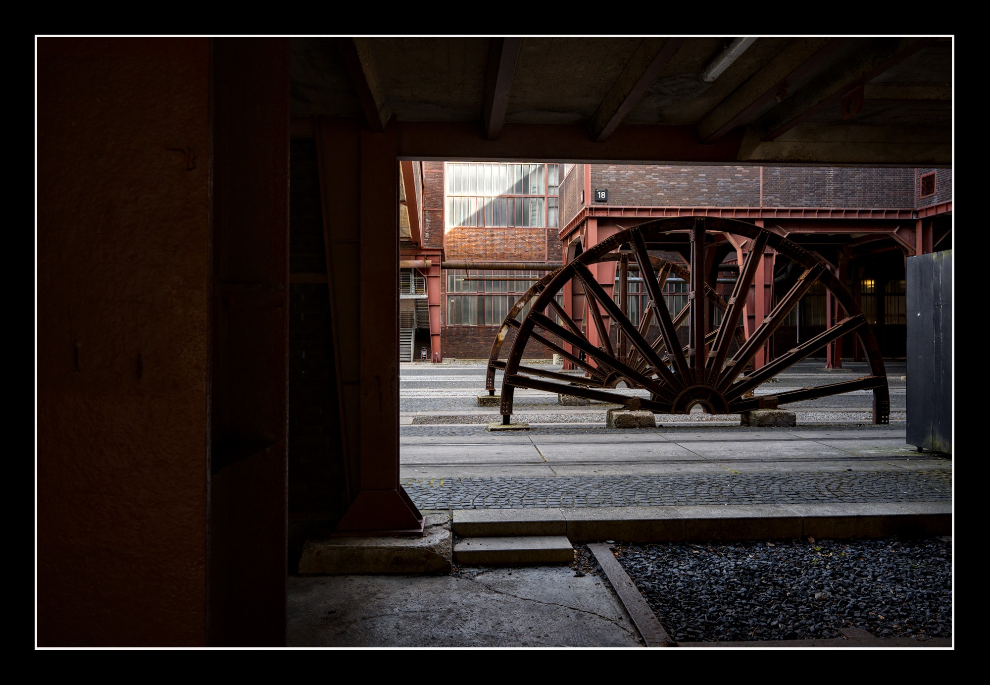
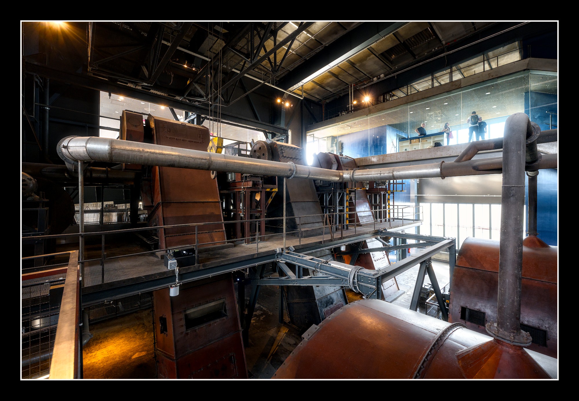
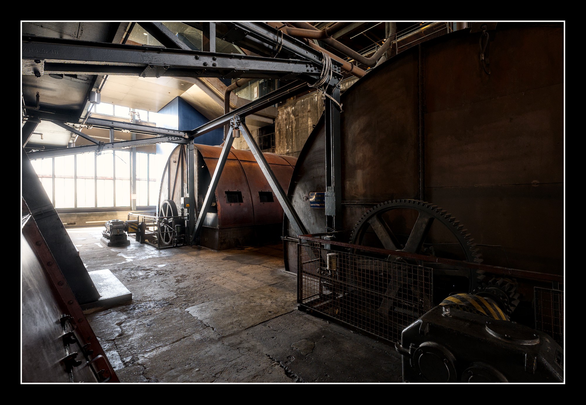
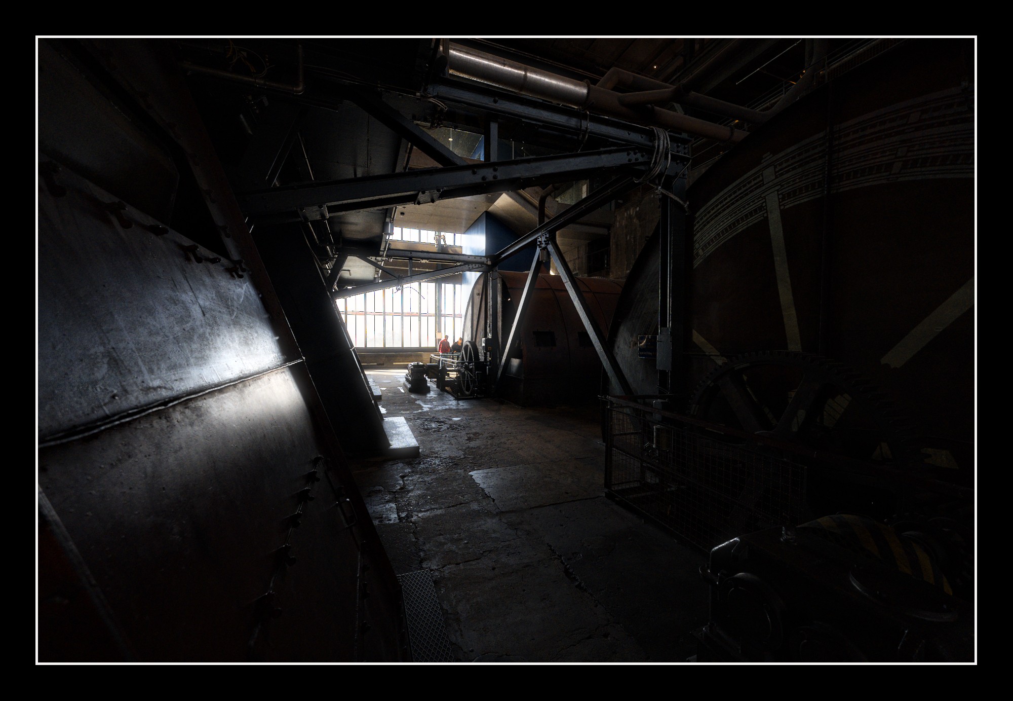
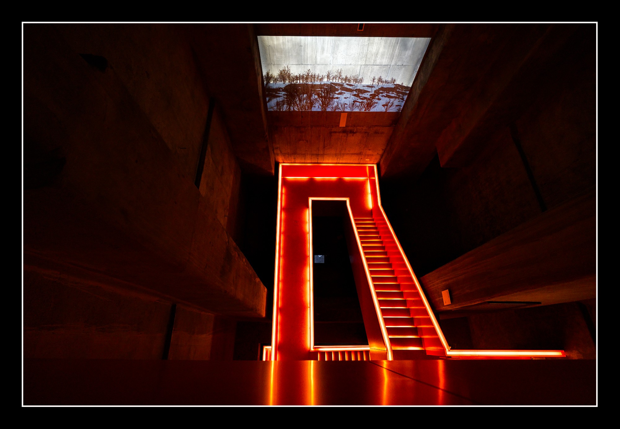
Usually I don’t showcase much of my work. But this time I want some feedback. So be prepared to face a quite big gallery (@paperdigits I hope this is OK). I usually don’t do that many architecture shots especially not on “lost places”, and I had the feeling for a place like this, we had some bad luck with the weather (sunny day), but at least it was not horrible (just blue sky).
When I started editing, I thought about B/W, to circumcise the weather problem. But I’m usually not the B/W guy and would have found it a bit coward to escape this way. So I tried to give the pictures their own look.
I would be happy, to get feedback on single shots. Which do you like and why. And of course the other way round, which do you find not that good and what is the nagging factor on them.
I’m impressed with this series. I love the colors (much blue and red) and color consistency and the high contrasty looks with lots of dark’s.
Beautiful!
Edit
I think you’ve found yourself a difficult subject to document.
Difficult as of harsh light conditions and because of the sheer scale of it forcing the use of a wide angle. Combined with the complexity of the ‘works’ you’ve encountered a lot of lines, surfaces, equipment, buildings. On top of that there were some people walking around to complicate your work.
What I like as said is the consistency in format and colors. And often in composition too. Lot’s of severe symmetry. I think you’ev absolutely made the right choice keeping the color in this reportage.
The individual pictures I like best tend to be more calm or moody in subject.
To name them:
08200 ( I would breake the consistency by cropping of the top… )
08215 (would like the right hand side a bit darker and moodier)
08222 (might darken background a bit)
08229 (Like this one best, being very concentrated, the light, the color, the repeating shapes)
08285 (Might crop front fence)
08287
08296
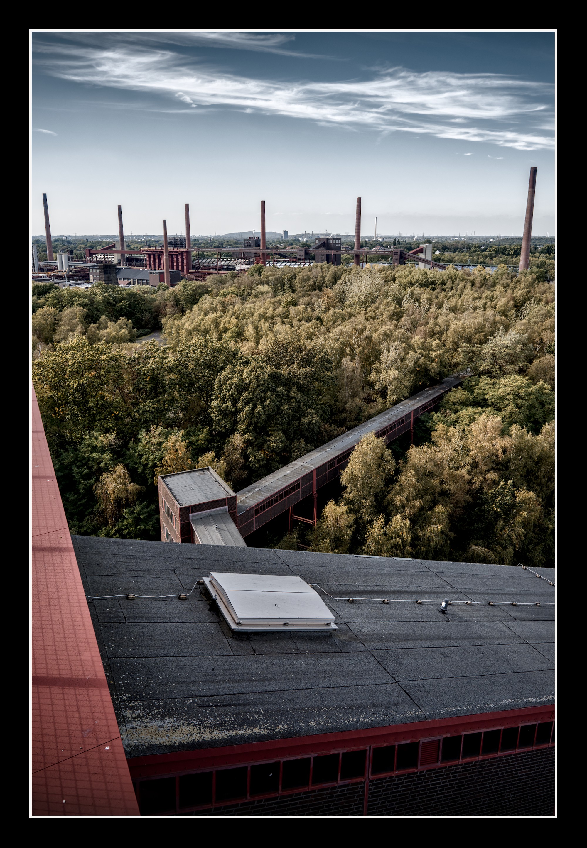
08313 (combi of color, sky, green, rusty color and lines)
08343 (nicely moody)
08361 (moody, the light, spacy)
08363 (moody, light, clear subject)
08365 (very nice mood, the light is mostly the subject here)
08374
Difficult subject, might try with a moderate tele (say 85 - 100 mm on FF) to concentrate on subjects/details but then you lose the unique wide angle reportage feeling you’ve accomplished now.
Absolute mastery of composition, brightness, and color!
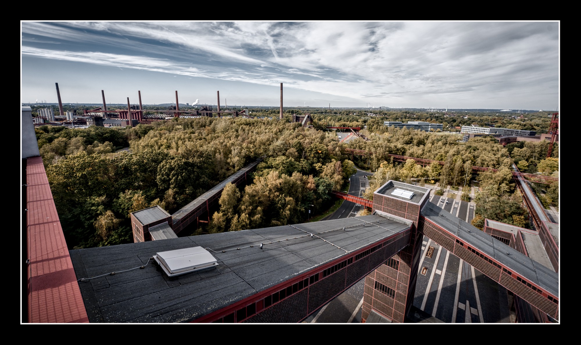
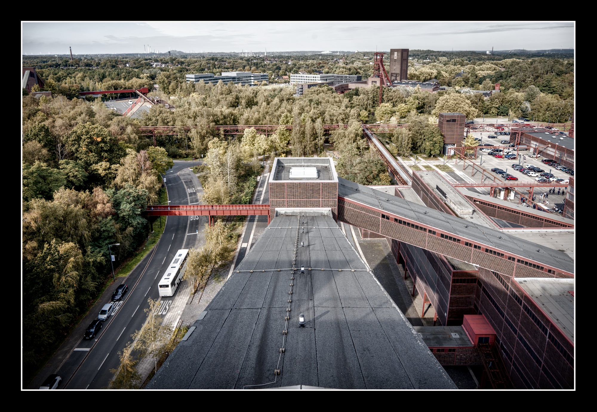
However, some motifs get lost in a sea of overly emphasized textures. I know that’s what makes your approach unique, but it reminds me too much of HDR photography. The sheer volume of overly emphasized fine details overwhelms my senses.
But I could hang this one on the wall without hesitation:
Very beautiful photographs that reflect your style. Fun fact, the sky color is almost gray (at least in my cheap monitor), is this intentional or is it just the different color profile? I use sRGB
Greetings. Roberto
The blue of the sky is on most pictures reduced but should still clearly be recognizable as blue. Only on Nr. 32 the blue is almost gone completely. The output colour profile for the pictures is set to sRGb. My displays are calibrated for sRGB as well.
Thanx @Doug-Phoenix and @Jetze
Your listings gives me a clear indicator on which edits you struggle. These are the ones where I indeed pushed the local contrasts a bit further than I usually did (to give the edits a bit more of an industrial look) but this was obviously a bit over the top.
Of course I had another look at this beautiful series…
I think it is a wonderful series or rather reportage as you like. And as such it is really good. I - to name one - would not have the consistency or mental calmness to produce it.
My preferences do say more about my taste then your editing. And in a reportage is is best to judge it as a whole - not the individual pictures. But since you really asked for input on individual pictures I gave my remarks at that level.
For me - and that’s a strong indicator of my personal taste - the best compositions are the ones without the confusing strong lines and perspectives which this subject naturally does have. I think it is an echo of what Boris H. did express.
So in reaction to your remark about contrasts pushed over the top, I would respectfully disagree with you. I believe it to be my personal reaction on the inevitable turmoil of lines of the subject.
So I still stand with my conclusion: excellent reportage, very well executed.
PS.
Just having showed your series to my wife who is a keen photographer herself I concluded the images 44, 53 and 54 a bit of an outlier, due to point of view and perspective.
But more important is my wife’s reaction: marvelous! very well executed! beautiful.
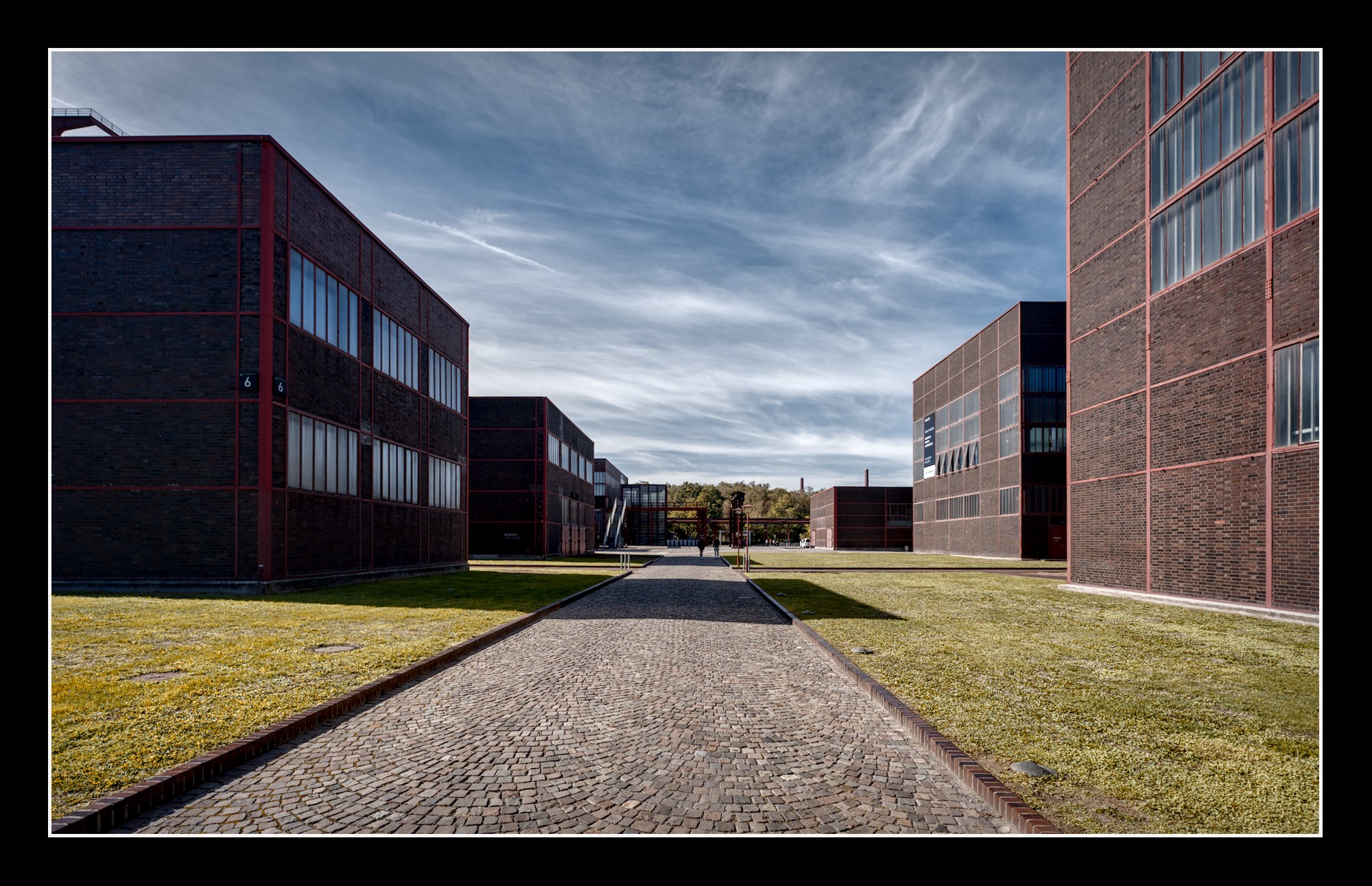
For example, in image 11, the monumental geometric blocks of buildings with their straight shadows and the street in the middle are overwhelmed by the overly emphasized details of the sky and the grass. Why do we need to see every blade of grass clearly, as well as every tiny spiderweb-like cloud in the sky? This distracts from the otherwise very clear geometry of the scene because they take up too much space and attention.
That doesn’t mean, by any means, that everything has to look smooth. Local contrasts are one of the elements that, like all other stylistic devices, must be used thoughtfully and purposefully.
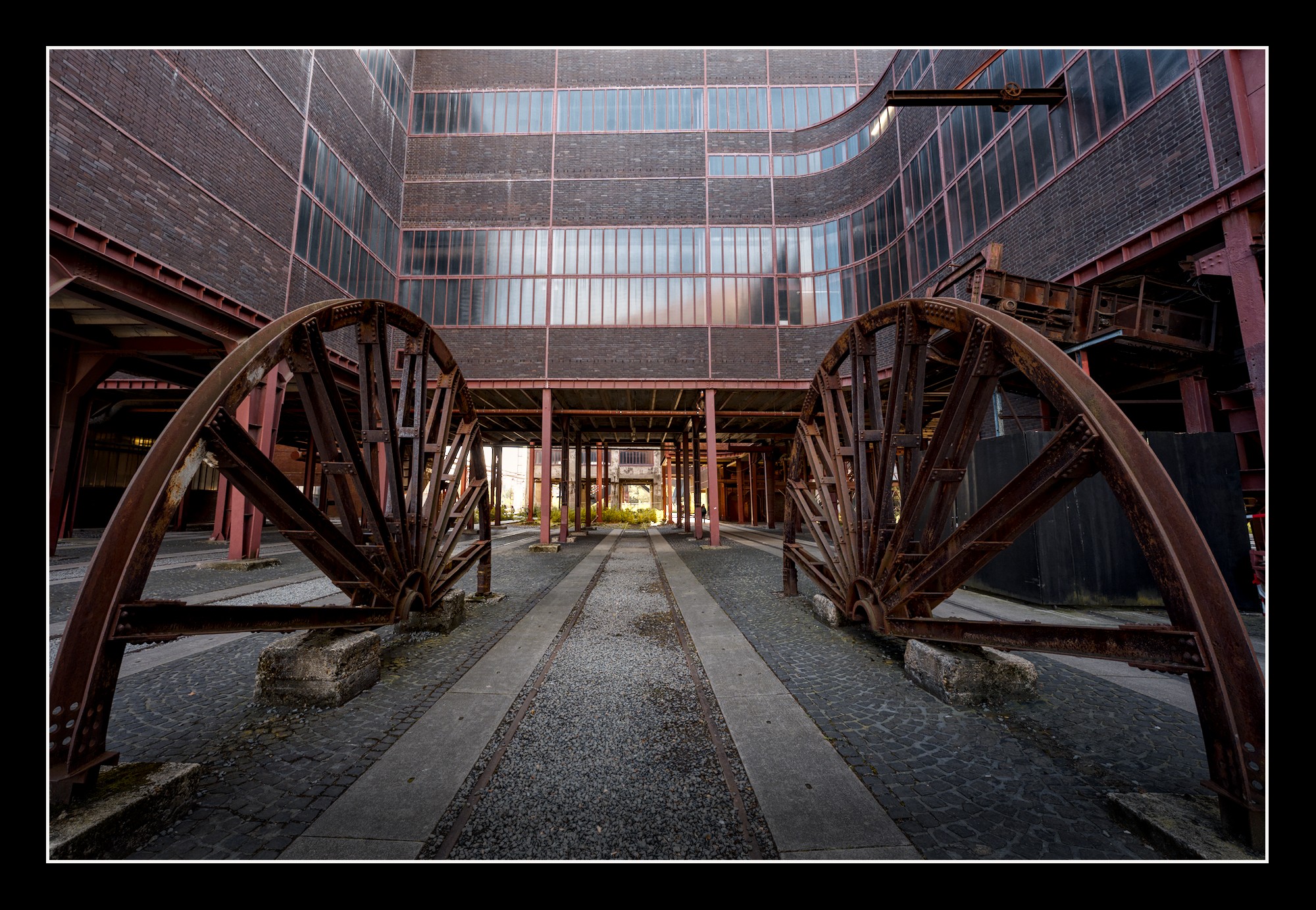
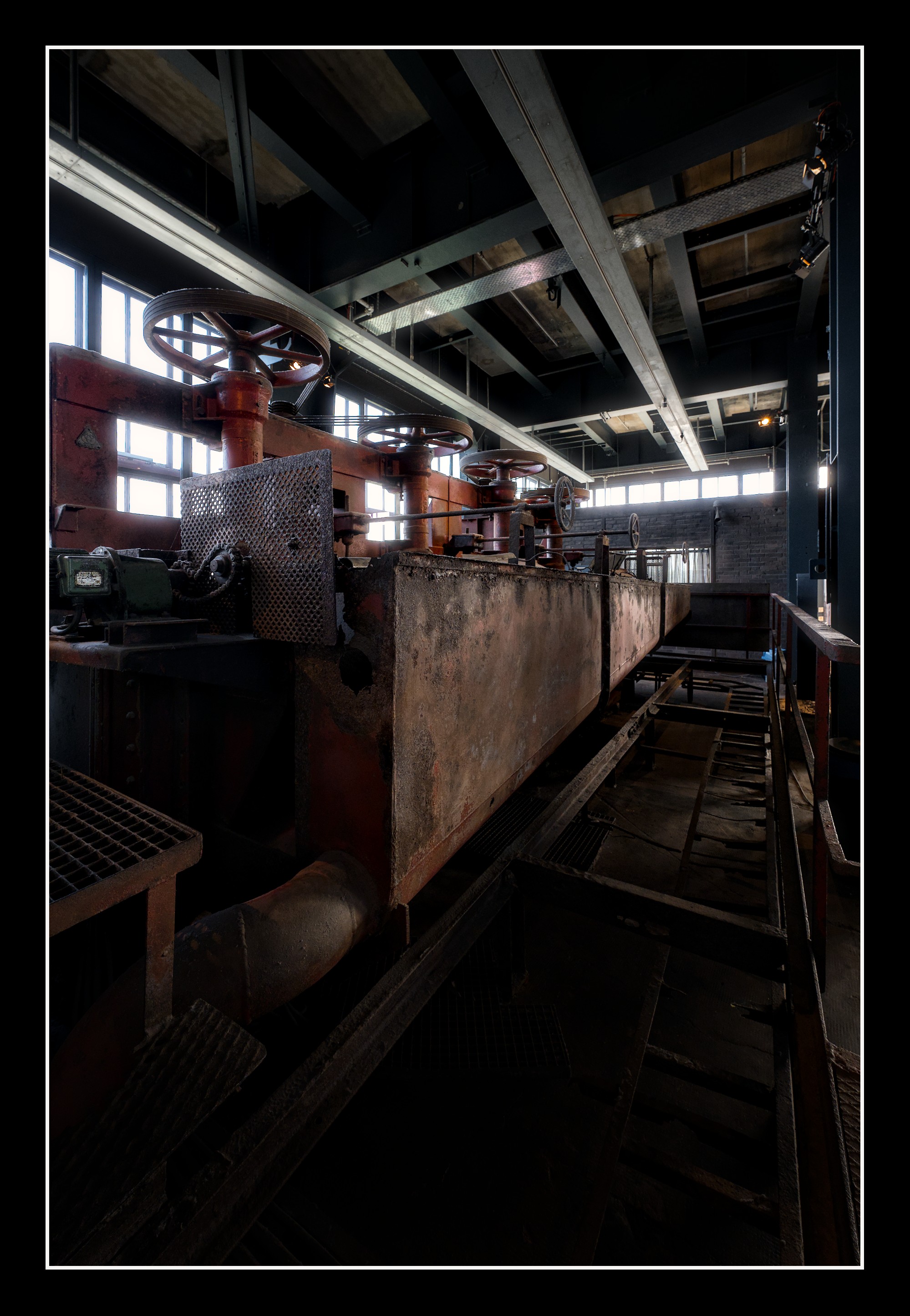
For example, where you’ve used local contrasts very artfully is in the industrial buildings and facilities. The rusted and weather-beaten industrial scenes take on an added sense of weight when you emphasize the roughness, as you’ve done. You’ve also used color contrasts masterfully there. The rust on the pipes in Photo No. 19 is outstanding! But if the surrounding is treated the same way, the effect is lost.
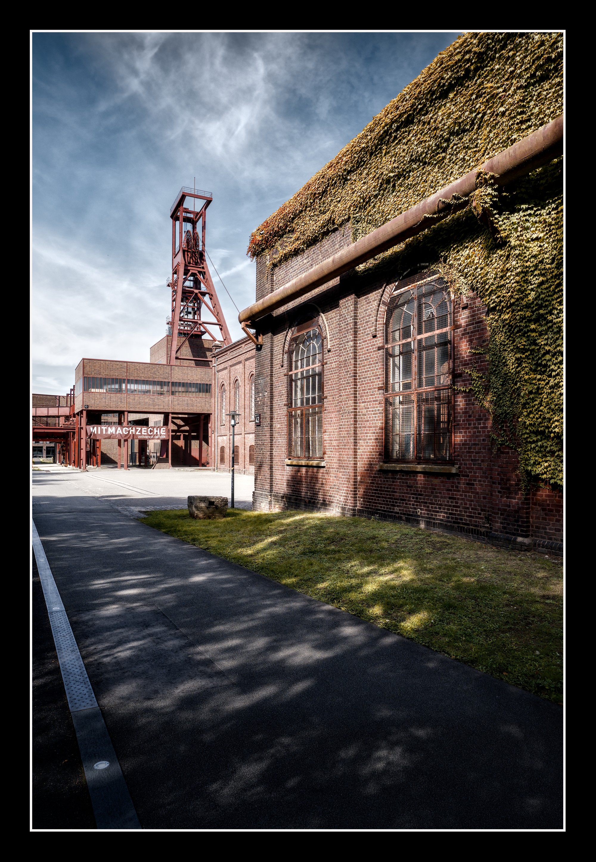
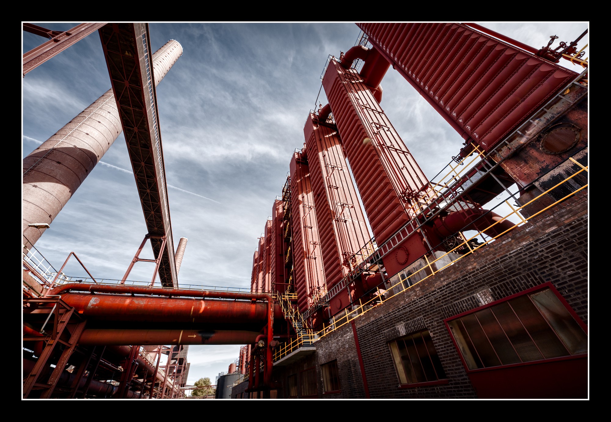
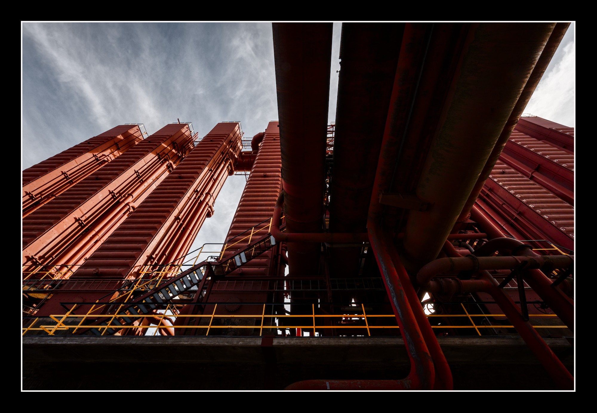
On the other hand, you can clearly see in images 24 and 25 where these strong contrasts work well with the surroundings. There, the dramatic sky enhances the monumental scene because it doesn’t take up as much space or attention as the main subject—the massive buildings towering into the sky. These two elements stand in a clear hierarchical relationship to one another. Clear geometry prevails, countering/fighting the restlessness of the sky.
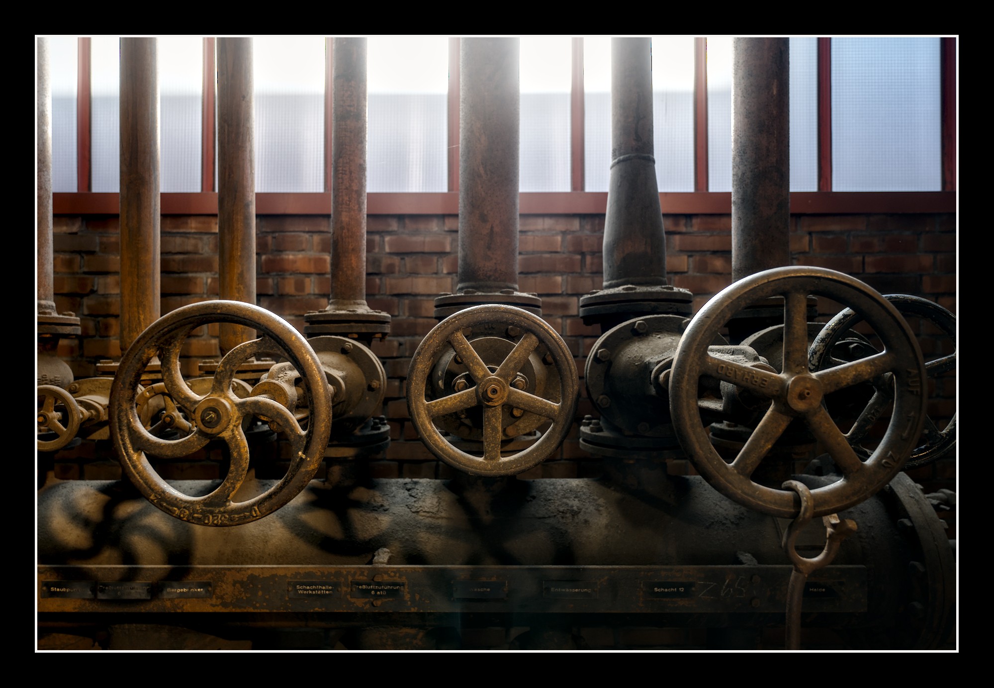
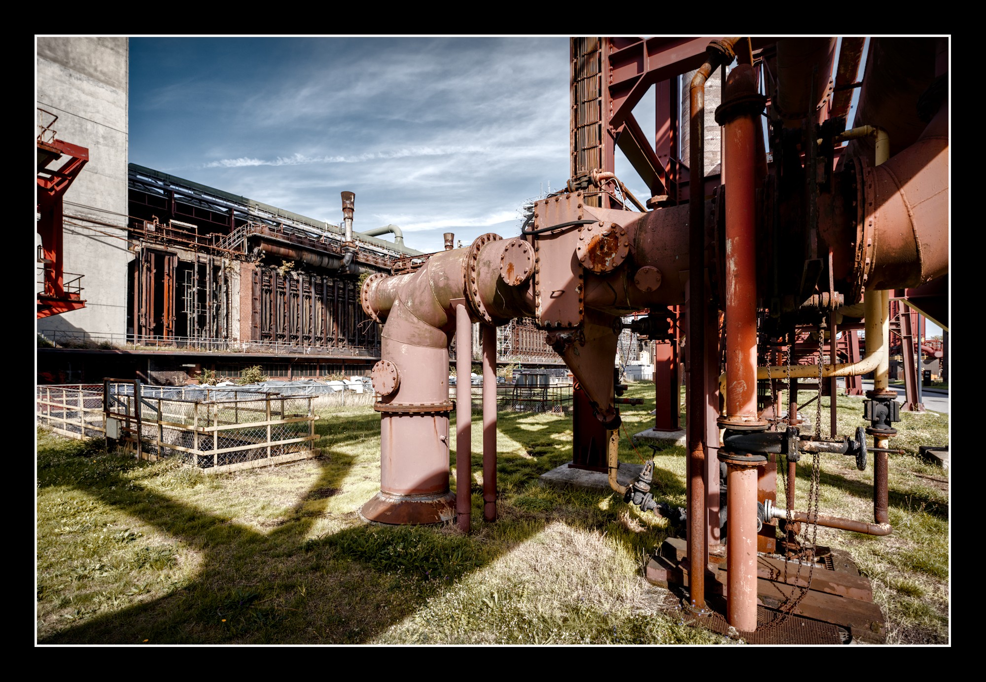
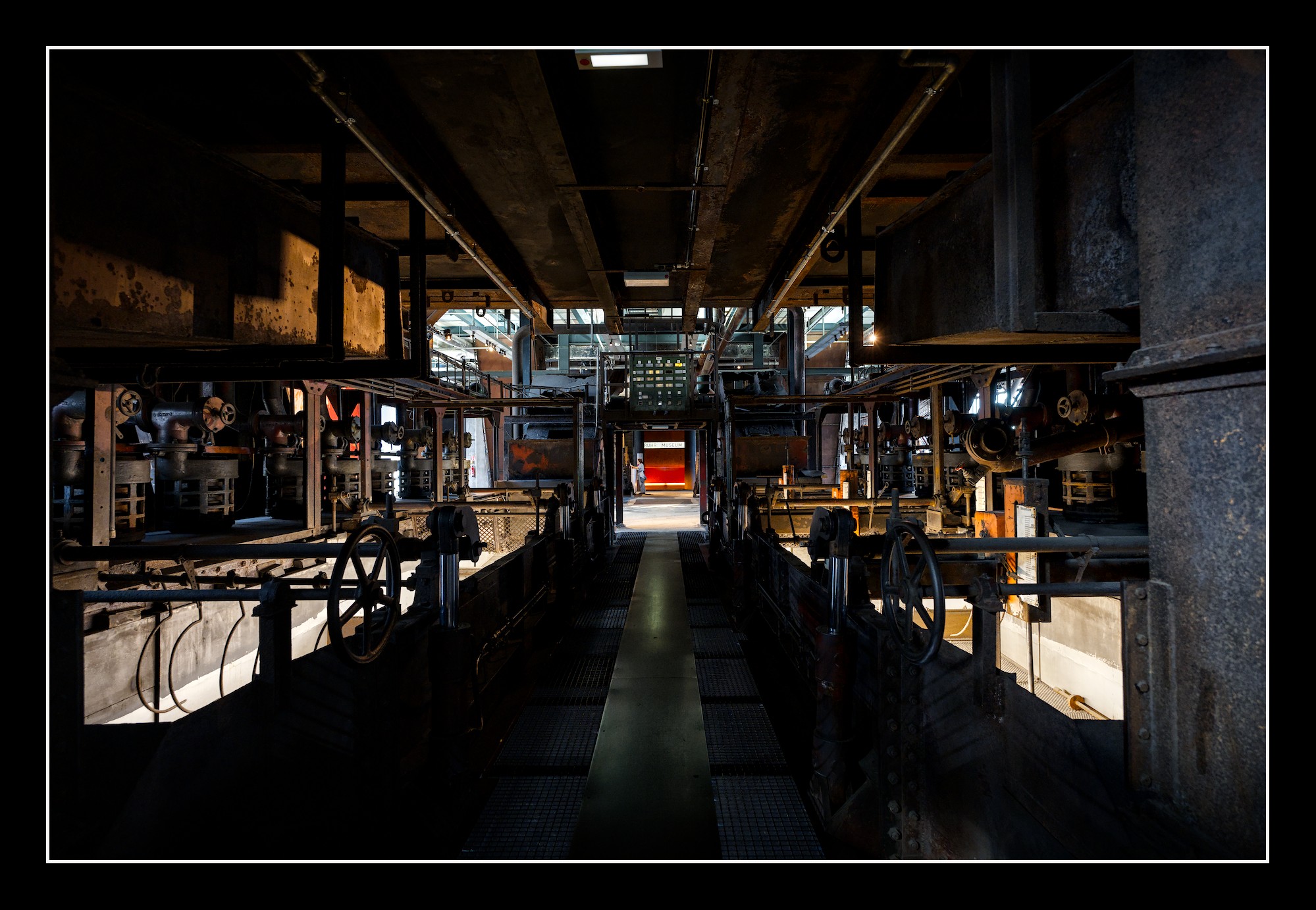
In Photo No. 9, which I really like, you’ve also used local contrasts very skillfully. The signs of wear on the valve wheels are beautifully highlighted because the rest of the image is much calmer. The hierarchy is clear here, too: Countless hands have turned those valve wheels, and they tell the story of this space. Everything else takes a step back.
So, I think that if you manage to use local contrasts—like all the other stylistic devices you’ve mastered so well—in the right context, your photography will rank quite high in the artistic realm.
It helps me - probably a lot of us - to improve how I might regard pictures in order to be able to improve on them. It helps to make conscious - a mostly unconscious mental process - needed to improve.
Regards, Jetze
PS.
I do wonder how others experience this and I personally would love to have more of this outspoken analysis in the play-raw category explaining what one sees in a photo and how one wants to handle things to improve/enhance.
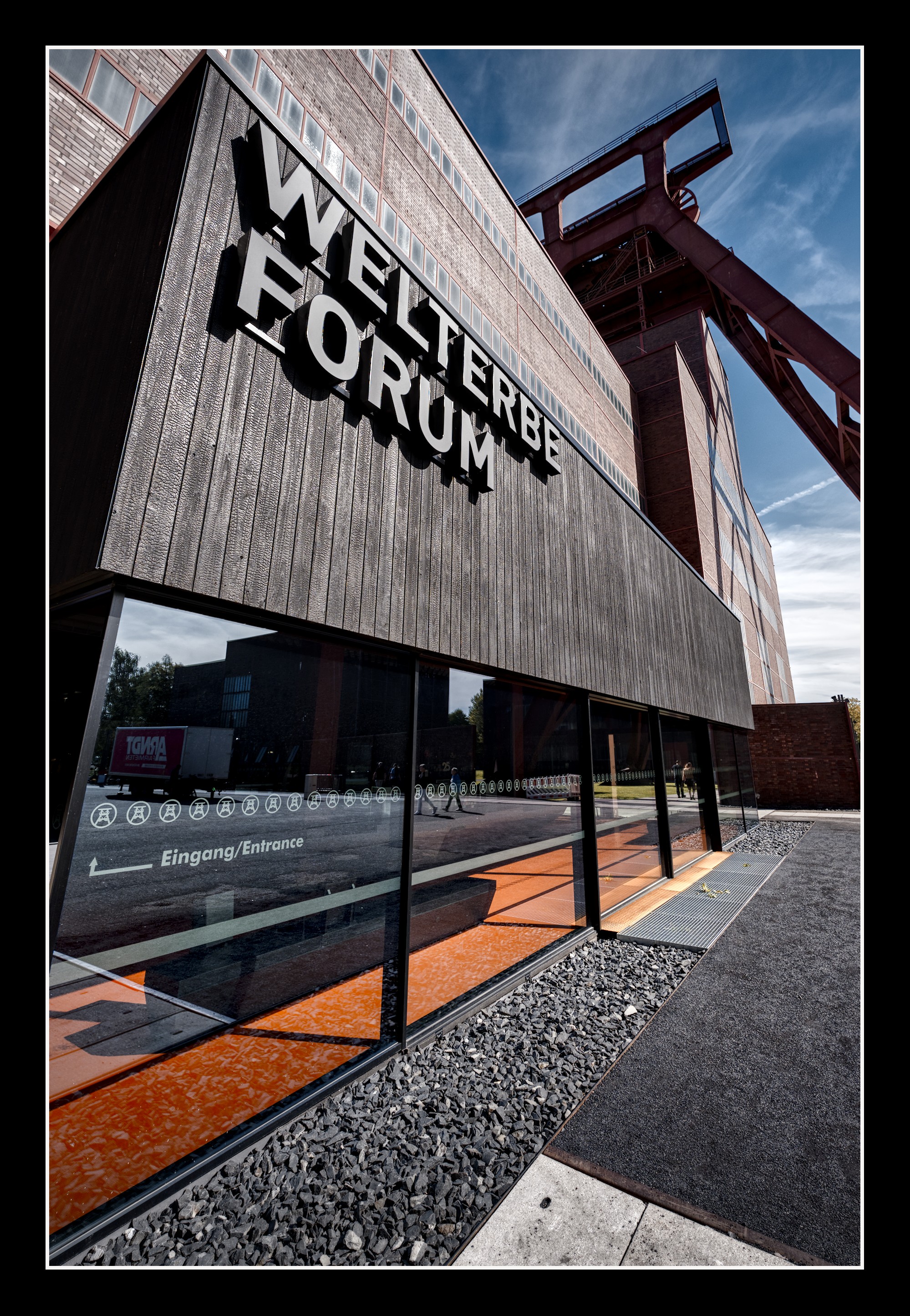
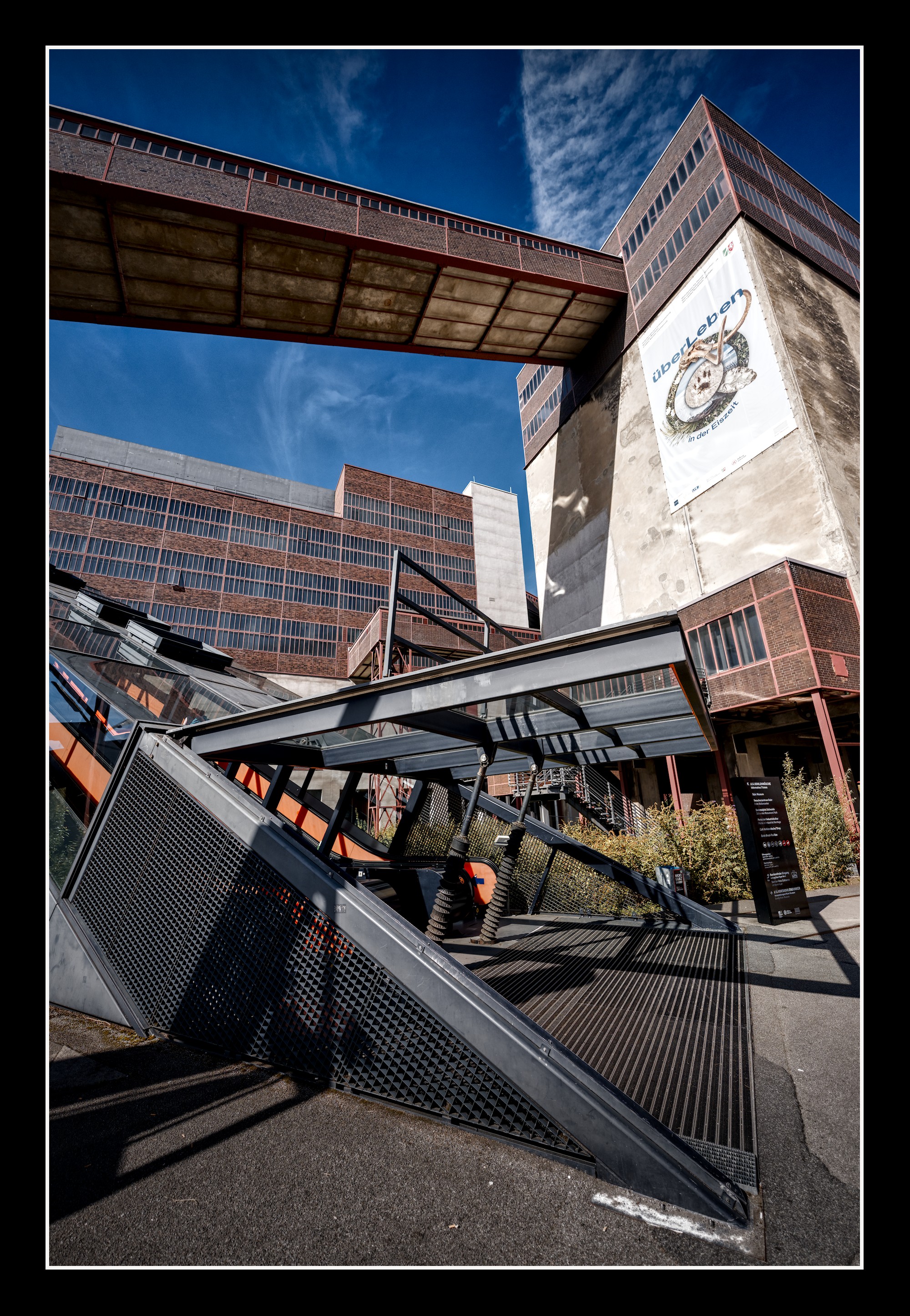
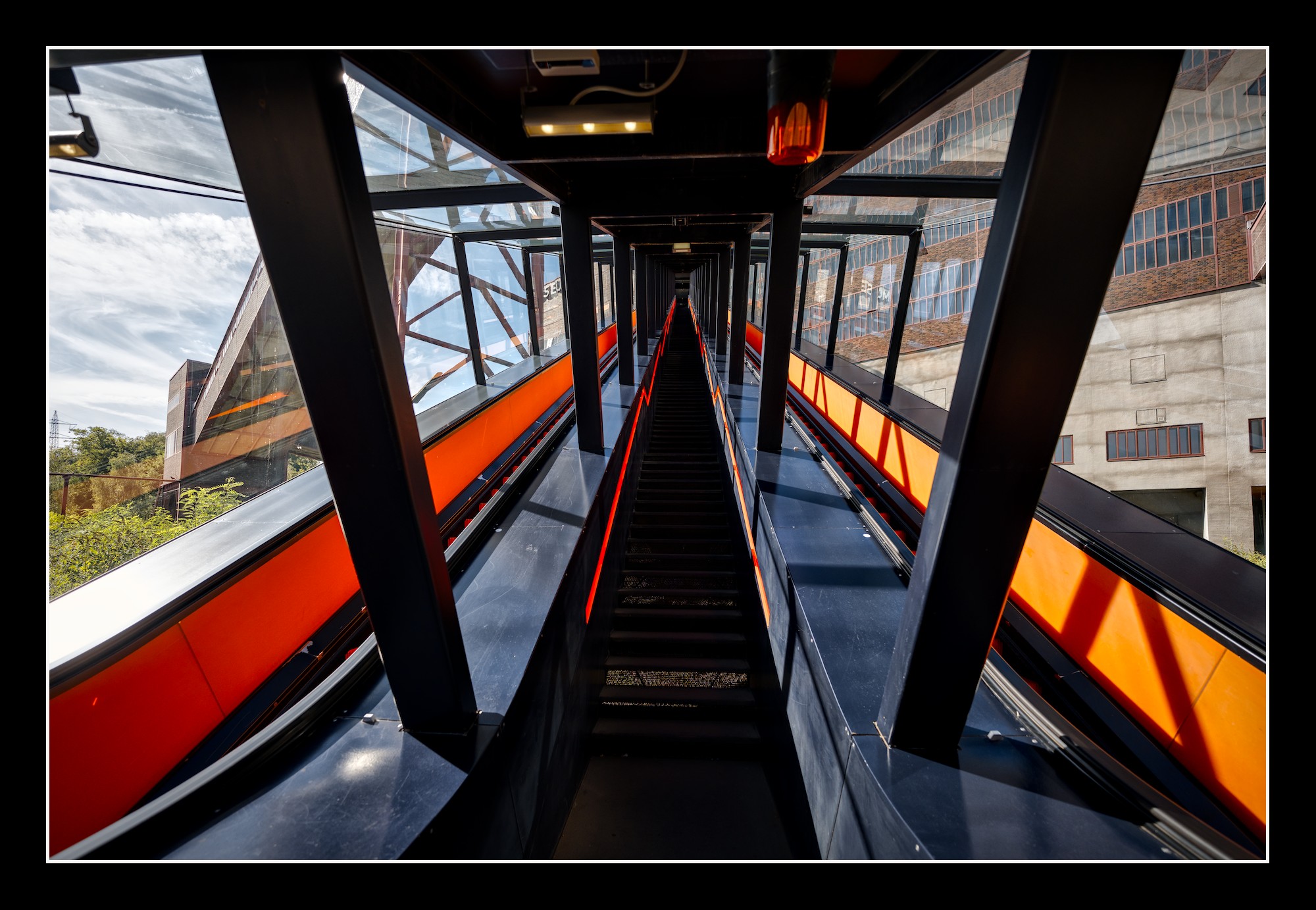
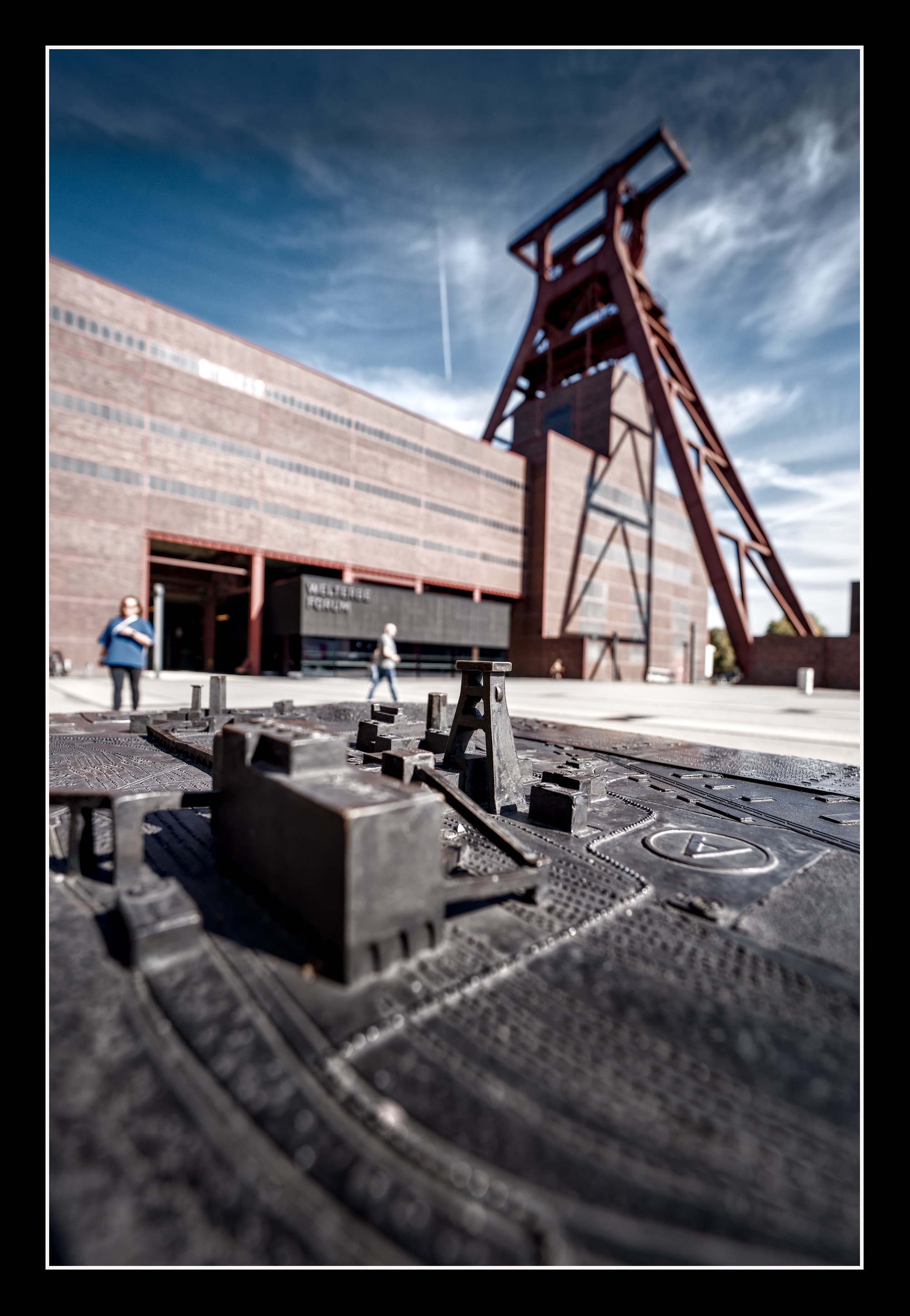

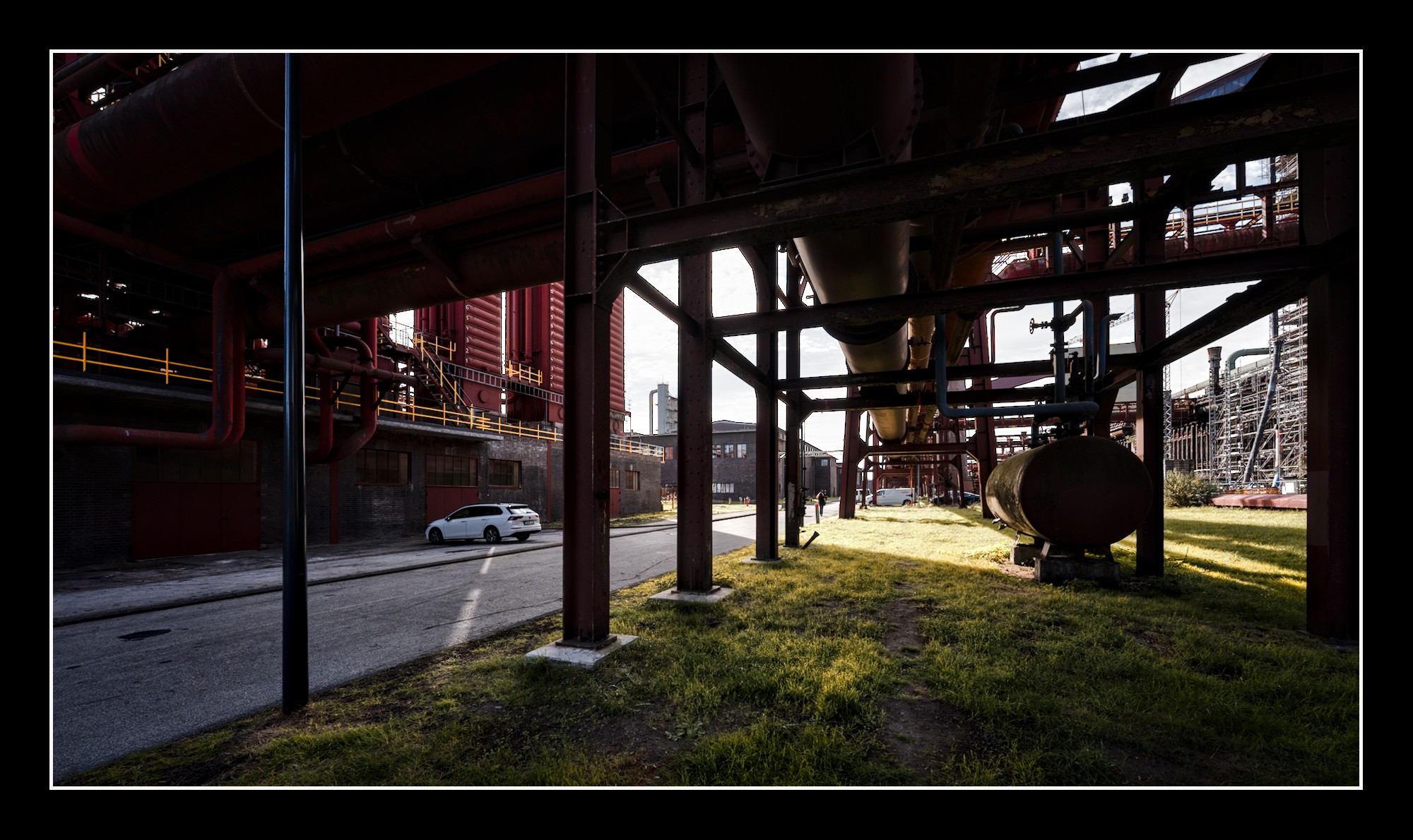
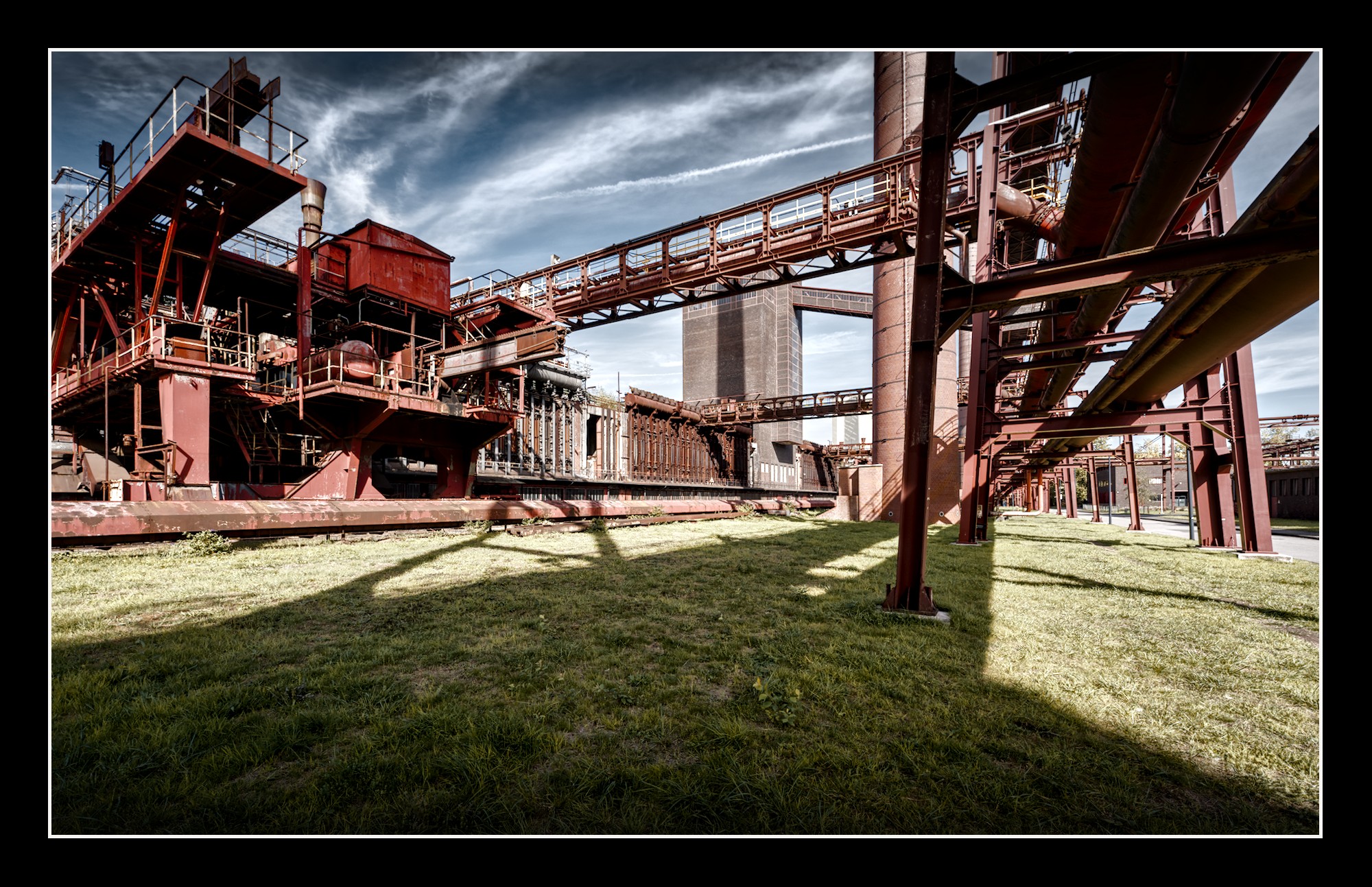
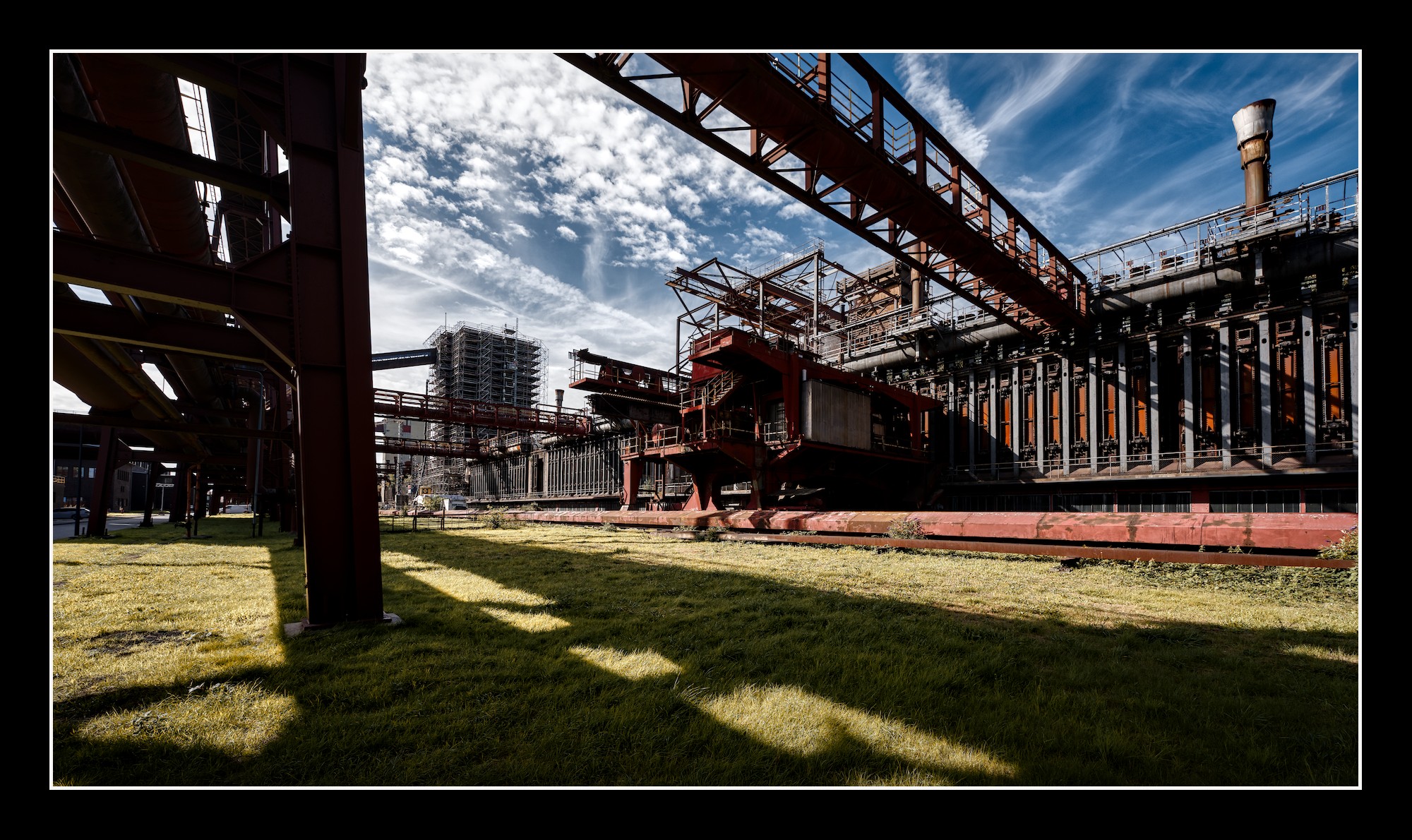
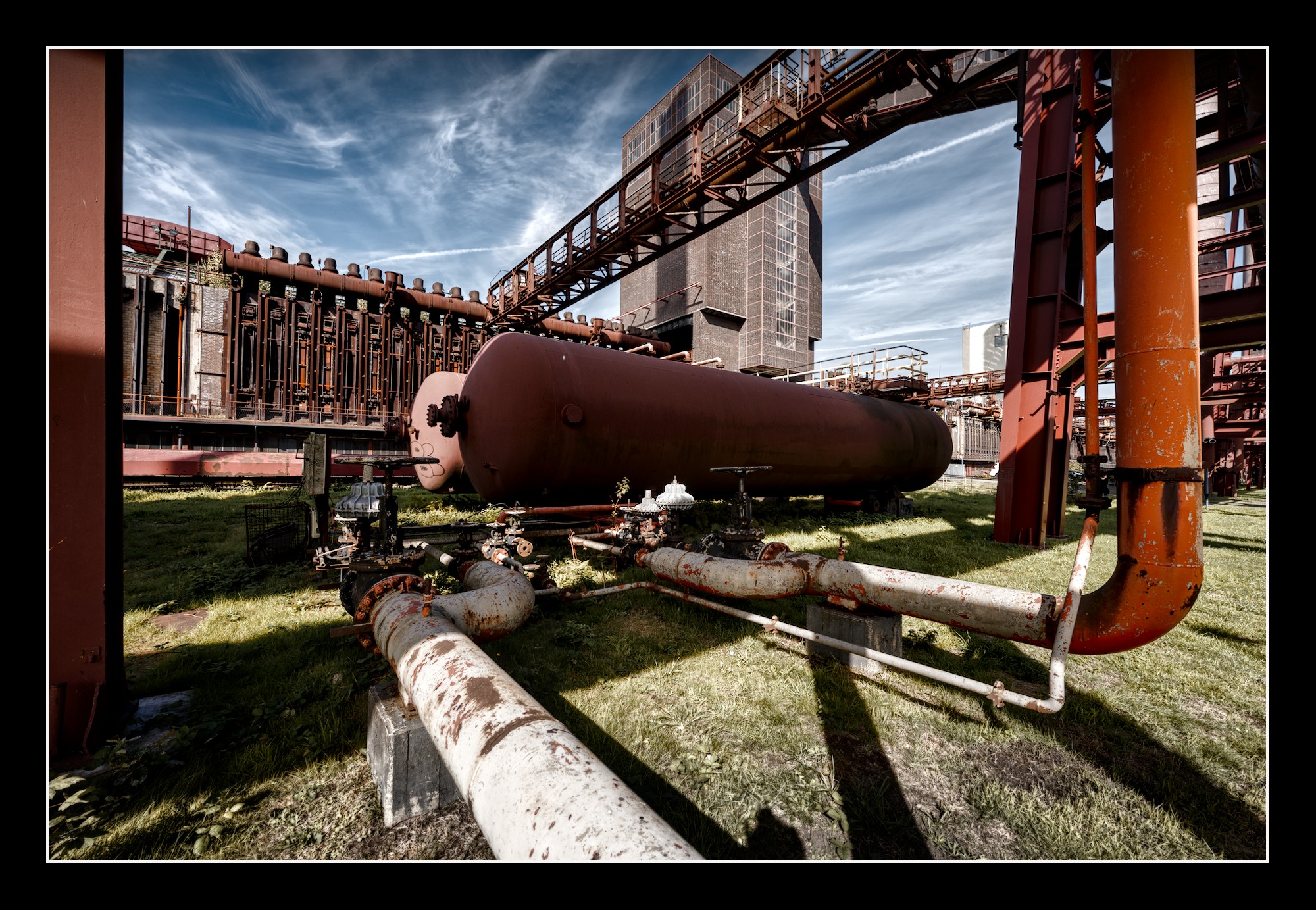
 )
)
