@age I think you have the cleanest rendition so far. The others, pushing it too much, caused halos and artifacts to emerge, when I zoom in or out. Yours still has a little fringing around the leaves though.
1 Like


Here is my very simple approach to an image which was well exposed in the camera and didn’t require much effort to get a nice result. BTW, a mixture of scene referred and displayed referred modules to achieve the look I liked.

20230328_0045.CR2.xmp (15.5 KB)
2 Likes
And now for something completely different …

20230328_0045.CR2.xmp (14.7 KB)
The masking was inexpertly and hurriedly done, I may have another go some other time.
1 Like
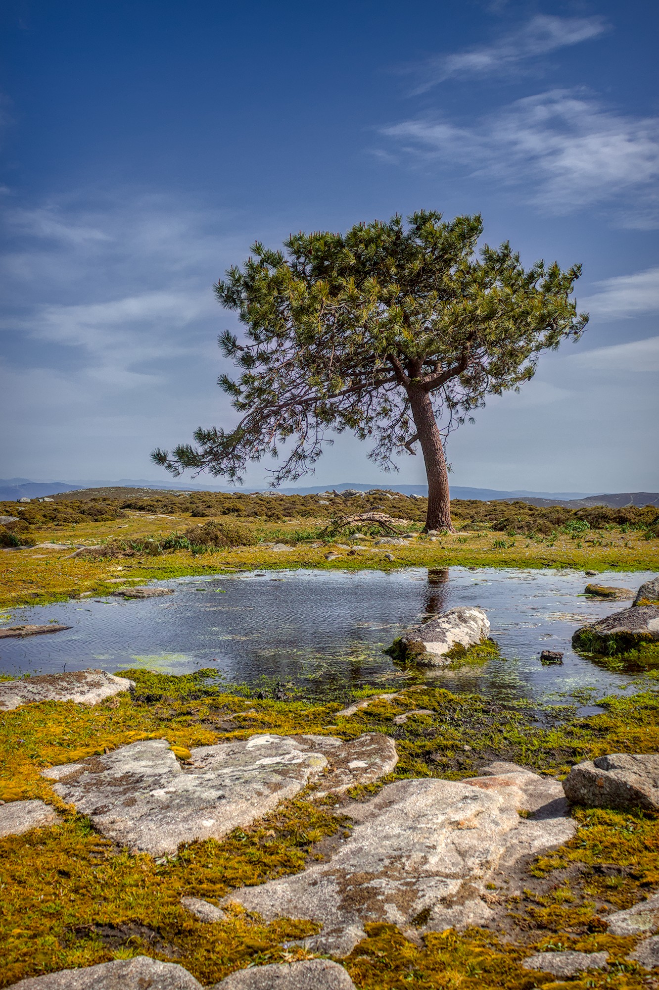
Nice middle of the day shot, so I tried to make the most of it. Brought up the visual impact of the foreground rocks so as to emphasize the little “avenue” of grass through the rock that continues to the rock in the pond, then on (via the trunk) to the head of the tree.
ART 1.21.1

20230328_0045.CR2.arp (32.2 KB)
6 Likes
Hello,
This is a magnificent, timeless image. As there are many beautiful editions, I suggest a monochrome version.
I took the opportunity to try out the new color equalizer module of the master version.

20230328_0045_04.CR2.xmp (19.0 KB)
Darktable 4.7
Greetings from Brussels,
Christian
4 Likes

I like the original, so in my play in GIMP I have tried to make slight changes to local contrast using layer masks and changes to local saturation.

2 Likes
With the new preset “Watercolour” or “Oil painting” in Denoise module (profiled) made by me:

20240311_0045.CR2.xmp (9,7 KB)
Greetings!
11 Likes

A dark, contrasty take on it:

20230328_0045.CR2.xmp (106.7 KB)
I just recalibrated my monitor now that KDE 6 wayland supports ICC profiles, please someone let me know if it looks very strange ![]()
3 Likes
That support is theoretical at this point. It does not work, as I understand it.
Your interpretation looks very underexposed. Do you have your screen brightness cranked up high?
1 Like
Same rendition with two different crops:

20230328_0045_01.CR2.xmp (23.8 KB)
20230328_0045.CR2.xmp (23.3 KB)
5 Likes
Inspired by @martin.scharnke version, a large format simulation straight from raw to jpg using Julia, with MiDaS for depth estimation :
With the focus mask :

7 Likes
Hmm, my brightness is definitely on the higher side, I was trying to match color/contrast with my phone as a reference. Maybe I should try turning it down, it feels so strange to have it lower though.
In my experience phones are generally too bright, too contrasty and too saturated.
1 Like
On a hardware calibrated Eizo ColorEdge at 150 cd/m² I’d say it’s underexposed by 2.5 stops or so. Of course it’s also a matter of taste, but it’s significantly darker than every interpretation in this thread. I’d investigate. ![]()
I was definitely going for a darker/contrasty edit than others in the thread. I might try again with lower monitor brightness