Few versions …first one is filmic then next few are sigmoid tweaks stemming from trying to be sure the hands on the clock had some detail…
I kept editing the same image so I think I lost the xmp files for each but you can get them by loading the jpgs as a sidecar if any of them spark any interest
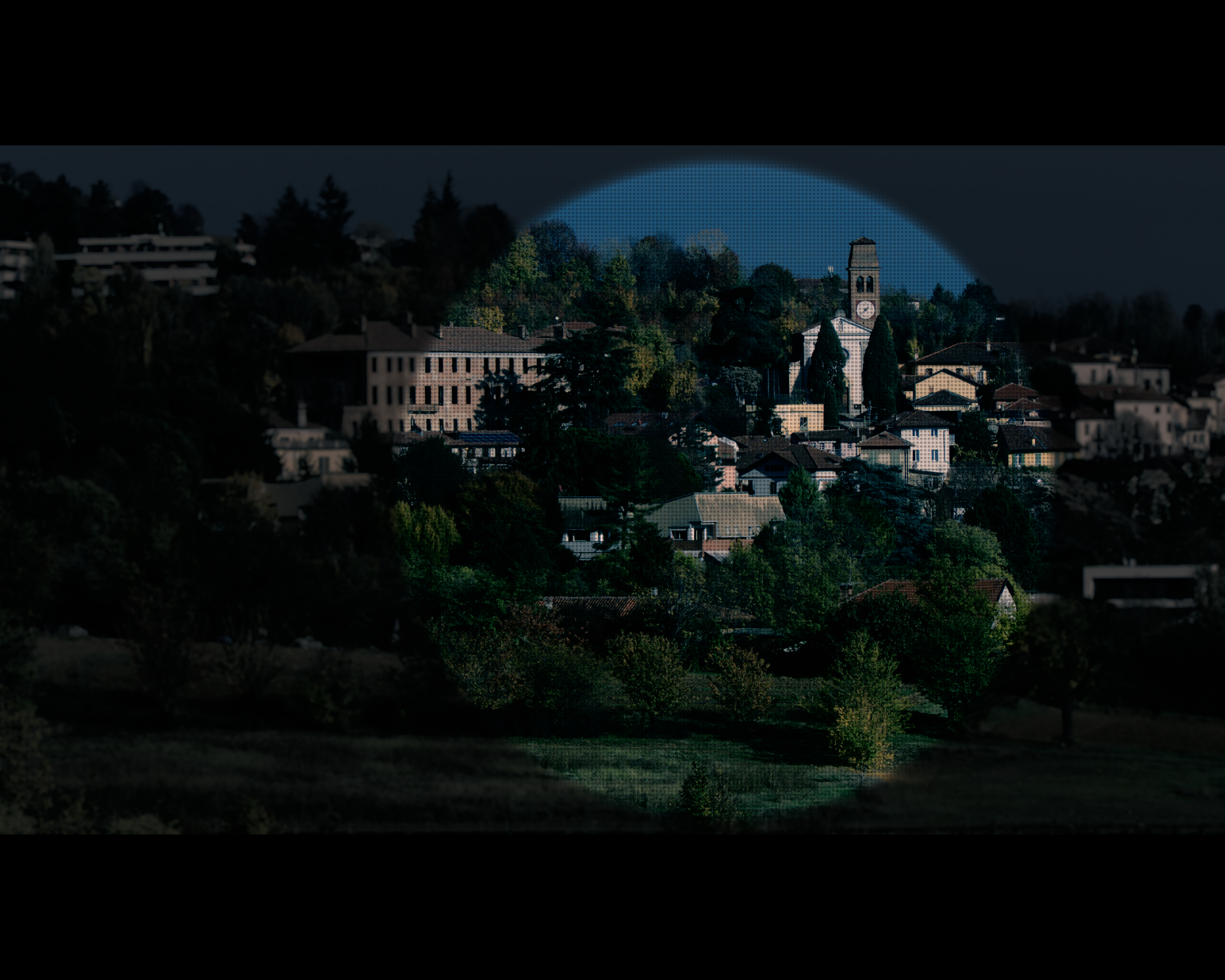
Edit" The halo on the tree line for a couple of them was present full screen but not 100 per cent I was curious how it would export… it is due to the tone eq on the clock… tweaking the settings or masking could remove it… I think I did that in a couple of the other ones not showing it…
I see you used a drawn & parametric mask. Could you please explain me how you set the parametric mask? Using just the hue sliders to select the blueish hue of the sky? Did you take advantage of the range color picker?
I think the gradient alone works nice here. But often (if possible) i just select a profile of the sky for hue and luminance - just to be a little more precise.
More important is the feathering and mask contrast. Just get a good feathering radius and often do increase the mask contrast a bit, to reduce the mask bleeding into the landscape.
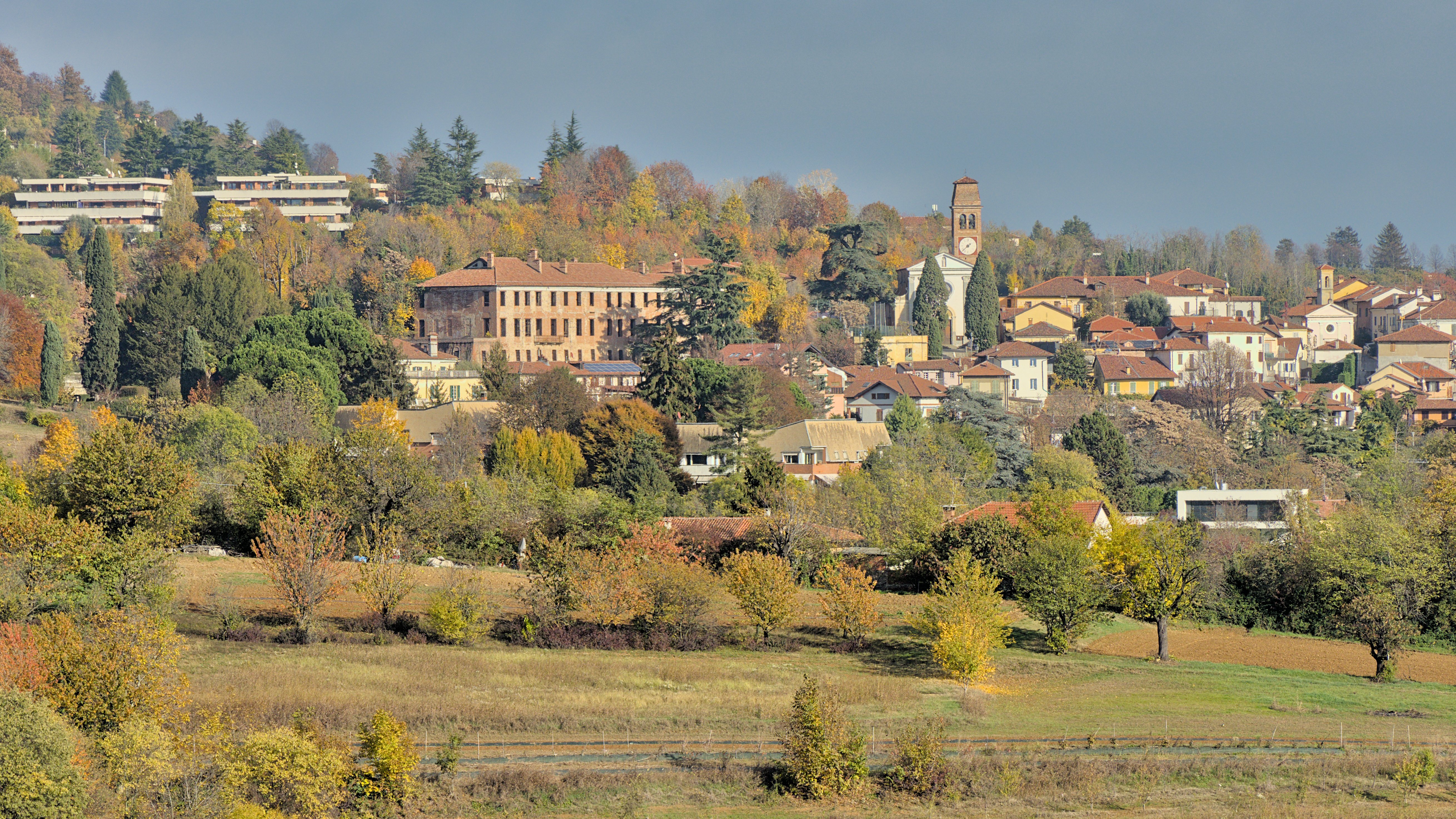
The last 3 show quite strong halo-ing around the edges between the trees and the sky. Or is me, or the smaller pixls-preview?
My own version (this sounds bad, not trying to say mine is ‘better’ than priorts of anything!! I just noticed it on his version, and hope mine doesn’t have it as well ).
Otherwise a boring version I guess, maybe with too little punch in the highlights. I did try to bring the sky out more, but there are almost no real clouds to speak of .
Ya I noted that in the comments… I didn’t go back to fix it… I mentioned that it was interesting that I did not see it at 100% zoom but for sure in the full screen preview… On export the full screen proved to be representative which often is the opposite
It can be a good place to start or people will also just turn on the mask display and then see how it evolves as they adjust the sliders… A good combination for a mask is hue and chroma… often you can use the chroma to refine where the hue is selected…
Very nice… @s7habo is a master of color contrast. I know he has used many techniques to enhance landscapes and foliage. I recall one video where he had lot of green and he did a really nice job to isolate and pull out the different hues and tones… your image has so many green hues that it could go in many directions. WB would also really impact it… If matching the look to the day was important I think this is one where you would have to be there to nail it
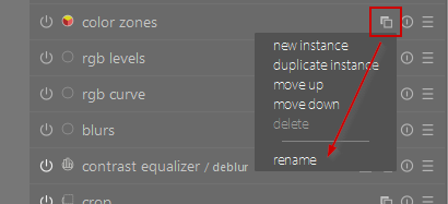
Hi @qmpel, how did you manage to give a name to some of your module instances? Like that for tone equilizing the sky, that is called tone equilizer sky .
Yes, easiest way as @123sg says. Otherwise you have the little menu which also allows to make new instances of the module.
bonus info:
I like to create some base styles, which contain often used modules named at possibly different positions in the pipeline. I find that very convenient.


 ).
). .
.