I have been reading the discussions from last September and October (2020). Do you have post Any interest in a "film negative" feature in RT ? - #254 by rom9 in mind, @rom9 ?
Yes, exactly: you should always set White Balance for the backlight, and then, only as a last resort if you really can’t get a good result, you can try altering the WB values as a “hack” on the conversion.
Not very scientific, i know 
@rom9, ok, good to know.
I’m puzzled, though, as to why that should be the case. And especially curious to know what the obvious trade-off is (when it comes to the computation), if I’m setting it to something else completely (read: if I’m not taking the backlight hue and temperature into account, at all)
Maybe it’s simple to understand with a workflow diagram.
Well, i don’t think i can describe some guideline to find the absolute best WB setting… you can only find it by chance, IMHO.
The only thing we know, is that we have to calculate “a power of the reciprocal” of the light passing through the negative. So, intuitively, i’d say that the most sensible thing to do, is getting the most accurate representation of the negative.
That could be done by creating a custom icc profile for the specific backlight we’re using. This icc profile, then, would be inherently optimized for the color temperature of that specific light: this is why i say “as a starting point, set WB for the color of the backlight”.
But … this does not take into consideration the spectral response of the film itself. For example: we know the red-sentitive layer captures a certain portion of the spectrum. After development, what portion of the spectrum will be blocked by that very same layer? Will it be the exact same portion? Most probably not, right?
So… wouldn’t that be a bit like a color space conversion, happening inside the film? Meaning that the concepts of red,green and blue may not be the same between when the image was captured, and when the image is reproduced, by shining light through the developed negative.
And i think this “conversion” would be extremely difficult if not impossible to measure, so it will always be a big question mark in our conversion workflow.
(i hope the above makes any sense )
Here is the (simplified) sequence in the processing workflow, when the FilmNeg combo is set to “Working profile” :
raw data -> WB -> input matrix -> filmNeg -> ...
Note that the WB multipliers are applied before input color profile conversion.
Roughly, this is what happens when the input profile is applied:
Rw = k11 * Ri + k12 * Gi + k13 * Bi
Gw = k21 * Ri + k22 * Gi + k23 * Bi
Bw = k31 * Ri + k32 * Gi + k33 * Bi
where:
Ri,Gi,Bi : input channel values (in camera color space)
Rw,Gw,Bw : channel values in working space (eg. Rec2020)
So basically, the input matrix calculates a weighted sum for each channel.
Now, if you “lie” by setting some completely different WB multipliers, you are in fact altering the input values. And each alteration of an input channel, has repercussions on all three working space channels.
But since there is a missing piece in our workflow, (due to the behaviour of the film as stated above), could this “lie” actually be beneficial to the final result ? Maybe…
How to determine which values to choose? I have no idea other than eyeballing 
This I completely agree with, but for somewhat different reasons.


Images source: Rogers, D. (2006). The Chemistry of Photography, 109-110.
Not even close, but is this really relevant? The scene (which is what the the captured light has been emitted from) is not part of the flow anymore. The negative is the scene, and the backlight now is the spectrum that needs to be accounted for.
Then this conversion workflow is not repeatable or consistent, which doesn’t make it very useful. Yet, we see in the analogue process that printing (and scanning!) of color negatives can be very repeatable and consistent.
Yes, but there is more to it.
A (negative) image on film is a component of the analogue process. What is the analogue process after the negative has been developed? It is printing on paper using an enlarger. The enlarger projects the image using a tungsten-halogen light source. The characteristics of that light is the temperature of around 3800K and the spectral composition not too far away from a 5500K black body, or the sunlight. The light has a yellowish whitepoint but other than that is neutral. That can be considered a reference light source in which the negative looks correct… to what? To the paper.
Like was mentioned on these forums elsewhere, the paper color response is what represents the observer. That is, the colors on the negative cannot be interpreted correctly by a “Standard Observer”-based system, such as a human (obviously), or a digital camera. The colors need conversion, which is implemented by the paper chemistry and (!) takes into account any specifics of the film’s color reproduction. One of those is, naturally, the color of the unexposed film areas, others are whatever color channel irregularities that may be there, which are not likely to be linear or evenly distributed (which comprises a ‘look’). Here is a paper spectral sensitivity chart, note how the channels response is proportional to the channels density on film:
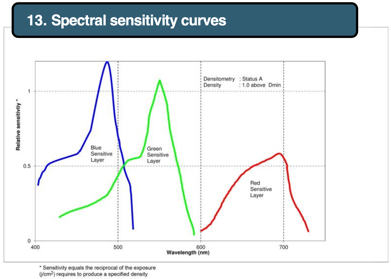
Image source: Fuji Crystal Archive Paper Data Sheet, p.3.
How can we emulate the same in digital? One way is to have a paper-like ICC profile which, by simply being applied to a negative would transform it to a nearly balanced positive. If necessary, an additional CMY color balance global correction would bring it to a completely balanced state. This is analogous to what the enlarger color knobs do.
Is this enough? For one film/paper combination - yes, but what about the others?
Then there is the question of the ‘look’, those same irregularities (compared to a linear response) in the channels (or, more precisely, the emulsion’s spectral response), which we generally would like to preserve. A transformation algorithm, based on some key values (such as WB, WP, BP, and per-channel gamma) would not necessarily give adequate results, because the channels may not have those assumed relationships.
One such discrepancy which I still don’t have a solid understanding of is the behaviour of the orange mask. It is described as a dynamic system, producing a decreasing proportion of the orange mask color with increasing exposure. The cyan layer is the topmost and is placed above the mask, so the red channel response is unaffected by this behaviour. The green and blue channels each do gain extra input from the couplers, increasing with the exposure. As far as I understand, in practice this means a dark green patch on the negative would have more yellow in it (coming from the unreacted coupler) than a light green one of the same (exposure spectrum) hue, and similar for the blue channel. This should place the green and blue curves at an angle to the red one, but it doesn’t on the Figure 2 chart, so it is not quite completely clear. Here is an excerpt from Rogers, D. (2006). The Chemistry of Photography, 109-115.
The Chemistry of Color excerpt.pdf (3.8 MB)
Nevertheless, the same Figure 2 chart demonstrates (and what is explicitly mentioned in the text) that on the negative the three channel response curves are approximately parallel. Meaning a simple per-channel exposure compensation would bring them pretty close to neutrality.
This I believe is what is mentioned as Integrating to Grey in Hunt, R.W.G. (2004). The Reproduction of Colour, 44-45:
Getting back to the point, reproducing the negative on scan as faithfully as possible indeed seems to be important. White balance and even the ICC profile should be applied to the backlight.
From there the promising direction seems to be very different from the current FilmNeg approach. There were indeed some very pleasing conversions posted in this thread. Yet, in complex cases where there is no neutral points FilmNeg struggles, while a decades-old manual PhotoShop channel equalization approach works very well indeed. Maybe it just needs to be automated.
1 Like
I’ve been inverting my negatives using my own method for a while, basically what ‘negfix8’ does.
After some talking with rom9 here I switched methods a bit, but mostly for inverting that doesn’t change much. And it was +/- 100 posts ago in this thread, I don’t know what has changed since then  .
.
But the basic idea: reciprocal (blackpoint/v). Subtract so blackpoint becomes 0, multiply to set whitepoint, apply optional pow/gamma to balance. I don’t think much has changed since then?
How you pick those points is where the magic happens. From my testing (with a Minolta film scanner, not a digital camera as scanner) I have scans made ‘as positive’, just as they are. So the analog gain in my scanner is 1,1,1. I then scanned the same picture but with raising the analog gain of my scanner as far as I dared without clipping the filmstrip. I then scanned it again but actually trying to balance out the analog gain in trying the filmstrip to be as close to white as I dared (without clipping, and some margin).
Doing the inversion on those, yields - colorwise - exactly the same results. It doesn’t seem to matter much. But then I’m using a scanned part of filmstrip to set my black levels and I use an auto-method to set the white levels. Apparently, modifying the analog scanner gain doesn’t do much in the final look (only how detailed the shadows are or how noisy it is).
Back to DSLR scanning, I think this reflects in setting the white-balance. As long as you’re not working with clipped channels, and you’re using the same method of setting the black, white (and gray) points, the result shouldn’t differ much. The data captured seems to be quite linear this way.
It’s a very good point that this does nothing with the effect the printing paper has in the whole process. But opinions (or intended results ) seem to differ quite a bit around if people think about ‘inverted film’ as looking the same as ‘printed on paper’. Paper stocks differ too, so it’s hard to generalize here.
I have little experience with pictures printed on analog paper (in the developer world I feel ancient, but saying this in the photo world makes me feel young  ). I know they handle what is most of the resulting contrast. But I have no clue how much color shift there was between different paper stocks?
I always think it’s a bit weird when you hear people describing things like ‘Kodak has warm colors, Fuji more cold’ etc… In my mind I go “That all depends on how you balanced the orange mask and the light source to project the negative onto photo paper, right?”.
So in my mind, a film negative has no ‘one correct true correct look’ on how it should look. There are too many variables in there.
That means at some point in the process, you need to let go of ‘how it should be done’ and start looking more at ‘do I like what I am seeing right now’.
I treat my negative film scans more as ‘an analog raw file’, and that means I can go all kinds of way with it in ‘inverting’ it and how the colors should look. Most of the times I’m happy with what I get after inverting. Sometimes I run a little color-cast removal, most of the times I tweak contrast and saturation to my liking after it. If it’s the ‘correct way of inverting’, I really don’t know and I start to care less and less to be honest.
I do like trying different methods of inverting and seeing if they give better results… guess I’m more of a developer than a photographer .
- I agree with your approach when it comes to interpretation of the negative,
- I’d like to nuance your response:
- the inversion process, in your dedicated scanner case, involves linear scans meant to be optically projected and printed (just as in a minilab). To my understanding, this linear scan simplifies things, as there’s no gamma baked in, yet. Each channel can be safely normalised and inverted. And only then, you can play with gamma / density.
- camera scans are not linear
Really?
If you work on a neutral RAW I expect the values to be perfectly linear? Maybe your camera looses precision in certain parts due to the capabilities of the sensor / whole camera.
Every raw converter I know of works - internally - with linear data. Maybe the data is not written linear in a RAW file, but then (through profiles or understanding of the process / manufacturer specific things) that is unpacked back to linear data to work on.
If you take a shot of a film negative, white balance it to the light source, use your camera profile, set the working space to rec2020-linear and then write a 16bittiff file as rec2020-linear… how is that going to be different than a dedicated film scanner applying it’s profile to write the final file to rec2020-linear 16bit tiff?
(Again, inaccuracies due to the whole process and or hardware involved ignore for a bit).
I believe Nikon uses or used to apply a curve to the values before writing them to the RAW file. Basically, if the raw file is written with 14bits of information, it would compress the highlights leaving more precision for the other parts. But AFAIK Nikon was (is?) the only one doing that, and a camera-calibration will make it possible to reverse the curve (you’ll always loose a bit of precision trying to inverse the curve, it’s far from a lossless operation… but it’s also not destructive enough to be of relevance in inverting analog film I believe.
But to be honest, I’m not that knowledgeable about this and a bit of what I’m saying is guessing… but every RAW converter out there works in a linear working space, so some way or another it at least tries to map the recorded data in the RAW file into linear space. As long as you’re not nearing the limits of your sensor (full well capacity?) to me a sensor (in the analog space) is also linear. All kinds of inaccuracies due to sensor design, color filter array, ADC, etc… that’s where camera profiles are for, to correct these as good as you can. And I think that’s more than good enough for analog film.
I at least noticed no limits or issues with what comes out of my Sony A7m2. The reason I stopped ‘DLSR scanning’ is because of the annoyance to set up my ‘scanning rig’, little mistakes during scanning (1 in 50 scans the focus was not OK, or I moved suddenly, etc…) and they (may) require too much cleaning work after. So I do it because my film scanner gives me a more relaxed (although slower) workflow and more consistent, reliable results. Not because I found my DSLR ‘scans’ lacking in detail / information.
… it was annoying to get color blotches because of light leaking at the sides and such. It requires more effort to get good results than I expected ;). But people are getting great results with it, so I don’t think the DSLR-sensors are a limiting factor there.
(Being aware of what you’re camera is doing with white-balance - or more what it is NOT doing - is important though. I took test shots of a piece of filmstrip, using dcraw to convert it to linear 16bit tiff, but doing no white-balance correction. That way it’s easier to see when I’m about to be clipping a channel. The tools in your camera or the the tools a RAW convert gives after demosaicing, white balancing and applying a camera profile are absolutely useless for this).
I also think that most camera ‘only’ have 12bit ADCs or 14bit ADCs. You don’t want to be at the limits of clipping your sensor/channels, and remember that white-balance is NOT done in the analog domain. In other words, if you take a single shot of a piece of negative film, you really have to do your best to get as much dynamic range as possible from your shot, because that dynamic range would be used for the red channel. A negative-scan like that uses way less green and even way less blue. So if you want to capture more than 8 bits of precision for your blue channel, you have to work a bit. And again, no in-camera tools are going to help you there. Just take a test-shot, use dcraw to convert to linear 16bit with as little as work as possible (no profile, no white balance, no exposure, no nothing), check if something is (close to) clipping. If is, lower exposure and test again. Repeat till you got it right.
Wow, my head is exploding ![]()
That’s true! Actually, your concept of “emulating paper” makes me think of another issue, related to the conversion function. As described in my posts above i was trying to emulate the film behaviour at the extremes of the exposure range, based on the measured film response. To do that, i just inverted the film response curve, so that the horizontal “asymptotes” at Dmin and Dmax, become vertical (see diagrams here).
That is, my function is a constant exponent in the middle (appears linear in log-log plot), and gets more and more “sensitive” as it approaches Dmin and Dmax … maybe that’s wrong ?
That’s not what happens when printing… i assume the transfer curve of printing paper has a similar shape to that of film, with horizontal asymptotes. Does this make sense? ![]()
Do you think that being able to adjust the toe size per-channel might help with that?
I’ve tried implementing that in my crappy “prototype” program, and it seems interesting.
Yes, i noticed it! Why?!? The linear parts are not so parallel in my plots … am i doing something wrong ?
I’ll try to re-plot my data with the same axis as the textbooks/datasheets, so we can compare apples to apples.
Wait, do you mean just stretching the R,G,B channel histograms individually? I did try a that method long ago, but i never managed to get a good result.
Please, could you point me to some how-to of the exact method you are referring to? Maybe i’ve just missed the easy solution ![]()
Actually, the filmneg tool does only reciprocal and gamma. Blackpoint and whitepoint are adjusted externally via the Tone Curve tool. The only thing that changed in the development version is that it’s now possible to perform the calculation after input profile conversion (so, in working space instead of camera space). For this reason, the output color balance is done with three dedicated sliders and not with the normal WB tool.
This is true when you perform the inversion directly on raw data, before input profile conversion (as was the only option in the old filmneg versions).
If you perform the inversion after the input profile, then you have the “channel mixing” described in the previous post, and things get complicated ![]()
Completely agree. That’s the goal here: Being able to get a good result in the most cases, using as few sliders as possible. Easier said than done ![]()
Same here, and even worse: i’m quite crap at both ![]()
I agree with @jorismak , that was the very first test i did before starting this whole thread: took several pictures of the same light, doubling the exposure time gave roughly double readouts in the raw data.
I think Sony does something similar (i have an A7m1), anyway it’s just a way of encoding the raw file to save space and write faster.
Once the raw file is parsed, decoded and the data is loaded on the RawTherapee buffer, you are working with a linear 16bit float image, regardless of any camera-specific encoding tweaks.
Remember that RawTherapee has the raw histogram plot … such a handy feature ![]()
Can disable white-balance completely these days? (It’s been a while since I spent some time in RT ![]() )
)
The raw histogram is never affected by WB, or by any other tool. It just does what it says 
Like in digital, the color precision on film diminishes as the extreme ends of the toe and shoulders are approached. There is increased noise in the shadows. Hue and saturation shifts, although not necessarily visible due to low (or high) relative luminance, but present in the numbers. Per-channel clipping on both sides.
All this makes the extreme points of the exposure range unfit for being a basis for the color correction. To me, the “integration to grey” along the straight line of the curve makes the most sense. It may indeed introduce (actually, just preserve) the deviations at the extremes, but they are likely to be the least visible there anyway (at least in the shadows).
It was indeed surprising to see the channels not being parallel on your charts before. Here is a part from Giorgianni, E. (2008). Digital Color Management: Encoding Solutions, 112:

Note the word representative. It then should be expected that channels are parallel, and if they are not, it is a concern. On the next page he goes on to stress that it is the printing density that should be calculated and reflected on the chart:
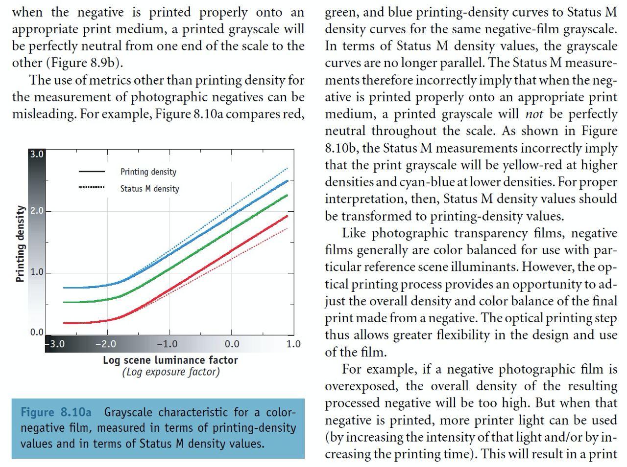
Note how the Status M dotted lines diverge with exposure, not unlike the channels on your chart.
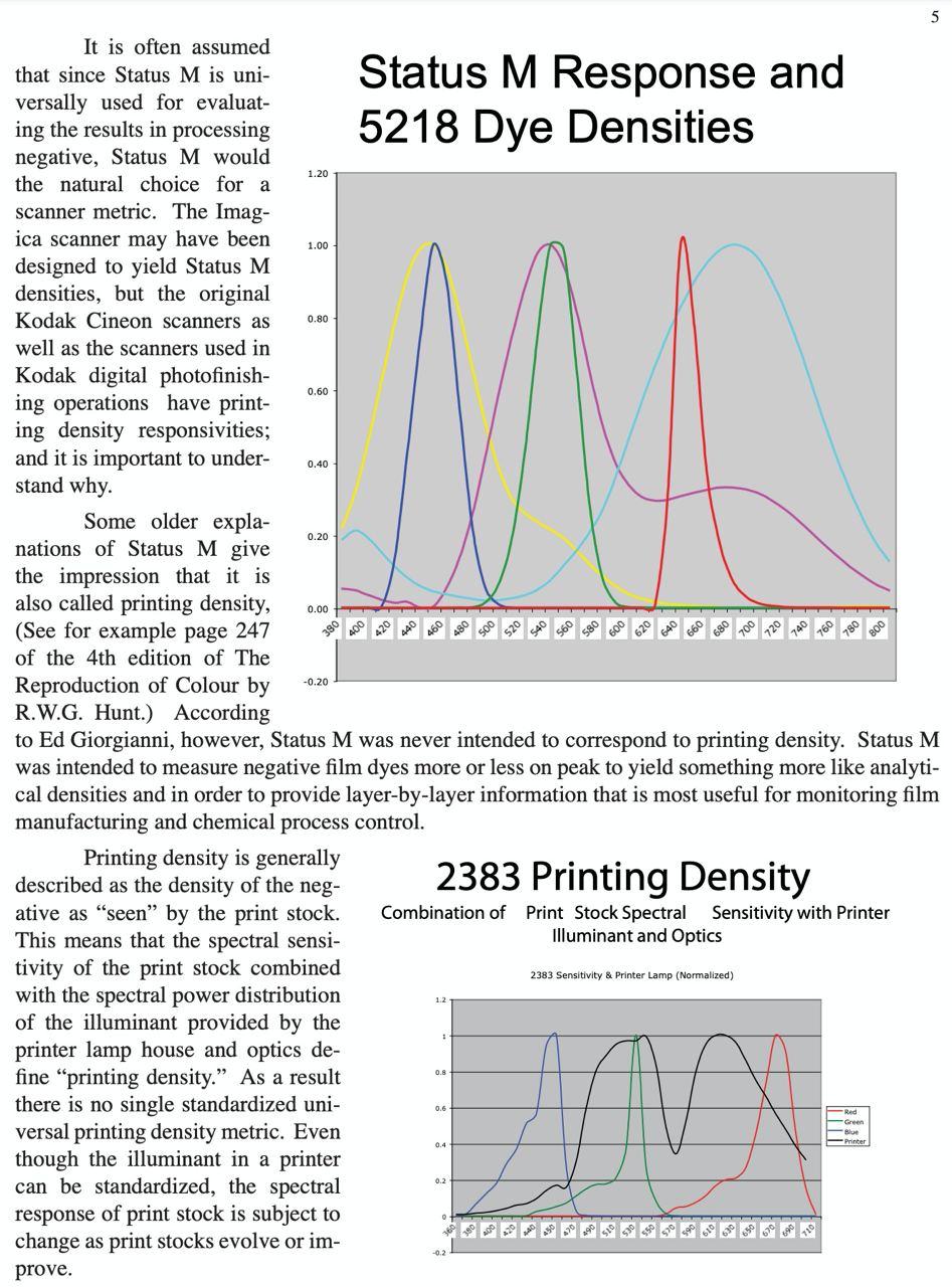
This topic is elaborated in Choosing A Metric For Scanning Negative, p.5:
Maybe ensuring the printing density values are used for the chat will make the channel lines parallel, bringing us to consistency with the theory.
Curious to see your results, but again, going with the “integrating to grey” concept, it seems more promising to instead appropriately cut off the toe and shoulder parts in order to correctly detect the slopes of the straight parts of the channel curves so that they can be integrated with minimal error. For this there does need to be a way to detect the toe and shoulder start points, even if by manual adjustment.
This was my experience as well until I realized a couple of crucial points, the primary of which is the linear input. I will post another comment as it can get pretty elaborate.
Generally speaking, maybe a good way to assess the quality of a conversion algorithm is to have a greyscale wedge exposed on a color film, scanned with gamma 1.0, and then subjected to the conversion. As the grey on print has to remain (nearly) neutral regardless of other film/paper qualities, the same should be a sound criteria for measuring the quality of the algorithm as well.
An extra step would be to expose the same greyscale wedge in a colored light, so despite the subject being greyscale, there would be no neutral areas in the image. A correct conversion would have to preserve the color of the lighting, meaning it cannot not be reliant on the information within the image itself for the hue component. They hue needs to come from the definition of grey and the only reliable way to get it is from the film rebate.
1 Like
Here goes the description of the manual color negative conversion I use, especially for difficult negatives. Most of the building blocks in various combinations were in use by folks for this purpose for twenty years, so its not exactly new. Yet, there are some important bits that were either missing or underutilized in the existing descriptions. So, this variety is called Linear Channel Equalization Conversion, just to give it a reference. The conversion is explained using Photoshop, but should be easily reproduced in other software, including RT, I just don’t know how ![]()
There will be more explanations, than necessary for some readers, but please bear with me for the sake of those who need them.

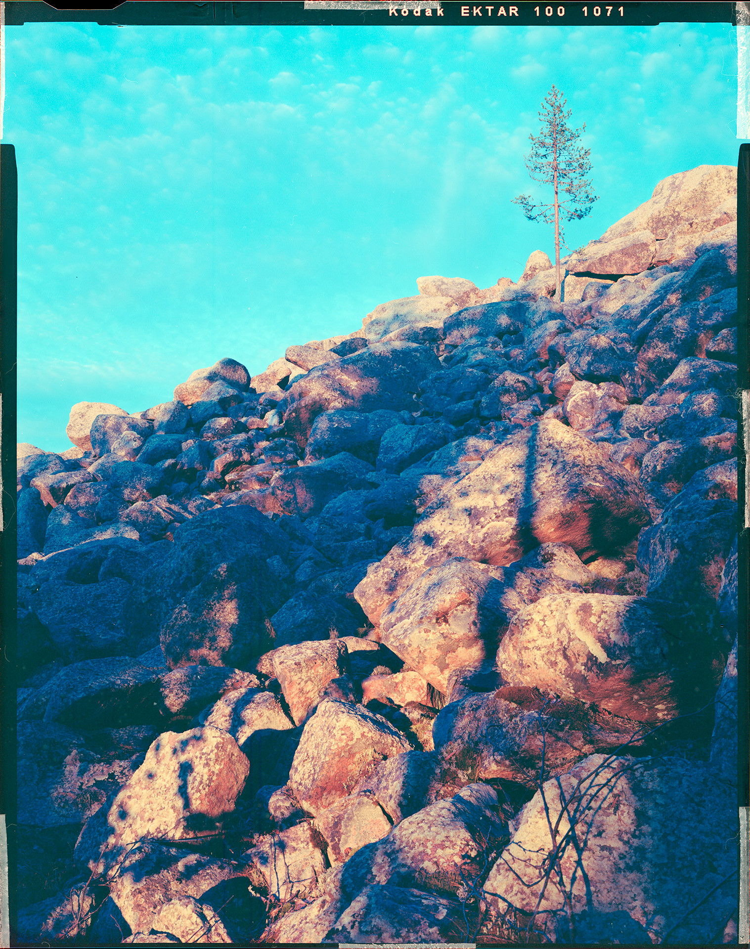
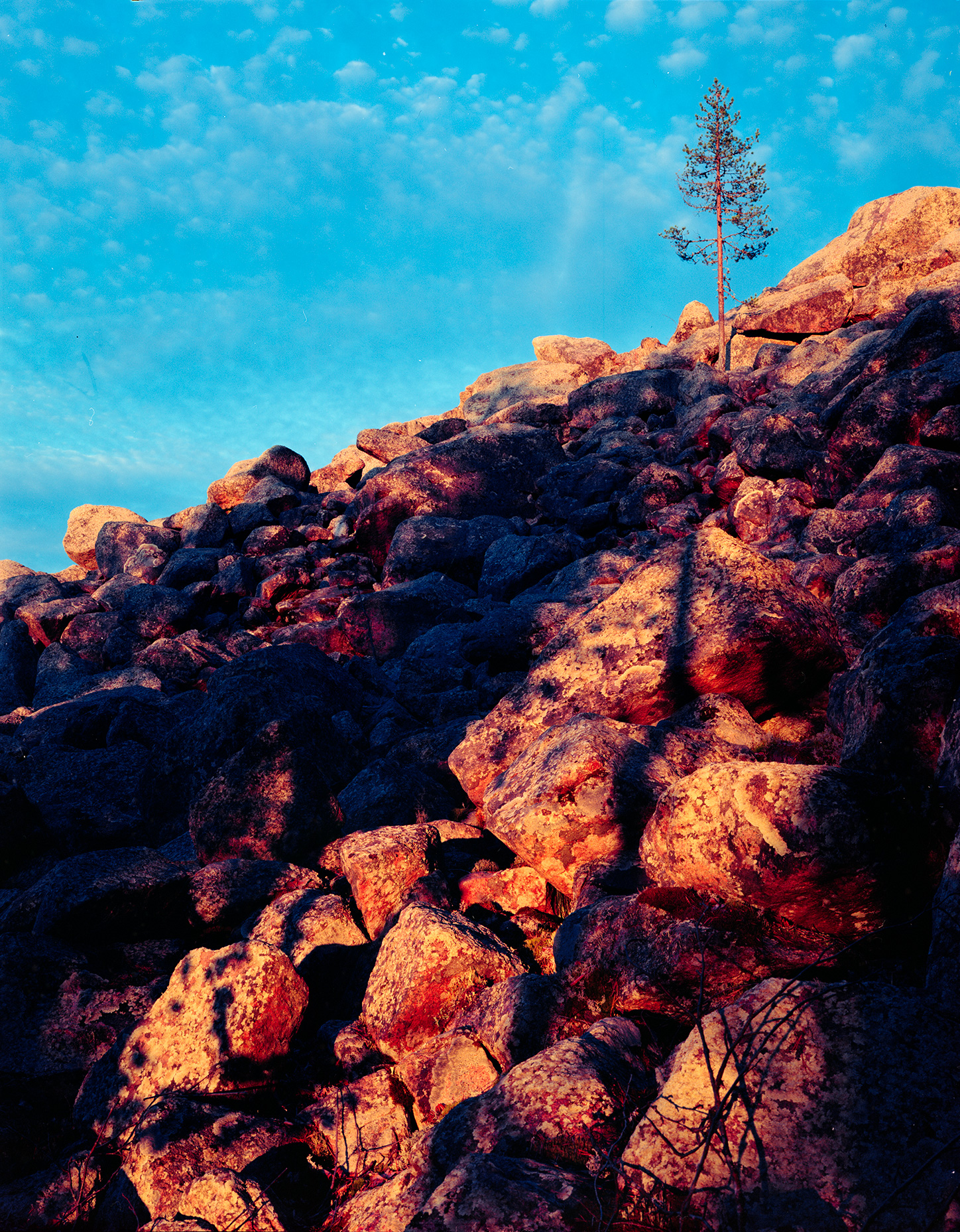
Here is the example image. It was taken in the middle of July on the boundary of the Arctic Circle at around 23:10 local time. During summer the night-time sunlight (yes) in that area can sometimes have a very intense color from bright yellow-green to red, and this was one of such moments. The film is Ektar 100 4x5 sheet film, fresh (not expired), exposed and developed normally. The scene dynamic range was 4 EV, the measurement made on the sunlit rocks to place them to Zone 5. The shutter speed was 1 second, so no reciprocity failure, and a circular polarizer was on (with the appropriate exposure correction).
You can compare the look of this scene to a digital rendering in this YouTube video (the link is for the relevant time offset). Make sure to select a high resolution when playing. You will see that the colors do not match exactly and are more pronounced on the film. This is expected and reflects the film character, as well as the creative choice which will be touched upon below.

What makes this image good for this exercise is there are no neutral tones anywhere, and the color combination is quite complex and intense. The image was intended for print so the printable gamut consideration is an important aspect of the conversion.
One other note before we start is the color settings of my Photoshop which may be important when following along.
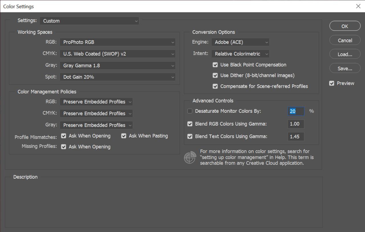
Note the ProPhoto RGB working space, meaning the display gamma is 1.8. No specific dependency between this conversion and ProPhoto RGB though.
1. Source Image
The source image needs to be linear, this is extremely important. The example image is a 16-bit tiff produced by scanning in positive mode with linear gamma and saved without an ICC profile attached. When opening the image in Photoshop it is important to keep it not color managed, so it is just raw non-interpreted numbers.

Double check the info panel to ensure the image is indeed Untagged RGB:

Note that the image is still being converted for display to the working color space (ProPhoto RGB) and its gamma (1.8), but this does not affect the calculations.

Here we are so far, just a negative.
Why linear?
The gamma curve due to its shape affects values differently depending on their place on the curve. Shadows change more than the highlights, but what is the shadows and what is the highlights? We are going to shift the channels around, making some of the values brighter and some darker. Until we finish, there is no telling which values end up where on the gamma curve. If we have an already gamma-corrected value, say, in the shadows, after equalizing the channels it may end up in the middle tones, but it already carries a shadows-magnitude gamma correction in it, which is bigger, compared to the gamma change applicable at the new, middle, tone. When this happens in all three channels, the color relationships in the image change in a complex way, and the image acquires a non-linear color cast, which is near impossible to correct.
2. Channels Equalization
This is in essence the white balance correction. There are ways to do it more conveniently, but I’m not certain about the underlying calculations. For now I do it in a pretty laborious way just to make sure it does what I expect.
The idea is to make the color of the film rebate neutral, that is, grey, without changing anything else. For that we need to move the per channel histograms around but not otherwise change their shape.
2.1 Prepare a reference area
Select an even area on the film rebate, leaving some margins at its sides. Apply a Gaussian Blur, picking a radius such that the blurred area is not polluted by the color nearby.

2.2 Set the reference point
Put a Color Sampler Tool point in the middle of the blurred area. Make sure it’s Sample Size is small enough, e.g. 3 by 3 Average (which also blurs the sampled area).

Set the sampler point mode to Lab in the info panel.
![]()
Our goal now is to bring the a and b values to zero.
2.3 Adjust the channels
Note
There certainly are more efficient and non-destructive ways to do this, but this is the only one I’m aware of that shifts a channel histogram as a whole. Please do let me know if you know a better way.
Convert the Background layer to a regular layer.

Go to Channels tab and pick a reference channel, observing the color picker L value. Generally, a channel with the highest value is appropriate.

In this image the Red channel has the color picker L value of 52, Green: 32, and Blue: 22. We will use the Red as the reference and adjust the others to match.
Duplicate the image.

In the duplicated image create a new empty layer and delete the image layer. We will use this copy only as a space to perform the channel modifications.

Note that the color picker should still stay where it was, even though there is no image at this point.
![]()
On the original image select the Green channel, hit Cmd/Ctrl+A to select it, and Cmd/Ctrl+C to copy. On the duplicated image select the Layers panel and hit Cmd/Ctrl+V to paste the copied Green channel as a layer.

Note the color picker showing L: 32, as was measured on the original image. We need to bring this value to 52, as that is what the Red channel has.
Add a Brightness/Contrast adjustment layer and set it’s mode to Legacy. If the Legacy is not selected, it will modify the toe and shoulder and we don’t want that.
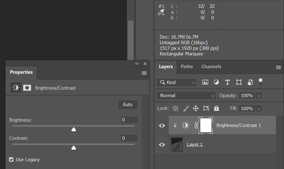
Note the little angled arrow on the adjustment layer, meaning the effect of this adjustment only affects the underlying layer and not anything below it. This is just a precaution for the next step as right now there are no layers below.
Move the brightness notch to the right until the color picker L value becomes 52. Note that there may be more than one Brightness value satisfying this condition. Pick any, but stay consistent when correcting the next channel.

Hit Cmd/Ctrl+A again to select the whole image and select Image/Copy Merged in the main menu. Go back to the original image, Channels tab. Select the Green channel and hit Cmd/Ctrl+V to paste the modified layer back as a channel. Now the Red and Green channels are equalized, Blue to go.

Note how the RGB thumbnail is more green now, which is expected.
Do a similar procedure with the Blue channel. This time the Brightness value to reach L: 52 is 65.

Note the layers below are switched off. This way they will not be taken into account by the Copy Merged command. After pasting the modified layer as the Blue channel to the original image, we have our channels equalized and the film rebate neutral grey. The duplicated image can now be closed, we won’t need it anymore.

Note the a and b are now zero, which is what we wanted. Also note the channels are placed well within the histogram range so nothing is clipped.

Sometimes when a channel is too dark, a single Brightness/Contrast adjustment layer is not enough to reach the target L value. In such case a second Brightness/Contrast adjustment can be added on top of the first.

Here is the equalized image. Note how the rebate looks somewhat bluish-pinkish in color, but is in fact grey. From here things become much easier.
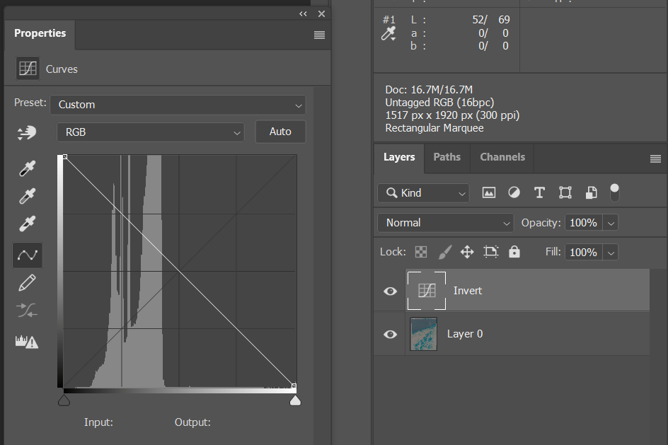
3. Invert
Add a Curves adjustment layer and switch the keypoints, keeping the curve straight. This will invert the image non-destructively.
4. White and Black Points
Add another Curves adjustment layer. Select the Red channel in its settings dialog.
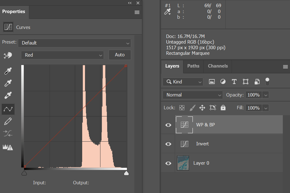
Grab the left control triangle while holding the Alt key and start moving it to the right. The image area will become red, and as you move the triangle farther, pixels will start to appear. Move the triangle so that some pixels in the image area (not on the film rebate) have just appeared. This is the boundary of the meaningful shadows data in this channel. Now hit the right triangle and move it to the left while holding the Alt key. This time the image area will become black, but the principle remains. Move the triangle until some pixels have just appeared in the image area. This is the boundary of the meaningful highlights in this channel.
Now select the Green channel in the same dialog and repeat, then the same for the Blue channel.
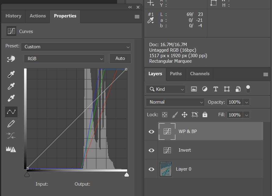
Here is what we should have. The channels are now stretched so that the dynamic range is expanded. Note that not every image should be expanded to the edges of the histogram. A foggy scene for example may not have any black or white in it. Such scenario can be addressed by e.g. moving the same Curves layer’s RGB (combined channel) control points vertically.
5. Gamma
The image is still flat and this is because it started as linear. Now is the time to apply gamma. This can either be done using Levels middle notch, or through a profile conversion. The Levels notch value of 0.45 represents gamma 1.22, and the value of 0.55 matches the gamma of 1.8. The profile conversion may be preferable as it also enables the transition between the negative conversion and the post-processing. Yet, not only is it destructive, but also requires layers to be merged, therefore maybe it is best to perform it on a copy of the conversion result. For this image gamma 1.22 works well, and generally the choice is free.

Here is the current result. Getting pretty close.
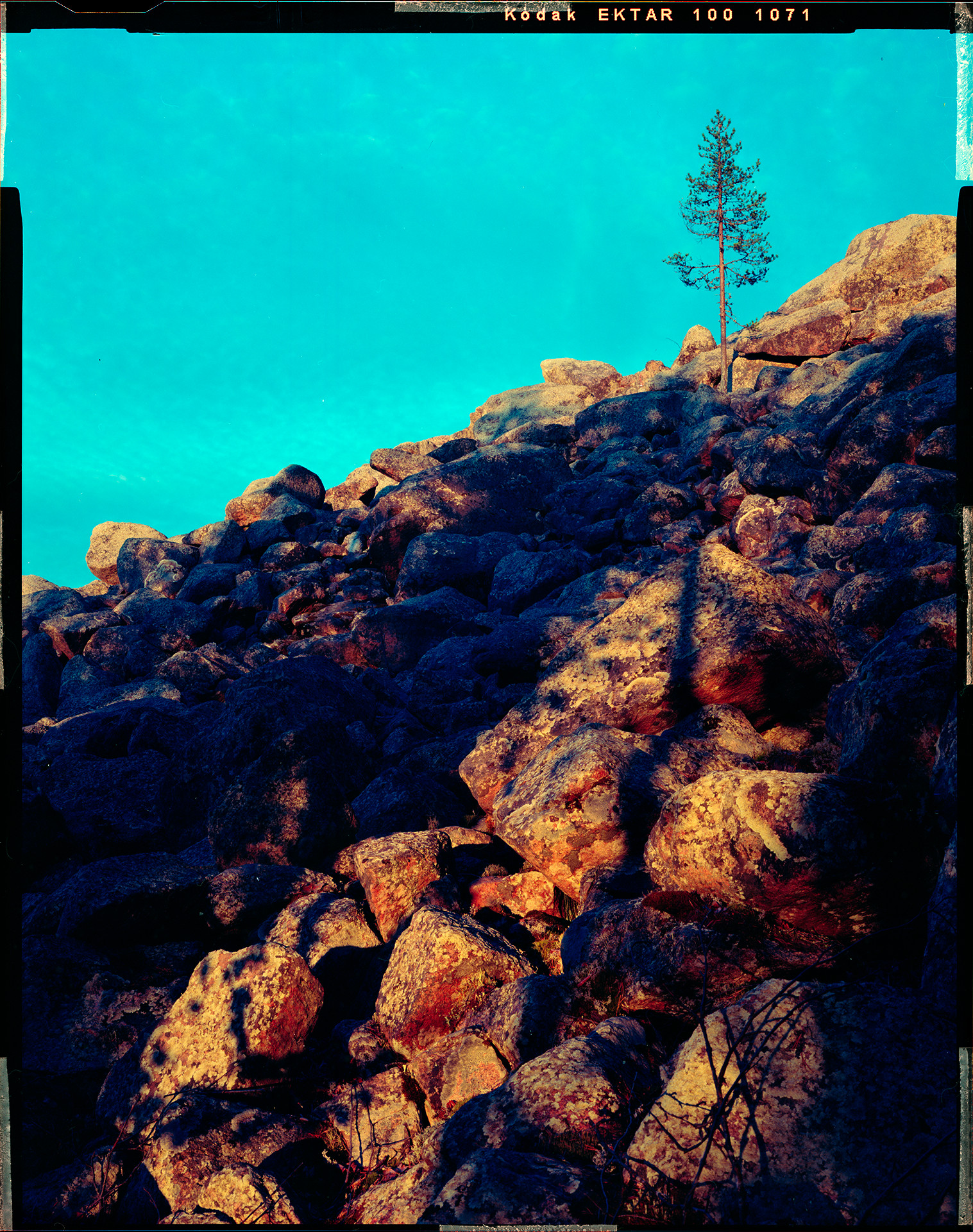
5. Cyan and Blue Correction
Note how the sky color is way too cyan. Also note how the deep shadows in the middle left area have pretty intense blue tint. This happens most of the time with this approach but I cannot reliably explain the reason for it. Previously I though it may be the effect of the couplers, comprising the film base color, which, when neutralized, shifts the overall balance in direction of cyan. Another way to explain may be the comparably large expansion of the blue channel on the earlier steps. The blue channel is typically the narrowest in the linear scan and have to be expanded more to compensate for its opposite salmon film base.
I can’t tell the reason, but fortunately, the effect and its amount are predictable and can be easily compensated for. This is where the colorimetric correction ends and the subjective one starts.
Add a Hue/Saturation adjustment layer. Select Cyans in its options, or use the picker and click somewhere on the sky. Set the Hue to +16 to move it in the Blue direction. Set the Saturation to -10 to calm it down a bit.
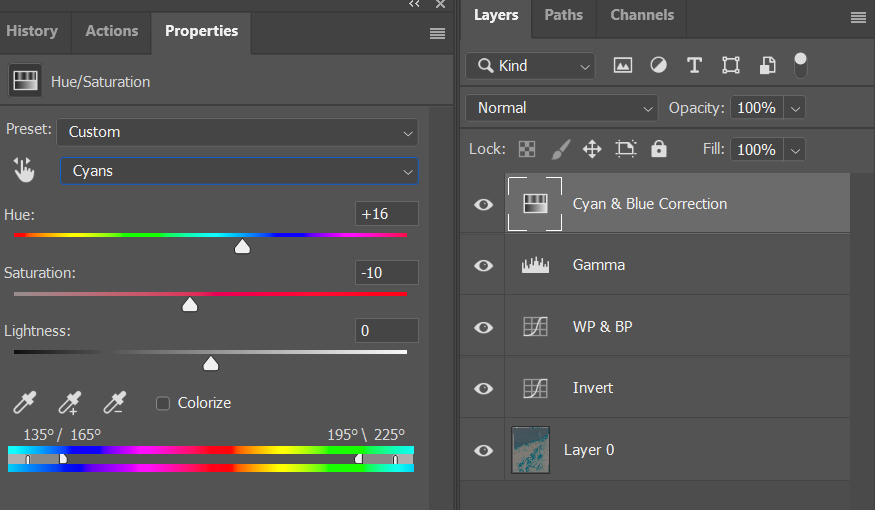
Add another Hue/Adjustment layer (or use the same if you want) and this time select Blues in the options. Set the Hue to +11. Note the rocks in the shadows change the color. Notably, this deep blue color is not printable at all. It can be displayed on screen, but is way beyond the paper gamut. For this reason its saturation needs to be reduced even more, -20 should do it.
6. Destination Color Space Conversion
At this point the image can be converted to a color space of your choice to be treated as the basis for the subsequent artistic interpretation.

Here we are. A corrected image with no neutral colors, yet the procedure is conceptually simple and should be automatable. For the most part the process is colorimetrically objective, that is, no user decision is required. The last step is indeed subjective and not well explained, but it is reasonably controllable. It is placed at the start of the “look” part of the post-processing, which is convenient.
Final Words
I’m attaching two files:
-
lce-conversion-example.psd is the source of all the screenshots. Use it to trace the conversion steps. The image layer is already neutralized so you don’t have to do that yourself.
lce-conversion-example.zip (27.9 MB) -
lce-conversion-example.tif is the source linear tiff in case you want to follow along from the start.
lce-conversion-example.tif (16.7 MB)
Here is also a different rendering of the same image with a more pronounced artistic choice, to demonstrate how this basic correction can be taken further.
1 Like
As a continuation to the previous comment, I’d appreciate if someone tried correcting the example image using either FilmNeg or any other approach, just to see if there is a better way.
Please excuse my math ignorance, what is meant by “integrating” here? It’s not like “the integral of a function” i assume, because we don’t have a function, we just have a bunch of pixels.
Does it mean the median value of each channel? Or the average? Again, sorry for the dumb question ![]()
So, if i understand correctly, these types of density measurements are taking different wavelengths into account. And the slopes are affected by these wavelenghts/bandwidths.
So, in our case, it is like saying that the plotted data must be first converted into a specific color profile, and if i’ve chosen the wrong one, the slopes will diverge.
In fact, if i compare my very first mesurements i did, taking the raw data directly without any color profile applied, with the data from the same pictures processed by my camera input profile and then saved to linear sRGB, i get different slopes:

Well… maybe i could try converting to different profiles, until i find one that gives parallel slopes?
Agreed, it would be great if we could achieve a decent result automatically, just by picking the film base color, and then allow for minor adjustments only when needed.
Thanks for all the great info! ![]()
I’ll try your conversion method tomorrow. In the meantime, here’s a quick conversion using RawTherapee with FilmNeg. Everything default except some color balance:

thanks for your linear scan! Always fun to try on scans from other people.
Up front: The relation between blue and red (the rocks and the sky) does seem a bit weird. I can convert it and end up with cyan sky, or I try a different white point and end up with ‘better’ sky on first try, but the rocks can be really red. And very contrasty.
Adding a tiny but of curves to raise the shadows a bit, also lowers saturation (brightening reduces saturation) and it seems ‘better’. Still, a lot of warmth on those rocks .
Also, I do notice something of a limited dynamic range. Not only by looking at the histogram of your linear file, but also when pulling and pushing and working on it, it tends to become noisy if you’re not careful.
I feel your scanner should perform better with the gain raised a bit to maximize DR for your scanner, and I suspect calibration the ‘scan as positive’ with a real it8 slide target may yield interesting results, because something seemed off in your blue/red ratios. Maybe they weren’t all at the same value?
Setting ‘working space’ in Photoshop is always a big no-no to me. It doesn’t really do that much if your files are tagged with a working space, and it seems to confuse people who tend to think it yields better results.
My scans are ‘tagged’ with the profile from calibration. That is converted to rec2020-linear and that’s where I work in. In the end I convert the result to whatever I want for output (mostly sRGB or the profile of my printer).
In your settings yo have ‘blend layers in 1.0 gamma’ enabled. That’s not bad at all, but it’s not the default. Just wanted to point that out :).
whitepoint set on the brightest point in the sky, yielding better sky colors in this case I think.
lce-conversion-example-try1.tif (16.7 MB)
whitepoint set on the brightest point in the picture, which seems to be a specular highlight on one of the rocks.
lce-conversion-example-try2.tif (16.7 MB)
I like to have the ‘reciprocal’ in the method, so I want to do a 1/r 1/g 1/b or something in there.
Working in 16bit Photoshop or 16bit Affinity Photo I switch it around a bit. I find the darkest point in the scan (so what will become our whitepoint in the image). I fill a layer with that color, then place the scan-layer on top of that with the ‘divide’ blend mode. That inverts the picture while having your white point set. After that we still have to set the blackpoint (but you have a bit of filmstrip in your scan for that!). This seems to work better while gamma-corrected. So I apply a dirty levels layer to push the gamma up by +/- 2.2 (a power of 0.45471). Then I add another levels layer and use the black-picker and click on a bit of filmstrip. Or - Affinity Photo ahem, - I add a permanent color-picker on the filmstrip and I adjust black-levels of the R, G and B channels up manually till the filmstrip reads 0,0,0 as values.
‘Basically’ I’m there. In the try1 version I added a little curves to boost the shadows, int he try2 version I did nothing. I used 563/256 = 2.199 gamma now which is the AdobeRGB gamma, but you can adjust it too taste. Or - in my case - the scan images are tagged with a linear ICC profile, so Photoshop and Affinity Photo already display it correctly without having to do a gamma adjustment myself.
I start just like you, with a linear file and while working I add a gaussian-blur (+/- 6px). This removes sample-errors from grain / noise / weird pixels. Using a live-layer or something helps, so you can just ‘turn it off’ in the end.
I add a threshold layer on top, and I set almost as low as it goes. I use this for finding … well, thresholds.

I slowly move the threshold slider up, till black spots start appearing in the image. I ignore parts of your film-leader, we’re only interested in the ‘real image content’. In ‘try2’ I picked this point, the highlight of the rock:

In try1 I used this, in the sky (hoping it would be a white cloud):

I then sample that point (with the threshold of ofcourse). Either sample with the blur layer working, or pick an average 3x3 or 5x5 picker to average it out.
Now, we’re going to create a solid-color fill layer with that selected color, and put it under the scan. We take this color, and divide it by your scan, not the other way around.

Red layer is the new fill solid, with the solid sampled color. Green is your original scanned image, and we set the blend mode of it to ‘divide’.
This already gets us a lot of the way:

I add a levels layer, and give it a gamma correction of +/- 2.2 (depends on the software if you need to enter ‘2.2’ or you need to enter the value of ‘1/2.2’. It should be brighter .

Then I create another levels layer, and adjust the individual channels so that the filmstrip becomes pure black. I need to add a color-sampler to it and watch the values manually:

This yields me the result of ‘try2’:
Turn off the gaussian blur, and you can tweak it further. This is my ‘start’.
In Affinity Photo I can actually do this all in 32bit mode, so I never clip anything. After setting all my thresholds and points, I can always take a levels layer and lower the whitepoint to recover information that might look clipped. This makes setting the whitepoint pure relevant for ‘starting exposure’ and ‘white-color-balance’. So I can try different points to see what color they give, and always lower the exposure again to get everything outside of clipping ranges.
As a trick I learned from @rom9 somewhere in this thread, you can look at the median of ‘the whole resulting image’ (all channels combined), and then add a levels layer, and adjust the gamma of the channels individually till the median of that channel matches the overal median. I think Photoshop has it the histogram view. I know Affinity Photo has it - a bit buggy though.
In try2, that gives me this, a try2b - still the sky is cyan though:

I couldn’t resist and had to try the ‘median color balance’ thing on the ‘try1’ version as well. It turned the blueish sky back to cyan a bit  . But it did nice things to the rocks though (not as neutral as previous, but not overly red).

Now, normally I have my own programs to do this in batch. The method I use then is a bit different, but it’s the order of the calculations that’s different, the principle still is the same.
I divide the film color by the scan. That gives me values who start at full clipping white and go up. You can’t do this in Photoshop, you need a good 32bit / HDR workflow for this. Subtracting ‘full white’ from it gives me an image that starts at full black (and the filmstrip should be full black) but goes up into very hard clipping levels. I then scale the whole thing with one big multiplication back into 0.0 - 1.0 range (so nothing clips). Then I look at histogram-binning per channel to set the whitepoint. Since I’m working in HDR, I can be quite aggressive with my percent-thresholding here, because nothing will be truely clipped.
I then do the median-color balance thing (or not, or at 50%…) and can think about saving the file. I can bring everything back into non-clipping ranges and write it as a 16bit TIF file, but it would require some exposure fixes (since I lowered exposure to prevent clipping). Or I save it as a 32bit floating-point tif file, or - even more to my liking - a PIZ-compressed EXR file. Those EXR files open in Darktable, where I can mess with filmic or other tools to map the dynamic range into display-ranges.
The thing here, is that I merge all scans from an entire roll into one big mosaic, of 512x512 squashed images with absolutely no spacing or other pixels in between (and no filmleaders, or sprockets, or whatever). This helps setting the blackpoint/whitepoint And median color balance for the whole roll of film in one analysis. This helps me to disregard outliers in weird scans or pictures. Those auto-tools work really well when you use them on 36 pictures of the same film at the same time (imagemagick’s magick montage is golden here).
In the end I get a bunch of values, which I can enter into an imagemagick commandline to process the individual scans at full resolution.
I’ve been learning g’mic lately and have functions and filters now that do the same thing in g’mic.
I’ve written the tool in c++ as well using libvips that does the whole ‘making montage and analyzing’ thing on a glob pattern of files, and then processes those files with the settings discovered. This automates it pretty well. But it’s harder to experiment with methods so the c++ tool didn’t see much love lately.
“Integrating to grey” in the same sense Hunt uses it in the quote in this earlier post. As far as I understand this just means the compensation of the film channels being apart from each other by the paper response, quoting:
Accordingly, in printing color negatives, it is often arranged that the cyan, magenta, and yellow layers of the print material receive exposures inversely proportional to the red, green, and blue transmittances of the negative, respectively.
Since we don’t have the paper, it should be the algorithm’s task to compensate for the gaps between the channel curves. In order to do that it needs to establish the boundaries of the straight part of the curve and its slope, for each channel. Then, using these values, calculate a correction such that all three curves are aligned along their straight part. This would mean greys along most of the midtone area become neutral, that is, well, grey. That’s what would “integrating to grey” mean in the digital application, I think.

Different coefficients, which yes, seem to end up using different wavelengths, as is shown on this picture (page 4). There is also the formula:

I believe the coefficients above are used as Sr, Sg, and Sb in this formula.
How did you originally measure these values? Was it using a densitometer/colorimeter from film, or from a linear scan on the image data?
Kind of, but the printed density is not color. We still need to calculate the density values similarly to how we calculate a color profile conversion, but the formula is different.
But that’s natural, the application of a color profile modifies the color coordinates in a color space, and that results in different density values, changing the shape of the curve. That is a wrong chart though, this is the right chart:

It does look like something that can be fixed by applying the printing density calculation formula instead of (what could be the default) Status M.
Thanks! This looks much better than what I was able to achieve with FilmNeg. The colors are closer to the digital version too, but the tonal definition is not satisfactory. Is there a way to improve?
1 Like
Indeed, instead of the channel equalization in Photoshop I did try adjusting the per-channel gain when scanning. This proved to be difficult as it takes many attempts to find the gain values such that the film rebate becomes neutral, otherwise the need for the manual equalization is still there. More to the point, I didn’t notice any improvement in terms of the image quality due to the gain increase. Since it’s a 16bit per channel file, even the narrow histogram has enough variety of values to keep the tonality within reason. So for this scan the gain was the default, same for all channels. With that said, of course it would be preferable to achieve a wider values distribution when scanning.
Regarding the scanner calibration, also a good point, in fact I forgot to mention in the post that a flat field correction along with the scanner profiling should be beneficial for the end result. This example though does not use it.
It’s a valid and quick method but I don’t use it because it can lead to a channel being clipped, depending on the channels relationship. This is easy to miss so I avoid this.
There is no real whitepoint in this image. Everything, including the clouds have chromaticity. This alone makes it useless to rely on any specific image point for correction.
On try1 the rocks look good but I feel there is an overall yellowish tint on the whole image, including the sky. This isn’t right. Also note how the clouds along the rocks line are blown and are likely clipped. Could this be the result of the “divide” blend?
Try2 looks bleached, and like you’re pointed out, the cyan is way too strong.
I do appreciate the attempts though, it helps to find out if there are any missing bits. With that said, the point of this exercise is to demonstrate/improve a correction which is automatable. For this reason no local corrections or anything image-specific should be applied, it’s just wouldn’t be reusable. The point is not to find the best rendition of this particular image, but to find a correction that would work equally well on this, as well as on a completely different image.
The rocks are not neutral in this light, nothing is. More importantly, there are some film defects which maybe several pixels wide, both white and black. This may not be apparent in these smaller files, but should be taken into account when finding the brightest and darkest spots.
That’s maybe where the clipping came from. When the area is blurred, the brightest pixels are dimmed down to the average level in the area. When using a dimmed pixel as a whitepoint, naturally, everything brighter than that gets blown out.
That’s why I do this normally in 32bit HDR, then you can always after everything is done lower exposure to get clipped values back in range.
And like you said, there is no whitepoint in this image… but you have to set it somewhere. The reason I like to scan/convert a whole roll instead of a single picture. Gives you more possibilities to judge if you set it correctly. With 135 this is easier than sheet… I get 36+ pictures to find a common black/gray/whitepoint .
-
You used a curves adjustment that you invert. Why not just insert an ‘invert adjustment’, it exists?
-
Although you can good results (heck, people also had good results by just hitting invert and then hitting auto-levels
) by using a simple 1-i invert, I still think you have to use a 1/i somewhere. -
I use the threshold layer to set a point and then divide/invert it. You use the ‘holding-alt while sliding levels’. In the end it does the same thing, it highlights where things start to clip and you stop there. So what clips or not is up to you. And like I said, use 32bit floating-point workflow, nothing can get clipped.
-
You said you use LAB space to balance your filmstrip to be neutral. Why not just look at the RGB values to see if they match?
And on my personal tastes: An image almost always requires some blacks and some whites. That means that something has to clip a bit, otherwise it looks dull. Those specular highlights, I almost always turn to full white, because otherwise the image always seems to be lacking something. But that’s me, and this is a personal choice.
Looking at the pictures, my ‘try1’ with color-balancing seems very similar to rom9’s ‘FilmNeg + color balancing’. They both seem to ~preserve~ show more details in the sky than your screenshots. If the workflow suites you or not, only you can decide.
Balancing points without having something of a reference is always a pain, and has more to do with your memory of the scene than the picture you took. In digital this is the same if the white balance is completely off and you have nothing to neutralize it against. In film this the same if you have nothing but the blackpoint of your filmstrip.