Hello @Lawrence37
What a wonderful description! Your explanation helped me a lot.
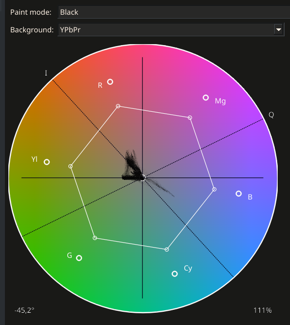
However, my experience with Kdenlive confirms that it is not so easy to align yourself only with the I-line. There, too, the vectorscope is only a certain orientation. If I place the skin tone exactly on the I-line, then the faces become far too yellow and the people look sick with kidney disease in Kdenlive.
But I can achieve a relativ good skin tone with the white balance in this photo with the right setting (Hue-Saturation vectorscope). The problem, however, is that each section of the face shows a different position of the Hue saturation in the vectorscope, which unfortunately means that the vectorscope is not a reliable display instrument for finding the right color tone for faces in difficult lighting conditions. Especially if there are several light sources.
The only question that remains is: If the vectorscope is not a reliable aid for the natural skin tone - what else can you do but try?
Or switch back to the old and best method: Make a proper white balance before taking the picture, with a gray card or a piece of white paper.
To my amazement, I find that the “Auto” white balance isn’t too bad on this image. This is my best result at the moment and it’s much better than “As shot”.
In the Dolby Labs white paper describing the ICtCp color representation, there is a graphic that includes a statistical distribution of skin tones as a function of hue angle. ICtCp was developed for UHD television and digital cinema, applications which mostly feature people.
The paper describes:
“Also plotted in Figure 4 is the normal distribution of skin tone hues that was derived from a large database of skin tone reflectances. ICtCp produces skin tones averaging 122.5 degrees and BT.2020 NCL Y’Cb’Cr’ produces skin tones averaging 136.2 degrees.”
The bell curve shown in the graphic has a sharp peak and a fairly narrow width of about +/-15 degrees. If the data underlying the bell curve has an approximately normal distribution, we should expect about 63% of us to have a skin hue within +/-5 degrees of the average, 95% should fall within +/-10 degrees, and nearly everyone should fall within +/-15 degrees. (The paper does not reference the source of the skin tone data.)
I think the issue is largely resolved for me.
The white balance is also done very well by “Auto” in this photo. I didn’t see it that way at first, but that’s probably down to the subject and the mood of the light when the photo was taken. All my attempts to improve things manually bring me more or less back to what “Auto” did from the start.
I have learnt a lot from your contributions.
I’m pleased to say that the Vectorscope works just as well or just as badly with ART as with all video editors, only the colour wheel has a different angle of rotation.
I have to admit that the reason for my initial dissatisfaction with the white balance is not due to ART, but to my lack of experience in seeing the colours correctly. You never stop learning.
Not to flog a dead horse but again but you might be also looking at the skin tones and thinking about wb being the issue, and it might be. However a simple stroll through the tone curve modes if you are auto applying them results in quite different looks due to changes in saturation and small hue shifts so again this initial setting in ART should be considered. I just opened your image in ART and starting with the default settings it opens with the neutral tone curve model…moving through the other modes gives the skin a very different visual look right out of the gate so might find that skin tones look better or start from a better place if you use a different initial application of the tone curve…
Yes, I also see that it’s not a lack of options that makes white balancing so difficult - it’s the limited ability of the photographer editing the image.
ART will do anything I want - but I need to know what I want, where I want to go with the colors. And that only works with a lot of practice and experience.
I took another closer look at the scene: It is lit by cool daylight (6,500 K or higher) from the left and there is a separate light in the hut, some old energy-saving lamp of unknown color temperature. (Probably somewhere between 2,000 K and 3,000 K, with larger gaps in the color spectrum).
I still have a lot to learn before I’m as perfect as ART already is.
This is now my best version: WB_Test.RW2 (29.7 MB) WB_Test.RW2.arp (144.0 KB)
The wall in the background is green rather than blue in reality, but then the mood of the picture becomes rather unpleasant. So the chosen colour is rarely the real one, but an intentional one.
@Lawrence37,
would it be possible to make the I axis in the vectroscope visually clearer? It would be a great help for people who want to work with it.
I now know that the skin tone is not the same everywhere: In the lights, the pale areas often take on the colour tone of the lighting, sometimes even bluish. The light is reflected there a little.
If you want to use the vectorscope as an aid, it makes sense to select an area of a medium brightness range of the face. Then the I-axis is a very good help.
Now I just have to find the best way to select a narrow area in the photo. With Crop you can get a good section, but you can’t see the rest of the picture when you move the colours. When I work with the hand tool (shortcut h), the selection is a bit too narrow and you can’t stay in the desired position with the mouse and move the colours at the same time. Do you know a better solution?
Possible? Yes. However, I am not an ART developer so I can’t help you with that.
The cursor indicator, if enabled, shows you the color of the pixel under your mouse in the vectorscope. You can use this to get an idea of which “cloud” in the vectorscope corresponds to the skin. When you adjust the colors, you can follow the movement of the “cloud” and check its position relative to the line.
I see, I’ll ask @agriggio if he would like to make the I-axis in the vectorscope more clearly visible. And maybe even turn the vectroscope 90° to the left as it appears in the video editors, like Kdenlive:
When you adjust the colors, you can follow the movement of the “cloud”
I don’t quite understand this yet: I can either click on a part of the face with the mouse, in which case the cloud is displayed in the vectorscope, or change the colour with the mouse, in which case the cloud displays all the colours of the image. Is it possible to have both at the same time? That would be wonderful.
I absolutely agree with @micha comment. What I would like to see is to be able set to set a marker on the vectorscope that corresponds to a particular point on the image and that marker moves around on the vectorscope as you make changes to the image.
For now if you just want to check an image and assess it in this way DT will allow you to place multiple sample on the vectorscope…I know you are referring to ART but for experimentation purposes you can if interested do this in DT…