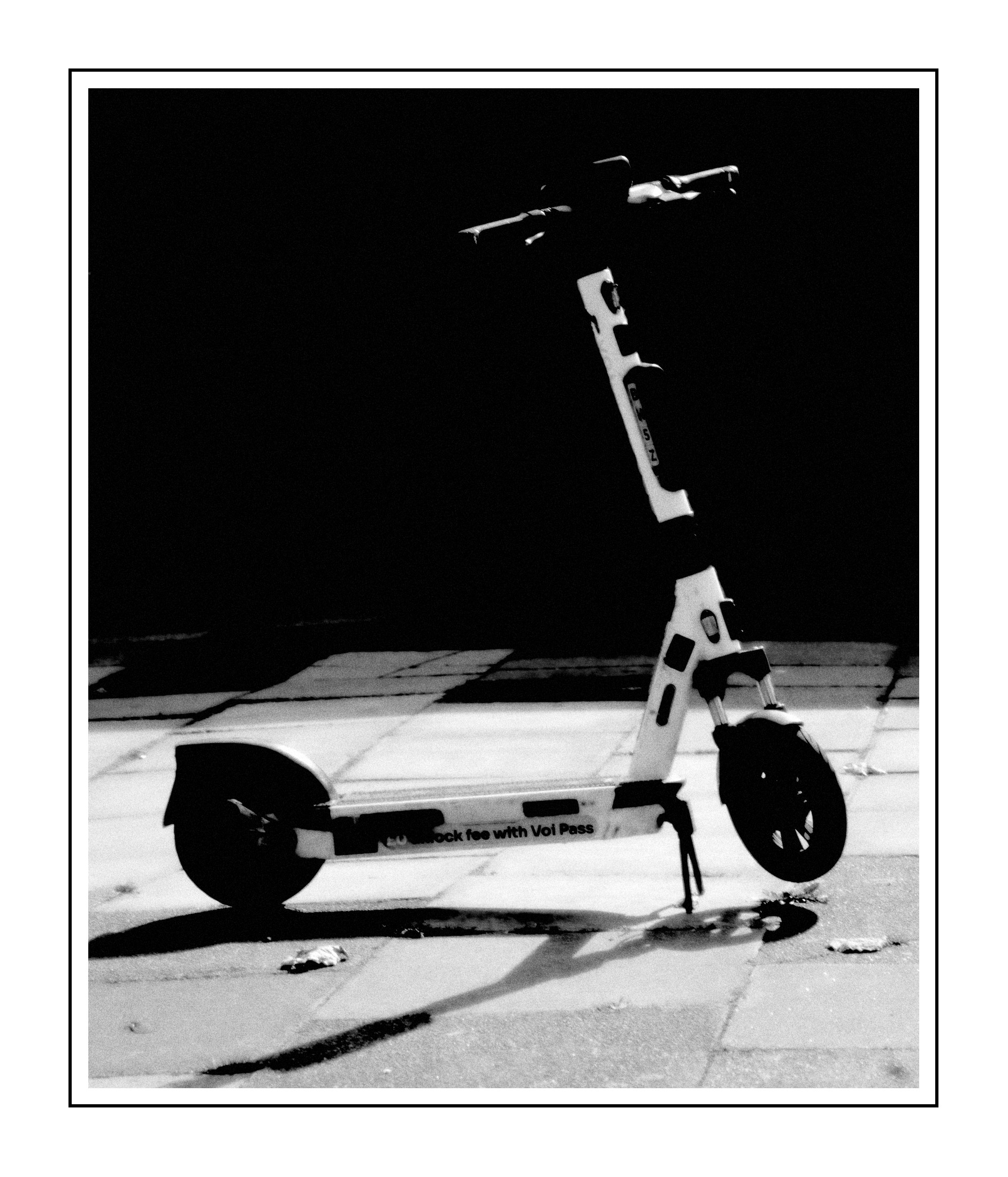
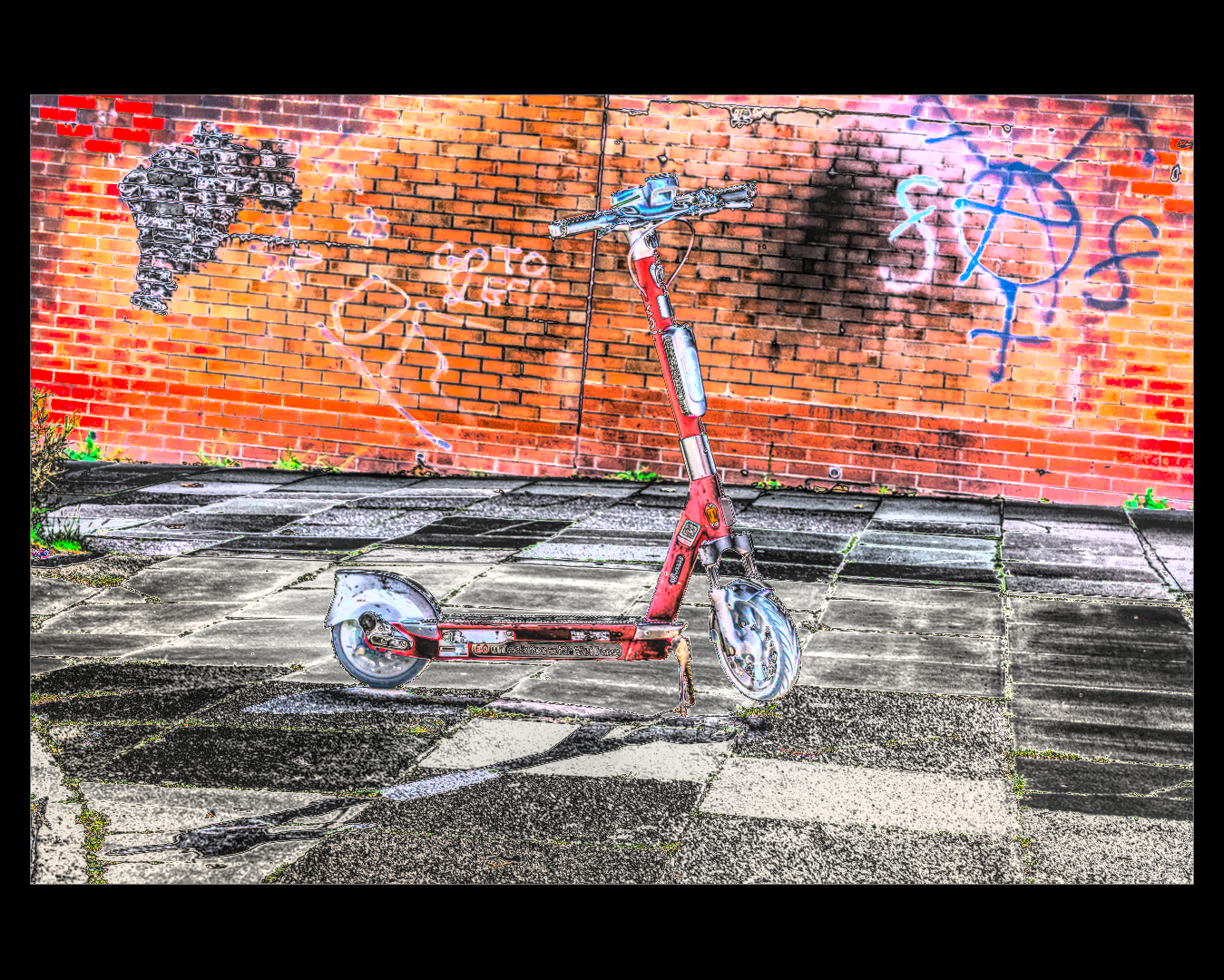
I still also don’t have much skill in a real B&W conversion…so I experimented with a uniform mask from the color balance module, adjusting the color range to close to colorless and then adjusted my contrast. After that I went through a fairly standard (for me) image adjustment before taking a shortcut and using one of the B&W conversion presets. Then did the final image tweaks to suit what I wanted and exported. I could probably achieve much of the same with less modules but old habits are hard to break.
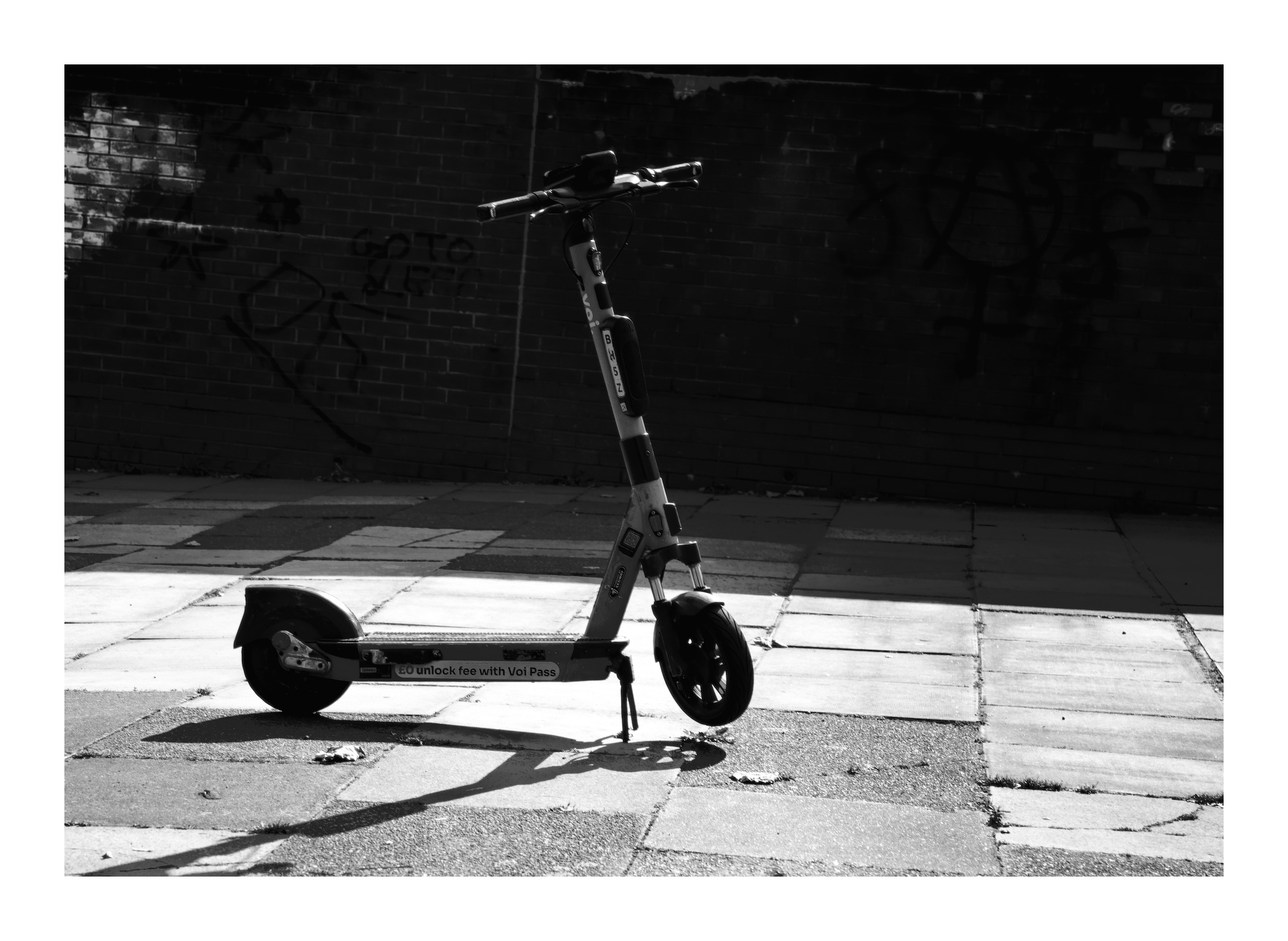
I focused more on the subject than the scene to try and keep the edit a bit more focused.
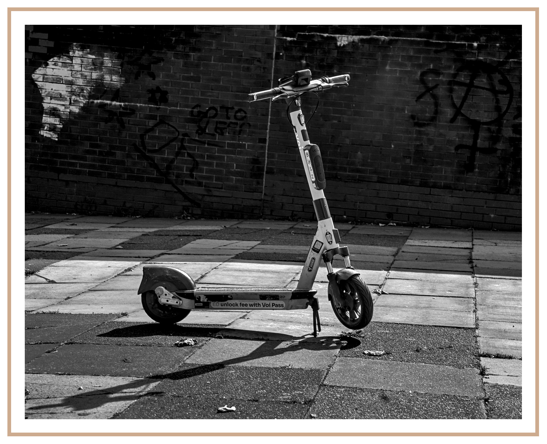
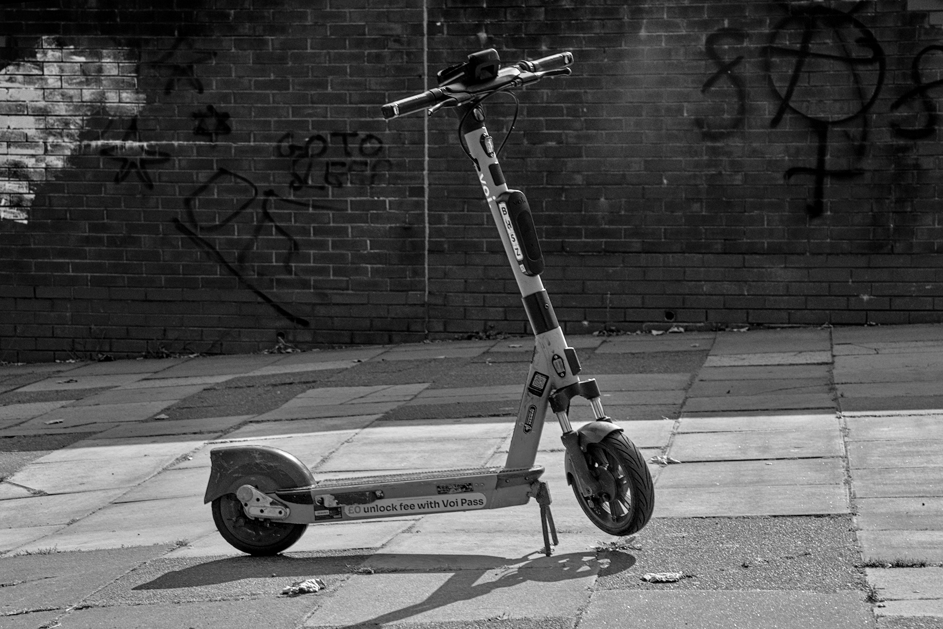
Depending on the image, I tend to edit the colours to achieve the best contrast before moving the color calibration module above any colour adjustment modules (e.g. color rgb) and then using the grey tab to convert to monochrome. I use the colour channel sliders to change contrast. So for example, if I want a black sky with white clouds, I adjust the blue slider, sometime using negative values.
Still have a lot to learn.
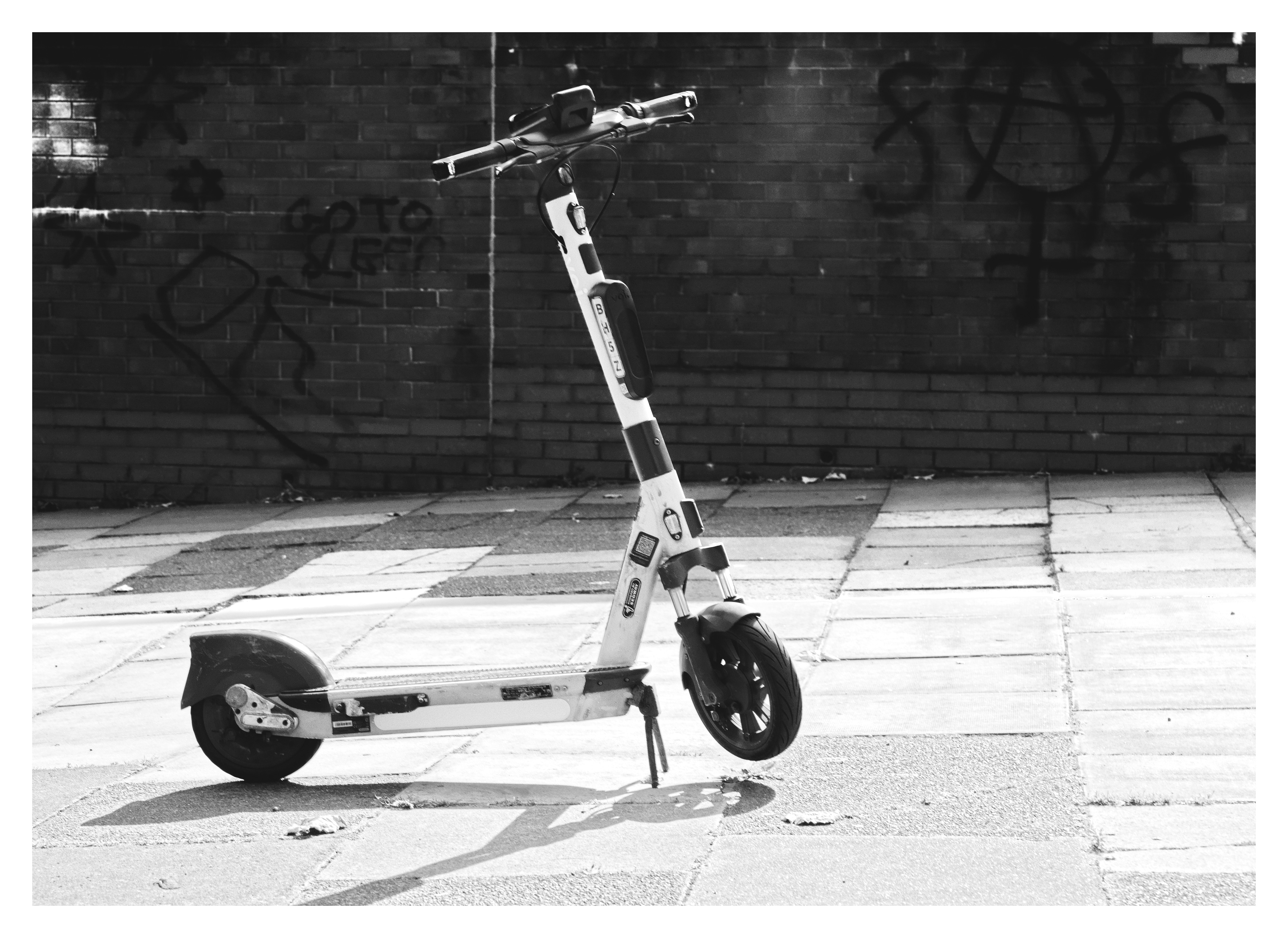
B&W conversion done with color calibration. Adaptation set to XYZ, which gives dramatically different results than none (bypass).
When learning something new, a mix of both reading and watching can be quite piwerful.
To find the details afterwards text is best, but sometimes when learning, a picture can be worth a 1000 words.
From an old Photographer, who never aspired to be a poet