The thing works perfectly for me now. I don’t even need the exposure correction. ![]()
I’m curious to hear what the others have to say.
The thing works perfectly for me now. I don’t even need the exposure correction. ![]()
I’m curious to hear what the others have to say.
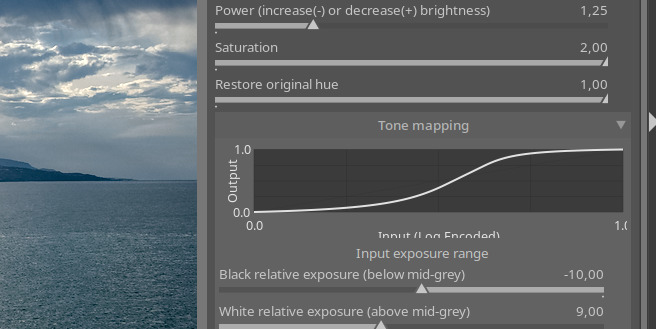
I think this is awesome. I can set black and white points, adjust for the scene mood and then fine tune the image.
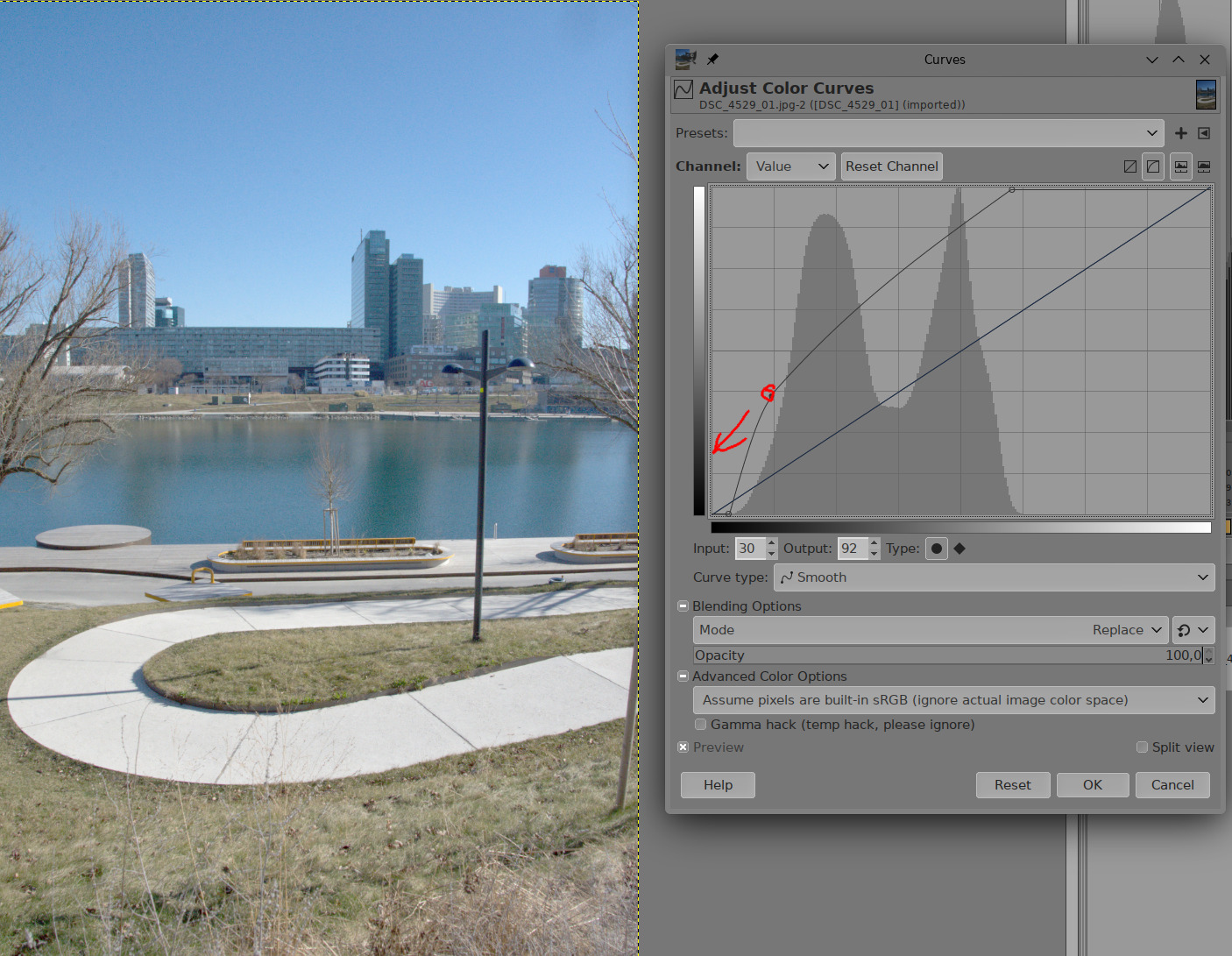
Love the curve. Hate the curve. It’s great for showing you exactly how your adjustments are affecting the curve. But, it takes up so much space. I think it’s great for starting out, but once you get used to how it works I don’t really need to see the curve (unless I get an image that’s behaving strangely). Maybe move the curve to the advanced section, or have a way to collapse it? If you leave it where it is, I can live with it. ![]()
if you can’t see the effect in the edit, then the curve doen’t give relevant information. So quite useful while experimenting until the final math is there - but limited benefit for those not optimizing curve but an image ![]() It would be dirfferen, if the curve gets handles to do the changes there - but thats an overkill…
It would be dirfferen, if the curve gets handles to do the changes there - but thats an overkill…
and at least on my macbook: i don’t like a gui that requires scrolling because of wasted space for not that relevant information.
Yes, the surprise was the curve. It was actually lifted over from rgb curves using an LLM. ![]() Sorry, I don’t know anything about GTK and darktable’s internals. It was good for a quick port, I’ll look into it to learn and understand. I was unable to get it to also paint the pivot at the right place, so it’s missing.
Sorry, I don’t know anything about GTK and darktable’s internals. It was good for a quick port, I’ll look into it to learn and understand. I was unable to get it to also paint the pivot at the right place, so it’s missing.
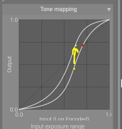
The curve is a bit of a weirdo. Let me explain.
It only shows the input and output mapping done by the sigmoid.
However, the overall mapping is more complex. Perhaps the most misleading piece is the gamma.
What you see on the curve is that the pivot (and the rest of the curve) move up and down. This is an overlay of two screenshots, at different gamma settings (everything else is the same).
As you can see, the x and y values of the pivot (yellow dots) are not 0.18.
The x value, as I have explained, is derived from how it divides the exposure range. With the defaults of -10 EV and 6.5 EV, the range will be split as 10 ‘units’ to the left of the pivot, 6.5 ‘units’ to the right, so its x coordinate is 10/(10+6.5) , or about 0.6.
The y coordinate is defined by the gamma. The input value of 0.18 (0 EV, x = 0.6) is mapped by the code in the end to output y = 0.18, but the sigmoid is only part of that. With a gamma of 2.2, y = 0.18^(1/2.2) = about 0.46; with a gamma of 5, y = 0.18^(1/5) = about 0.71. That is what the curve shows. It’s that y value we send to the ‘look’, where you can still scale and offset and ‘power’ it. After the look processing is done, the gamma is reversed. Let’s say you did not apply anything → that 0.46 or 0.71 (for gamma 2.2 or 5) will be returned to 0.18.
In a way, the y values on the curve are only meaningful if points are compared with the same gamma. The top yellow dot would be mapped back to 0.18 just like the bottom yellow dot; however, the red dot would be brighter, as it belongs to the gamma 2.2 curve, so its y = 0.7 would be mapped to about 0.46 (0.7^2.2) in the final output.
Where the gamma is important: you can use it to distribute the y range between highlights and shadows.
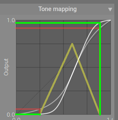
A note on usage of the curve: I’ve found that setting black and white exposure is not as important as with filmic. In fact, it may even be detrimental to contrast. The reason is that no matter how you tweak the toe and the shadow, the contrast near the (0, 0) and (1, 1) point will be lower than in the middle of the curve (unless you lower contrast too much, or move the pivot too close to one of the sides, and the fallback toe/shoulder kick in to keep the blacks / whites, overriding the power you set and breaking away from the S shape).
Let’s say the yellow triangle represents the input histogram (I tried to get the a curve displayed inside the histogram, and I got something, but it looked completely wrong, so I removed it to avoid confusion). I used the red lines to project the darkest and brightest value onto the curve, and from the curve to the y axis; then I did the same, but first maximised the toe and shoulder powers (green lines):
You can see that the curve is not entirely flat at the darkest part, and is quite steep at the brightest. You can then stretch that even more with the slope and offset to take one really black and the other really white in the output.
Alternatively, I could adjust the black and white exposure, so the histogram stretches from one end to the other. However, I would be moving the endpoints much closer to the quite flat parts of the curve (near (0, 0) and (1, 1)). The power settings do not help there: they make the initial part of the toe and the shoulder steeper, but cause a much more sudden fall-off towards horizontal. And, since I would place the darkest and brightest points at y = 0 and 1, respectively, I couldn’t even use look controls to enhance contrast in details and in highlights.
I don’t know if that makes sense, and/or if my meagre illustration skills cause more confusion than benefit.
@wpferguson , @MStraeten : I guess I can add yet another collapsing section for the curve.
It is exciting to see this excellent module develop so rapidly in this group. I really like the tone curve and the new slider labels, which make it easier to understand what’s working and how.
Is “Curve y Gamma” designed to mean Curve AND Gamma, which is what a Spanish speaking person might interpret? Or does it mean Curve with Gamma on the y axis?
This is opposite to my observation. When using white/black relative instead of slope/offset I am always able to achieve better contrast (whilst ensuring no clipping). Sometimes the results are very similar, but if there is a case where slope/offset gives better contrast, I haven’t yet seen it. Often the better contrast with white/black relative can be achieved by having more room to move with the other sliders in the tone mapping section.
This does match my observation. When using white/black relative sliders as per filmic, I haven’t found use for slope/offset, since there is no room to move those sliders before you get clipping. I also use power very minimally with white/black relative, whereas when using the slope/offset workflow, I use it with much more freedom.
PS. I love the addition of the visual curve. It would be nice if the effects of the ‘look’ sliders could also be shown in that visualisation, but I’m sure you have a lot on your plate already.
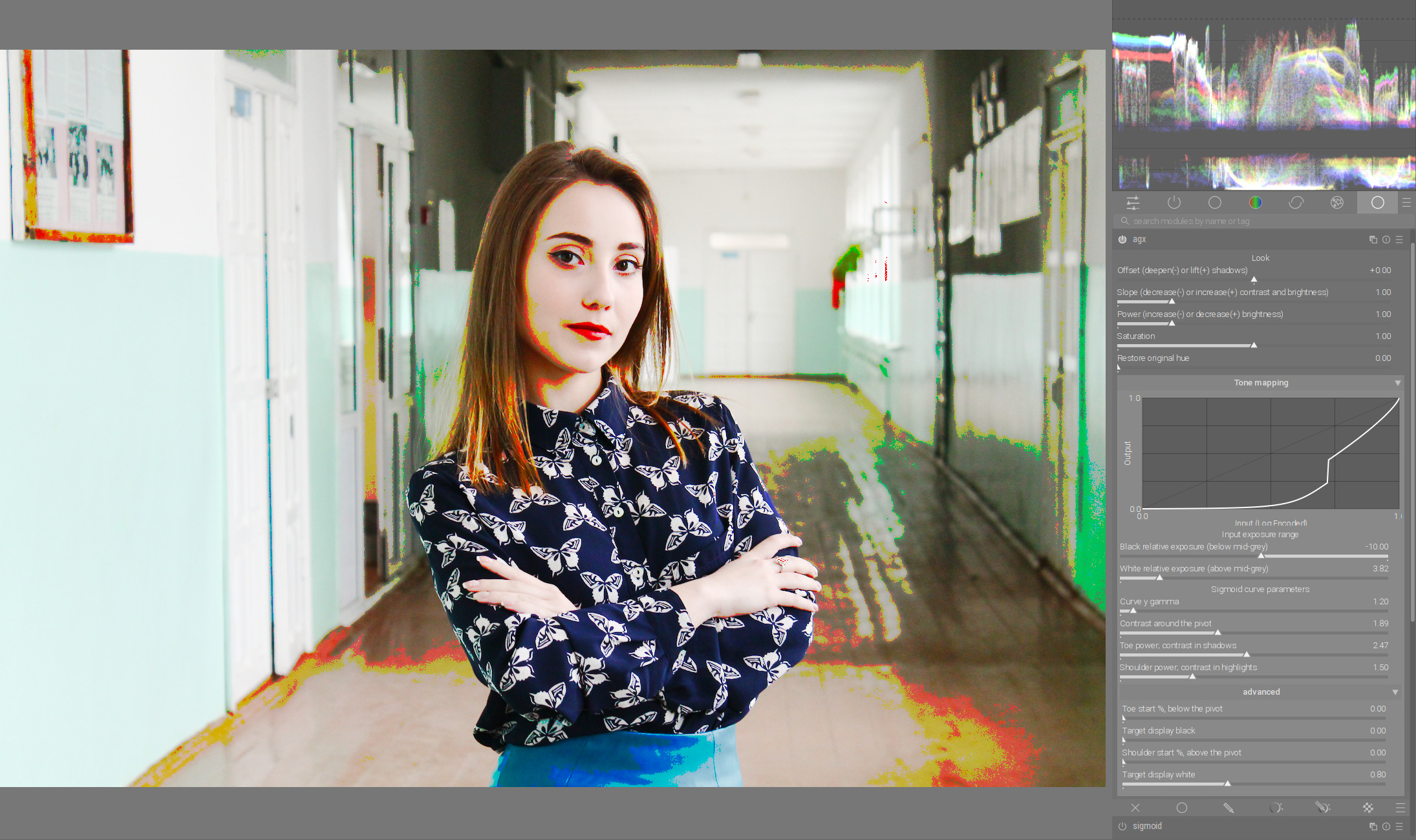
Here’s a Sigmoid version I did yesterday:
And the AgX version today:
This was a 5 minute experiment, nothing too crazy, and I can’t say I fully understand it all yet. But having the curve visible helped and the new labels and descriptions are also helpful. Since I did the first without the intention of testing the AgX module, I added some further edits to the AgX version: denoise, d&s lens deblur medium, and some clarity with the contrast equalizer. I also added a slight blue cast to the shadows in color balance rgb but nothing else with that module. The Sigmoid version has significant adjustments with color balance rgb, it’s pretty much where the bulk of the edits are from.
I think the contrast is better in the AgX version, and the colors in the lower part of the pupa stand out more. I’m definitely pleased with what I got out of it. The only real adjustment I made in the advanced section was adjusting the toe power slightly to darken the background.
Unfortunately, I don’t speak Spanish. If the module gets into the official release, someone will probably translate it to Spanish.
So it’s about the gamma applied to the output, the y axis:
OK, I’ll experiment more. It’s a new module, a new discovery. ![]()
Hi @kofa ,
just as a thought, would it be possible to have the pivot (gamma) we have in sigmoid section also for power function in look section.
I find pivot in sigmoid very useful to relieve/manipulate contrast in the shadows/highlights if needed.
Numpty question : How did you get the curves module in a pop-up window?
That is GIMP, not darktable. ![]()
Thank you - makes sense
The gamma is only undone (the output data is linearised) only after the look controls are applied.
The pivot itself, for sigmoid, is currently 18% mid grey. The maths can handle an arbitrary pivot, I plan to expose the control, but I’d like to finish the display target black / white first, because those are broken (not used consistently throughout the code).
This would actually be awesome. If you could add a node on the spline where you wanted the toe/shoulder/pivot to start, then drag up/down/left/right, it would be amazing. You can do this with Base Curve and RGB Curve, and the user-friendliness of it is really nice. I would love to have this interface with the math of Agx.
For the record, I’m not suggesting this is implemented because I doubt @kofa is interested, and it might be way too complex, but if we’re looking at the best aspects of each tone mapper we currently have, then this is where Base Curve really shines.