Looks good
1 Like
Thanks.
I’d like to move the curve params and graph to a separate tab, too. It’ll go faster, now that I have some experience. The real blocker was the collapsible sections, which automatically add themselves to the bottom of the box/container they are placed in, any have to be added to a separate box of their own to be positioned somewhere else. Me being unfamiliar with any UI development, let away with darktable’s specifics, that took me a lot of time to figure out.
I’d like to duplicate some controls, if I can find a way, so we could have some curve controls also on the first tab (e.g. pivot and contrast), but also on the full curve tab. They’d be kept in sync across the various tabs. (Again, if I can find a way.)
Also, I’d like to add a checkbox to the primaries tab: use same values for reversal. Ticking that would hide the 6 channel-specific reversal sliders, leaving ‘only’ the 6 attenuation/rotation sliders (like in sigmoid), the master attenuation reversal (which I’ll rename to restore purity, to match sigmoid) and the master rotation reversal.
Once that is done, I may add the last set of sliders from Blender’s AgX, which allow some artistic effects, and the presets that ship with Blender.
It will take time, but I’ll publish a build every now and then.
5 Likes
Wow! Cant wait for the next updates
Don’t hold your breath. There were many non-working days these past weeks, but now we’re back to the normal 5-day work week. ![]()
5 Likes
Wow working on dt 5 days a week is great ![]()
11 Likes
![]()
3 Likes
I still don’t understand fully what does the reversal sliders actually do ! I mean you said hear that you will rename them to restore putity, but how do they achieve it specifically ?
Ps : I didn’t actually used the latest build because @Dave22152 is making builds for win 11 and I use 10.
Before the tone mapping curve is applied, agx (and also sigmoid, in per-channel mode) desaturates (attenuates) and skews (rotates) colours. The reversal simply does the opposite. The desaturation and rotation influence where non-primary colours (everything that is not the pure red, green and blue of the ‘base’ colour space) are affected by the per-channel application of the tone curve, as I understand it. Even if you revert the attenuation and rotation completely, you will get different results from not doing them at all, I think. I’m not at my computer to try.
As for the specific mechanism: from the primaries of the base space, new primaries are created, which are closer to the neutral axis (white point xy chromaticity coordinates), and are rotated around that point. Then, the incoming ‘base’ RGB triplet is interpreted as if it were in that space, and converted to the base space. The curve is applied. Another space is created, using the ‘restoration’ parameters, and the tone-mapped RGB values are are returned to the real ‘base’ space by transforming them ‘backwards’ (using an inverted matrix) describing that space.
3 Likes
I’m pretty sure they will still work for you…if not we can ask Dave if his build is a generic one and if not we can build it that way so it’s not using options specific to the compile hardware as well just to make it the most compatible for you…
1 Like
Thank you for clarifying.
I didn’t try it though, but yeah maybe it could work fo me. I will try it when I get home. Thanks mate
@Billal - as @priort mentioned, my builds are generic so I would go ahead and give them a try on your Windows 10 machine.
Make sure you set it up in a separate directory so the proof of concept doesn’t overwrite your real edits. The poc is not compatable with mainline builds.
1 Like
Or itself from update to update ![]()
Thanks Dave…
1 Like
It did work !
Thanks guys.
2 Likes
@kofa in the base primaries, is it best to choose Srgb as a working space like sigmoid to handle colors, or we can leave it at the pipeline working space usually linear rec2020 ?
Job done! AgX saved me an hour’s work.

What stood out very positively was:
- Primaries. Mastering the colored neon lights was a breeze. By color-intensive motifs, I could reproduce this color intensity well without gamut clipping.
- Shoulder power/start. This helped a lot, especially with chandeliers. I could really make them shine with this additional contrast enhancement in highlights.
- Autotune levels and pivot pickers. I was able to very quickly adjust the dynamic range of photos across the entire histogram and set contrasts exactly where I needed them.
Overall the work was fast. Apart from the correction modules and tone equalizer, I hardly had to touch any other modules. AgX was enough for the most part.
I really hope that this excellent tone mapper will soon be integrated into darktable.
18 Likes
Let’s look a bit under the hood, without matrices. ![]()
Here is an image in Gimp. It’s in the wide Rec 2020 colour space (I converted it from sRGB, but currently it is in Rec 2020), in linear encoding.

Let’s apply an S-curve:

Now let’s start over, and rotate/inset the primaries. To avoid matrix calculations, we’ll simply use linear sRGB to play the role of the space with the attenuated/rotated primaries. It simply means that the same RGB values, when interpreted in this space, represent less saturated and shifted colours (like 1 km is smaller than 1 mile, 100% sRGB red is less vivid than 100% Rec 2020 red). We assign sRGB to this image (important: assign, not convert – simply keep the RGB values, but change their interpretation, instead of changing the RGB values to find new RGB values that would represent the same colours). We get this less saturated, somewhat colour-shifted version:
Now, we convert the image into Rec 2020. This will create a Rec 2020 image that has less saturated and shifted colours. It looks the same on the screen, so I’ll skip the screenshot.
Now, apply the same curve (AgX would apply the tone-mapping curve at this point):

Now, we have two choices:
- restore attenuation and rotation completely. We do that by converting the image from Rec 2020 to sRGB (which generates new RGB values), and then assigning the Rec 2020 profile to the result (that last step will mean a very strong saturation boost):
- don’t restore the attenuation and rotation completely. We’ll simulate that by do that by converting the image from Rec 2020 to Adobe RGB (a space slightly larger than sRGB, and therefore having more vivid primaries than sRGB), and then assigning the Rec 2020 profile to the result (the last step will boost saturation, but less than in the sRGB case):


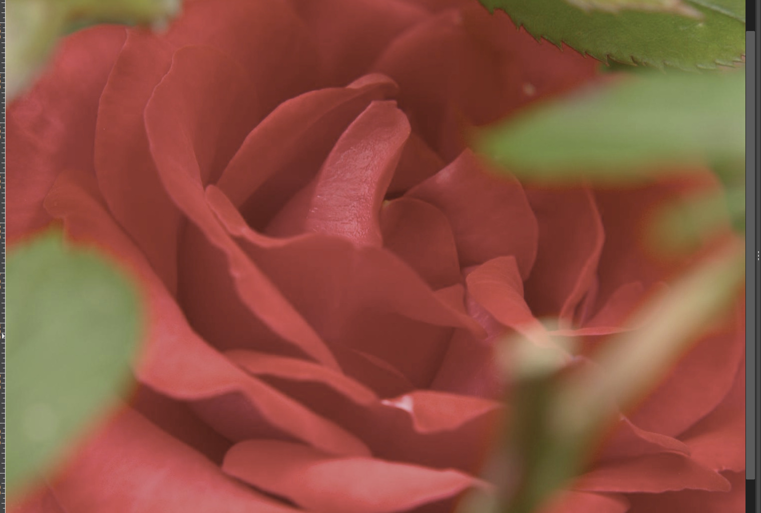
So, here are the results side-by-side (of course, the saturated reds of the rose, when boosted by the curve, are clipped in all 3 of them – maybe I should have chosen another image).
‘Curved’ in Rec2020; via sRGB/sRGB; via sRGB/AdobeRGB:


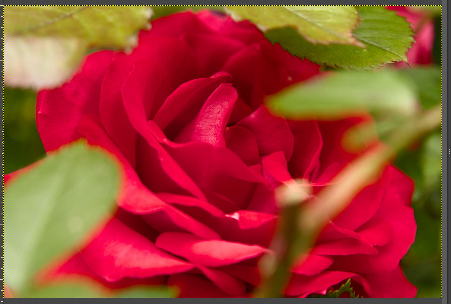
OK, so probably not the best demo image, but maybe you were able to follow the process.
9 Likes
Thanks Kofa.
To check my understanding, is this correct folks? -
The main benefit of AgX is that the tone curve and SOP parameters are applied in a space which has reduced saturation. This means there are fewer issues with colours exceeding gamut. After SOP, saturation can be selectively brought back within the overall AgX process.
Also, I don’t understand why primaries are rotated. I read a bit about this and understand a rotated space uses primaries of different RGB values to the original ones. Why does this make things better?
AP developed a perceptually uniform space which DT uses for some modules. Is this of any value in AgX maybe?
I think not – since you bring back (and resaturate the colours) anyway.
When you partially desaturate them, you introduce ‘crosstalk’ between the channels.
Suppose you start with something like
R: 0.8, G: 0.4, G: 0.1
Desaturation means R decreases, G increases slightly, G increases more (you get closer to grey, where R = G = B). This means, when applying the curve per-channel, the curve will have a more similar effect on all channels. Remember that an S curve tends to reduce small values and increase large values (but increasing already high values by just a bit, mid values quite a lot), increasing colour differences and shifting colours towards those secondaries (the ‘middle’ component starts catching up with the highest). This pushes most colours towards the secondary / complementary colours (orange, magenta, cyan), with sharp primary dividers between them. I’ve started to write an article about this, but currently can only give you these charts – I hope I got my conclusions right:
The ‘N6’ (Notorious 6) look like this:

By messing with the primaries:

Read a lot about this (I did not read the page in its entirety):
2 Likes
Are these brief explanations basically similar to what you are working on?? I guess in terms of Troy mentioning the visual impact of some of the settings??