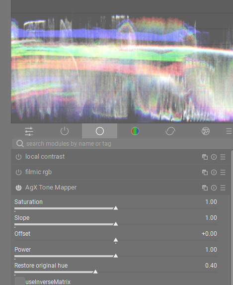
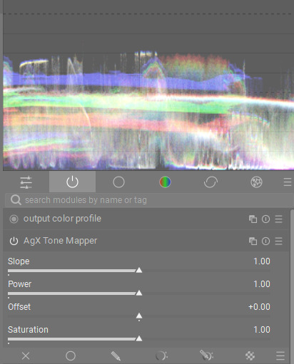
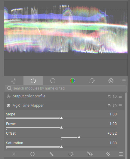
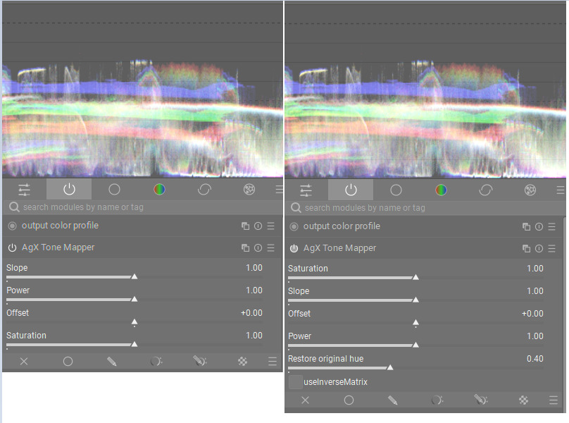
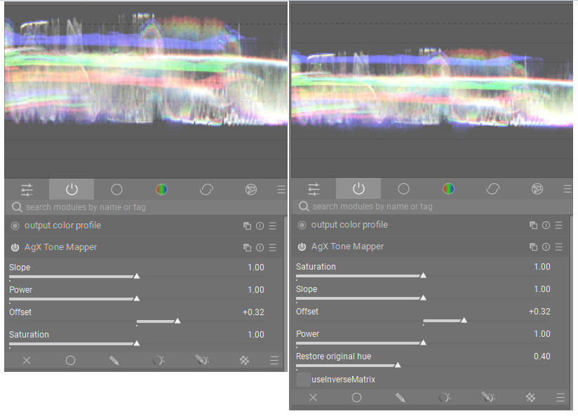
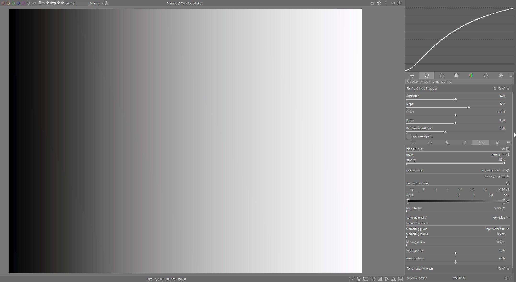
@kofa , I think I know exactly what you are asking. There is a clear difference between the two builds, I can confirm this. I did a lot of experimenting with both builds, and I immediately noticed the difference. @s7habo, on the latest build, if all sliders are set at default, just moving Offset does not really shift the white point.
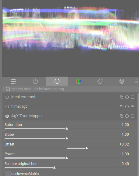
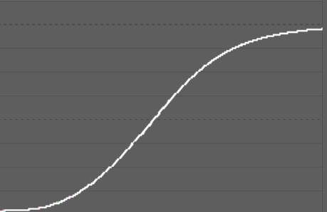
In the previous build, when Power was set to 1.0 (default), Offset would move the whole range in a linear fashion. By checking the waveform, you could see the whole range move up and down without any compression, with both the black point and white point increasing by equal amounts.
To me, this was a huge difference and immediately reduced the dance of the sliders. There is still a bit of back and forth, but not nearly as much.
I guess we need feedback from other people to see if they prefer this new behaviour, but I certainly noticed it.
Edit: I’ve just reinstalled the old build to show the old behaviour with the same screenshots:
No, the calculation of the saturation did not change. Could be a side-effect of the choice of matrix? If you don’t check ‘use inverse matrix’, do you see a change to brightness?
I don’t think anything has changed. The saturation is linked to the contrast. If you have increased the contrast and then increased the saturation, the contrast is additionally increased. I assume this is the perceptual adjustment of the saturation. I find that very pleasant.
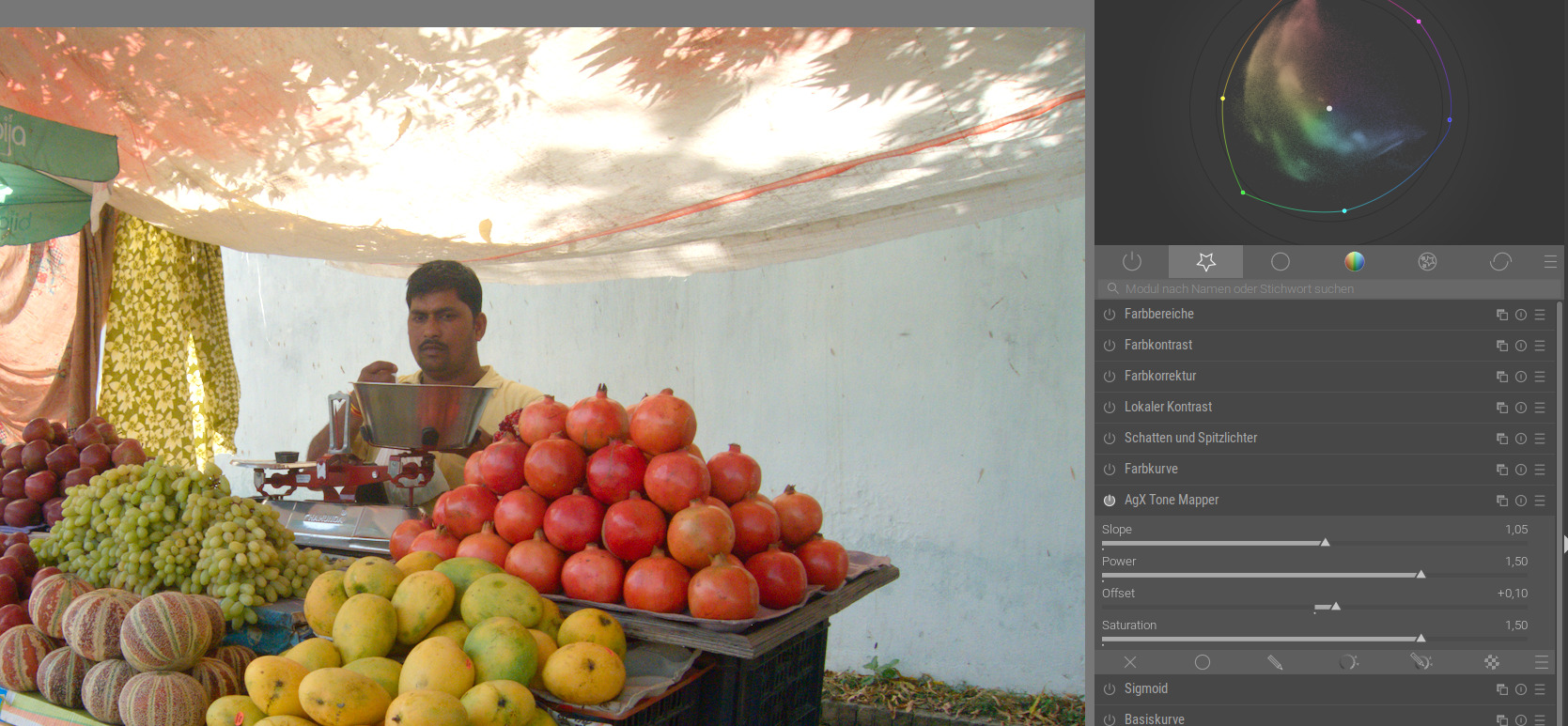
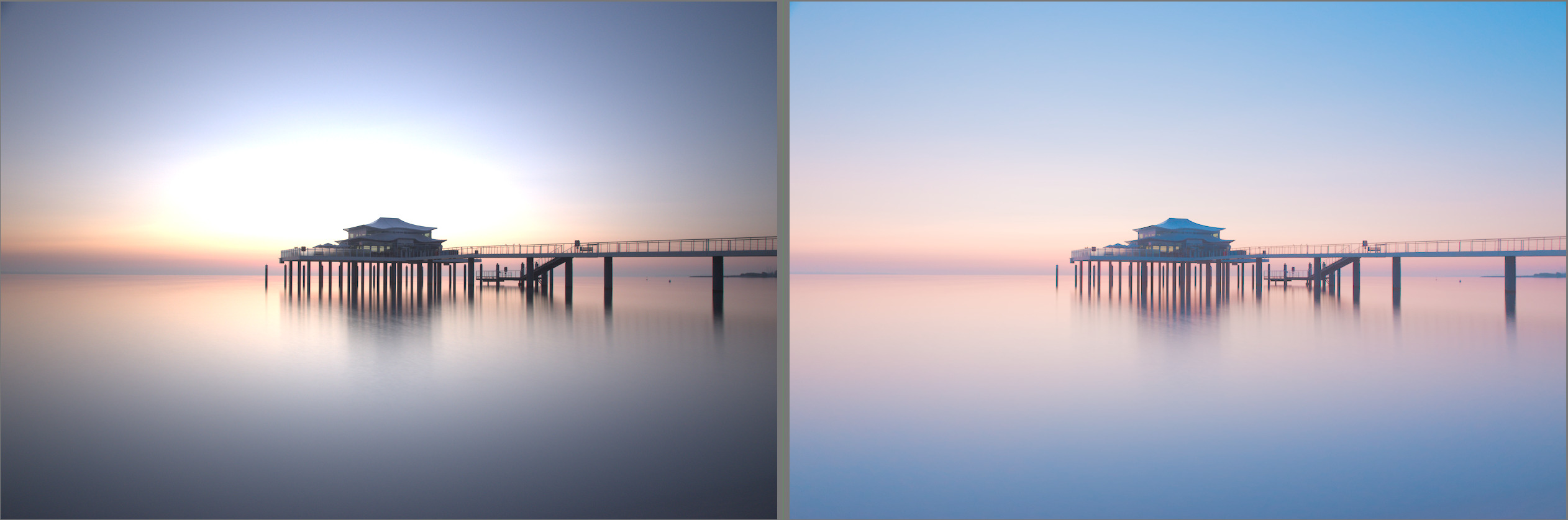
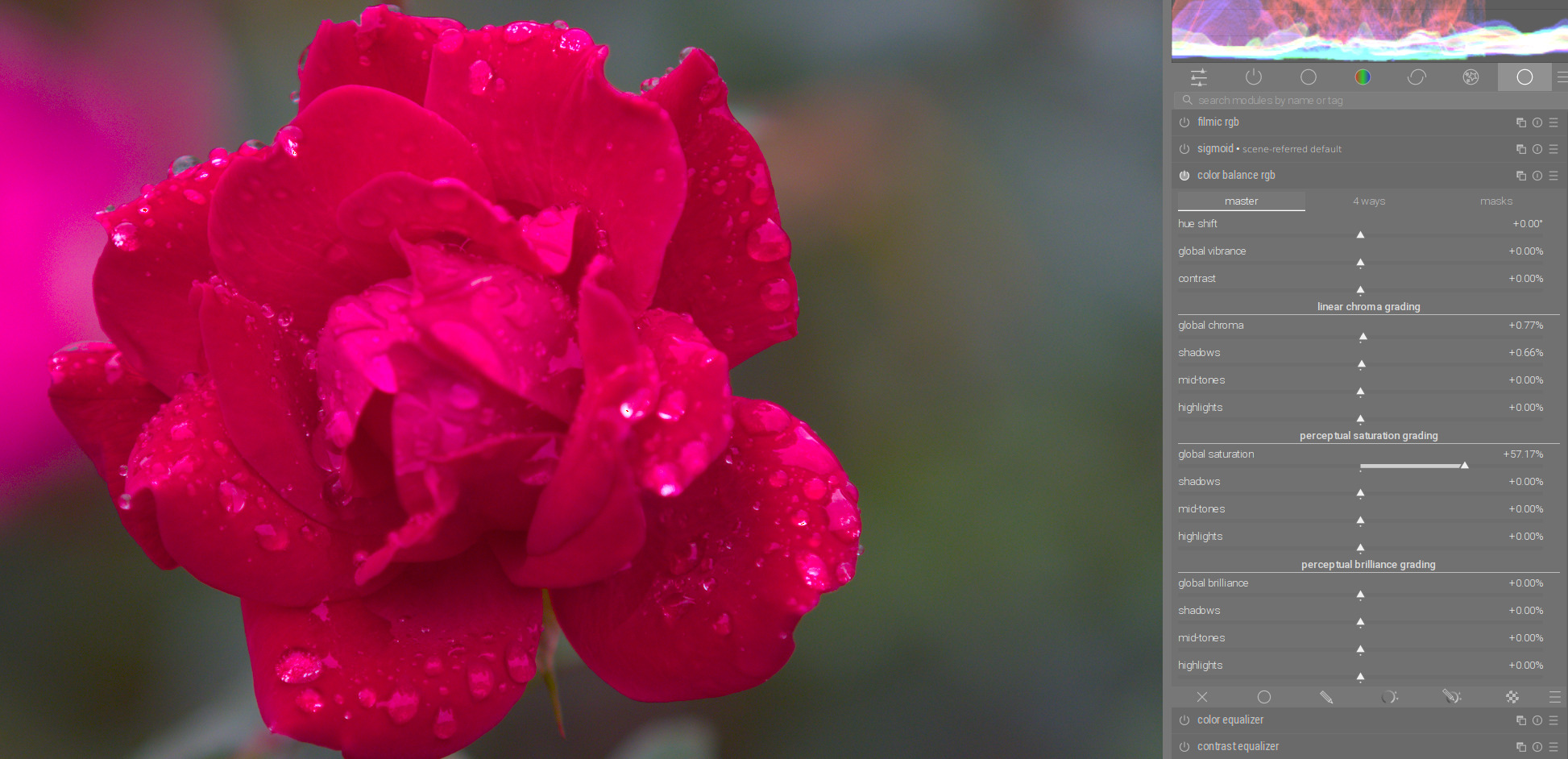
By the way, color rendering is very nice. Here is a scene with pastel colors. I used RGB primaries to rotate the primary colors a bit to get pastel tones. A subtle increase of the contrast with power and increase of the black point with offset give the scene a nice softness:
I understand the theorie, yet I like to have full control.
Just an example. I start with the saturation slider. And then, after I adjusted the rest I find the result very pleasing, but have the feeling that I have chosen the wrong saturation setting. I have the choice to fiddle around in AgX to get the same result or I need a separate module to change satuaration alone. Maybe a checkbox for linking saturation with contrast would be the solution.
Yes, I think so. Now, you can adjust the Slope to set your highlights, and adjusting Offset will not mess with your Slope as much. It can now become much more of a 3-step process:
1: Adjust white point with Slope
2: Adjust black point with Offset
3: Adjust skew of contrast with Power
Power still affects the black point significantly, so it doesn’t eliminate the need to go back and further adjust sliders, but it seems to be easier now. With the previous build, I found there was a lot more readjustment necessary because the sliders significantly affected each other.
With the current build, it’s getting close to being exactly what I would want from a tone mapper. Thanks so much for your work @kofa !
(For reference, this is what my personal ideal is for purely tone adjustments:
1: Adjust white point,
2: Adjust black point
3: Adjust shadows contrast
4: Adjust highlights contrast
Done!)
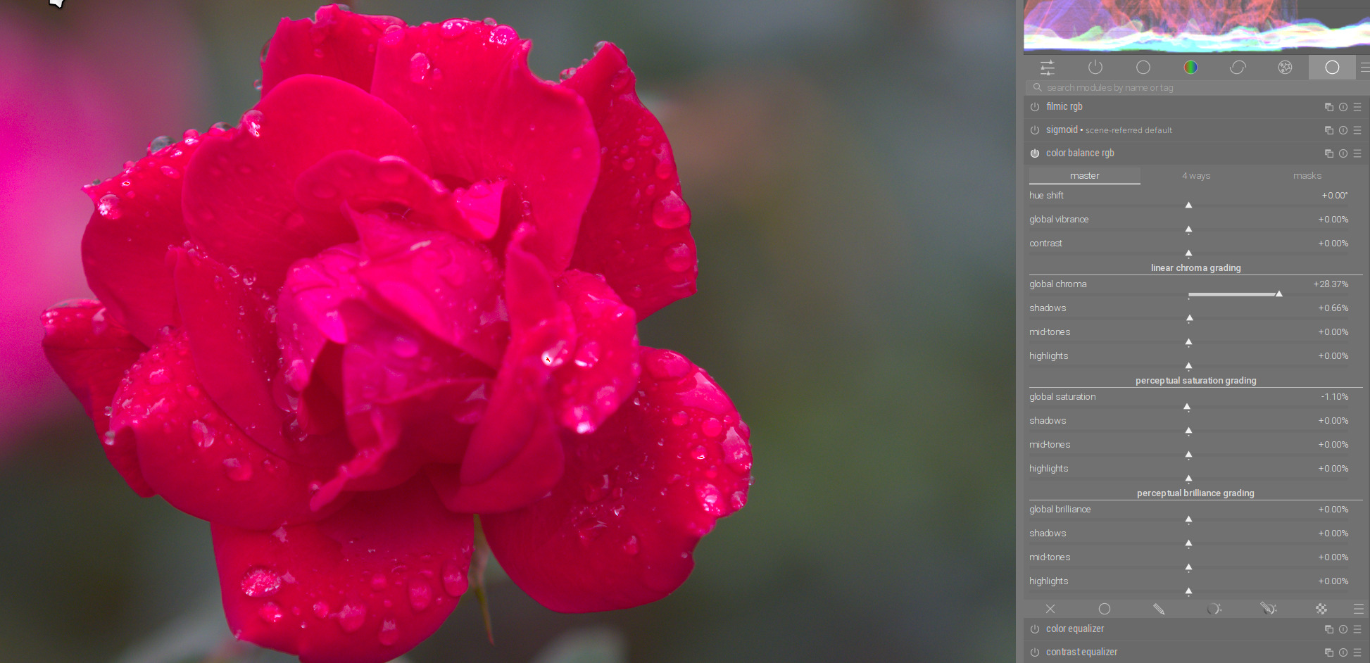
And color balance RGB is perfect for this. So if the saturation is not sufficient or too much, you can also adjust it there. You won’t have any problems with changes in contrast.
The two modules work perfectly together.
I also had this a couple of times because, as you say, you can’t always immediately judge the saturation in AgX. You can do this wonderfully afterwards in Color Balance RGB, especially since you can adjust it even more precisely according to shadows, midtones and highlights.
Exactly. AgX is not intended to be an all-purpose editing tool, but as a tone mapper. I guess sigmoid, with its versatile colour adjustment possibilities, has the edge. Right now, I’d like to understand more about the in/outsetting and rotation process (I think I’m beginning to understand the basics), then we’ll see.
Its interesting and as it says each software can implement things a bit differently but the notion of order of operations here and the introduction of saturation as explained for this application makes it sound like it it added on after the other math is complete…
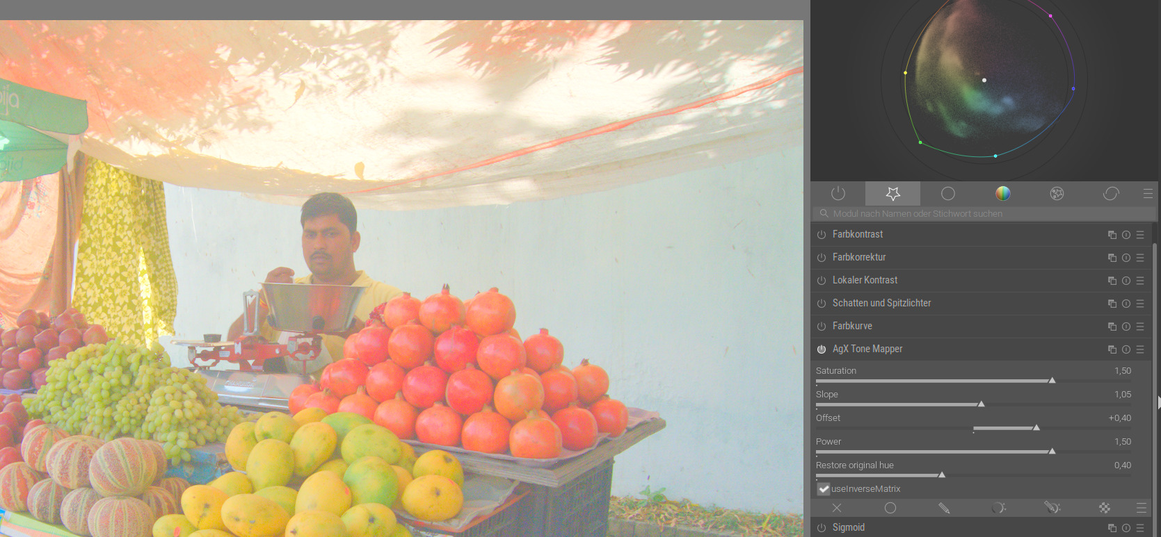
Unfortunately, I don’t think this works particularly well. See how the pomegranates stick out from the surface, like they didn’t belong to the same composition at all? The same happens with the person’s face to a bit less obvious extent.
In that regard, this is the much better one of the pictures.
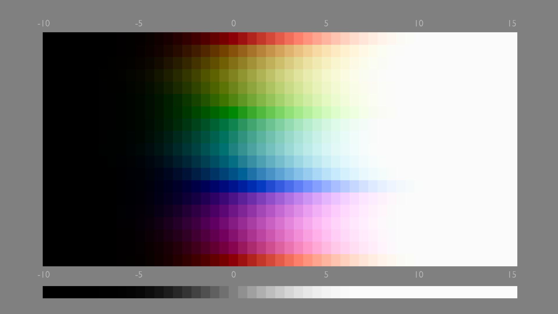
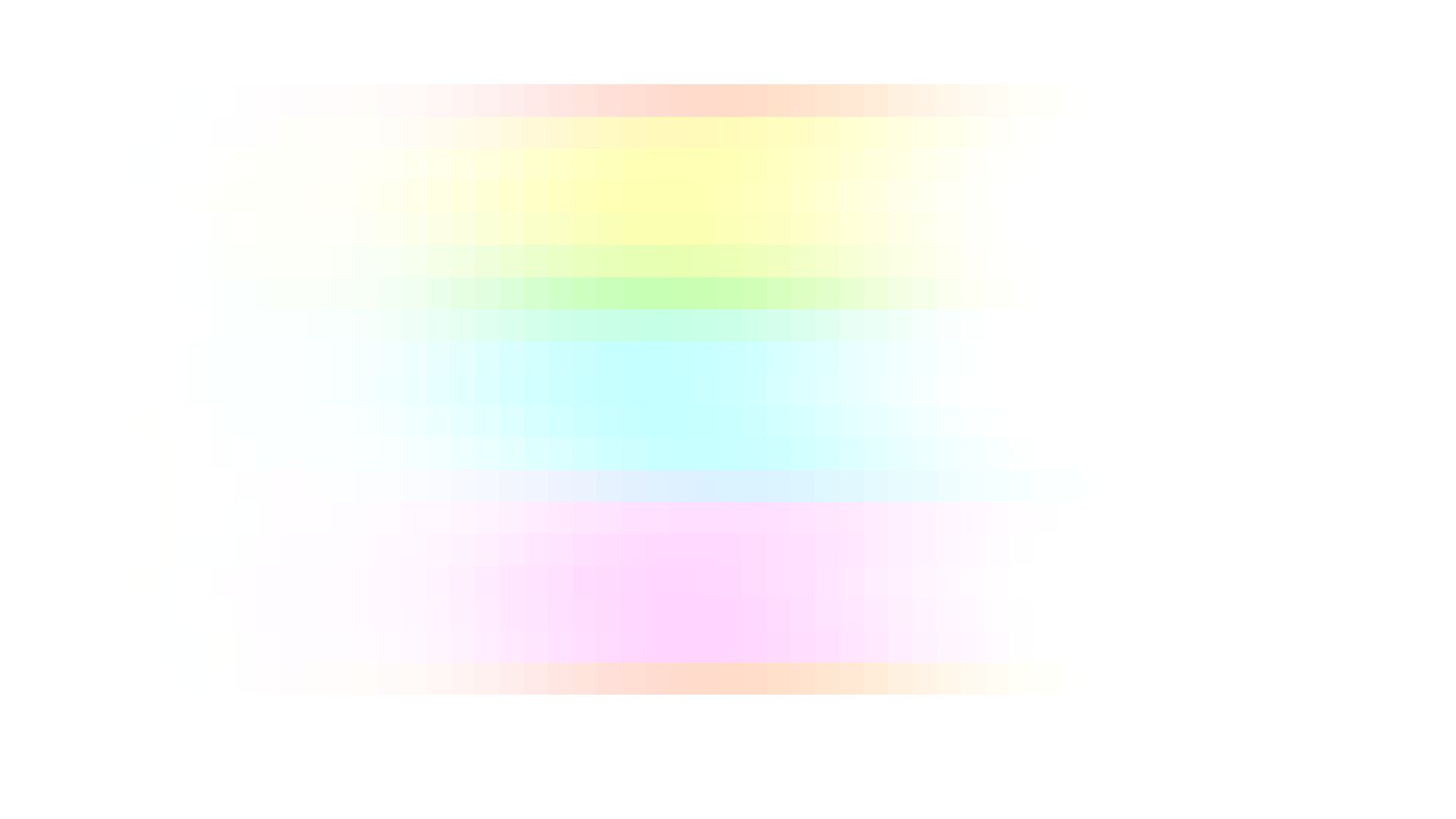
I’m sure this can be avoided by changing the offset algorithm, and it also should be avoided. Also a color sweep reveals that something is off here. With offset = 0:
Of course not. Both are rubbish.
This was just to demonstrate that there was a change in the behaviour of the Offset slider between kofas two appimage versions.
If there is something wrong from the colour mangement side, you are the better one to judge this.
I certainly noticed it was for demo purposes, and my comment was purely that the new version of the offset doesn’t work well. It certainly wasn’t meant toward your edit.
My point is that this kind of a tool should produce sensible results even when the sliders are pushed further than what would be usual. Here, a congitive dissonance is caused that breaks the picture surface. Even when staying in the more usual range, the error is there, just more subtly.
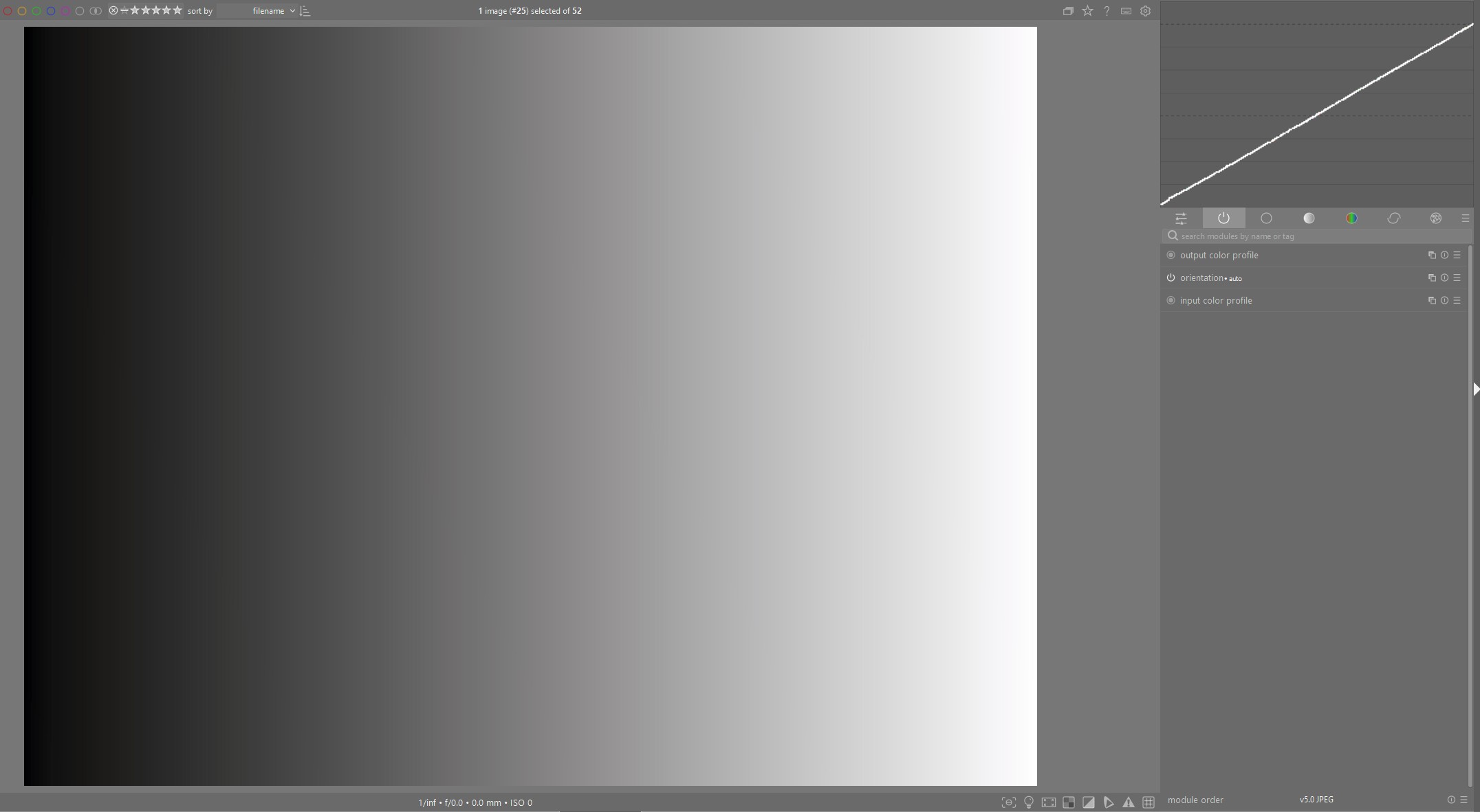
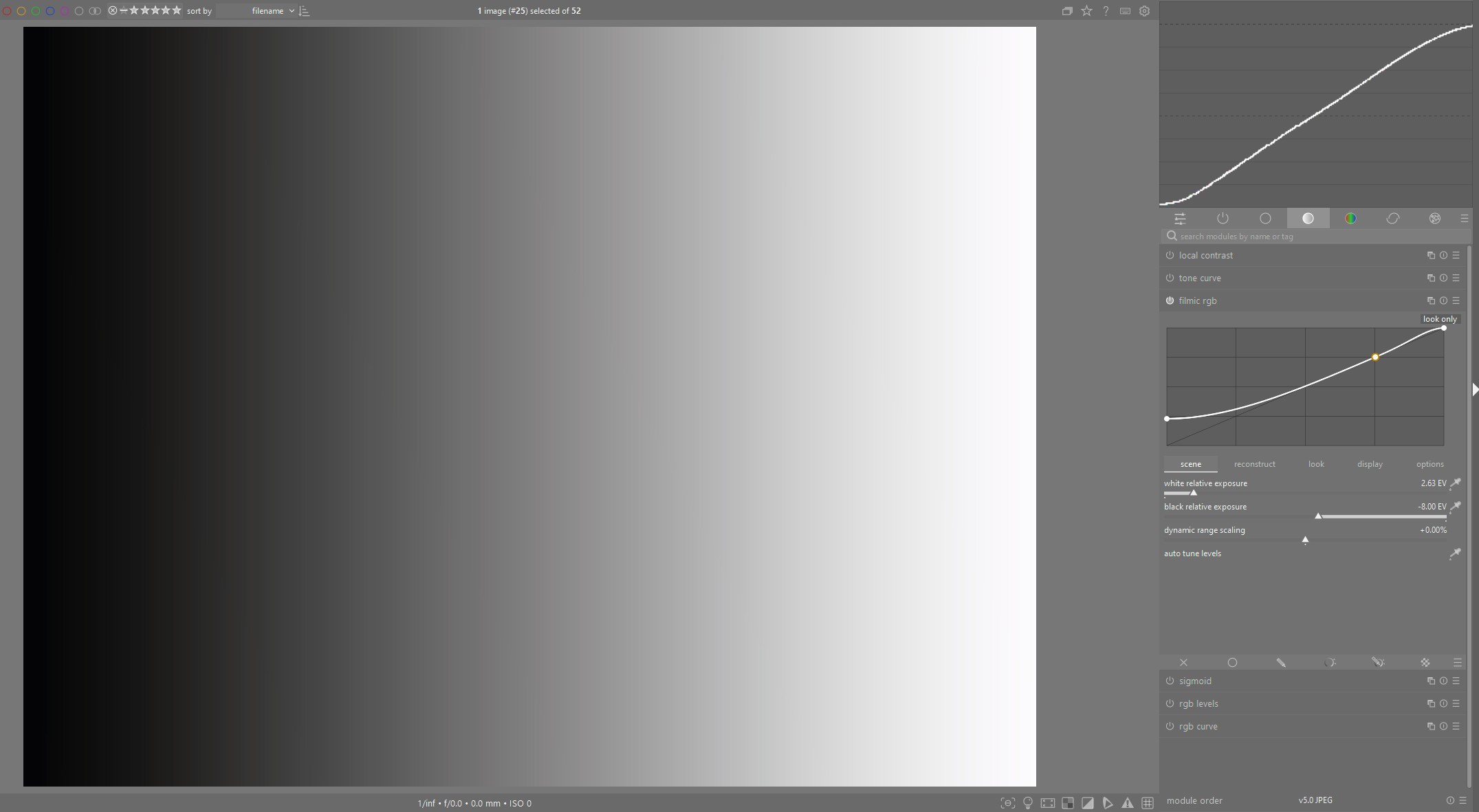
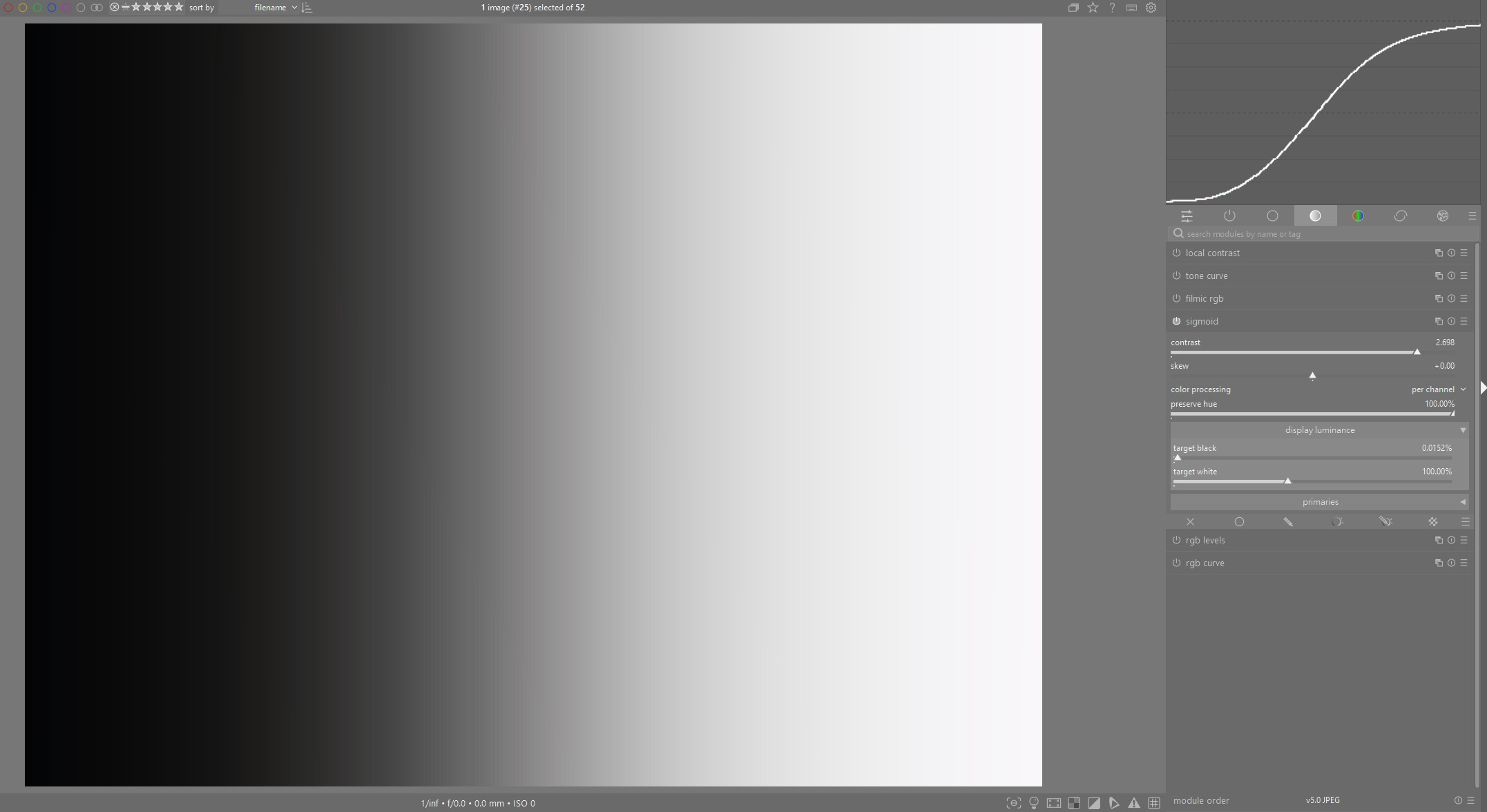
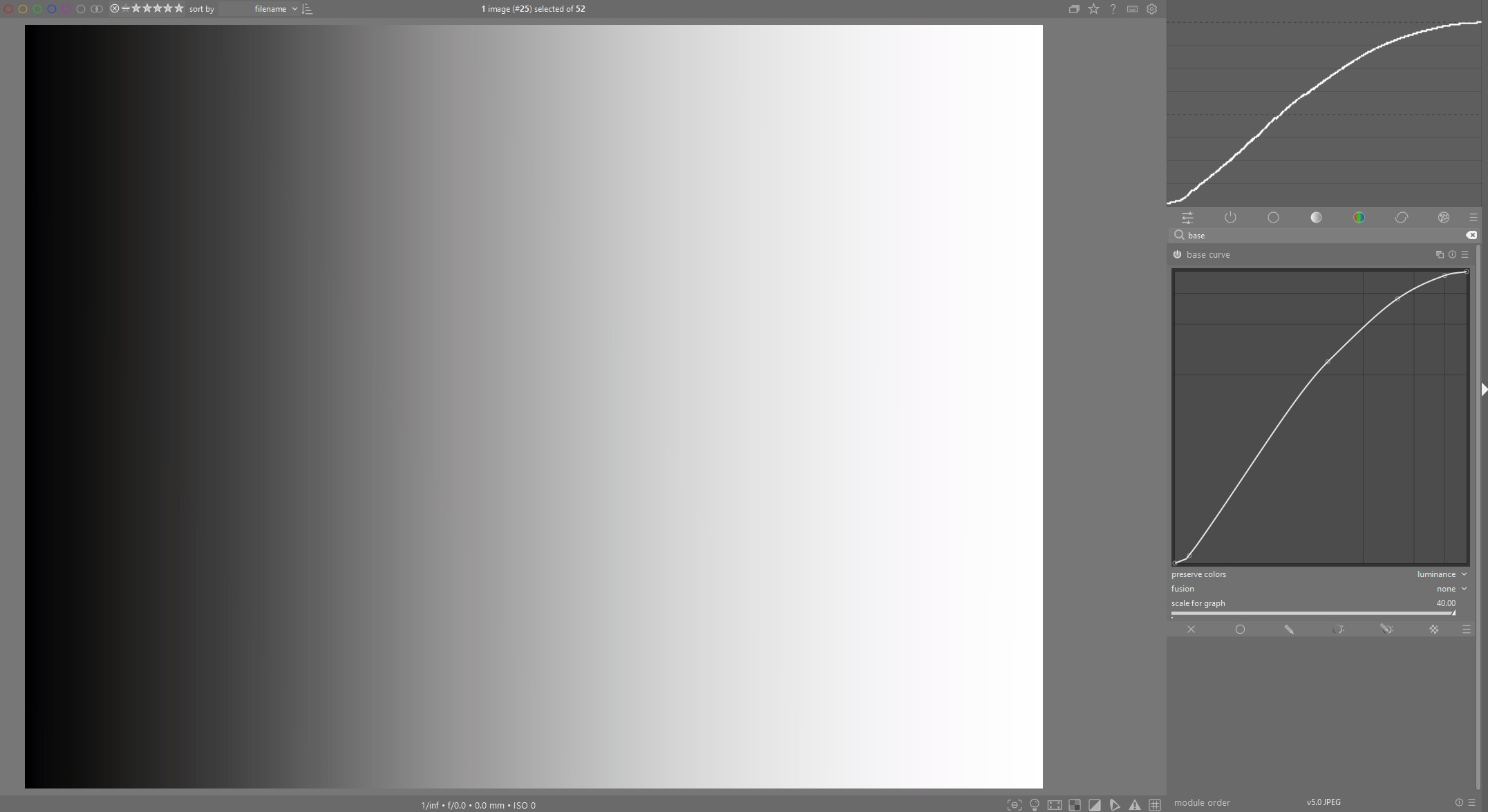
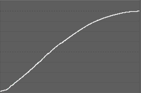
I don’t know if anyone had gotten around to this, but I was curious about the tone curves across the mappers. I created a linear grey scale shown here without any tone mapping and then applied Filmic, Sigmoid, AgX and the basecurve, using defaults and only adjusting for full dynamic range:
I think others had noted that the shape of the AgX curve is pretty close to the classic base curve and doesn’t preserve middle grey, as Filmic and Sigmoid do.