I could show you a picture of them ![]()
2 Likes
I agree. It is the main reason why I don’t like using all these defaults. As mentioned before I like my starting point to be as bare-bones as possible.
Not knowing what the flowers/subject actually looked like does make it harder.
ROFL!
looking at the chart/flowers again it does seem like perhaps the difference in red yellow and orange patches might translate to the flowers. What do you think?
Nice!
Yes, the handling of very chromatic colors is a bit of an unknown. For the patches of the CC24 target (a bit less chromaticity(I think all of those patches are well within sRGB, please correct me if I am wrong EDIT: I was somewhat wrong, see @snibgo 's post)) though I think it’s fair to say that the defaults used here are not particularly reproducing what they should be.
For people not having a CC24 target, the default maybe only for this camera is not colorimetrically ‘good’. I must repeat that for stylized looks this is to be expected. So I am not sure yet what to make of all this, yet.
If I remember correctly, sRGB has a problem with the cyan patch at the end of the third row,
1 Like
I’m trying to understand why I like the colour of the flowers better in the DxO version but prefer the colours of the ColourChecker in the RT version.
I do think that @PhotoPhysicsGuy’s remark about rendering/handling very chromatic colours lies at the base of that. If that is the case then I would definitely choose the way RT applies its defaults.
But the slight contrast difference also plays a roll, at least it does for me.
1 Like
FWIF, RawTherapee provides a dual illuminant custom-made DCP file shot under good conditions for the calibration. So that the CC looks good is a nice confirmation.
2 Likes
Of those three images, which would I prefer as an initial rendering?
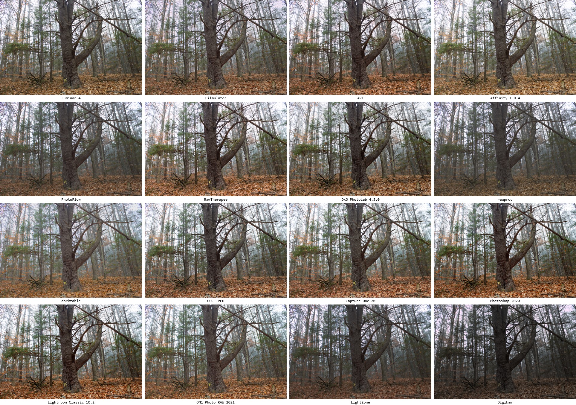
I prefer the tones of the darktable version, but I’m not keen on the colour patches, especially the saturated red and blue in the third row.
The other versions have increased mid-tone contrast at the expense of crushed highlights. This makes the foliage pop, because that doesn’t contain highlights. Of course, the software may have noticed the image has very little highlight areas, so may be deliberately lowering highlight contrast.


Great stuff!
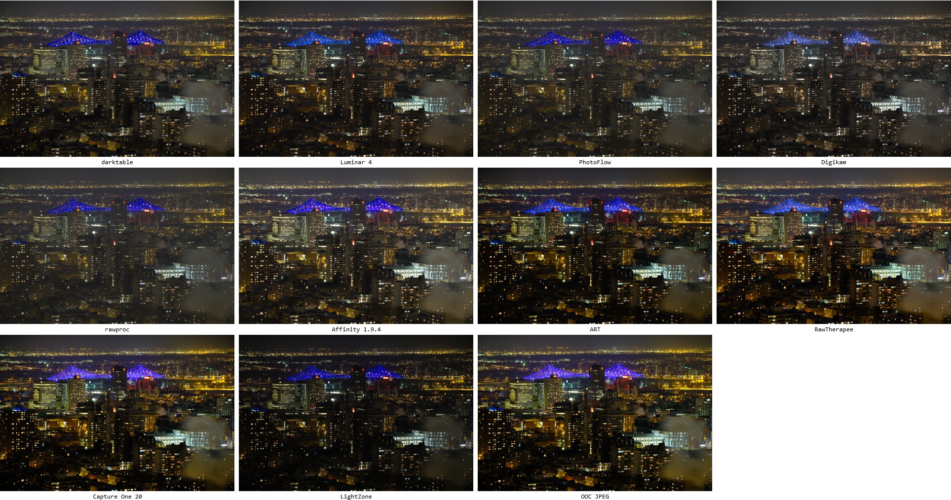
Makes for very interesting comparisons of the tricky files such as the led bridge and the flowers. It also makes it obvious that simple scenes are simpler and less vulnerable to dodgy settings.
@Thanatomanic Next are annotations and region zoomed comparisons. 
Could you make an archive of the sets, so that we can make our own visual and numerical comparisons?
1 Like
Looks to me like the commercial products are a lot more consistent with one another, and when the FOSS comes closer to the top (like the foggy forest or the landscape with the river), it’s because the FOSS ones are all biased one way (usually darker).
One thing to keep in mind is that the contrast of RT/ART will mirror your sooc settings. So there’s no default rendering. If you set your camera to Bright your out of the box RT/ART image will be bright and contrasty. If you set it to Flat it will be flat. High key will shift it, etc, etc.
I shoot with a customized flat setting with my camera so I get a out of the box image that suit’s me. The colour profile will be the dual illuminant auto matched unless I prefer the embedded out of camera dng matrix. So I can get more accurate colours but the contrast curve i set in camera. (the dng matrix is a bit desaturated which I actually quite like)
The stupid thing is that I didn’t fully realize the utility and genius of this despite using it. Two posts in the other thread made me understand it fully.
What it means is that you control important aspects of the default rendering in camera. What you see from those software above is actually what the photographer has chosen. I only considered it a sooc jpeg setting. Not my sooc jpeg setting.
1 Like
If you had them as layers you could turn them off and on in difference or divide blend modes to visualize in another way how each part of the image deviated from the jpg…
I’m assuming the thumbnails are ordered by similarity?
It seems to me that the most different thumbnails are always different because of brightness differences.
I don’t quite know what to make of that. Perhaps one could do another comparison with an L* correction? Add/subtract the mean L* difference before comparison, to mitigate the worst of the brightness difference.
Perhaps that is misguided, though. If we’re comparing defaults, then we shouldn’t mess with the data.
At any rate, this comparison somewhat matches my own results from a few months ago: the default rendering of any of these tools is fine as a starting point. All of them are probably capable of editing most pictures if used well. The differences are in the details, and in UI design, and by and large probably more of a creative choice than a technical one.
Correct
I already calculate the RMS distance in Lab space (so on L, a and b channel), so I think this is already taken into account.
@afre I’ll make the archive available, just have to think what is the best way (lots of big tiff files!).
@priort Good idea for the comparisons, I’ll give it a go in GIMP.
I think blending them might be difficult in some cases since they might not perfectly align. (?)
@Thanatomanic thanks for the amazing work! 
It’s the tone curve. I think tone curves are like opinions, everybody has their own… If you’re looking for science behind the selection of a particular tone curve, I don’t think you’re going to find it. Ha, my opinion… ![]()
4 Likes
Ya I didn’t mean to the pixel just regional visualization
Can you do a similar comparison between beer, wine, milk, vodka, whiskey and rum?
If you assume, the ooc jpg is the best result, then it makes sense to compare the stuff this way - but then why not simply use the in cam jpg processor?
What do you think is the purpose to use a raw processing software instead of ooc jpgs?
That would be a valid point to start a comparison.