It took me quite a long time to figure out that I could add whatever I wanted to the Quick Actions panel!
Some time after that, I more or less abandoned it and now it sits neglected. I should probably remove it (if I can) because it is unused now. I keep going on about the Favourites tab: well, it works for me .
Polish and good UX design takes a lot of focused work. There are kind of subjective which makes it even harder
I quite like these suggestions, though it would require quite a lot of work I assume (showing/hiding controls based on conditions, the workflow preset, built-in actions like “only show controls used for this image”), but it would be really awesome for a lot of use cases.
One additional area I would love to see per parameter granularity, is in creating styles. That is something I miss from lightroom. It would allow you to exclude specific parameters/controls when creating styles. So you could exclude auto-detect controls or controls that almost never stay the same, like the white/black relative exposure sliders in AGX, etc.
It is really quite amazing how subjective UI “prettiness” is
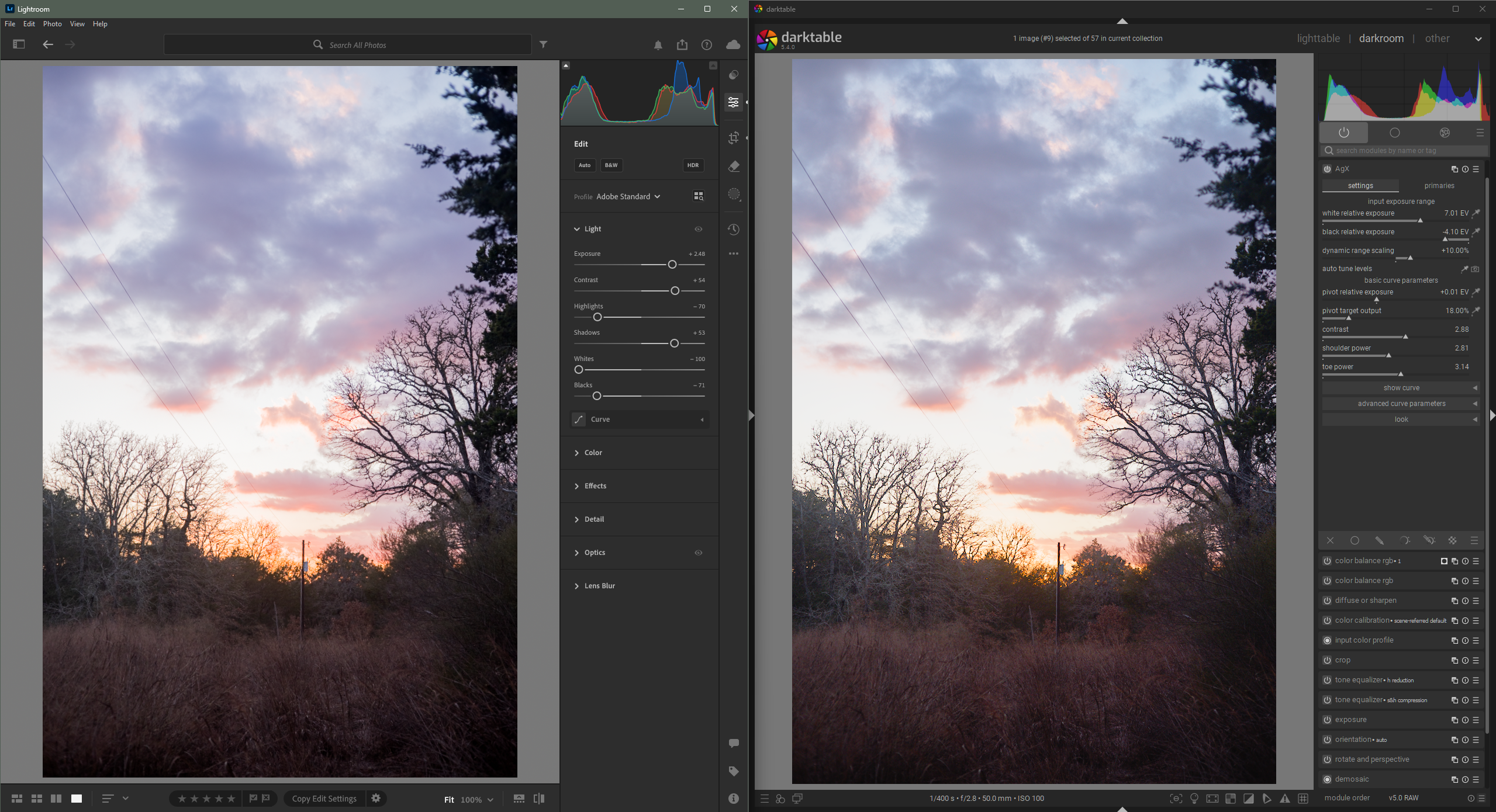
While I don’t think darktable is ugly, it still looks generally dated compared to Lightroom IMO. Not that looking dated is inherently bad. I will share a screenshot to hopefully explain what I am talking about. I only have access to LR CC, not Classic.
My biggest gripe is that darktable lacks vertical spacing between controls. Controls/parameters feel a little cramped. This makes it look more cluttered, which might be one reason the learning curve is steeper in darktable. It is simply harder to find controls when they are closer together (I think that is obvious).
You can see in the above screenshot: the padding around ui elements is generally 2X-3X bigger in Lightroom.
I also think that Lightroom does a little bit better job of utilizing horizontal space. For example, In lightroom, you will see there is a sidebar to the right of the editing controls that is basically the same as the module group tabs darktable has above the editing controls. Generally, vertical space is at a premium, especially with all the modules that darktable makes available, so if darktable adopted the idea of moving the module group tabs/buttons to a sidebar, I think it would help give even more room for an increase in vertical padding.
TLDR: darktable could be improved through slight layout/positioning changes. It is already a marvelous piece of software; let people see it for the majestic creature it is.
This is definitely true, and something that a lot of FOSS projects have been learning over time. KDE used to have almost no margins at all. They have since worked on this and it made their software much easier to use and navigate.
That should be easy to experiment with, with a few CSS tweaks. Though I’d think that vertical space in Darktable is much more expensive, simply because we have so many more sliders.
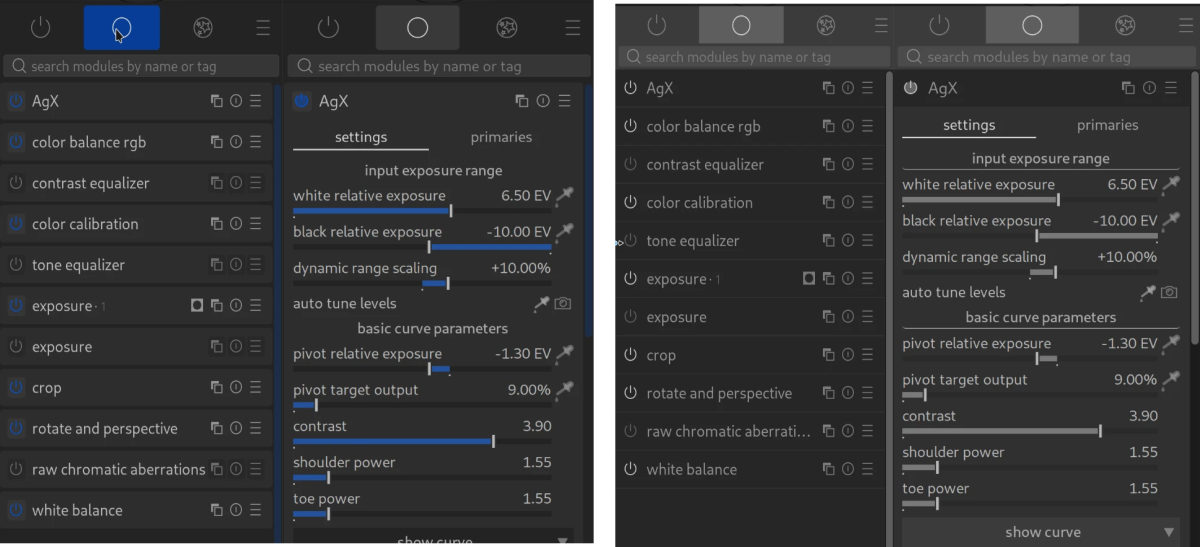
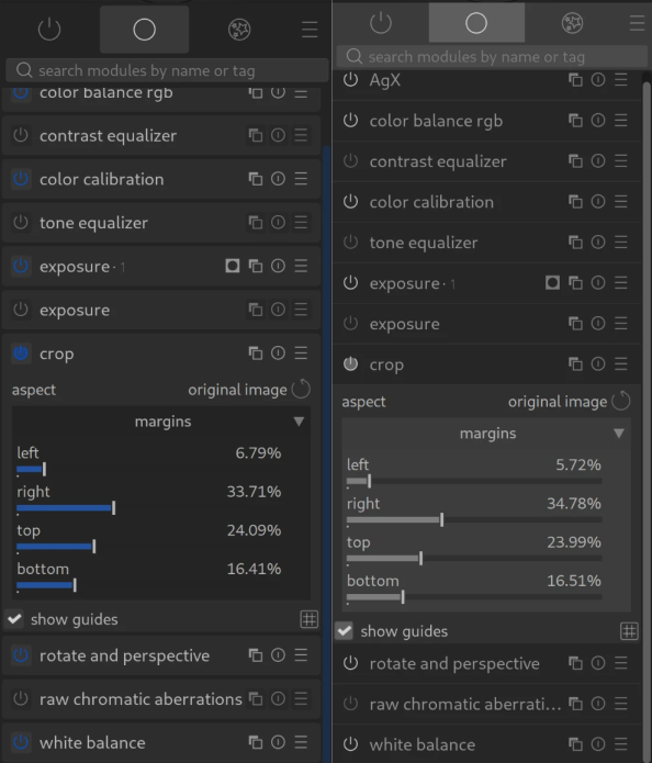
One of the things that might make dt look more cluttered is the set of icons to right of each module name. They also make a wider column necessary to be able to see enough of the module name and label.
They are all necessary. I use them all.
My Big Recent Darktable Discovery
You can hide them. You can make it show when you hover the mouse in that space. This makes the module header easier to read, the whole screen look neater, and you can save a few mm of horizontal space.
It’s in the settings.
In general, I think that, for software that doesn’t have a department working on User Interface, darktable is wonderful. And it may even be better for not having a UI dept, because it is designed and developed by people to do stuff they want to do
They can’t be assigned because they are user definable and stored in presets so the shortcut system has no idea if they exist or not. You can shortcut the presets.
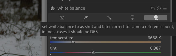
In the scene referred workflow the white balance module is set to “as shot to reference” meaning that it’s set to a reference value and doesn’t try to white balance the image. The white balance module does extract some information from the image and supply it to demosaic, denoise profiled, etc. Otherwise it operates in “bypass” mode and lets color calibration handle the white balance.
If you choose another setting in white balance, then the white balance module tries to white balance the image and color calibration detects that and warns the user that they are trying to white balance the image in 2 places.
Regarding white balance: Are there any settings that are useful in the scene-referred workflow?
If there is only one useful setting, then perhaps it could be “locked” and the symbol changed to a filled circle + circle? Just like other essential modules?
I’ve heard that in certain cases users have gotten better results (or results that they preferred) using the white balance module and turning off the color calibration module.
It’s a niche use case but for IR photography being able to adjust the white balance module can be important. Depending on the IR filter, sometimes there is no “white” in the image and neither the camera nor software really knows how to deal with it, so you have to deal with it yourself as a sort of “best guess”. I can’t profess to be an expert on the “why” of it, but using the white balance module can get different / better results than just using the color calibration module.
The “as shot to reference” setting does apply a white balance, but it does so automatically using values derived (I believe) from the metadata.
Then demosaic, profiled denoise, etc. are applied, and right before the input color profile this first white balance is “undone” or “reversed,” so that the data entering the input color profile appears to the modules as if white balance were set to 6500 K.
This way, demosaic, profiled denoise, and especially highlight reconstruction can work “properly” when the illumination is something other than 6500 K, while the input color profile still receives the white point it expects.
The problem is that there is no way to set this manually. If the metadata is wrong, for example, highlight reconstruction does not work properly.
Highlight reconstruction (as well as demosaic and denoise) needs to know what “white” is in the image—for example, to correctly reconstruct luminance.
This works fine as long as white balance is 6500 K. In that case, you can set white balance to “camera reference point.”
However, if the illumination is not 6500 K, a white balance must be applied for highlight reconstruction to work properly.
At the same time, color calibration (and possibly the input color profile) does not work correctly if white balance is set to something other than the camera reference point (usually 6500 K).
To work around this, an initial white balance is applied automatically and later silently unapplied before color calibration. This is what the following refers to:
The problem is that this only works with “as shot” white balance.
Sometimes there are highlights in an image that are not the same color temperature as the overall scene, or a scene may contain multiple illuminants with different color temperatures.
Therefore, it can be important to be able to set white balance manually, or via a color picker, and still activate the “later convert back to D65 reference temperature” option.
This is why I suggest making “later convert back to D65 reference temperature” an external module, or an option in a module that actually comes later in the pipeline.
Yes very much this. My IR conversion is ~580 nM, there are no real colors in there even though it is a color image. In that case I only use color calibration to do the channel swap and WB to give a bit of control to the color.
I went back and read the manual again, since it had been awhile, and there is a note included with as shot to reference
“Please note that, in a few cases, the coefficients reported by the camera for ‘as shot’ are bad so you might prefer camera reference for those cameras.”
The second is
color calibration still works and is usable when white balance is not set to as shot to reference or camera reference. You get the error because you “shouldn’t” be trying to white balance with 2 separate modules at the same time, but there might be instances where you need to, such as different light sources in different parts of the image.