Thanks for this. Nice explanation and examples.
1 Like


8 Likes


I read your article which I think was good and informative as you addressed some topics in dt that is not so often discussed here, I think.
2 Likes

I’ve also added a list of modules to this page, so you can browse all of the tutorials that cover a specific module:

2 Likes
This one is close to home for me. I like to shoot a fair amount of flora and getting the green right is frequently a struggle for me. I aim for a healthy pastel green but I wind up with something too blue or - even worse - sickly yellow green. Saturation is another issue as well. I’ll look at your post in more detail later today and maybe it’ll give me some pointers for the future.
I’ve used similar tricks on some of my photos but one thing I never really tried is using color equalizer to de-saturate the background. I’ll give it a shot on some more problematic photos!
1 Like
I struggle with this too. In the “purple” flower photo, I’m not sure if either the “before” or “after” green is exactly the hue I want, but I settled on those values for this image for demonstrating the color harmony
The purple flower is a good example of what I encounter with my own photos. I understand your point is to demonstrate the color harmony of the warmer green, but I think I like the cooler version as well. But frankly, neither of them work particularly well for me. It might also be a case where the overall background color is too uniform and busy so it competes with the plant.
Maybe using diffuse or sharpen with the bloom preset and desaturating the greens with color equalizer is better:
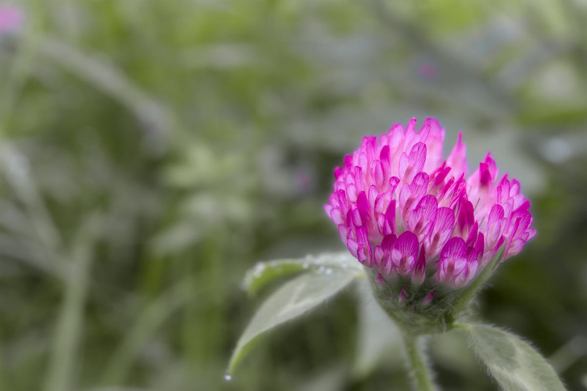
As you said, it’s often tricky to find the right balance
3 Likes