@priort Could you please explain why you prefer Rec2020 over ProPhotoRGB?
Seems to be that ProPhotoRGB has a wider gamut (and is the default in Adobe Lightroom). Is that that a better option for archiving photos?
Thanks!
@priort Could you please explain why you prefer Rec2020 over ProPhotoRGB?
Seems to be that ProPhotoRGB has a wider gamut (and is the default in Adobe Lightroom). Is that that a better option for archiving photos?
Thanks!
I’m not in front of my computer but did you import that profile into the color out directory,…I thought DT only had linear prophoto profile by default.
Stupid question do you have it specified implicitly in both DT and Gimp…If not just to be sure I would rather than use system as your setting and assume the you have the system using you display cal profile and each program is set properly…
I read this some time ago…seemed like a decent overview…
Which colorspace should you use for photography? - Greg Benz Photography Which colorspace should you use for photography? - Greg Benz Photography
Yes, I added profiles from Elle Stone into the DT “out” folder. And yes, both DT and GIMP explicitly use the same monitor profile, which is also set as the system default.
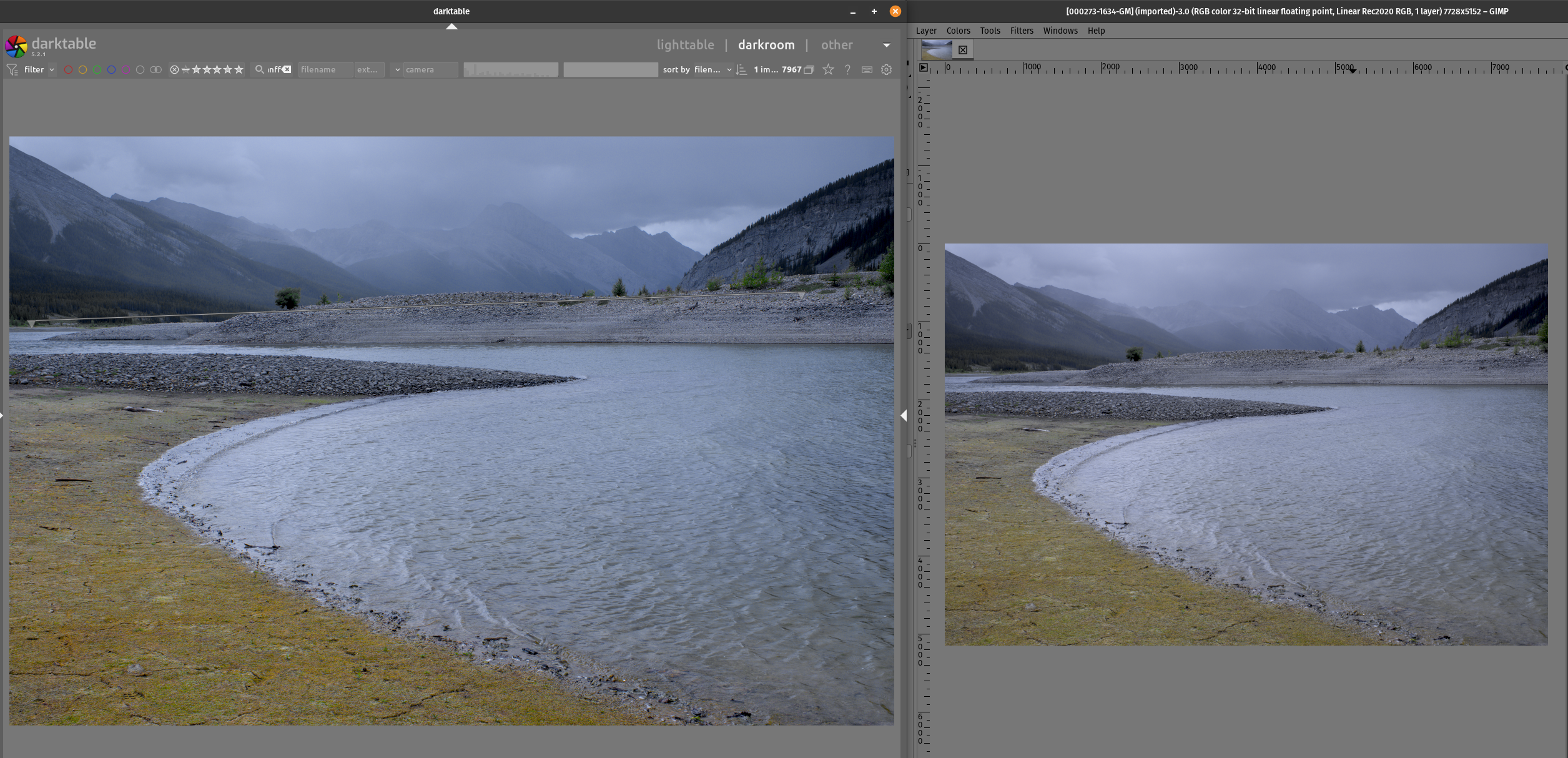
Here’s what I see: Darktable at left, GIMP at right. Following up on what was discussed yesterday and today, I am now using the GIMP v3.0.4 flatpak (better support for non sRGB profiles) and I exported the TIFF as 32bit float linear Rec2020.
As you can see the yellow orange at bottom left is different from one application to the other. Close, but noticeably different.
I’ll look when I get home…thanks for spelling out your setup…Are you comparing the edit in DT to the tiff loaded in Gimp. If so what does the Tiff look like in each when you compare and if the former do things change when you switch preview modes in DT to HQ mode??
As you can see in the screen capture I posted above, both applications are set side by side on the same (higher quality / P3 display) monitor in my dual monitor setup. Enabling HQ mode in DT makes no difference.
It often will change the preview image…just trying to test all possible options…if DorS or dehaze is used then often there is a considerable change in the image between the modes….
Referring to the 1931 CIE xyY chromaticity diagram, some ProPhoto chromaticities are out-of-gamut; they are outside of the horse-shoe boundary and are not colors.
On the other hand, all of the Rec.2020 xy coordinates are inside or on the boundary.
Based on that difference, there may or may not be adverse consequences when transforming an image to display-referred.
Going to extremes, how would a ProPhoto image consisting of only the ProPhoto primaries (for example, the classic Venn diagram) look when transformed to a display-referred sRGB image “for the web”?
You might find this worth a look:
There is a misunderstanding - I use the monitor manufacturer’s profile as-delivered … always have.
Oops, see below.
![]() a NP I just noticed it in your GIMP screen shot…I was curious…
a NP I just noticed it in your GIMP screen shot…I was curious…![]()
Eek !! I have a vague memory of trying a V4 profile to get a true perceptual rendering as opposed to relative colorimetric that comes with display-type V2 matrix profiles. Thanks for the heads-up!
I linked Greg’s post but I also recall Elle discussing this and we also had a similar discussion recently I think in the last few months here about default colorspaces and the like where some thoughts were shared…anyway here where she talks about her profiles and the relative merits or limitations
That I think the OP is using these actual profiles…
In her comments Elle refers to a study or some experiments comparing the mathematical accuracy vs spectral data for various colorspaces…
Some of the findings were summarized here…
Prophoto ranked lower than some others…not to say this one examination is definitive but she used the reference to make a point in any case.
But the statements in her section on using Prophoto … esp the last line probably sum it up…
Quoting Elle Stone…
The ProPhotoRGB primaries are hard-coded into Adobe products such as Lightroom and the Dng-DCP camera “profiles”. However, other than being large enough to hold a lot of colors, ProPhotoRGB has no particular merit as an RGB working space. Personally I recommend the Rec.2020 or ACEScg profiles over ProPhotoRGB. But if you have an already well-established workflow using ProPhotoRGB, you might find a shift to another RGB working space a little odd, at least at first, and so you have to weight the pros and cons of changing your workflow.
If you use that profile in ART as your output profile …at least because of the pipeline ART uses it gives the full functionality for viewing…you will see that changing the rendering intent and black point compensation will change as you might expect in the preview…
I’d have to check but I don’t think it works completely in RT and the pipeline for display is different so you don’t see it like that in DT …you might be able to use it as the softproofing profile and get DT to show rendering intents…I forget but it works nicely in ART
Thanks for the Elle Stone links, I’ve been there, referred there many times and even chatted a couple times.
As to my monitor profile in the GIMP, I’ll probably set it back to the manufacturer’s sometime.
As a decade-long Lightroom user my workflow has always been ProPhotoRGB-centric. I am now about nine months into my FOSS photography journey, and in the last two days I have discovered Rec2020. (Thanks folks!)
I am a bit bewildered as to where the colour bug is in my workflow. I can only assume it is in my settings. My thirty years worth of macOS experience is suddenly worth next to nil, and I can’t seem to pinpoint what might be off.
My last Mac OS was 9.0 and it is now dead-in-the-shed, so no McHelp from me, sorry.
In switching to Linux, this is my only bug!
Forgive me if asked and answered…
In DT you have 2 potential comparisions…
The DT edit preview to the preview of the TIFF export in GIMP
and
The Tiff export imported and previewed in DT and compared against that same file in GIMP and
maybe a third …the edit in DT vs the TIFF imported back into DT… so looking for differences within DT…
Do all of these show the difference …ie within and between or just one??
Again if you feel you have answered this tell me to go back and read…
![]()
Also if you can share this file or if its not able to be shared one that you can that shows this on your end with the xmp then others try to replicate and comment…
I hope that I am understanding you correctly as well.
My comparison setup is: processed raw file in darktable in the editor window (ie “what I want”) comparing to the exported tiff opened in GIMP and displaying slightly off color and contrast (which should display what I want but doesn’t).
Here are the raw file, XMP and TIFF (300mb): 000273-1634.zip