Like that one with the green back ground and the curves.
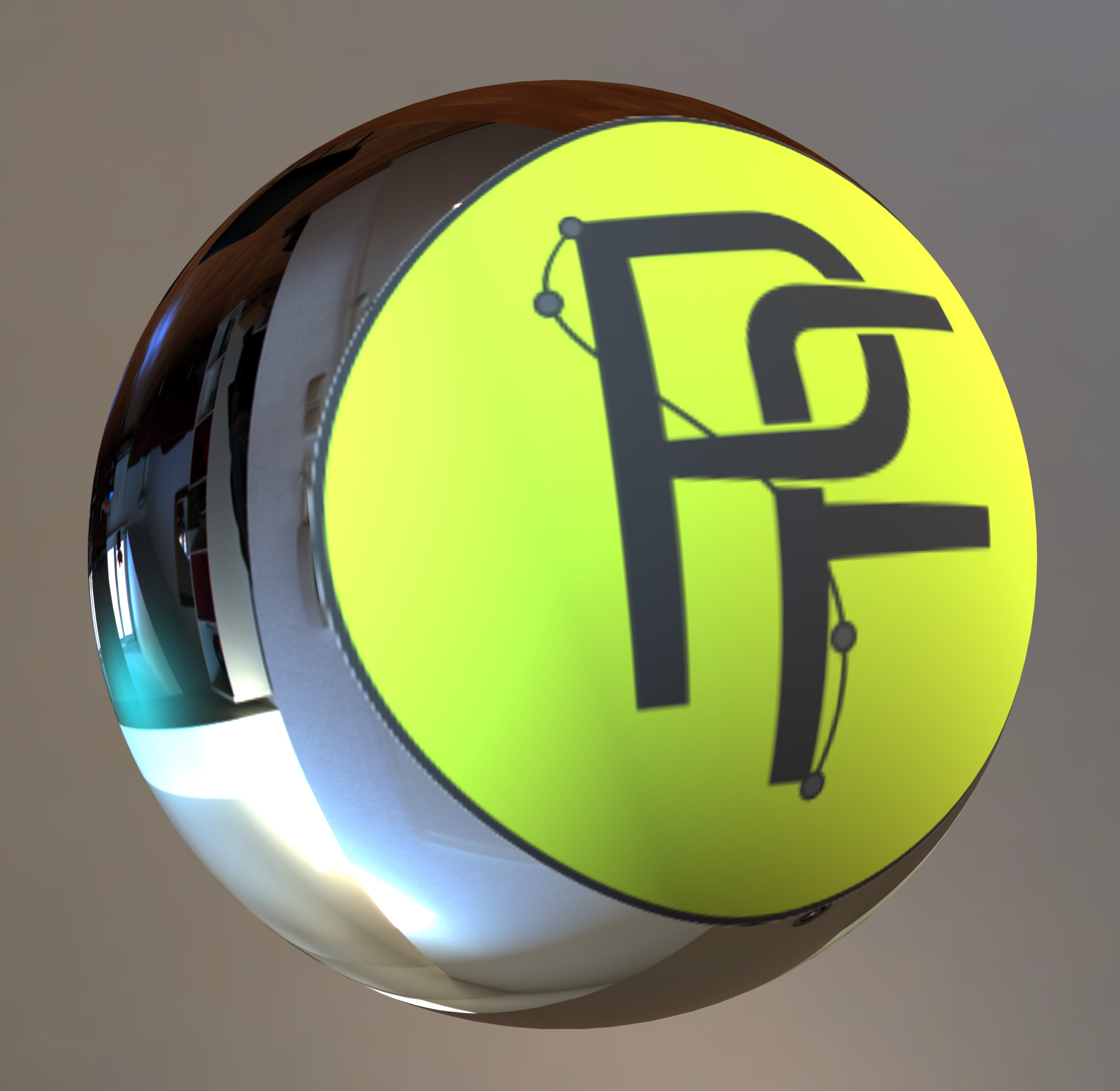
I would like the yellow one if it would be a PF and not a P7
1 Like
@paperdigits @HIRAM Thanks! It’s still a little rough, but I think I’m finding myself inclined toward that one, too.
@heckflosse Nobody reads cursive anymore!
I’m in tune with the approach of @MLC, I like especially the green one.
Evolving the idea of @Dariusz_Duma, I propose something minimal like this:

![]()
I think it is pretty readable also when very small.
What do you think?
The gears symbolize “workflow/editing” and the aperture blades symbolize “photography”.
Colors are completely exchangable. 
1 Like
Would Larson agree with text in icons?

Andrea I think your sample is wonderful and you’ve clearly developed a real skill in this area. However in my opinion the mechanical gear metaphor for work flow is so overused these days it’s become a stale visual cliche. How about another visual metaphor for flow from the natural world, e.g. a feather, a body of water, or something abstract that builds on the tear drop shape you’ve got going there?
1 Like
Those are for the moment my favorite ones:


The one from @arctic has the merit of being very schematic and also with a non-round shape that helps to distinguish it from others.
The yellow one from @MLC gives in turn better the idea of a photography-related application, and the green one is the most visually simple (although I’m not sure that the line and nodes really give the idea of a curve, if that was the goal…).
Personally I’ve been trying in different ways to give the idea of the flow from the camera to the finished image, without arriving at anything that was nice and simple enough for an icon.
This is a very rough attempt, just to put some more ideas on the table:


This one is cute.
Suggestion for suggestion Dariusz Duma.

@arctic your design is lovely. I particularly like your choice of color and the subtle gradient. You clearly have mad Inkscape skills( I’m having to brush up as I go along…meh). However, I must concur with @damonlynch in regards to the gears and believe his suggestions have merit. Although, I fear a feather may be too reminiscent of the Ps CS2 logo.
@damonlynch What would Larson do? Personally speaking, I don’t see that using text in icons is really an issue. You certainly wouldn’t want to use whole words, but truth be told, the most important thing an icon has to be is, well, iconic. And a strong font-face can be a very good way of achieving that. Many of the most iconic applications in the world employ text, e.g. Linkden, Google +, Blogger, WordPress.com, Pinterest, the list goes on and on. This is, of course, not to say that one has to use text, or that there are indeed no caveats in using it. Only that it shouldn’t be completely discounted.
@Carmelo_DrRaw Yeah, that was supposed to evoke a curve, but you’re right, as it stands it’s a little confusing and unbalanced. I get what you’re saying with your example, but there’s a lot going on there and I simply can see no way of incorporating all of those elements into one cohesive design. That certainly doesn’t mean that someone else can’t, mind you. I’m just not that good.
All that being said, here is something else to hopefully get the creative juices flowing:

Maybe if the arrows were more reminiscent of water?
I just thought of this but don’t have the time nor skill, but what about a river coming out of the camera’s lens?
I tryed to draw few other ideas using the same orange background of my previous icon.
I wanted to stay focused on the concept of @Carmelo_DrRaw.


Probably the PC is too generic, but I quite like the second one. The idea was to match the water flowing from the camera and the water in the stylized photo of the screen.
@paperdigits Not exactly a river… rather a camera just recovered from the bottom of a pool leaking liquid. 
The “leakage” is very hard to see at small size, but I like it.
Again, I love the colors. It’s a tad too literal which translates to generic.
Here are a few more ideas I was tossing around:


I’d actually ditch the computer and make the camera larger!
After this new round of ideas, I personally have four preferred ones:
@Dariusz_Duma: a classic one but really nice! I’m just afraid that it does not differ enough from all other iris-based icons:

@arctic: I think the last version is cleaner:
@MLC: I really like the second and last attempts:
Maybe they could be merged? Here is a very rough attempt to do that:

I really see a lot of neat things, thanks you all!
I strongly suggest checking which ever you like at the smallest size that it will be used at- The “F” on the waterdrop design is indistinct at 32x32
3 Likes


1 Like
![]()
I can tell it’s an “F”, but that may be because I’ve been messing with it for awhile.
Can you change the colors? Make the diaphragm dark colored? It looks like a plain surface in the small size.