Thanks, Matt. Most helpful. I already knew that white border for color assesment but I was not aware that the grey background was a proper “mid gray”.
I understand the concept but I have tried this a bit and it doesn’t leave me confident that I am matching that tone at all…I mean perhaps as a rough guide. If I was comparing a monochrome image fine but in color images my brain does not connect the dots as it should I guess…
@Matt_Maguire Is that not the point of adding or subtracting exposure, ie to get part of your image into middle gray tones that you feel should be middle gray or have middle gray properly exposed?? Maybe those aren’t the same things?? Filmic unless you enable the middle gray control as you says uses a value or 18.45 for a central point and then the black and white are reeled in by adding EV to define the dynamic range mapping is that not correct?? Aren’t you defining what it uses or maps to 18.45 by adding or subtracting exposure… I guess you are saying that the middle gray going in to filmic is not changed just the mapping of black and white on either side so it won’t matter for the middle grey area shown in the zone map just how the other zones will shift after filmic black and white ev settings are applied ??
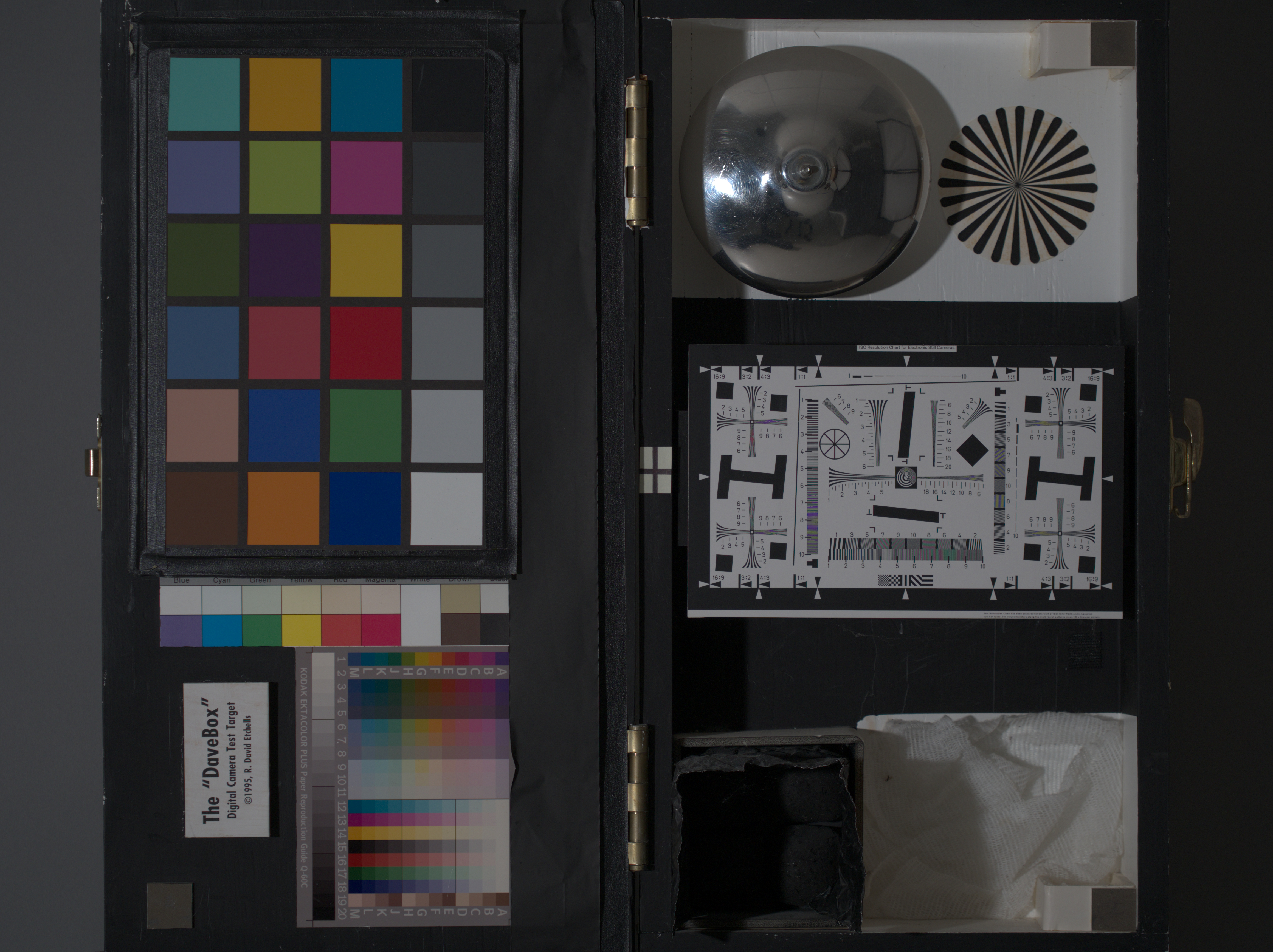
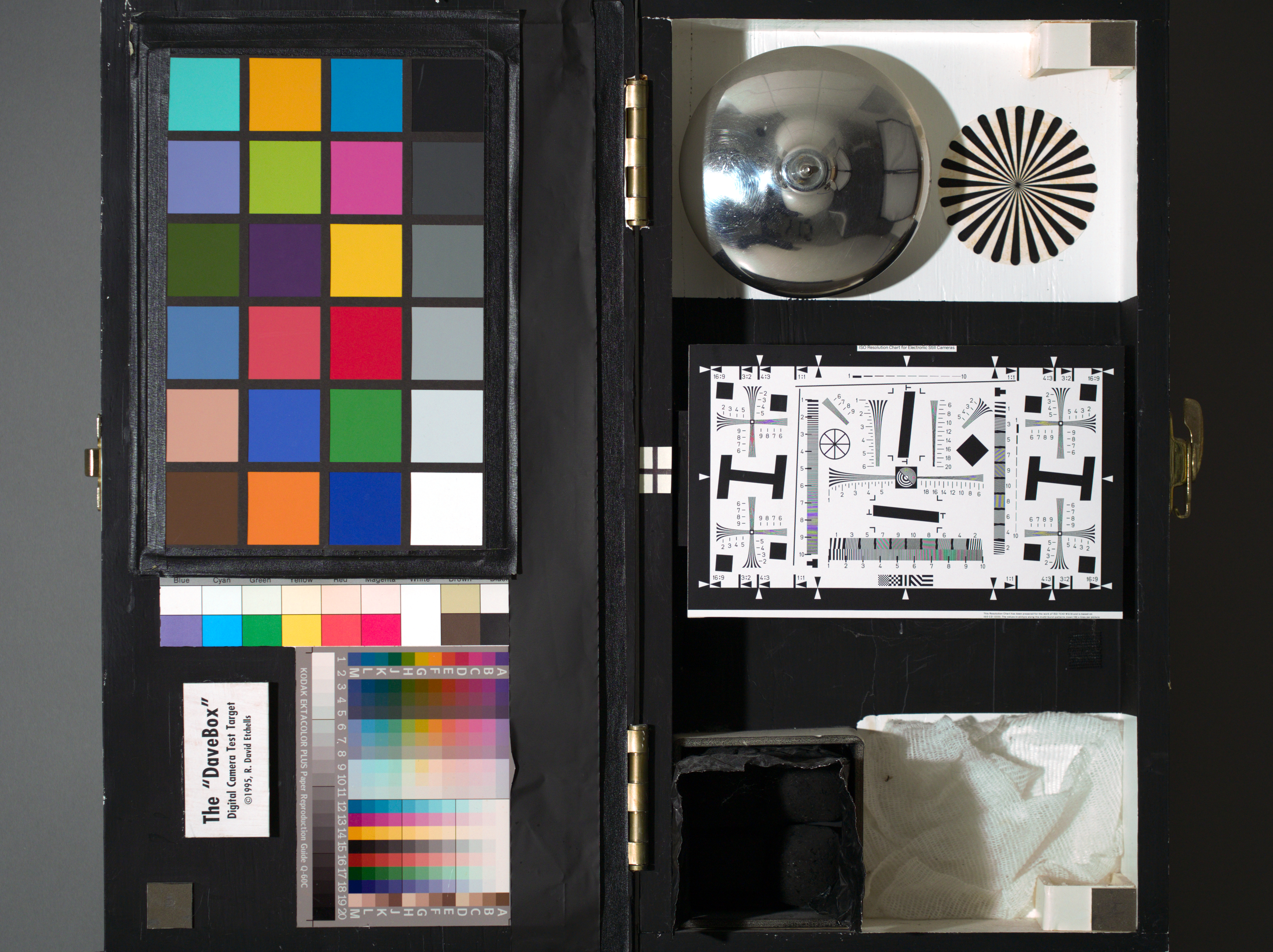
@Pierre its not perfect but you can use the test shots from here to try the various calibration appoaches. They have image pairs of test shots for a few iso with colorcharts. It won’t be as good as if you had a card but it does actually sometimes help with color Olympus E-M5 II Review - Thumbnails
Exactly right, Todd.
In the dark room (when you edit a picture), there is a light bulb icon at the bottom of the screen:

It’s the “ISO 12646 color assessment mode” that was apparently introduced in darktable 3.0.1. Click on it then zoom out, it should help your eyes to assess the levels of grey in your photo.
Hope this helps!
2 Likes
Thanks, Pierre.
Judging colors on screen is almost a nightmare for me, especially at night. I can not even see the blue channel of the histogram. That mode is really helpful in this regard.
2 Likes
I have looked through several tutorials on monitor color calibration. One thing is, the calibration is only valid for the ambient light conditions at the time the calibration is done. This implies that colors on the screen are different depending on the light in the room. Not a very comforting thought, but there it is.
1 Like
Isn’t it more that the colours on the screen appear different depending on the ambient light, because your brain tries to compensate based on ambient conditions?
1 Like
Very true! Now I process “relatively color-sensitive” images (a totally personal statement, not to be taken seriously!) always under similar lighting conditions. This means never finalizing those images at night.
1 Like
I suppose all color is a matter of perception.
3 Likes
Slightly off-topic, but is there a way to do this without using the scroll wheel? It doesn’t seem to work for me, which I think is because I have “mouse wheel scrolls module side panel by default” enabled in the settings. But I can’t find a button or setting anywhere to do this without the scroll wheel. I have the same problem in the monochrome module where the scroll wheel is used to change the size of the filter.
What ever you set in preferences…ctrl alt scroll will give you the opposite…its like toggle…
2 Likes
I think also a reason professional monitors have a hood or shield to try to eliminate reflection and light fluctuations…
Ctrl b as well will bring it up…
1 Like
Thanks!
That mean I could use the charts pictures to follow this article, but would this work with the filmic model? (i.e. if I use filmic and not base curve to process my pictures)
The darktable-charts tool is basically creating a DT style which uses the Color LUT and Tone Curve modules to make a shot of a color chart resemble the reference image, which is either an out-of-camera JEPG of the same color chart, or make it align to the reference values published by the color chart manufacturer. It is designed to be used instead of base curve or filmic, so base curve and filmic should normally be switched off, and any tone mapping tweaks can be done via tone curve module.
If you want to profile your camera using a color chart and use it with filmic, I suggest not to use darktable-chart, but instead use ArgyllCMS to produce an ICC profile that can be loaded by your input color profile module. This then normalises your colours and allows you to apply tone mapping using filmic, base curve, or any other global tone mapping module.
The ArgyllCMS profiling instructions are here:
http://www.argyllcms.com/doc/Scenarios.html#PS1
Edit: here is a slightly more user-friendly overview of the process described in the above link:
https://encrypted.pcode.nl/blog/index.html%3Fp=594.html
4 Likes
Well this will give you a lut and a tone curve saved in a dtstyle . You could see where that leaves you. You might for some images do not need any further tone mapping. You could also just use the color table part of the style and experiment with filmic instead of the tone curve or in addition to the tone curve… You could also just use the chart to make an icc file rather than a DT style and that you would use as your input profile……if you are on linux you can make a combo icc profile including the jpg using this approach GitHub - pmjdebruijn/colormatch: ColorMatch
but it needs a bit of modification….I will make a profile from the test shots via the colormatch and send it to you….
Tomas also has some good instructions and information Articles - Tomas Sobek Photography
Also here are the styles…one using the xrite color values and one matched to the jpg you can compare to what you get…
OM5_chart.dtstyle (5.0 KB) OM5_jpg.dtstyle (5.0 KB)
EDIT***
Sorry Pierre my first styles did not have the look up table only the tone curve…these have both
Correct_OM5_chart.dtstyle (5.0 KB) Correct_OM5_JPG.dtstyle (5.0 KB)
1 Like
ColorMatch_OLYMPUS_EM5MarkII.icc (237.0 KB)
@Pierre try this one just for kicks…just copy it to your config directory making a subfolder color\in …if you don’t have the folder you need to create it …something like \usr\AppData\local\darktable\color\in and put it there for Windows on Linux I am not sure but I will look it up… or you can google where ICC files go. Then just use this instead of enhanced matrix in your color input profile…
1 Like
Here are jpg exports of the results of applying the two styles and the icc file compared to the original…the filenames make it explanatory as to what is what…Definitely better not sure if it will be what your are hoping for??? May not show up here but there was a considerable improvement image by image in DT
.


1 Like