Yeah … I was toying around and forgot to disable it before the final export 
Thanks for that tip! I loaded the jpeg as a sidecar and I am amazed about how few steps it has. Sure it doesn’t look like mine but it’s great on it’s own. Nice job!
Sometimes, I also get tired of the ‘I saw a Lightroom video; which modules do the same in darktable’ questions, but this question was not like it. Also, sometimes people ask ‘how do I get this effect’, ‘how do I achieve that look’, based on some finished photos, without having access to a raw file. In such cases, there is even less to go on, but those are valid questions, too.
I don’t think the question was asked provocatively, and Viktor never said he preferred Lightroom’s output over anything that could be achieved using darktable. There was, as far as I can see, no intention to harm or belittle anything or anyone. Comparing free tools with each other, or with commercial alternatives, is good, as long as the reason for such comparisons is objective evaluation or learning. Often, when free software was found to be abysmal, the developers took up the challenge, and improved it (just like how commercial products are improved). That is how progress is made. At other times, new users simply had to be show how to use the tools. The fact that so many have achieved similar results using a varying set of tools shows we can all learn from each other.
Another way to look at it is like learning a language: ‘I already know how to say Good evening in English, now I want to learn it in French’. There is a big difference between asking ‘Can you tell me how to say Good evening in French?’ on a forum for French learners, and between entering the same forum with a post like ‘French just sucks, even a simple sentence like Good evening sounds weird’.
7 Likes
Thanks. Well I think it speaks to what you can do with a raw…its just one possible version of many. With the jpg you just don’t have that range and a lot is baked into it. And if you become fixated with reproducing somehow the jpg but just a better version again you might miss out the opportunity to discover a really nice version strait from your own vision and creative juices…
2 Likes
I’m not quite sure if I fully understand… but I don’t see what’s stopping anyone from masking, healing etc with darktable or anything else? No criticism intended 
I wanted to do a more personalized version too… it looks a bit flat compared with my last one, but in isolation looks very natural I think.
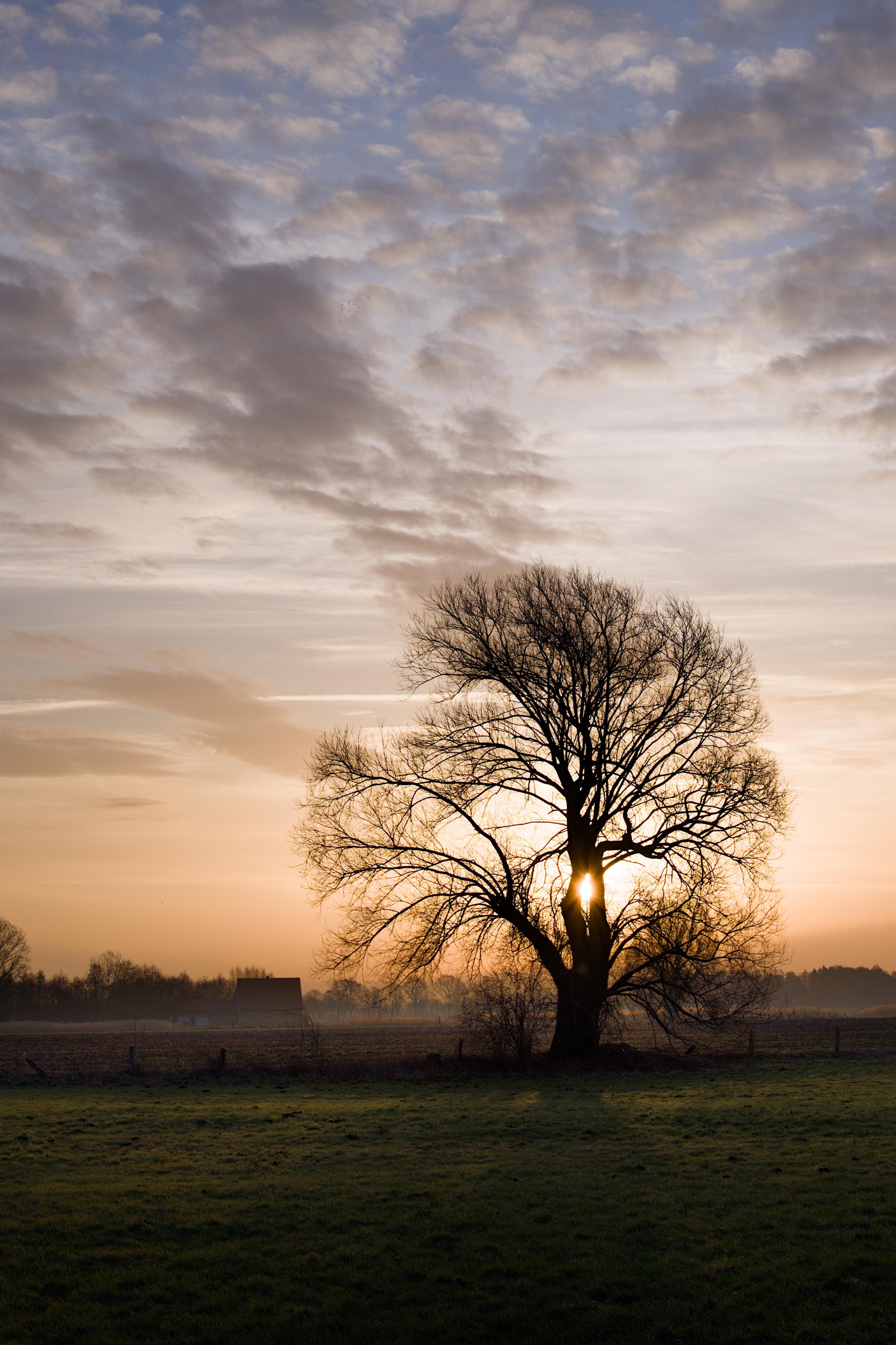
DSC_9310_01.NEF.xmp (20.1 KB)
5 Likes
Thanks, I understand now… and sorry. It really wasn’t my intention to be a nuisance. I don’t want to misread anyone’s post either. Cheers!
I’m sorry for this misleading line. Really! Yes, it was a curve, a brush stroke and a mask as well as you can see in the screenshots. I just wouldn’t have thought it could cause trouble, it was just a way to say how easy and quick it was.
In Post 9 I offered to show my LR editing and nobody seemed to care. I really had no bad intention or wanted to make LR appear to be better in my eyes than darktable. It isn’t, it’s just different. So to be more precise I will add that information to the OP.
1 Like
That’s how it came across (at least to me) 
Seems like it isn’t possible to edit the OP at this point, so you just have to take my correction above.
Nice, I like this approach as well!
The saturation and colours are clearly ‘way more’ then what Darktable wants to do by default. So don’t be afraid to crank some sliders :).
With Lightroom, always remember that the highlight slider does more things at once, and in DT you have to use a few modules to do the same. And I have a feeling you were working with the clarity slider in Lightroom, which means it needs some extra local-contrast somewhere.
There are never true 1:1 equivalents, but knowing things like this makes it more straight forward. I think at least :).
As almost always, I work with the exposure slider (without filmic or sigmoid enabled even, personal choice) to set the exposure of the subject. In this case, I focus that the grass has the light I want it to be (so the shadows are somewhere where I want them to be) and trying to ignore the highlights.
Latest filmic defaults (so v6 with power and such) I often start with just setting white point auto, I leave black alone. Then add color-rgb, start with vibrant preset. Then start turning the highlight slider up, because we want all the colours there. Add local-contrast in bilateral, contrast to 3 (or even 4 here) and start cranking the detail slider, but not too much. I add a mask to ignore the extreme highlights, those can be messy, and I don’t want the messy parts to be boosted.
Now I go back to filmic and start moving the white slider up and down to see what the effect does and where I end up with it.
In the end, I remembered that sigmoid was ‘the sunset tonemapper’  , so I checked that out quickly… got something I like a bit more (less salmon) and settled on that. But it’s close.
Now, comparing back to your image, the grass / shadows are still a bit too dark, so I enable the tone-equalizer, set it to one eigf shadow/highlight compression, but after that reset the curve. Then move my mouse over the grass and use the scroll-wheel up a bit to boost the shadows.
I don’t do studio work often - or indoor shots. But most natural outside shots, I do something like this. Exposure first, brighter than you might think, ignore highlights. Set up a quick filmic with auto white point, doesn’t have to be perfect. Add colours, add local contrast (often only in the highlights, in this shot the opposite  ), then go back to filmic to tweak the white point slider.
Sometimes if the amount of highlight data that needs to be compressed is a lot - like really a lot - I turn to the tone equalizer to turn the highlights down first. Or - like here - after the basics are done, I see I want a part a bit brighter, and I grab the tone equalizer.
(And I cheat by using DxO as a preprocessor for lens-correction and denoising).
DSC_9310_fix.dng.xmp (10.5 KB)
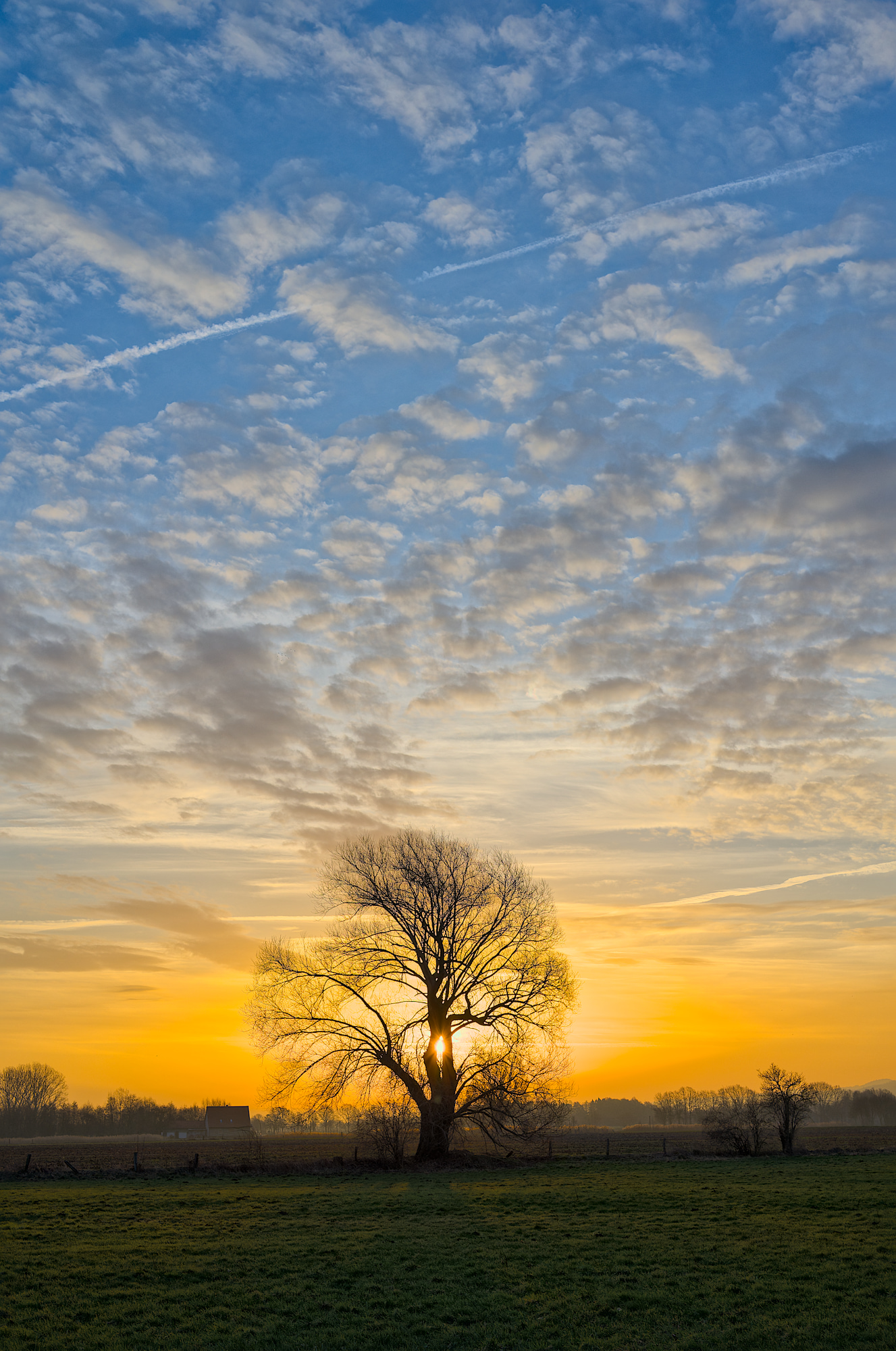
DSC_9310_fix.dng (74.6 MB)
7 Likes
Now that is the a description! Thank you!
btw: As you can see in the Screenshots (Post 73) I did not touch Texture/Clarity/Dehaze at all on the overall photo, especially the grass. Just for the sky mask I used a little bit of Dehaze. So it’s even more obvious LR does a lot of things internally when simply moving sliders
These threads are also important for people who don’t know much about darktable or RT and often look at it or write articles about it. We’ve seen a few DPReview articles where they barely scratched the surface or put in the effort, sometimes only comparing the default output. If they stumbled upon one of these threads maybe they could link it, or realize what can be achieved and put a little more effort into their article about said software. darktable is almost always talked about as an unwieldy monster with hundreds of modules where you need a degree to get a decent result and hopefully this proves them wrong, or at least makes them question it.
I think dpreview largely takes the release announcement and does a random YouTube search. I don’t think they’ll ever do in-depth research, as darktable, unlike commercial products featured on their site, does not produce income. I have the feeling they only provide coverage to show they are balanced and independent. They don’t even care to reach out to the community for advice (for example, ‘Which video would you recommend to explain and demonstrate new features?’).
2 Likes
Ah, but you pushed the shadow-slider way up. Which proves my point exactly (because that’s also doing the same thing as pulling the highlights down, adding local contrast to get details more visible next to a change in a curve somewhere).
I missed your LR post to be honest. Also, it’s been a while since I looked at LR. I don’t recognize the ‘texture’ slider in there for example.
Knowing you actually were pushing the blues a certain direction, would’ve helped, because I did very little with masking or selection colors. Just ‘global tone-mapping’ and ‘boosting local contrast’.
Adding ‘color balance rgb’, adding a parametic mask and selecting the blues (‘hz’ is the hue).
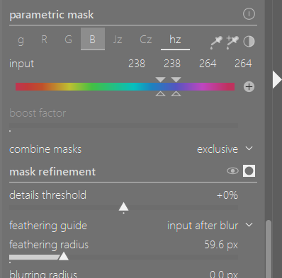

In the 4-way tab you can get some quick results by then lowering the global luminance, to darken blues, and in the original master tab you have hue-shift to push the blues more towards another kind of blue, and global vibrance to quickly ‘make them pop more’
Remember that you can often right-click on a slider to enter values manually, and also extend the range. The global luminance slider in the 4-ways tab goes to -5% for example, but if you right-click and type in ‘-10’, it’s now a slider that goes to -10%, and you can tune with the mouse.
If you like the darkblue broody skies:

4 Likes
I don’t have LR but I do have ON1 and for sure just cycling through their profile options can make a massive difference. There I select linear raw and this is more like the basic starting point for DT. They also have a neutral be even that has a substantial boost over the linear raw profile starting point. So massive changes to tone and color right out of the gate and LR will be doing the same sort of thing so doing a DT edit will always have to add module to compensate for that when you do a comparative edit and this might not actually be the way you would approach just doing a DT edit on its own from scratch…
Using the tone eq and blending in the blue channel can be yet another tool you can use on the sky. Use a gradient/drawn masking option if further control is needed and with some opacity adjustment you can dial in some nice blue and also impact yellows… + values on the curve add blue and negative ones can essentially add/boost yellow so you can use it to tonally tweak skies. I often even try without the mask as it can transfer the effect to scattered light or bounce light cast and make the effect seem more normal say for example a reflection on the lake.
I finally have something to chime in with, and it was not easy by any means. dt 4.2.1
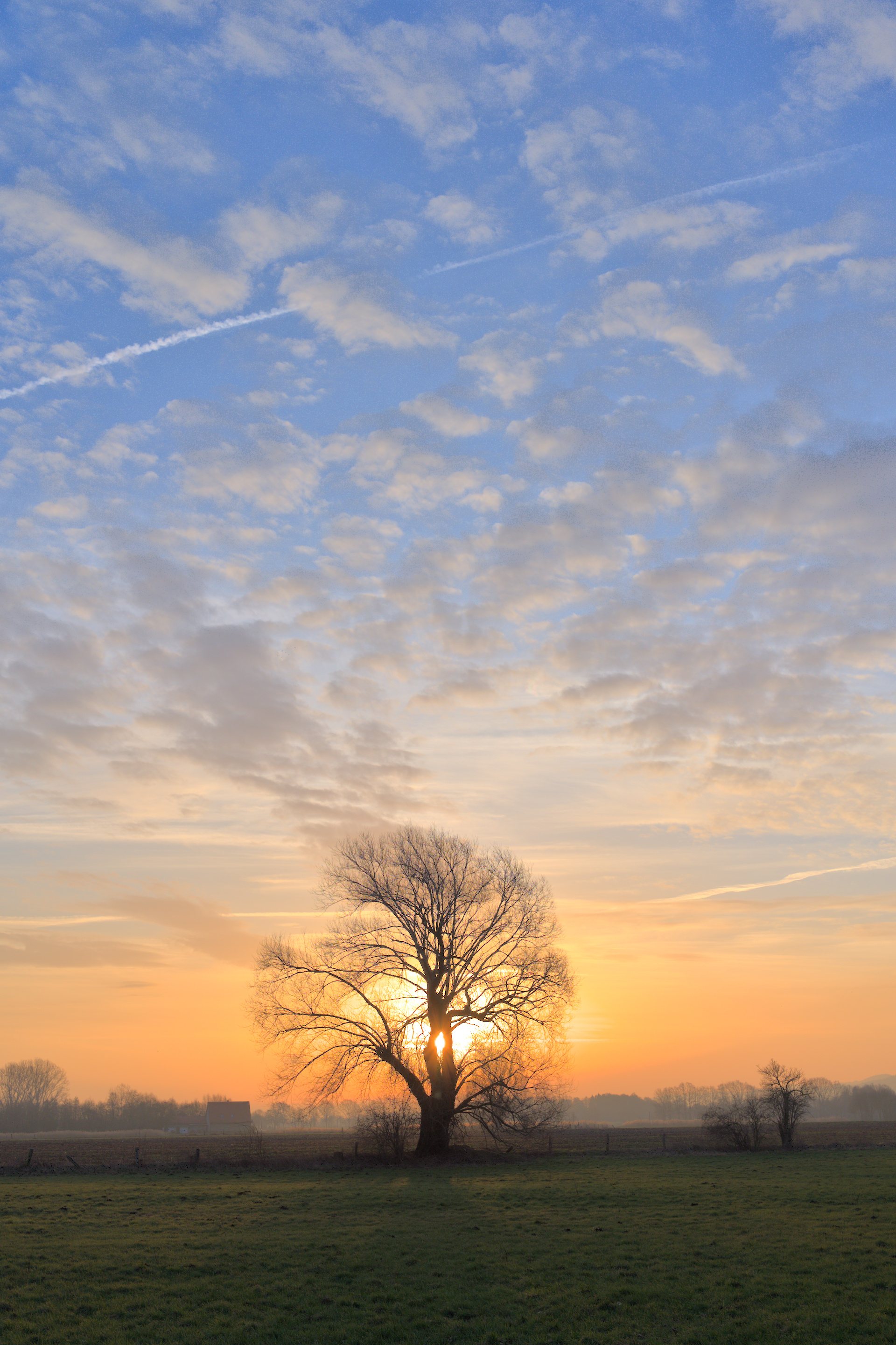
DSC_9310.NEF.xmp (8.7 KB)
3 Likes