I haven’t heard anything new, and was waiting for @rudantu to be reasonably close to finished before writing any code. They just got busy with life. It happens.
Of course, of course. I hope it will eventually get picked up again. I’d offer myself to study a redesign, but it would feel somewhat off. Honestly I don’t even think I’d be in the right mindset as I’d probably be comparing to the work being showcased here, I would have loved to contribute tho. ![]()
Its a penpot, and you can probably request access to it. I’m not sure what else they wanted to do it, it looked pretty good to me, but I’m not a good designer, so…
Hey all! Apologies life did in fact interrupt this project - lets see if I can hop back in and rev the engines. I probably should have ensured the work was readier to hand off before hitting post ![]()
I will revisit my files and see if I can get things into a more presentable state shortly ![]()
![]()
Hey all - I’ve made some adjustments and a recap of progress on this project! Thought it best to explain each element and go over my thinking in depth. Would love your feedback!
Please send me a message if you’d like access to the Penpot workspace ![]()
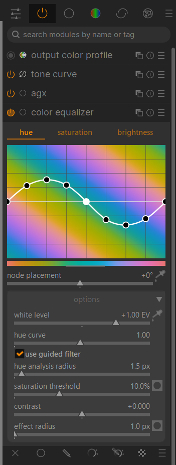
I really like the palette you use to indicate the status of a module and the use of icons having the same behaviour as the standby switch, instead of sitting beside it. It helps with navigation, and they have a satisfying “weight” to them. I’m used to working visually with many other creative programs and seeing what’s active, just with an icon, really goes a long way in terms of streamlining the workflow.
Of course, it takes some time to adapt, but I guess it’s not a huge deal when you use a program for a while. To this day, I still have memorized so many icon sets of programs I do not even use anymore, but if I go back to them, I’d still know where to look for. ![]()
Thank you for this video, it was very inspiring as always.
Love it. I would like to see darktable like this. Just to comment, without knowing anything about graphic design, I think the black tone of the logo might look good with a dark gray, almost black? I don’t know, the way you’ve done it isn’t bad, but I find it too contrasting with the colors of the iris. I really like the icons for the different tools and the opening image as well.
I love it as well, the result and the thought process! Thanks for working on this, no matter if it will be adopted or not, there was something to learn for all of us I would guess which itself is already a value!
One little comment though regarding accessibility: I am slowly facing presbyopia as most people do at a certain age, and for the manual, I would strongly recommend a white background version for longer reading, as the additional light allows for a lower aperture of the eye and therefore helps people like me to postpone getting glasses for another while ![]() .
.
Yes I’d like the websites to collectively detect your desktop’s theme preference and style themselves accordingly. I got a framework laptop last year, and the screen is much much brighter than my last laptop, and when browsing in the evening under subdued lighting conditions, sites that don’t auto detect my dark theme and style themselves accordingly give me a headache from the bright flash of mostly white. Its become a new pet peeve
The website design looks good, but I’m not a fan of the app redesign.
First of all, the default theme looks the way it does for very good reasons, which you can read more about here: faq | darktable
Secondly, the use of flag icons for color labels will no doubt confuse many, since flags are used in other programs for marking pending, accepted or rejected (I think the tag is called urgency). Best to stick with simple shapes. In digiKam:
![]()
Finally, and subjectively, I find the use of colored module icons distracting, pulling my eyes away from the image.
Agreed, I’ll keep my mockups to the standard 50% gray theme, and reduce color to not distract. Good to find the bounds of good UI practice ![]()
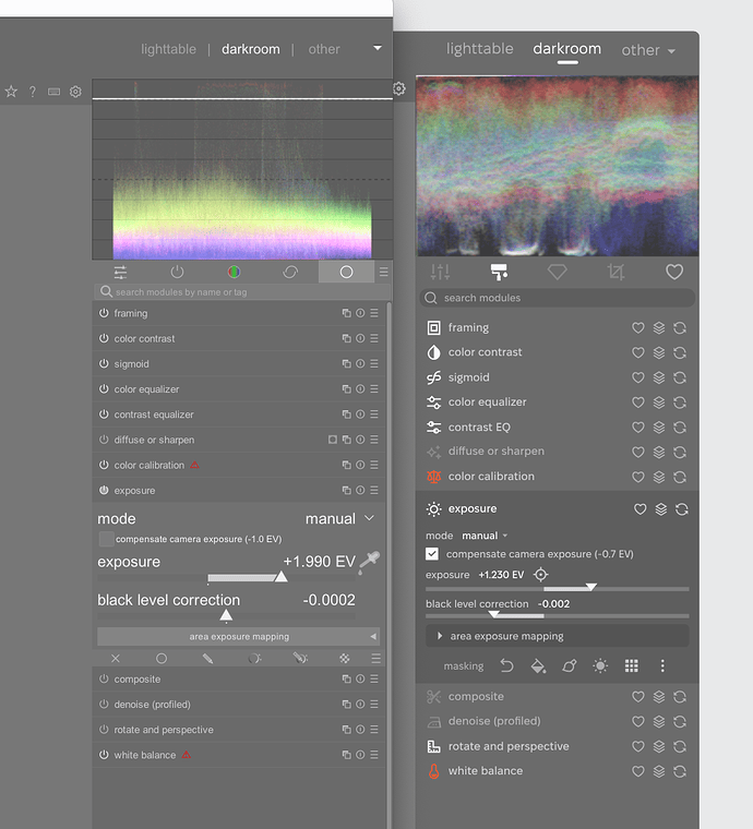
Doing some direct comparisons, (some wiggle room for DPI adjustment, user font size, etc):
Left: current Right: Redesign mockup
By ‘indenting’ panels to a darker shade instead of lighter (See the expanded exposure module in the redesign) I think this is maybe more successful in communicating a ‘group’ of content, as it creates just a biiiit more contrast within that shape.
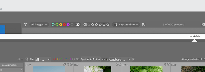
Top: Redesign mockup Bottom: current
I am finding the redesign is quite successful in legibility. A thicker icon system like this is super nice at small sizes. Even down to 12px wide, icon lines and shapes pop on my cruddy display.
Font size adjustments allow more content to be shown and prevent truncation. Some text is a bit smaller, some larger - to me it feels visually cleaner.
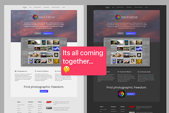
Will work on the website next and try get some pages ready for implementation ![]()
![]()
Thanks for coming back to this!
Has @Pascal_Obry seen this? Is he open to new branding? How about @hanatos ?
I love the design and wish it could be possible to add this design philosophy to darktable as a new CSS theme that anyone could choose to test and use before it becomes “official.”
sorry this is way more than just altering the CSS.
“Hi!”![]() While browsing through this thread, I came across some really interesting visual ideas for darktable. Since I already had a custom CSS theme I created a while ago My personal darktable theme. - #44 by difrkaguilar, I decided to incorporate some of the concepts shared here (like the color palette, spacing and search box) to update it.
While browsing through this thread, I came across some really interesting visual ideas for darktable. Since I already had a custom CSS theme I created a while ago My personal darktable theme. - #44 by difrkaguilar, I decided to incorporate some of the concepts shared here (like the color palette, spacing and search box) to update it.
If I publish the revamped version, I will explicitly welcome inspiration from the contributions in this discussion. It’s just a personal experiment, but if anyone wants to try it or has any suggestions, let me know!
PS: Great job with the redesign proposals ![]() "
"
I love it, I think it greatly improves the identification of interface elements
I have really no problem with that. We probably want to discuss the details of course. That being said we need a dev motivated to do all this changes because as already mentioned this is not only CSS tweak.
@rudantu : Are you also a dev? Do you plan to drive this project?
Yes for the application changes.
I was thinking, at least for now, about the logo/branding/typeface change. I really like the web site redesigns, and had planned to start coding them once @rudantu feels like its all at a good place.
Agreed, the project is quite big, one bite at a time ![]() . I sadly am probably not trustworthy with code - I can work with CSS but I get things tangled quickly.
. I sadly am probably not trustworthy with code - I can work with CSS but I get things tangled quickly.
- The website I feel is ready to start being put into HTML + CSS, at least the homepage and basic subpage like the Resources page. From there, I imagine most pages will use similar components and styles.
- The app would require I assume GTK and CSS tinkering, I imagine starting with those new icons, small parts like the splash screen. Then maybe mild font / container metrics. Hope unravelling as little of the code as possible
 .
.
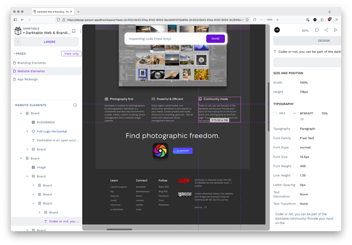
If @paperdigits or anyone would like access to the Penpot environment, give me a shout! It has a great ‘inspect’ mode that shows all properties and such for each part ![]() . Obviously some coder interpretation would be used (ensure things are responsive, properly declared as variables, etc.)
. Obviously some coder interpretation would be used (ensure things are responsive, properly declared as variables, etc.)
I should’ve been more verbose about this… for the website we have like… five templates or so (?) that all the page use:
- home page
- blog (single page, list page)
- page (single page, list page)
Blog and page are likely very similar, I don’t quite remember.
