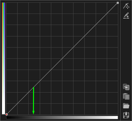
First of all, let’s agree that some parts of the user interface should be corrected (e.g., the left bar, because its lower part shouldn’t be white, but gray as in a real desaturation), the documentation should be clearly improved, and there should even be a better tooltip for each curve.
But a completely different thing is that any other interface is more intuitive, obvious or user friendly, just because different people think differently, and what is intuitive for you, may not be so much for me. Let me explain:
In your Davinci example, me as a user tend to think that I will get a huge transformation in the leftmost part of the shadows, and it will be increasingly moderate up to about 25% of the graph. Good!
It means that I will have an impressive desaturation of black (red arrow), and a bit less impressive in the green arrow grey. How much? I’m not sure…
On the other hand:

Here the red arrow vanishes, just because black can’t be desaturated (as explained in the other thread), and the green arrow tells me how much from the current colour values of that luminances the hues could be desaturated. If I drag the curve (the line) down to around the middle of that free space, those colors will become about half desaturated.
To me (again, to me) that’s more intuitive, but probably it all depends on what you are used to, or which software you come from, but not how wrongly is this interface designed.
