My take with RT5.8dev commit 0fcca6290
IMG_3868.jpg.out.pp3 (13.6 KB)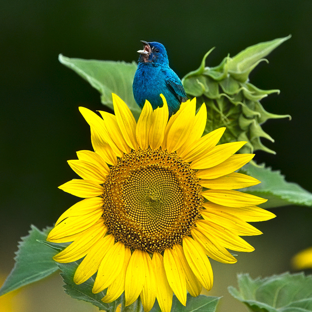
2 Likes


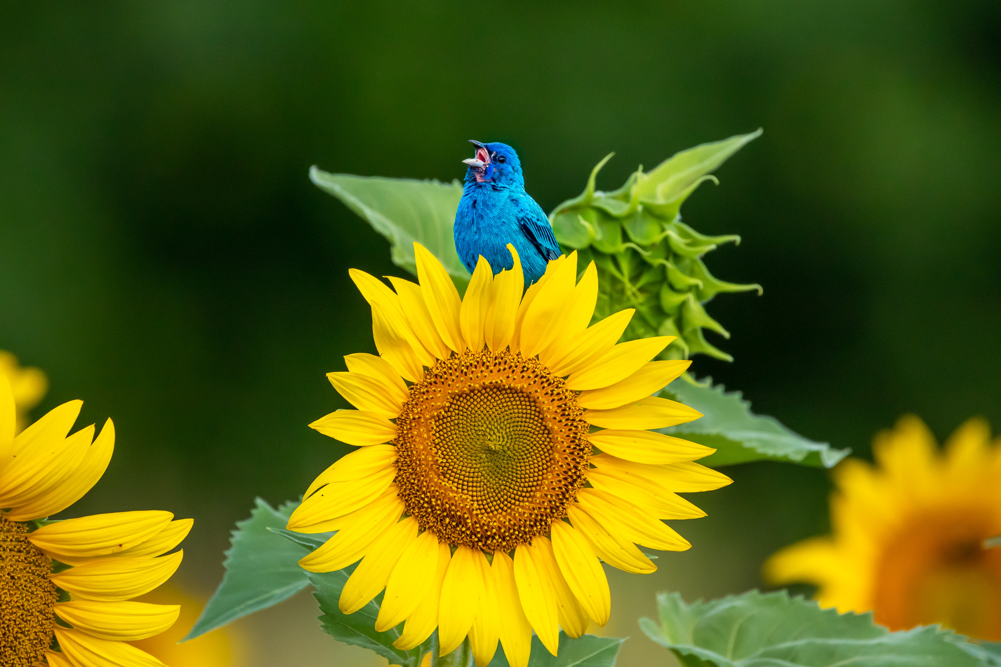
A beginner’s attempt. I think I got it a little too red, but I couldn’t get it any better way I liked.
IMG_3868_01.CR2.xmp (7.7 KB)
1 Like
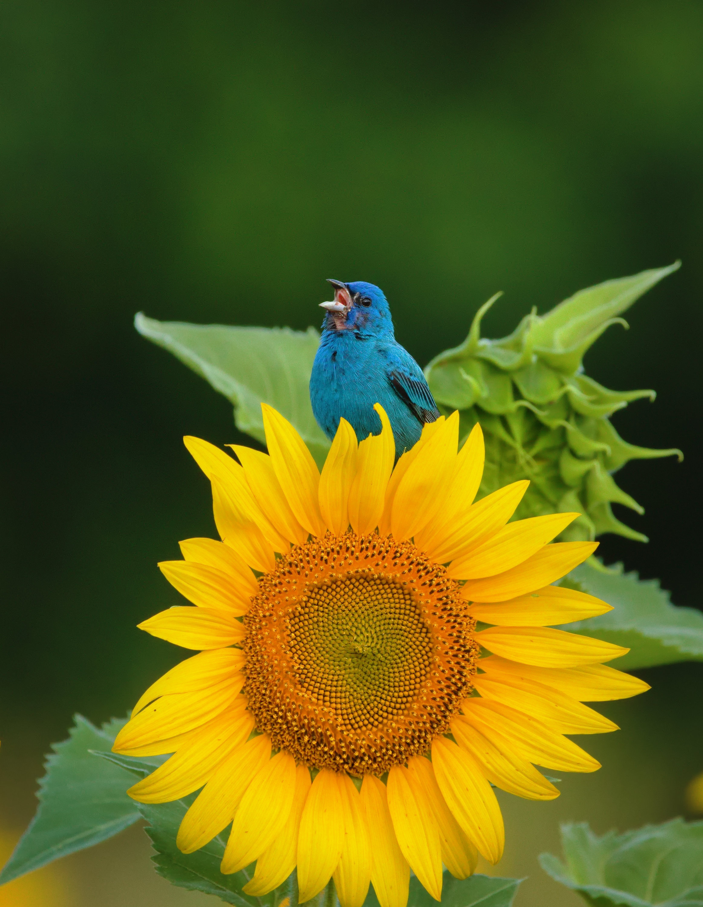
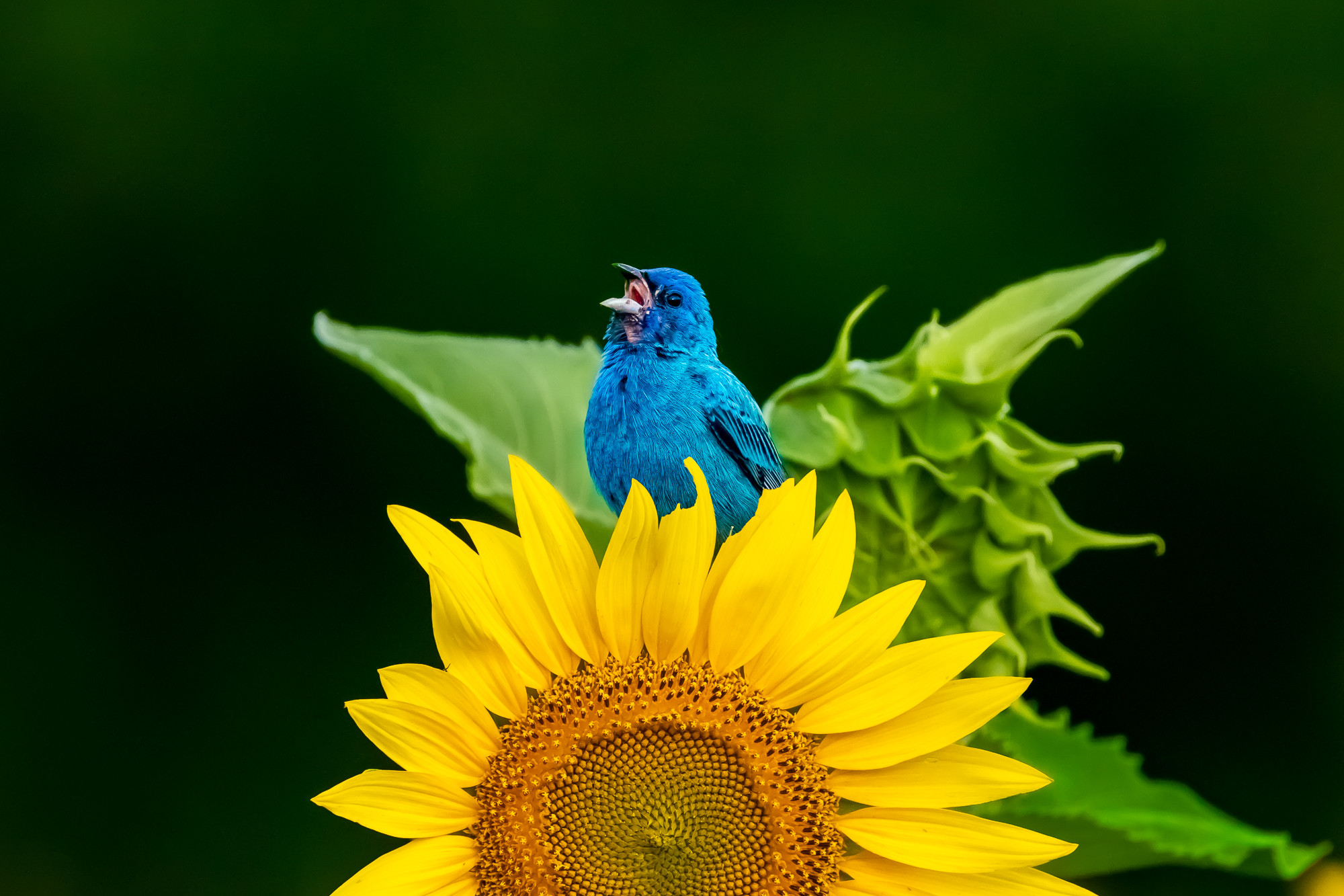
I have made another stab at it with dt 3.3 and filmic v4. Quicker, easier, and better. No red cast, this time.

IMG_3868.CR2.xmp (5.7 KB)
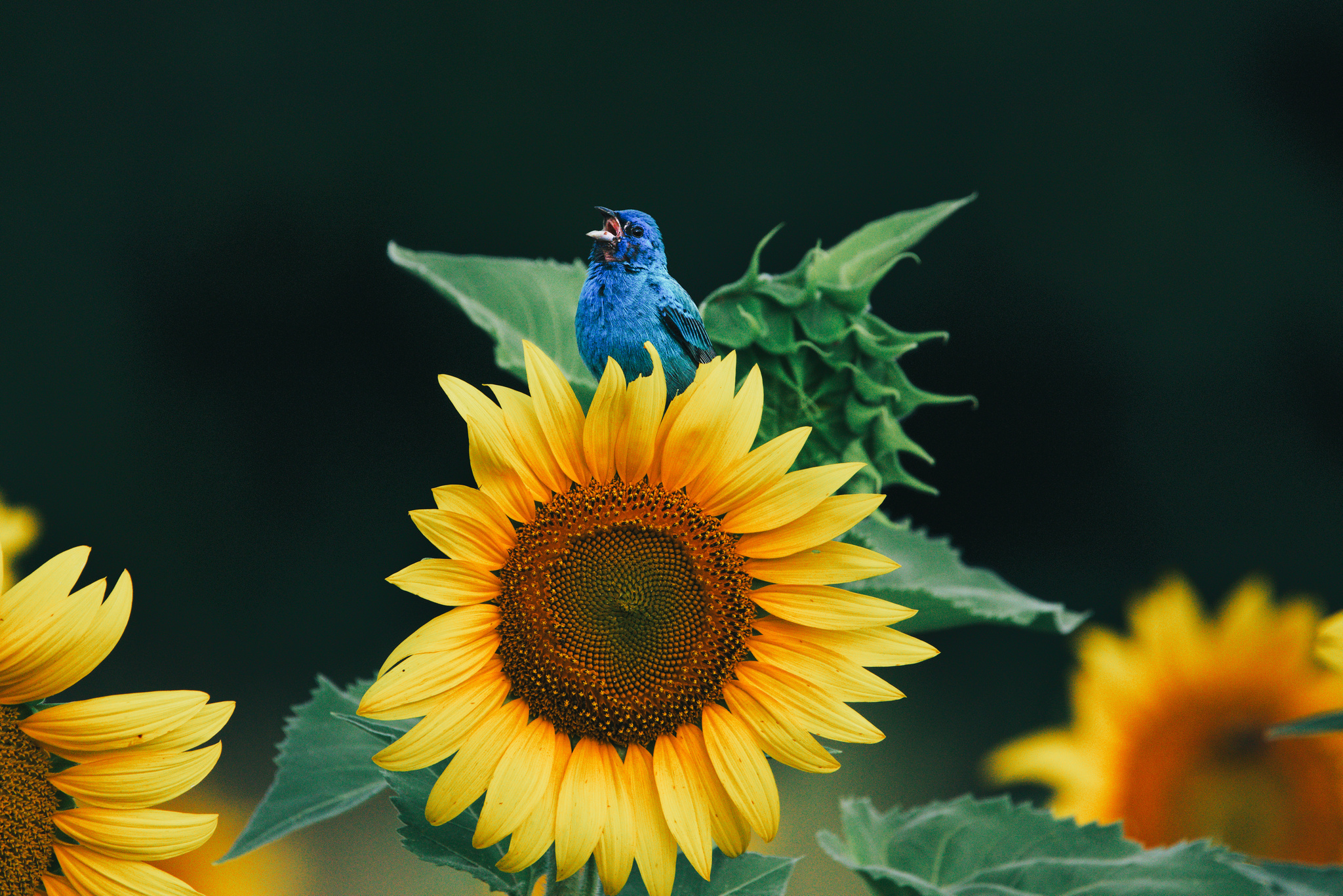
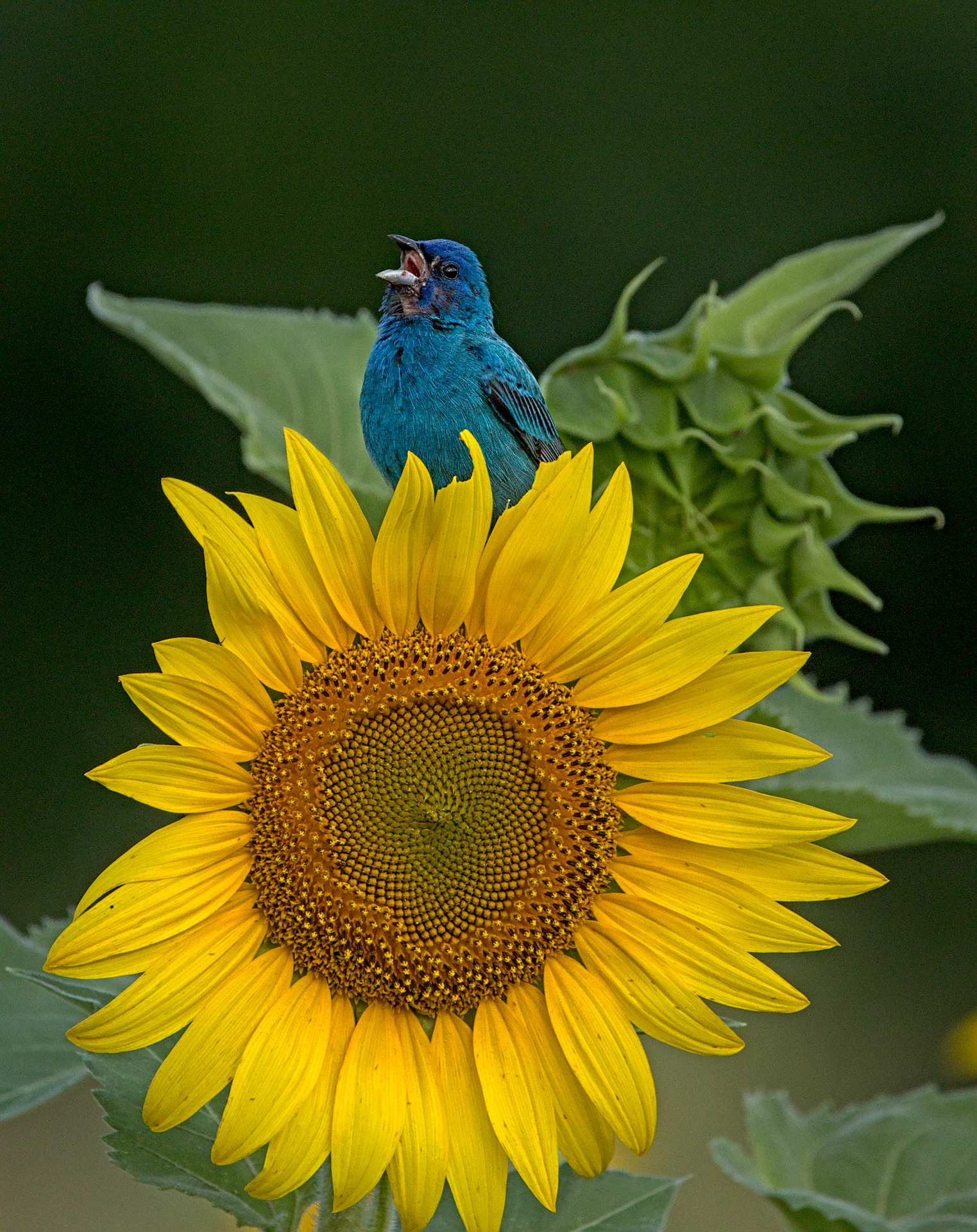
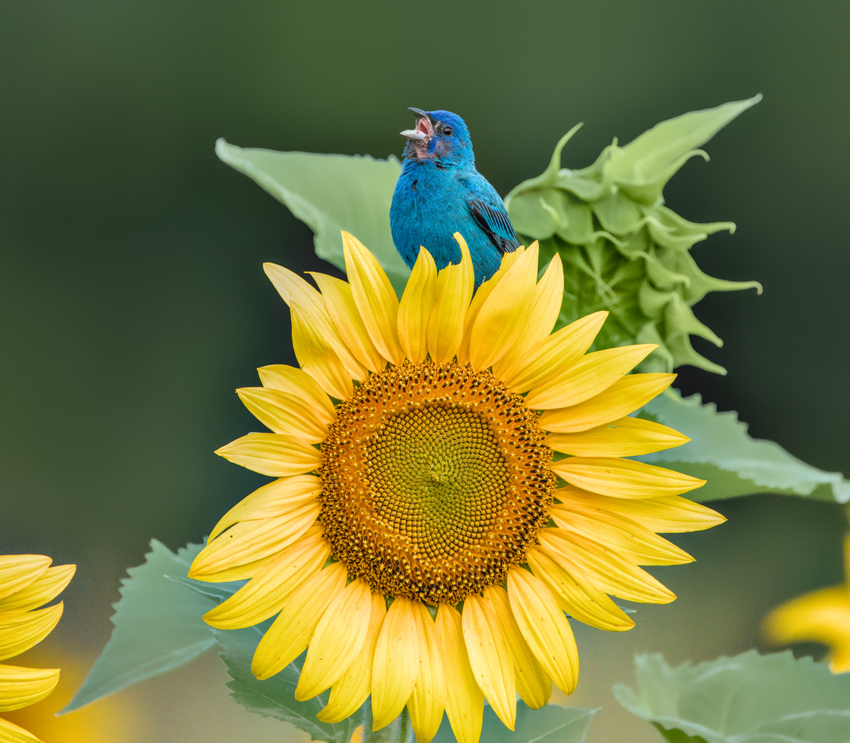
Great photo. I got inspired by the color grading video that @Bruce_Williams did recently and particularly the awesome webinar he linked by Joanna Kustra (https://www.youtube.com/watch?v=mC8ol2-V7Ck). I was looking for a nice photo to play with to apply that and this struck me as a photo with clear potential for color grading.
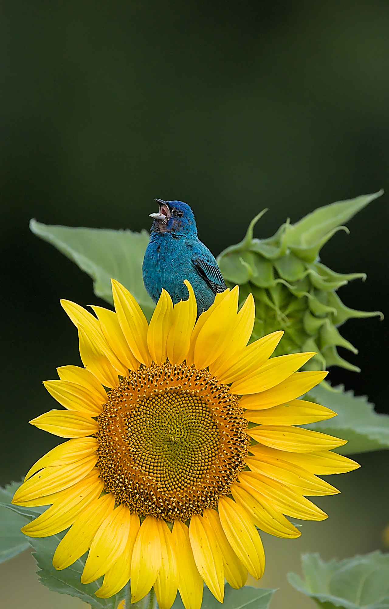
Basically, I wanted to make the little bird the obvious center piece of this photo. The original had a distracting background that was very green and saturated. And obviously the warm colors from the yellow and the green clash with the blues. It is lacking harmony and is an obvious candidate for some color grading.
To fix this, I looked at the hues on the color wheel (you can use a 0 contrast low pass filter blended on luminosity to reveal the hues). That basically pointed to a solution: I needed some purplish hue to turn this into a square harmony on the color wheel. Also green was very dominant and I wanted less of it.
I simply played with the color balance module for this to add purple to the shadows and darkened it as well. This completely got rid of the distracting green background. Next I considered the color weights. I wanted the bird to be the thing that catches the eye. So I reduced the saturation of the greens and the yellows to to get a better balance between saturation of blues yellows/oranges and greens and to compensate for the relatively small area of the blue bird. I used another instance of the color balance module for this and simply reduced saturation and excluded the blue hues using a parametric mask. I slightly darkened the green leaves and the sun flower as well.
The rest is just getting rid of the noise. Some surface blur took care of that. And I did a bit of contrast equalizer masked on the bird’s blue hue and saturation to pop out the detail in the feathers. I went for a crop that puts the bird at the top left corner when you apply the rule of thirds. I love the out of focus flower in the background on the bottom right corner. Even with the contrast and light reduction the other flower still jumps out. But your eye goes to the bird first.
I did not actually increase the saturation of the bird yet it looks more saturated. Color theory is awesome!
All done with v3.4 of Darktable
I see others did very similar things. Especially liking what @martin.scharnke & @kakashy did here.
IMG_3868.CR2.xmp (11.1 KB)

4 Likes
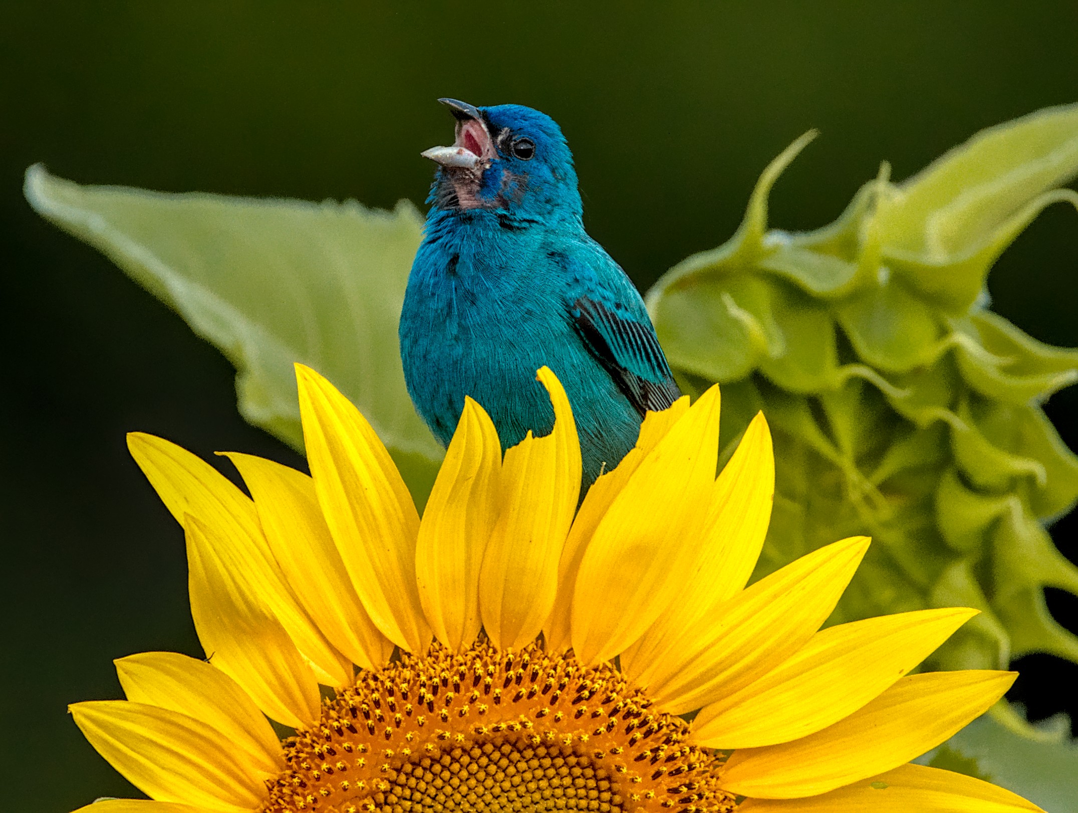
Since I have improved my usage of darktable a lot over the past year, I’m posting a new edit. I think it’s much better than the one I did a year ago.
dt 3.4.1

IMG_3868.CR2.xmp (9.1 KB)
@jillesvangurp and @Tim, I like both your edits. I’ve learned a lot over the last year and would probably do a few things differently.
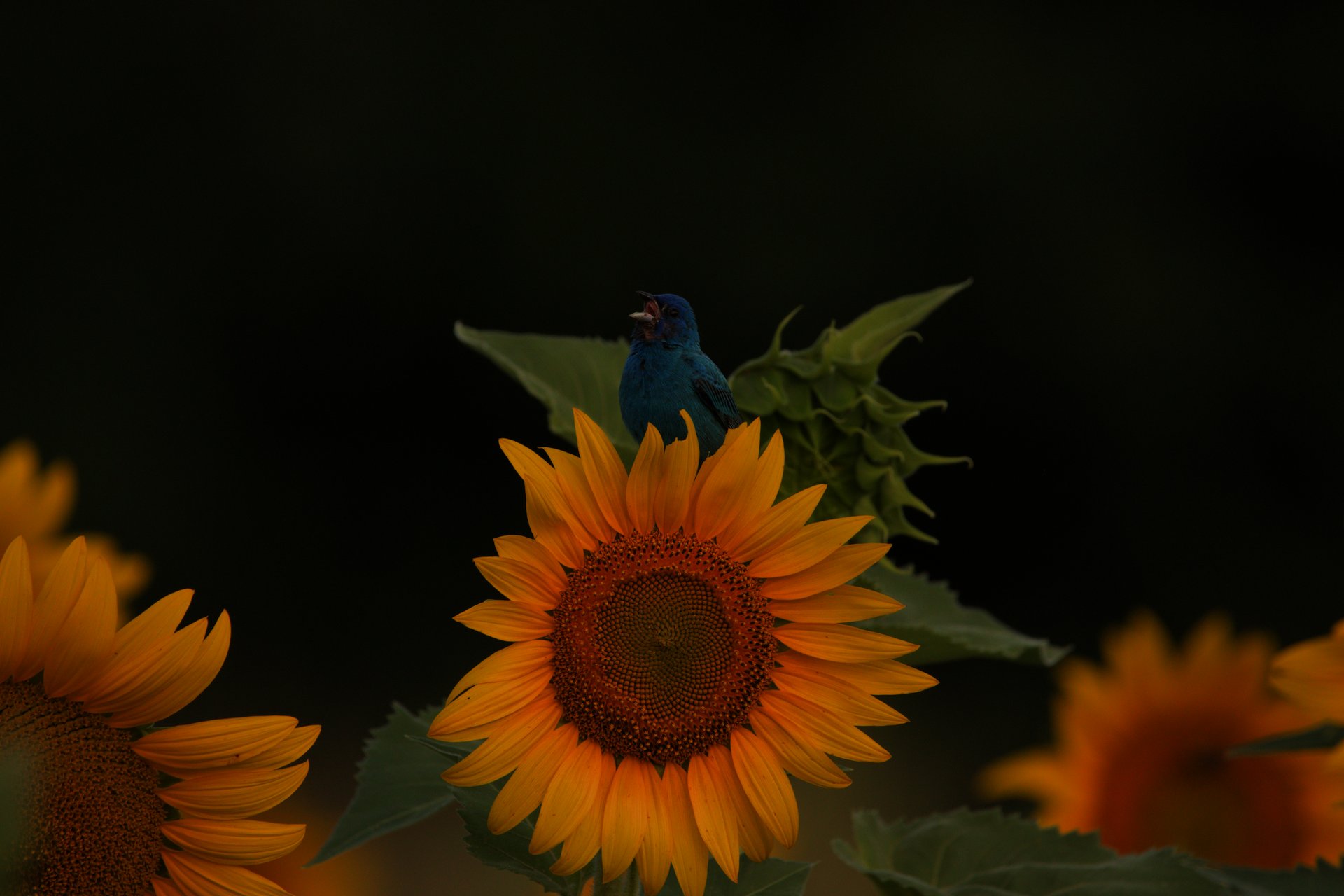
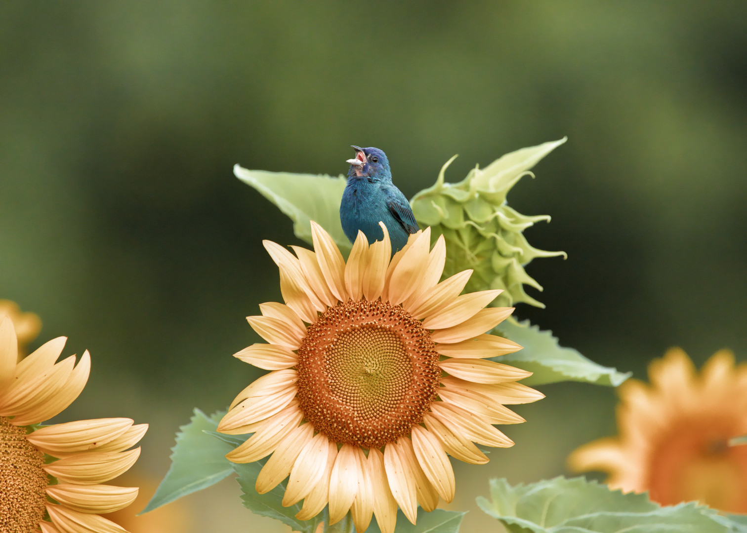
Sadly, its very hard to convince wildlife to respect the color wheel so we do the best we can  . I think my hardest challenge was to convey the sense of the bright, sunny day when I took that shot. The image seems very dark and subdued and I still can’t find a way to bring out the bright, vibrant colors of the sunflower to my satisfaction. It’s just the nature of the shot, I suppose
But July is around the corner and I have another chance at it. Maybe we’ll see our Bunting again… or maybe a Scarlet Tanager or Goldfinch will oblige me with better color coordination!
2 Likes
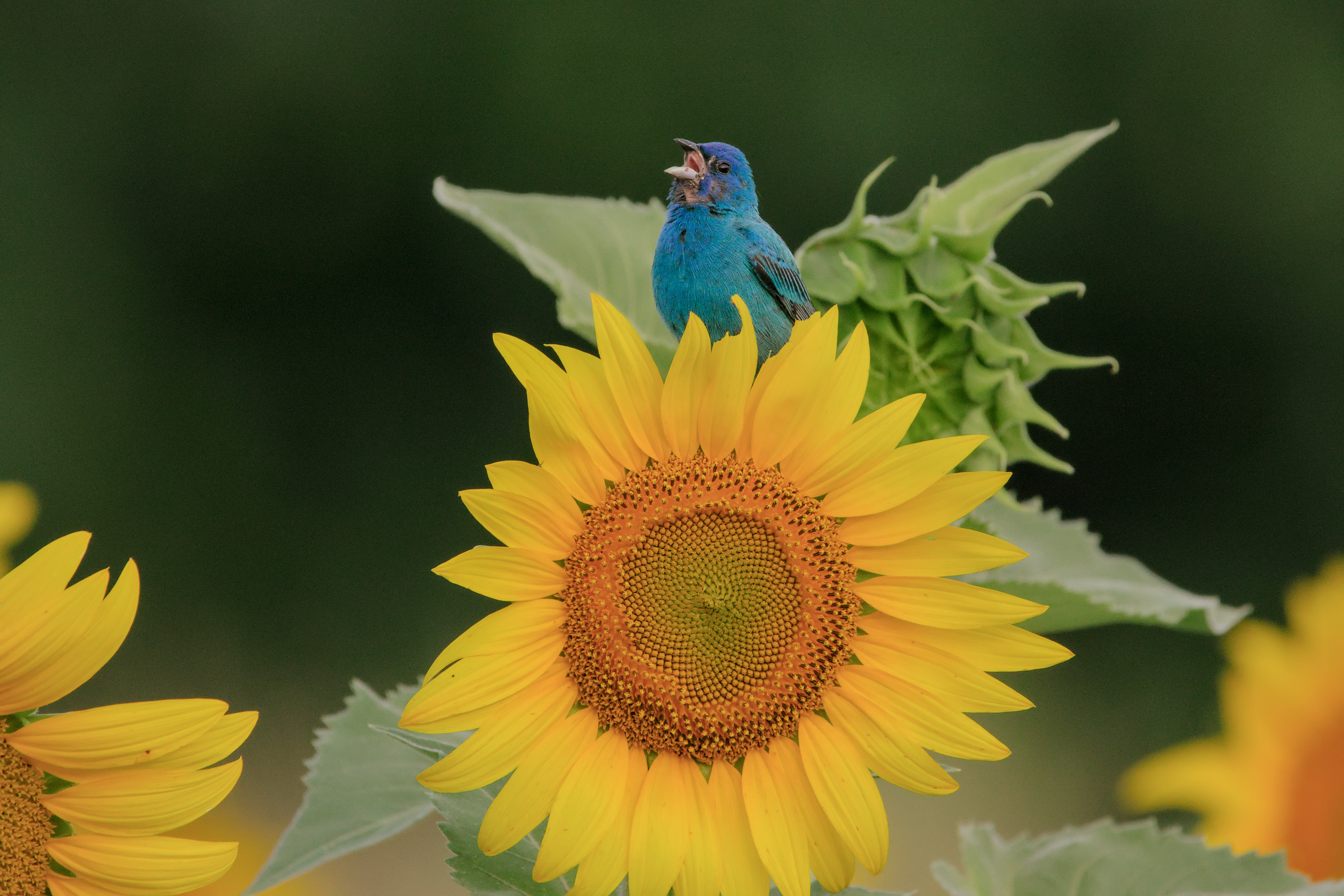
Both of these are very nice… much closer to the scene. Could you add the XMPs? I’ve never been able to extract them from the JPEGs
I have a preset for color calibration that I call ‘bright, sunny look’. Here it is, applied to your photo (with your XMP):

It’s in channel mixer mode (i.e. with adaptation turned off):

And my version (also using this preset, applied on top of my current default style + noise reduction):
IMG_3868_02.CR2.xmp (16.0 KB)
The mask on the NL-mode instance of denoise (profiled) should be improved not to obliterate the detail on the leaves (e.g. by using a drawn + parametric mask), but you get the idea.
1 Like