Will this already be in 4.6? Or 4.8?
In 4.6.
3 Likes
Thanks. So more work for me then…
3 Likes
I am in the process of making some presets using this feature. Specifically, slight tweaks improve brightly lit greens in landscapes without much effort. I imagine that once I have a bunch of presets I like, the extra effort for this feature will be trivial, and the benefit very noticeable. YMMV.
My bad, I should have realized that this was not to be a play raw discussion.
I was just surprised, after exp and cc, how easily sigmoid attained a reasonable result.
By more work I meant that there will be another article about dartable and I will have to integrate this into it.
5 Likes
In my example with the samples on the face I also tried filmic. Most were listed as coral or crimson with the sigmoid preset and tweak where as with Filmic v5 auto tuned and only boosting vibrance 5 out of 6 were labelled by DT as falling in the average skin tones. So it will be a nice set of controls but it doesn’t necessarily impart any magic
How do you do that with DT? I didn’t know darktable had a skin tone evaluation module.
Thanks for the files. This is a terrific example, and your observations are very good indeed. I definitely see what you meant.
If I had to describe what happened with the tweaked settings, I’d say there was a really noticeable shift to red in the darker parts of the face, or rather, those areas stayed near their original chromaticity whereas with the smooth preset they got shifted toward yellow. (As a side note, I think the picture could be exposed a little bit more and this would also quite directly help here.)
Some direct things that could be done are white balancing and/or probably nudging the red primary just a tiny bit toward yellow in rgb primaries (but don’t overdo it). I would apply rgb primaries after sigmoid because then it will be working on the readily-formed picture rather than the pre-formation state where the RGB ratios are going to be twisted by sigmoid anyway.
In case you meant to increase the brightness of the white wall: doing this via in sigmoid will quite necessarily also introduce some (usually undesired) harshness of the highlights of the face. From my point of view, as far as workflow goes, this would be more of a job for some local editing by masks (from my point of view, anyway).
The issue with unpleasant skin tones is mostly due to the quite drastic change to the skew parameter. This is how the curve looks like with contrast = 1.5 and skew = -0.2:

This is how it looks like with contrast = 1.6 and skew = 0.3:
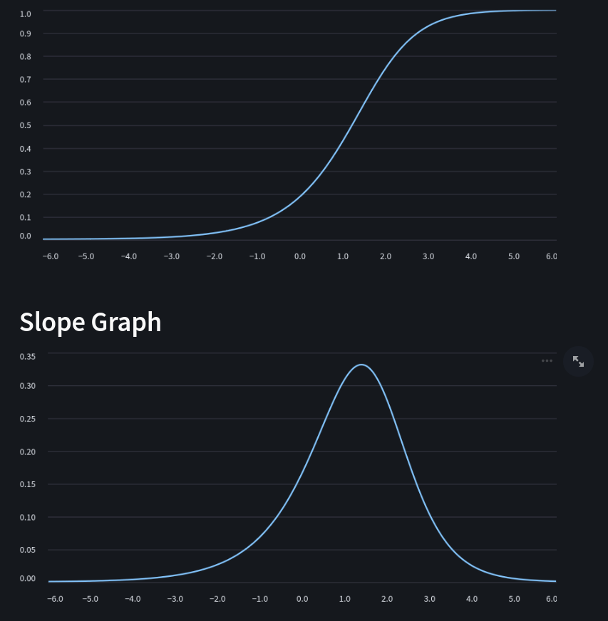
These images were made with @jandren’s excellent tone curve explorer.
With the latter settings, the curve is much steeper above the middle greys, where I’d expect the skin tones to fall. This causes the RGB ratios to be torn apart, so that the red-ish chromaticities have their purity increased. Then there’s quite a rapid decrease of slope, which means the G and B components that were “left behind” have their chance to “catch up” and the transition to yellow happens quite abruptly.
With the settings from smooth preset, the curve is not as steep and the transition toward yellow happens at a much slower rate and, well, smoother. The reds don’t get as large a purity boost.
I hadn’t actually played with the tone curve explorer before, but based on my first time doing so, I would say the skew parameter has quite an impact especially on the range beyond middle gray. I would keep the skew as negative to allow the transition to yellow in the high end happen smoothly.
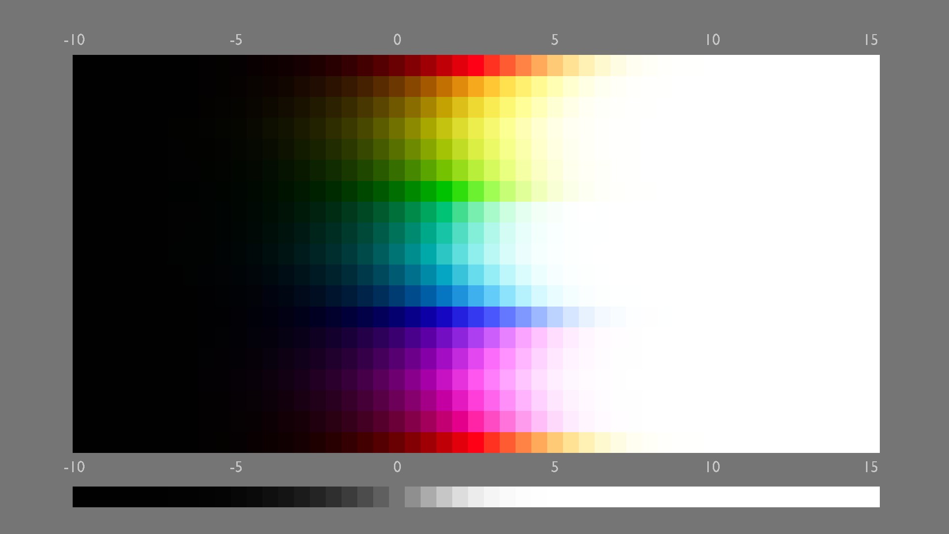
The sweep image visualizes this difference quite well. The first one is with contrast = 1.5, skew = -0.2:

contrast = 1.6, skew = 0.3:
Btw, there is also an AgX node for DaVinci Resolve available here. It has the possibility to tune the curve parameters, and that parametrization has more degrees of freedom. Should be interesting to experiment with it, too bad I haven’t managed to install Resolve yet.
Hope you find this helpful! And thanks again for the feedback, I’m very glad to have this discussion. The observation was excellent.
5 Likes
Hover on picker data… it will name the color… Skin tones are included… when you are close it’s usually given as coral or crimson…Final adjustments will provided average skin tone for various ethnicities. You can also use the vectorscope with samples…
I would observe caution when using those meters / the vocabulary. The perceived color depends so much on the surroundings that absolute measurements from single points can’t possible cover that.
Here’s a terrific demonstration:
4 Likes
Thanks for the tip Priort
Thanks for the analysis. I hope the picture can be useful in improving the feature. As I said, the smooth preset is already very good, but it would be even better if there was a systematic way (or at least some guidelines) of tuning the primaries according to the curve parameters. FWIW, in my code I’m following a different approach to the picture formation, but the simplicity of per channel in a custom working space is really appealing, so I’m looking forward to future refinements of the idea/implementation! ![]()
3 Likes
Thanks for your work, it works great!
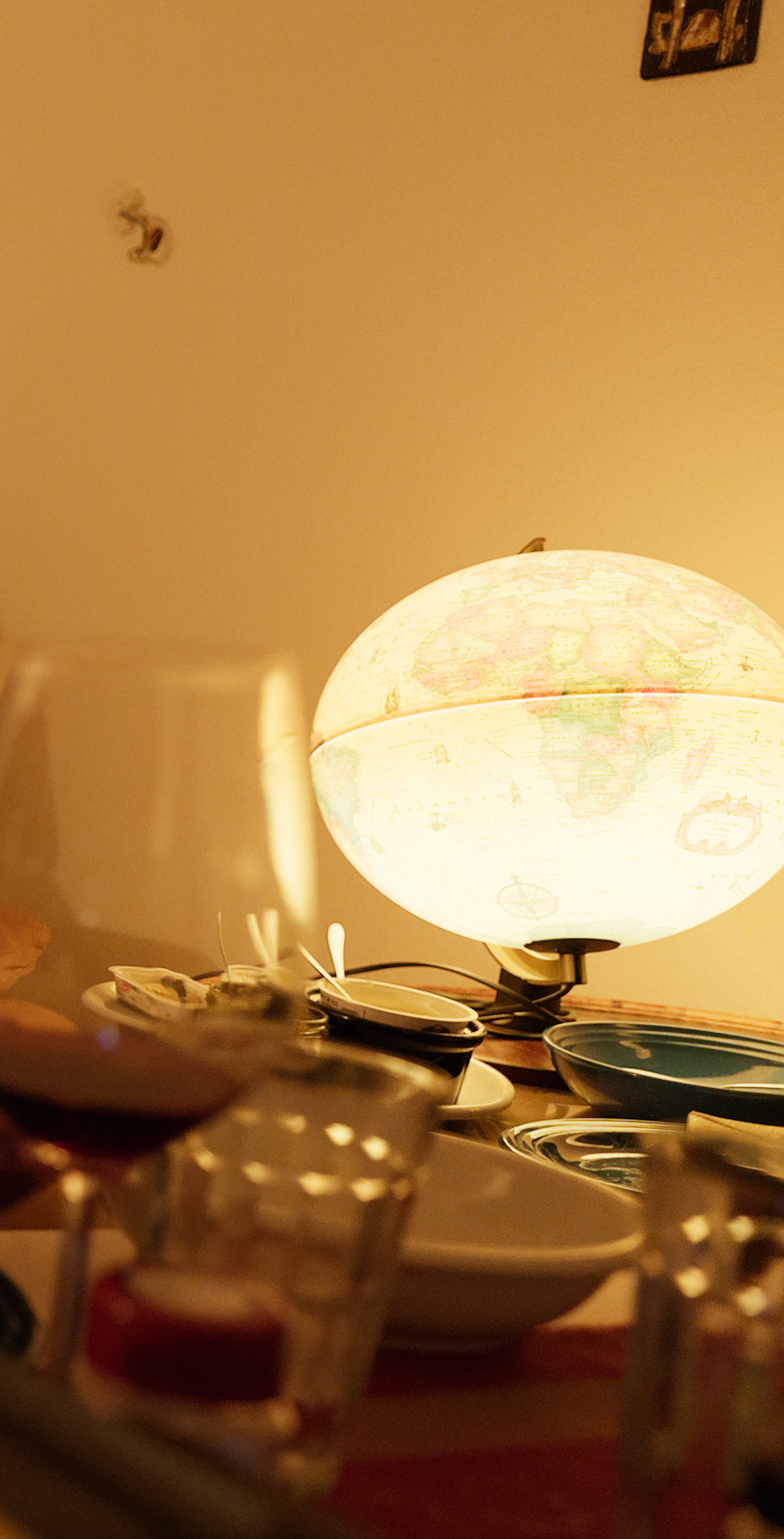
I tried it on a few of my pictures that I’ve never managed to look like how I perceived the scene. Left (filmic) has never felt right — the globe is supposed to emit a strong yellow light, but it looks salmon colored. The right picture, using the sigmoid smooth preset, recovers the atmosphere of the room far better.

5 Likes
But adjust the hand to get the right skin tone and I bet it would be red or more red. I have found it to be surprising how often targeting skin tones and setting them results in the whole photo being corrected from some weird color casts… I am no expert but often when I get a tricky skin color I have used the lab tone curve to tweak the skin tones using the guides offered in DT to bring up the average caucasian tones… Your point is well taken. Every photo is its own challenge
Edit: Just for fun…downloading this image with “no color” and actually looking at it… its not white balanced…if you simple white balance and then you can further tweak things using the hand skin tone using the DT reference as a guide… and then finally CB RGB for set the black as its not right…you end up here… with red for sure…

WB it…on coke letters

Then skin tone and overall tone tweak

3 Likes
Hello, I left a lights and smoke playraw to everyone who likes to test the primaries for Sigmoid.
Thanks @flannelhead !!
For sure! It has been already. I think it helped already to make it very clear that the skew parameter has a drastic influence on the output, and that with portraits (or probably most kinds of images) it is not advisable to push it very high to positive values. I think this is true of sigmoid’s per-channel mode in general.
I think in this particular case this wouldn’t have helped much, since the more red areas were in such position that with the chosen curve, they only ever get some increased purity but none of the desired shift toward yellow. With that particular curve, I don’t think any settings of the primaries would have remedied this, like you also found out.
Would be really interesting to learn more about this. Where should I start looking?
1 Like
Yes, sure it was not white balanced. The point I tried to make was that in the original, the can is clearly perceived as red, but no color picker would be able to tell you that.
This kind of a thing will happen on smaller scale in pretty much every picture, so it’s always best to rely on one’s eyes for judgement.
4 Likes
Well, it depends… I prefer to keep the dynamic range compression separated from the contrast recovery and “path to white”, so these are in two different places. Assuming you are interested in the latter, it’s essentially here. In a nutshell:
- save the original hue in jzazbz
- apply gamut compression for the output profile, using the aces method
- apply a per-channel tone curve (in the working profile)
- restore the original hue in jzazbz
- apply some handtuned hue shifts and highlights desaturation. This is the part I’d like to improve ideally
1 Like
I wonder do our eyes WB or do we just know the can is red and have a strong perceptual bias, or both ![]()