I feel like its late at night for me and I might not be thinking clearly but the color assessment thing is not going to help if the screen is too bright or dark its it?? If the monitor is properly calibrated such that the white has a decent brightness then the color assessment can be a reference point for the tonal state of the image as it relates to white and middle gray but if the monitor is set too bright then these points will also be impacted will they not?? So as far as I think of it this is a tool to assess your image on a well setup monitor but not a tool to set up your monitor or account for issues with your monitor brightness…
@Pic-N3p You should try viewing test images meant for calibration to see how well the different modes on your monitor perform. Eyeballing is not the same as using a dedicated colorimeter, but it should give you a sense of which mode is more neutral.
1 Like
Not judging the decision, we should use what we prefer, but I believe the purpose of it being smaller with the color assessment tool is that you have an easier time taking the whole image in, and being able to analyze it easier as a whole. Of course this also relies on other factors like distance to monitor, monitor size etc so ymmv.
1 Like
I use a single screen.
Note: ProArt Display PA247CV - Tech Specs|Monitors|ASUS Global indicates brightness as Brightness (Typ.) : 300cd/㎡. If that’s what the standard preset uses, it is too bright, indeed. According to https://photo.stackexchange.com/a/132206:
The “official” sRGB display spec is a peak white is 80 cd/m […] 120 cd/m² is a common reference level.
1 Like
IMO the image on the left is more natural, if a tad too dark, but not much.
1 Like
I agree, but only the OP can judge which one conveys their intention.
1 Like
In my opinion these values are too low if you want to process images that are solely viewed on displays. As far as I understood, the brightness setting of the monitor should match that of the viewing medium in the end - thus 80 to 120cd/m² are typically that of prints.
I set my monitor for 140cd/m² now, as I noticed that was also the native brightness of my laptop and approximately the brightness I typically use my tablet or phone.
I rarely print photos - but if I do, I reduce the brightness level first. I did this once with 120cd/m² and the print turned out great IMHO.
Long story short: Test the luminance of the devices/prints/… you want to show the photos on, and set your monitor accordingly.
Yep, the StackExchange comment goes on to say some set 160 - 220. Still, the 300 quoted in the specs looks excessive. Of course, the 80 - 120 etc. numbers were for SDR content; with HDR, it’s fine to have high peaks, as long as the brightness of midtones is correct.
I think one can simply look at photos on the internet, and adjust the monitor to a brightness where those look OK under their viewing / editing conditions, and then edit their own using that level.
1 Like
That is a good idea!
Yep, that is I guess a “problem” with most modern monitors, as they have now HDR. To use them for editing you have to pretty much disable everything first ![]()
1 Like
There are as well websites with testcharts for black- and whitepoint, like this (in German language):
https://www.simpelfilter.de/farbmanagement/monitorkalib.html
there is an English version as well:
https://www.simpelfilter.de/en/colorman/monitorcalibration.html
2 Likes
I think the caveat is that the standard also implies a specified range for room “brightness” which is reasonably dim so 80-120 is paired with that… If your conditions vary then a shift might be required. I think it is often said that your monitor should not be the brightest or significantly the brightest light source in the room or it will be at a level that impacts how you evaluate the edit…
There are also studies about the preferred viewing brightness as we age as one might expect…
Given that we have no control over what others are doing when they view our images and how their viewing environment and devices are configured then all we can do is calibrate the screen if we have the ability to do so and try to match the editing environment with the standards or when that is not a match for the editing environment/hardware setup, then do as you mention and just try a more empirical evaluation from a set of images…
1 Like
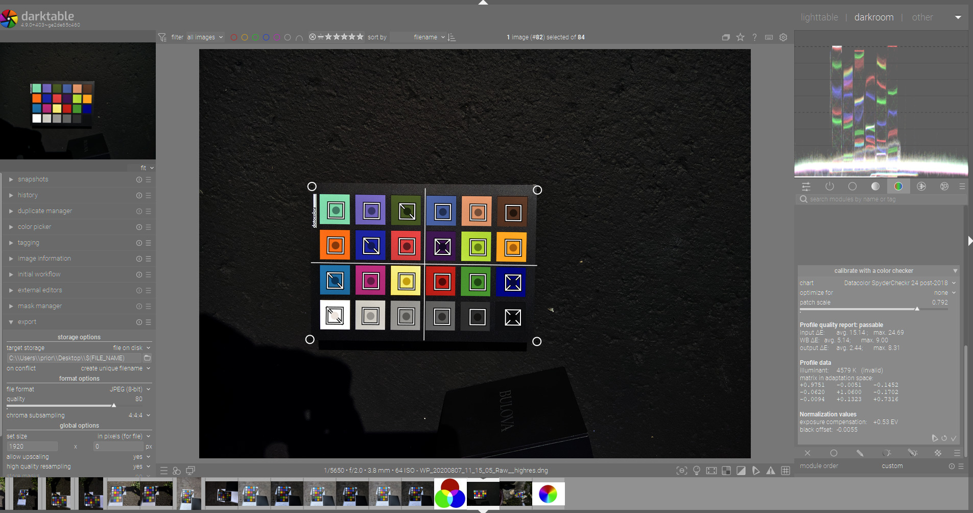
I was thinking…if you have a colorchecker and shoot it. Then if you use CC module and do the calibration I think it will look at the grey patches and tell you what exposure should be used to set things correctly. If doing so ie say adjusting the exposure on the test shot makes the white patch/image look too bright or too dark could that indicate if the monitor might be setup too bright or too dark and allow for a correction to be made??
Its a random thought as I am dashing off but maybe I will see or maybe I am out to lunch on that being at all useful…
1 Like
it’s not a major problem what is happening, IMO half of it was solved already by knowing that what I do on my monitor, was done under too much brightness.
Today I am contemplating the idea of making 2 versions of the same image, one for my screen and the other one with more expositionj for other screens. I gave up on using the sRGB profile yesterday, it’s just too dark, I don’t like it.
@Popanz Thanks for the links, I will check out these images.
@priort I don’t have a colorchecker… I see that they are fairly expensive.
Note: I am not serious enough to buy a calibrator for my monitor, no thanks… i’ll figure out a way to adjust my images.
I have a copy of the problematic monitor here with me, it’s either a HP E223 or HP E22 G4. I’ll take look at my pictures with it to see what is going on and how different it is from my ProArt. I think they are decent screens.
@hatsnp thanks for the feed back on the 2 images, I prefer the darker image too. I looked at some landscape pictures yesterday most of them had darker backgrounds, so maybe it’s just how things are.
1 Like
UPDATE.
I may have wasted your time here… I tested my pictures on 2 of the problematic screens with my Laptop and they were totally beautiful.
I think what happened… I looked at the pictures while standing and perhaps these screens were less tolerant to that type of viewing. With the screen right in front of me… the views on these 1080p HPs 22" were totally amazing.
![]()
But as for the darkness… it was really not a problem while facing the screen. I tried to reset the settings of 1 monitor too, same thing, images OK.
Looks like it was a code 18 again…
1 Like
For what I was wondering you could use any image of one shot from say imaging resources…it wouldn’t even have to be your camera.
You would just run the calibration process in the CC module…
It will suggest the correct exposure. You would set the exposure to that value and then guage overall brightness of grey and esp white… I suspect for minor offsets you wouldn’t maybe notice much but though I haven’t had time to check I would think a setting way to bright or dark might be revealed…
I think I’ll do nothing with this seriously, especially following my tests with the monitors from my last “update” post.
The CC module is it for color correction or color contrast in darktable? It might be something else, not sure.
It is the color calibration module that is used for the modern white balance but it has a tab for a color checker… you could use any raw with one in it for testing. It will also tell you the correct exposure for that set of color correction parameters based on the image…
1 Like
Ok I watched some videos about the color calibration module yesterday, some people comparing it to white balance maybe better version of something similar. Saw some more cool features and learned a bit how to use it.
I was not able pick up any information about CC telling me the right exposure or how to use the color checker.
Need to find other videos about this.
Thanks for the info.
There are a few videos including 2 from the module author Aurelie Pierre that walk through the process. If I get a moment I will share them…I’m pretty sure the manual section explains it well
EDIT
The first video by Hal is pretty good. I do feel like you need to do a second exposure adjustment if you change the black point compensation and exposure and then recompute one of the models to optimize the deltaE…You can see after he does it that a different EV value is shown and I think the image looks dark and reflects that… so resetting the exposure to 0.5 from -1.34 would likely make for a nice result…
THe third video is Aureliens…he added this feature… Also one small note on the exposure value…in the first/early version of the module this value was given as the adjustment to be added to the current EV setting…it was later changed to be the actual EV value that would set the correct exposure based on the patches from the color checker… I can’t recall if AP’s video was in the earlier version or it was done after the change was made…
Also he demonstrates this from around 20 min mark onwards…
