That would be great!
Mike
That would be great!
Mike
I added this code snippet to the CSS and set it to grey_90 for the border when an image is selected in the lighttable. I hope this is the change you need. You can download the user.zip file again and add it to the configuration window.
/* set selected image and/or focus one */
.dt_act_on_hover #thumb-main:active #thumb-back,
.dt_act_on_hover #thumb-main:selected #thumb-back,
.dt_act_on_selection #thumb-main:hover #thumb-back
{
  background-color: shade(@thumbnail_selected_bg_color, 1.05);
  border-color: shade(@grey_90, 0.8);
}
do I need to place this code in a particular place within the file?
Not in a particular place, you can put the code at the end of the custom user.css or you can download and unzip the user.zip again and copy all the content of the user.css to the darktable configuration window.
First Question: Can I ask questions on this thread? 
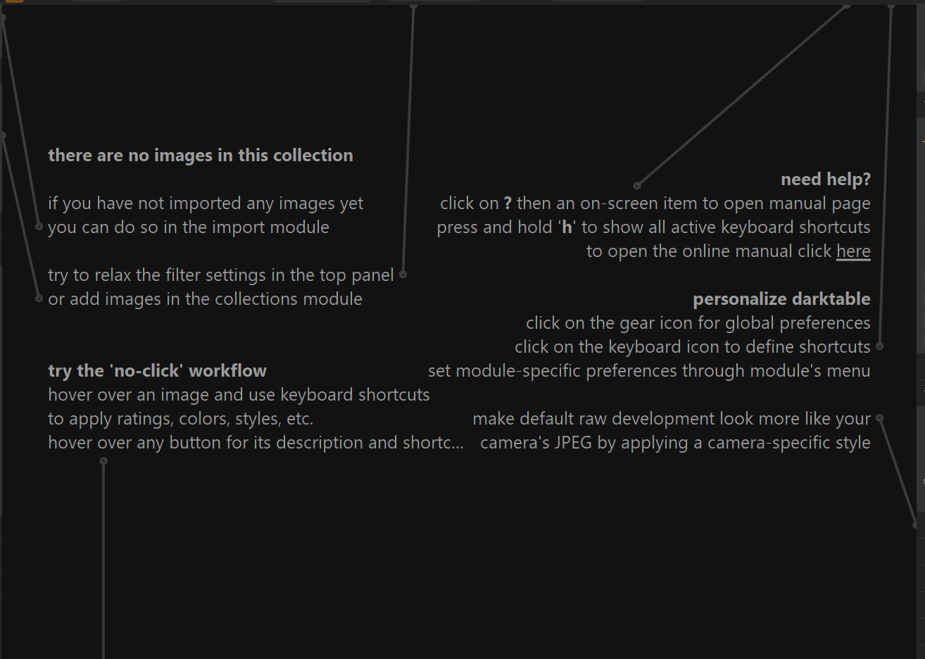
My first is: is it possible to hide the “help” messages that show on a blank lightable screen?
I have no idea what the “help” messages you post are, but in the case of the tooltips they can be hide using the shortcut shift+t
PS. if you refer to this information on the screen. At least in CSS it is not possible to modify or hide it.
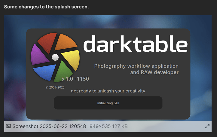
Yes, I am referring to that. Thanks! It would be nice if it was an option, like the splash screen.
tooltips I know,and do turn them on and off as required.
Good stuff in this thread – a very polished theme that makes DT’s underlying solid UX really shine.
I’d be very curious if any GTK - C savvy devs can identify where icon assets like these icons come from:

I can’t seem to find icon files or CSS references to them in the source code. Below is a rough mockup of the icons I might use - each is a nice little SVG square.
My comprehensive Darktable redesign is approaching ready-for-dev testing, and I’d love some assistance or hints towards SVG icon implementation 
In this thread I like the comment about difficulty seeing where module X ends and module Y begins - a good use case. I use single open modules so didn’t think of that!
All those icons and lot more are drawn hard-coded into darktable. See:
All those should be moved to external SVG if we want full GUI redesign based on CSS.
First off, I really like in a general sense what you’re doing with this. Attention to UI details make – I think – a much bigger difference than some might expect. When cumulatively they come together even small changes can have a big positive or negative impact. So, kudos to you for the efforts you’re making.
That said (here it comes, right?  ) a little personal preference – which is all it is, and may or may not be worth anything:
To my erstwhile graphic designer eye, the contents of the splash visually crowd the background. In particular ‘darktable’ is too large and too close to the right edge. Same for the “aperture blades” symbol – A tad too large and too close to the left edge. My personal approach would not be to make splash larger, but the graphics smaller, to better fit. Maybe 75% to 80% of the current size. Understatement goes a long way.
But if that’s all I can nit-pick, it’s testament to how good it looks.
This was an attempt to implement what could be done via CSS only from another thread on revamping the whole DT UI. Since some elements and fonts and logo are hard coded, this is about as close as it gets without changing dt’s source code. So its not all the way done 
It is precisely those elements that I have no possibility to resize or otherwise adjust using the CSS
The logo should have a smaller size as a whole, both the typography of the word darktable and the image, to achieve more space at the edges of the pop-up window, as well as adjust it horizontally to achieve visual balance.
I love the design ideas but I had to pull out the CSS changes on my Mac Studio M2 Max machine because the UI changes resulted in visible performance lags. Probably CSS is not the most efficient way to change the UI.
Thanks for the compliment.
I have no idea why CSS has caused performance issues for your Mac, darktable works with CSS since it runs, to display the interface it uses the predefined themes using the darktable.css and the others (darktable elegant grey etc). The changes in the configuration window are just to adjust the interface to other custom colors and shapes. In fact I have always tested the program with interface customization on Linux, Mac and Windows without causing delays or lags in performance. Surely there is someone knowledgeable on the subject who can shed light and knowledge to understand what may be happening on your Mac.
My problem still exists!
I have been very careful to follow your instructions and select the correct theme. Overall the changes are very good and the legibility is much improved but now I wonder how to overcome my localized problems.
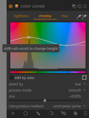
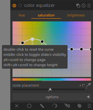
On the color-equalizer there is no pick icon … color-look-up-table, same problem.
I’m going to check it ASAP to see if in my side I find the same issues.
I have no idea what could be happening on your side, there are none of the errors you raise on my side. the custom CSS works without the problems you mention.
Once before you had some issues with the theme, really I don’t know about how to fix it.
That response, noted above, was made when I reverted back the the original ‘user.css’ and not with the revised version.
SOLUTION …
I appear to have found the root of the problem. I changed my system (Linux) appearance from using a Xfwm4 theme to that of a Gtk3, this now fully works for me.
I spoke too soon … after a system restart the problem persists
Rather a shame since the overall appearance is really very fine.
Sorry to bring bad news again… I have spent some time researching the problems that I have encountered and, unfortunately, my problems still exist.
I have a couple of older systems so I was able to try using a couple of distributions (OpenSuse and Fedora) with my current desktop (XFCE) and also my current distribution (Manjaro) using KDE desktop. In all cases there were problems both in the graphics display as well as in the top menu structure.
I have finally ‘given-up’ and returned to the original offering that works well.
I do have to say that the overall appearance of your latest offering is, in my opinion, much much better than that offered in the basic dt form in several ways.
I suspect that my comments appear to be negative … they are not meant to be.
I would be interested to know what combination of distribution and desktop you are using.
Thank you for the effort and time that you have spent on this project.