The white balance works well but it’s still not exposed for the faces.
I also gave the image another try, mainly bumped the exposure
The white balance works well but it’s still not exposed for the faces.
I also gave the image another try, mainly bumped the exposure
Or go black and white. ![]()
Thanks again to all who contributed to this thread.
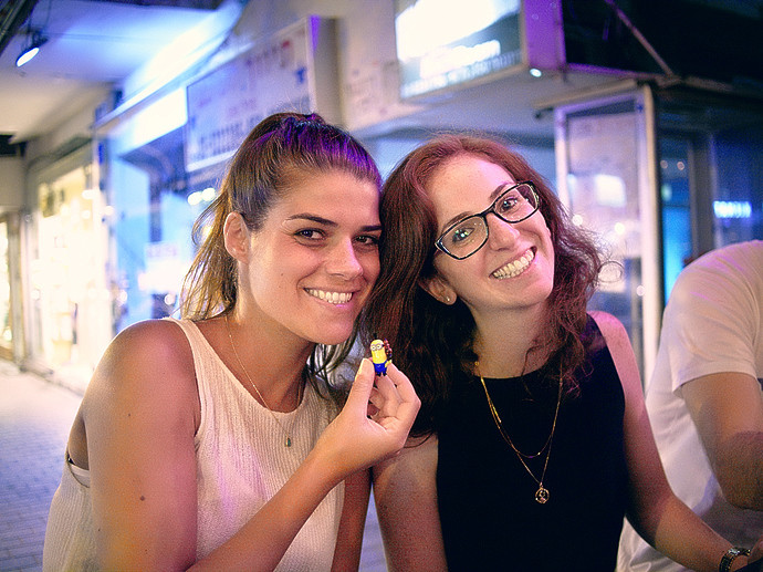
First of all, let me say that I’m well aware of the painful mixed light in this scene and I didn’t expect to see miracles from the RAW converter. Yet, mixed light and backlit subjects are part of life and my point in posting the OP was to use this picture to learn how to deal with these issues.
Backlit subject - I find John’s attempt to be the most successful one in lifting the shadows while protecting the highlights. However, upon further inspection in RT, I see that the shadows were lifted using the Highlights/Shadows tool, which unfortunately adds tons of noise to the dark areas, which consequently require very aggressive NR. Another problem with this tool is that it isn’t applied uniformly to uniformly dark areas. For example, the edges of the black shirt are darker than the center of it in this development, and also the areas around the chain. Too much color noise too. This is John’s result that I’m talking about:
I spent time trying different combinations of the sliders Black, Lightness, Contrast, and curves, but didn’t manage to balance the exposure in the sense of lifting the shadows to the extent shown above while protecting the highlights and maintaining good contrast in the overall look of the image. I’m sure it is possible, since John has just shown that such look can be obtained, but it was done using a tool that adds too much noise and introduces strange artifacts as on the black shirt.
Colors - I didn’t use the Adobe standard profile because it caused me problems in other cases, and the same goes for Adobe’s profiles for Olympus color modes. Perhaps there’s a problem with the profile I created. I’ll try to get back to the place one evening and create a new profile for the same point of view. Regarding the harsh transitions I talked about in the OP, and the general ‘plastic’ look I got in the beginning, I see that it can be much better when a warmer WB is used, but that’s not necessarily the nicest WB to set for this image. Maybe this problem will be solved when I have a better profile. Anyway, I don’t think there’s much to improve in terms of the WB setting. It’s a compromise given the mixed light (in the foreground and in the background).
Thanks again to all contributors.
Thank you for sharing this and for kicking off a great discussion of various approaches to a common problem! At the very least there were some great tips and pieces of advice for a problem that I’m sure many folks face fairly commonly. 
The solution is to cheat: go black and white. You might agree that it makes the noise reduction issue easier to solve. I used three tone curves, each to cope with one issue or another.
P9040307rt-BW.jpg.out.pp3 (10.5 KB)
Just for interest. I took the last one I posted and altered the basic lightness and contrast exposure sliders. Altered the colour temperature a bit, changed the skin tone protection value in contrast by detail level and selected Adobe’s portrait camera profile which in my view did improve the skin toning. After saving from RT I opened it up in Fotoxx and did my usual post reduction unsharp mask rad 2 strength in this case 25 as I feel this is a weakness in RT - not being able to set sharpness levels in a reduced shot. Doesn’t make much difference on this one but that’s not always the case. The same thing could be checked / done in the GIMP.
P9040307.ORF.pp3 (6.1 KB)
I always adjust on a near black background but hopefully this one will be brighter on the default white on here. Something the board might want to think about.
There’s some discussion on that here:
(I’ve had a go at this image but haven’t been able to get a result I’m happy with yet.)
I’ve never had any problems reading posts on this forum David
http://www.cambridgeincolour.com/forums/latest.php
They provide an option on how things look in this respect as well but most use the default. I find it a touchy area and have often been tempted to try and get some OS developers to allow me to set it myself. There can be a problem. Fotoxx once went dead black - Great but at times it was impossible to see the edges of shots. Something I have never noticed on that particular forum but if it happens a frame would soon sorts that out.
I could have several more goes at this image but think the last one isn’t too bad. Maybe a touch brighter than I would like but that seems to be what was wanted. Hopefully the pp3 files will help the poster with their adjustments in future. I’d guess your PP may be better than mine.


