Would you be able to tell if you prefer the output tone distribution, the colors, or both?
I have done some further work to improve and simplify the tone mapping tool.
Instead of a general “compression” adjustment, it is now possible to specify the “white” input level, which is mapped to 1 in the tone mapping output. This “white” level is not affected by changes in the slope parameters, so it should be easier now to precisely define the values above which the input will be clipped.
The white level is represented in a 10 * log10(white) scale, so a value of 0 for the white level means that 1 is mapped to 1. In this case the tone mapping can be used as a classical S curve.
The maximum value of 100 means white = 10^10, which can be considered as infinite in practical terms…
There is also a new slider to adjust the de-saturation of highlights, if needed (it defaults to 0, that is no desaturation).
Here is an extreme example of a conversion to sRGB through a combined use of the tone mapping and the gamut mapping tools. The input is a synthetic ACES-P1 image with gradients that reach extreme RGB values, and which are usually rather difficult to gracefully compress into the sRGB gamut:

For comparison, here is the result of a straight relative colorimetric conversion to sRGB:
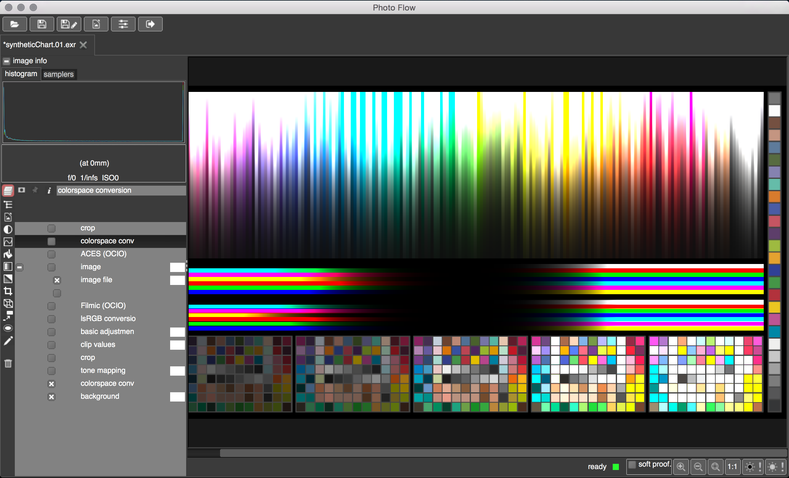
The image used in this example is the syntheticChart.01.exr file in the ACES folder from the ACES test images set.
1 Like
You would have to gift me with a pro monitor with a powerful rig first, which I would then have to colour manage properly. ![]() All I can say is that they look better and that my eyes are way more sensitive to tone than colours.
All I can say is that they look better and that my eyes are way more sensitive to tone than colours.
I realise I have asked a rather mis-placed question… Anyway, I am trying now to provide presets that are very close to the OCIO filmic ones, and that can be used as starting points for further tweaking.
Excuse my misplaced wit. ![]()
That would be a good decision since OCIO filmic has been battle tested. However, I think that they also deserve their own, since they have a different character to them.
Dear all, here comes the next improvements in the tone mapping tool.
The main new thing are presets, that is user-selectable pre-configured sets of values for the parameters that give “good starting points”. Actually, the presets have been tuned to reproduce very accurately the OCIO-filmic ones. The agreement is very good, with just a little discrepancy in the deep shadows where my presets are a bit brighter.
Once a preset is selected, the user can further tune the parameters to achieve best results, if needed.
There is also a new slider to control the saturation of highlights. By default it is set to “0”, which matches the OCIO-filmic behaviour. Moving the value from “0” to “100” the highlights will progressively retain more colors
Here is an example of comparison between OCIO and my own.
OCIO Filmic “Medium High Contrast”:
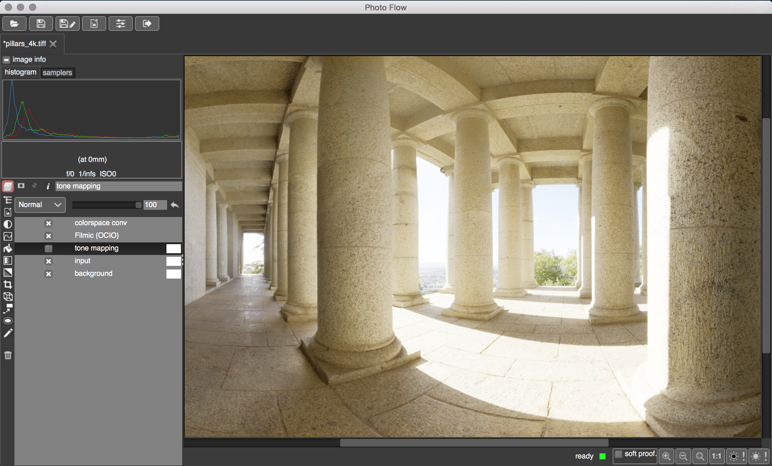
My tone mapping with “Medium High Contrast” preset and some additional local contrast + highlights saturation:

Incidentally, I have discovered a bug that made the OCIO-filmic output look brighter than it should. That means that existing edits using the OCIO-filmic module will produce a slightly darker output when re-opened with the latest PhF version. This can be corrected with a power-like adjustment after the OCIO-filmic layer, if needed.
Sorry for that, but I could not really ignore such type of bug…
Noticed it right away but didn’t want to bother you about it since it didn’t bother me.
Could you please provide your PFIs for examination, and a link to the source image?
I find the saturation a bit uncanny and unnatural, esp. in the centre where the sky meets the highlighted pillar.
Could you also add tool information to the info button of your tone mapping modules? Even though I have been testing all along, the parameters still give me pause. Info readily available would be nice.
The source image is the 4k one from here, but I had to convert the .hdr file to TIFF with GIMP because the format is not supported (yet) in PhF. The original image is in linear sRGB colorspace.
I have uploaded the TIFF file for convenience here.
Here is the .pfi file:
pillars_4k.pfi (11.6 KB)
Indeed, whether a bit of HL saturation is good or not really depends on the image. That’s why the default is “no additional saturation”. Anyways, I am still experimenting with this part…
Agreed. It’s time to work on the documentation!
HL Saturation - really useful. My biggest problem with filmic type curves is that skies (and sunlit foliage highlights) tend to end up grey instead of blue. By bringing up the HL saturation you can get the sky the right colour (some care is needed - as already mentioned the results look unnatural if you overdo it). I think the problem is that increasing the saturation in the highlights is reducing the luminance at the same time.
The gamut mapping in the Colourspace conversion module is also helpful.
Mid-tones shift - also very useful.
I’m finding that I tend to end up with +ve exposure compensation (1.5-2 stops generally).
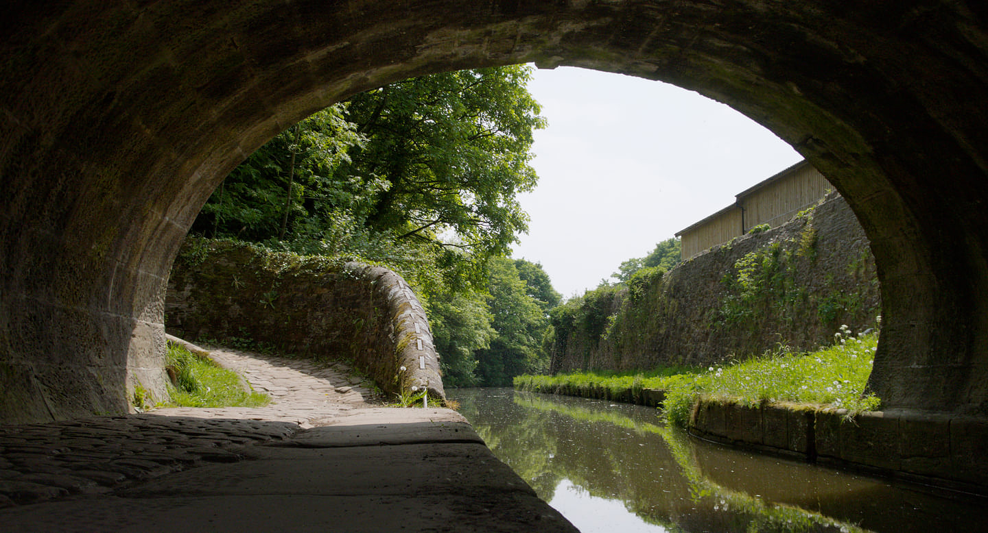
With the OCIO filmic module (medium-high contrast preset):
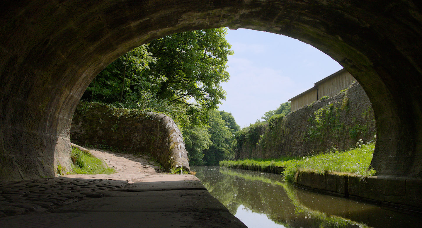
With new Tone mapping (using the medium-high preset + 76% on the HL saturation):
1 Like
Are there any linux builds available of recent PhotoFlow? I usually have no problems compiling myself but for whatever reason PhotoFlow tends to fail on me.
When trying to find recent builds I’ve ended up at various dead ends.
2 Likes
Thanks!
@Carmelo_DrRaw perhaps make that link a sticky in the PhotoFlow category? I did search around a bit but failed to find it.
Make it easier to find on the GitHub site.  I only know because I bookmark everything.
You are right, and that is mostly due to the use of MAX(RGB) as the RGB norm for this. However, this has the advantage of automatically keeping the resulting pixels into display range. Other methods would likely generate RGB channels > 1, hence requiring some gamut mapping to bring them back into display range.
Now, if you want to preserve saturation in the gamut mapping, the only choice is to reduce the luminance…
My suggestion would be to “prepare” the image using a simple exposure compensation that puts the desired mid-gray areas at the correct luminance, and then apply the tone mapping. You do not need to worry about blown out highlights, because the information is still there, and those areas will be recovered by the shoulder of the tone mapping curve…
I have put a link near the top of the README.md file in the GitHub repository. I hope this will help people finding the most recent development packages!
Which Linux distro are you using?
Im running Debian sid and testing.