Ok, I managed to have a play with it thanks to @priort and his new Windows build.
I really like it! It’s a really cool module for harmonizing colours, and it doesn’t feel similar to Color Balance RGB at all. It definitely feels like a completely new module.
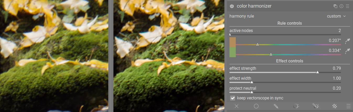
I particularly like the “custom” mode, where you can move away from harmony rules and even create colour contrast. Here, I moved the yellow leaves away from the green moss and created more contrast between them:
Original on the left, with Color Harmonizer on the right (zoomed in a lot, which is why it’s not sharp)
This may not be the purpose of the module, but I still find it a cool feature nonetheless.
@Masterpiga , I noticed that the pickers default to an area pick, similar to the 4 Ways tab in Color Balance RGB. Was there a reason for this? Or could it make sense to have a picker like in Color Equalizer where it defaults to a precise picker but you can right click to pick an area? As we’re picking an anchor hue, I think I would prefer to have a precise picker personally.
Thanks for the feedback, @europlatus. You can already switch to a precision picker by ctrl+clicking on the image after enabling the area picker. If there is a general preference for this modality I am happy to change the defaults as you suggest. I find the area useful as you can quickly get the overall hue of a subject or background area.
Good point, and ultimately I don’t mind as long as both functionalities exist.
But it does make me wonder why the pickers work in opposite ways across modules. It strikes me that it’s not particularly user-friendly for a new user when they don’t know if picker will default to a precise or area picker. Anyway, that’s a more general query - not specific to this module.
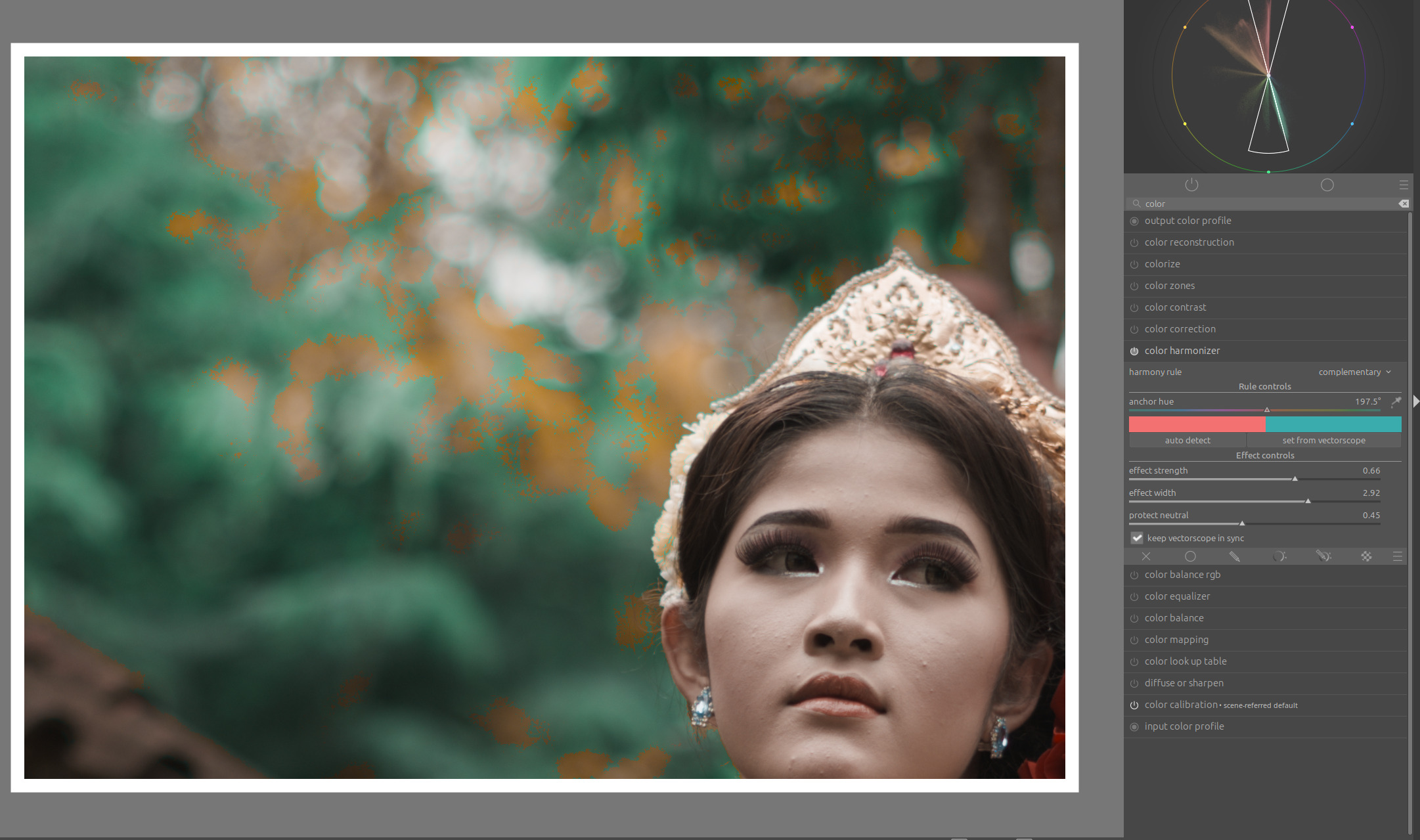
I see it uses JzAzBz. Have you considered using darktable UCS instead or as an option? It was designed specifically for color grading and is a bit more perceptually uniform.
This is exactly the feedback from more knowledgeable people that I was after
Here is a new version working in UCS:
I have also fixed the “protect neutral” slider, which was protecting a bit too much. Now, even when it is maxed out the saturated hues will feel the pull of the anchor nodes.
I finally have the opportunity to test your new tool.
And as far as I can tell, it’s a very nice addition for color grading. It will be a perfect module for color matching photos to a given color scheme in graphic design. I need this very often.
I have two suggestions for improvement based on the current version:
The tool needs something like a guided filter to soften harsh color transitions at higher values for effect strength and width:
Suggestion for a possible extension: saturation control according to dominant and subordinate colors. An important rule in color harmony is to adjust saturation based on color hierarchy. Often, you want to emphasize the contrast between given colors in the color harmony by additionally highlighting the dominant color through saturation.
In any case, thank you very much for your efforts regarding this nice extension.
This would completely change the math of how it works, but if you were able to achieve the concept using rgb primaries (color calibration/channel mixer) that would negate the need for a guided filter. Dont know if that would offer as fine control however.
Thanks! I’ve enjoyed playing with it. It seems like it’s not possible (or at least not straightforward) to get a good result for every photo. Some things have flexible color, like walls or furniture. Water and sky to some extent. Leaves and animals largely don’t. This tool doesn’t know which elements can be pushed.
And of course a color will low saturation can’t be pushed very much because grey is grey.
It worked great on a carnival photo where some bright pink lights could become orange. I had mixed feelings about when it changed a brown door to a shade more similar to the subject’s skin. And I didn’t like it much when some leaves were turned less green. But for sure this tool isn’t appropriate for every use case. I look forward to learning more about it.
Jokes aside, as mentioned in the OP it is mostly meant to emphasize what is there already. If there is no inherent harmony in the photo, trying to force one will most likely lead to unpleasant results.
It is like that with every transformation that you can apply, really. E.g., pushing the contrast works well on some photos, and not on others.
No, it’s not AI. Like everything else in darktable, it does not detect subjects. It just applies some function to the values of the pixels, regardless of what the pixels belong to.
Correct, it isn’t and is not meant to be
Exactly. It is not meant to be used in a vacuum. You use it together with the other available tools to reach the desired effect. It’s just one tool in a toolbox with many other wonderful tools.
Finally gave it a try. Interesting module! Thanks for investing your time for our benefit !
Some feedback
In my opinion the picker would make sense to be the eyedropper by default. It will draw a point on the vectorscope and give direct feedback as to what primary colour has been chosen.
If possible activation of the module could activate the harmony-overlay on the vectorscope right away. Currently it only does so upon changing the harmony rule.
I find the movement of the anchor hue counter intuitive. Moving right turns the anchors counter-clockwise. At least to me the other way around makes more sense.
Auto-Detection doesn’t work for me: “no histogram available yet - wait for the preview to finish processing”.
I mostly wrangle my simple harmonies with the colour equalizer and have to say I currently find that more precise because it can not only push colours to different hues but also act on their saturation.
I think it depends on which quadrant you are in. In the south hemicycle they move in the same direction, in the north hemicycle in the opposite.
It happened also to me once or twice, don’t know what causes this
Saturation control is coming too. It will be like using ColorEq, with the difference that you do not have to select the hues again, so it’s mostly an ergonomic win, not really a new capability.
Toggling open CL off (and on) in the options, then making an adjustment to trigger re-rendering cleared the issue. Launching DT with openCL active causes the issue to reappear.
Everything can be Achieved with curve Moduls or a LUT.
Or if one is truly committed in Hex editor…
So i would mush prefer having a dedicated “tool for the job”.
Me to! i was wondering if it would be possible to load modules kind of “plug-in” based. like its common in audio editors.
@Masterpiga Thanks a lot for taking the time of making this awesome extension for Darktabel!
I Hope to see this Soon in the main version