Sorry for the Bump, but I would like to add my 2cents to this topic.
I found this a really nice challenge - something to train your eyes, spotting the color, sharpness and contrast differences and, of course, using the tools to minimize them.
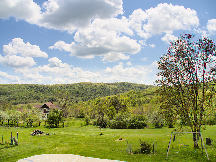
I tried really hard, to get a very good match between my edit end the Pixel 3a reference, but I failed because of 3 reasons
- the reference photo has same subtle color gradients in the greens or the blues (in the sky). These are not decisive for the look, i think, but make the exact matching very hard
- the OMD picture is a bit blurry in the foreground (the bushes for example)
- there seems to be a different lighting in the near foreground (the tree, its shadow and the plastic cover)
So after trying several hours with masks and gradients, I ditched this approach and tried a more imperfect but quicker edit.
First of, here is the end result and I think it matches pretty good in the overall contrast and colors, the sharpness and local contrast.
As to what I’ve done… I found the most important bit is the dynamic range compression, while maintaining or enhancing local contrast, which can be done (like @s7habo and others have shown) with two instances of tone eq - this gives really good control over where exactly to place your contrasts.

Second, I looked for the colors. I made the sky more bluish and kept clouds mostly neutral with a little bluish cast. Not sure, how the Pixel 3a does this, but I tried to match the colors with the channel mixer, as I like to use this module. I kept an eye on the greens, and balanced them between cold and warm to match the reference.
To match the blues I used the input blue in all three color channels of the mixer and for the greens, I mostly used the input red/green in the blue color channel.
At last I tried to match the sharpness with multiple instances of diffuse or sharpen. This is pretty standard for my editing process and here i used a lens deblur, dehaze and sharpen demosaic, with my personal adjustments and balanced out to kinda match the reference.
So, to wrap this up… I thought I’d add a little information about my thought process, which may or may be not useful for the op (or other interested people), because I think it’s a common theme for, err, newbies, trying to match the style of their previous photos with the phone.
Thanks for the fun and the learning experience on my side, @Sciencenerd!


