Here are a few possibly interesting ones:
- Fujifilm Professional Data Guide
- Development of Motion-picture Recording Film ETERNA-RDI
- Development of Fujichrome ASTIA100
That’s pretty wild, nice find! Love hearing these development stories! 
Here are a few possibly interesting ones:
That’s pretty wild, nice find! Love hearing these development stories!
             [
                 null,
-                1.012518727450156,
-                1.7554564241334116
+                -1.2157949931727523,
+                -0.4946460830254054
             ],
oh, did everything become a lot darker? this is from the log_sensitivity table in the portra 160 data. what else should i be re-normalising in different ways now? without further changes i’ll render everything black. also need to re-calibrate the white balancing of course.
[edit: for now i mutiplied the film exposure light *1000.0 and it’s kinda back to normal. updated the vkdt data to upstream]
in negative and positive film i normalize with the spectrum upsampled for midgray = [0.184, 0.184, 0.184] (that is essentially the reference illuminant bandpass-filtered, i consider the bandpass as part of the spectral upsampling). so when inputting midgray as input i get zero log exposure for the three channels. the spectral upsampling spectra are computed with code very similar to the one you shared to me last year, i hope i didn’t add other weird normalizations there.
for print media i normalize sensitivities with the printing illuminant attenuated by the mid density published for the reference target film (portra 400 for kodak, vision3 250d for cine kodak, pro 400h for fuji paper) and enlarger filters set to Y50M50(C0) CC units (100 kodak CC units is 1 OD, and for Durst enlargers 100 steps is in the ball park of 50CC). in this way i get neutral filters fitted in a reasonable range without pushing the density of the enlarger filters too much. i changed also the scale of the filters, now linear in density, because they are like this in real enlargers, and i avoid to get filter values crashing to 1.
ah, nice. that sounds good. i need to think about whether colours on the purple line (spectra with dips not lobes) would fall off to zero at all or just be clipped at the maximum evaluation range. does the middle grey spectrum fall off to zero? or is this about frequency domain over lambda more than uv and near-ir?
that sounds really useful. it’s a ui change / breaking history (but i keep doing that in this filmsim module…), but also something that would potentially help the white balance optimiser to be more stable. i might experiment with this too, probably a good idea to stick as closely as possible to your implementation anyways. even if these particular changes seem to be more constant normalisation offsets or paramater sensitivity changes that could likely be compensated by user settings and wouldn’t in general lead to a different output/expressivity.
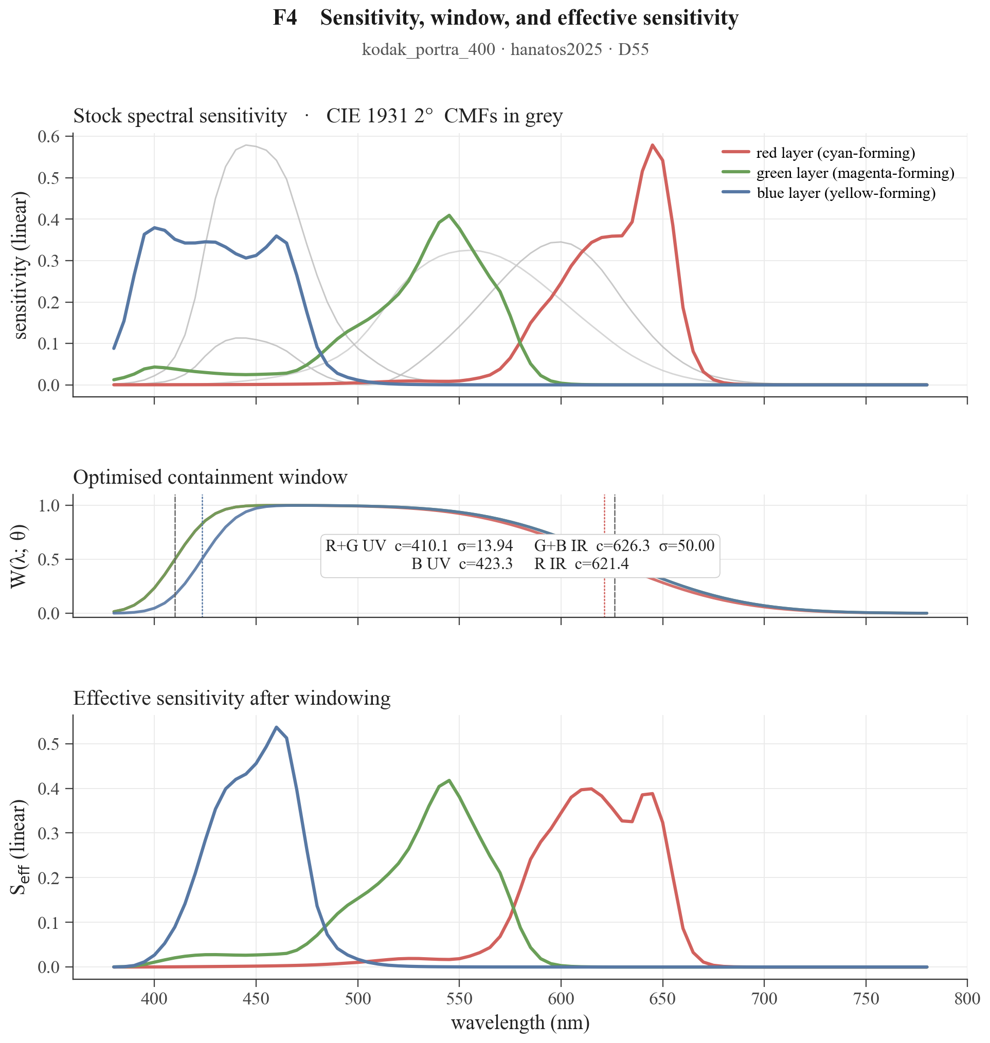
i am not sure about the extreme purple line, i am pretty sure it will suffer, but during the weekend i got some results from a sidequest: trying to optimize the bandpass filters for every stock. the results might give some insight on these questions (and there might be pitfalls). any feedback is very welcome of course!
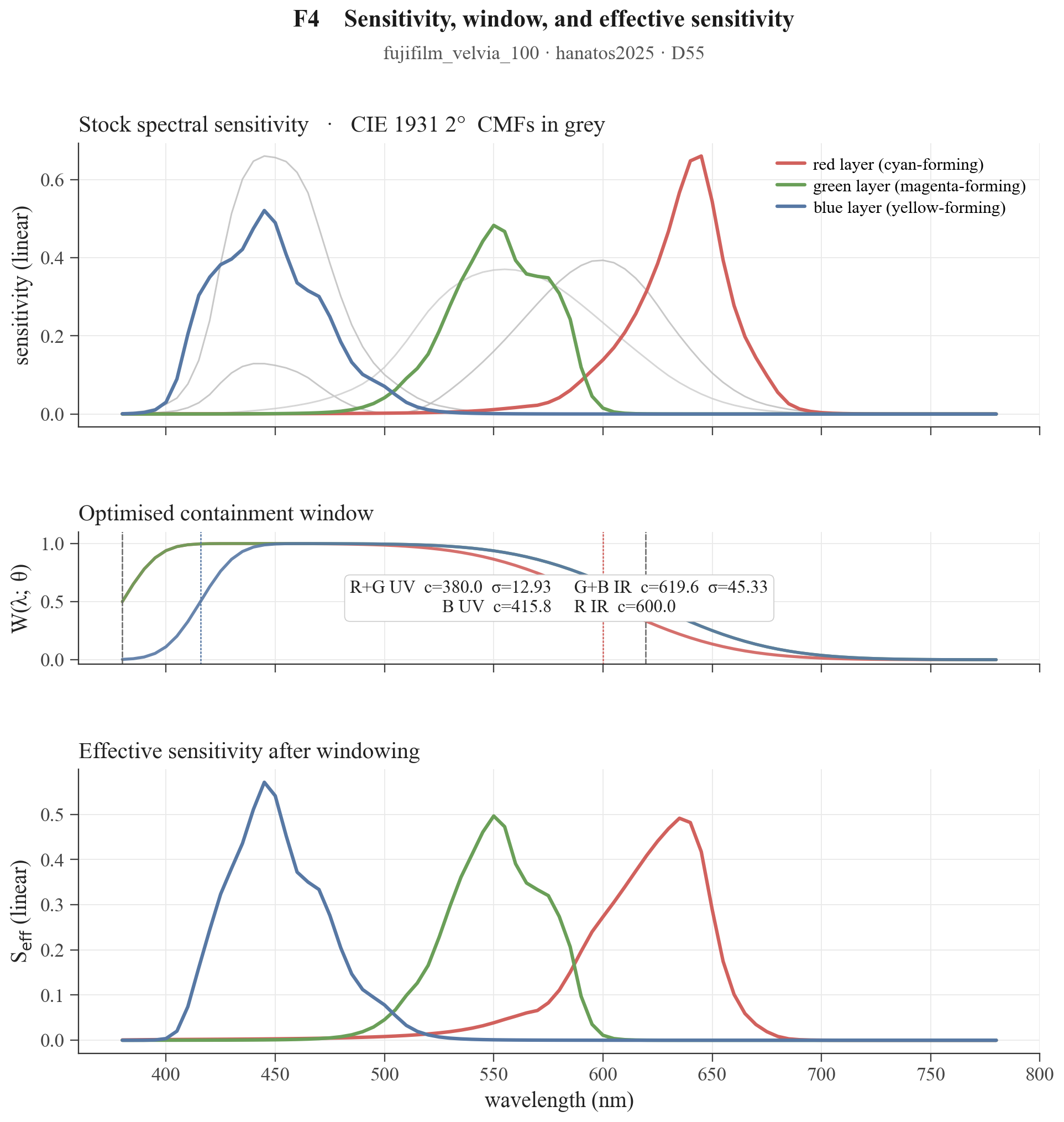
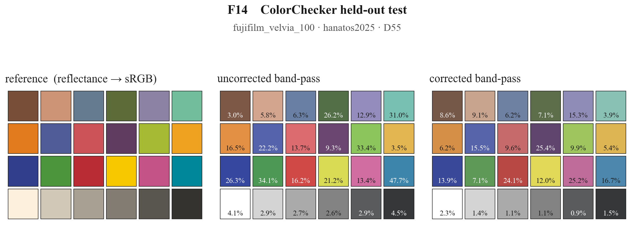
i wrote a little optimizer that fit a 6 parameters band pass model to minimize the delta exposure of a measured dataset of real spectra vs the upsampled versions (the loss function is the sum of the difference of log exposure per channel). clearly the problem is imperfect by definition and there is no perfect solution, but it seems we can do a decent job for many film stocks and a good job for some of them.
essentially we are comparing integral(real_spectra x sensitivities) and integral(upsampled_spectra x sensitivities x bandpass). we can view it as reducing the near-uv-ir sensitivities or reducing the near-uv-ir upsampled spectra energy. i monitor the result using
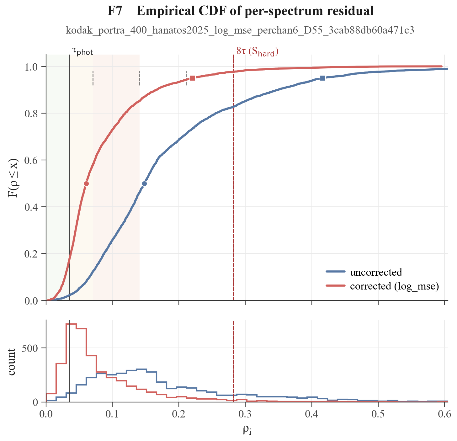
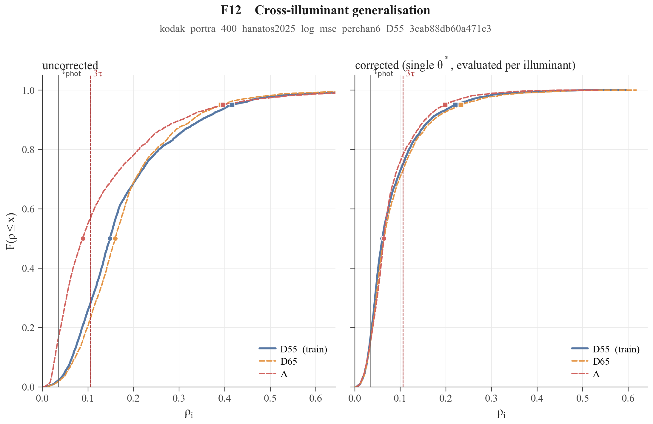
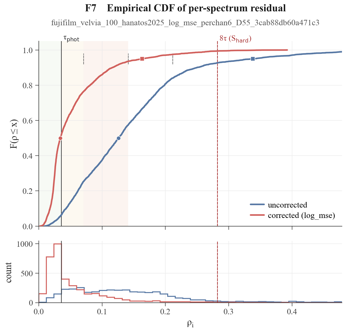
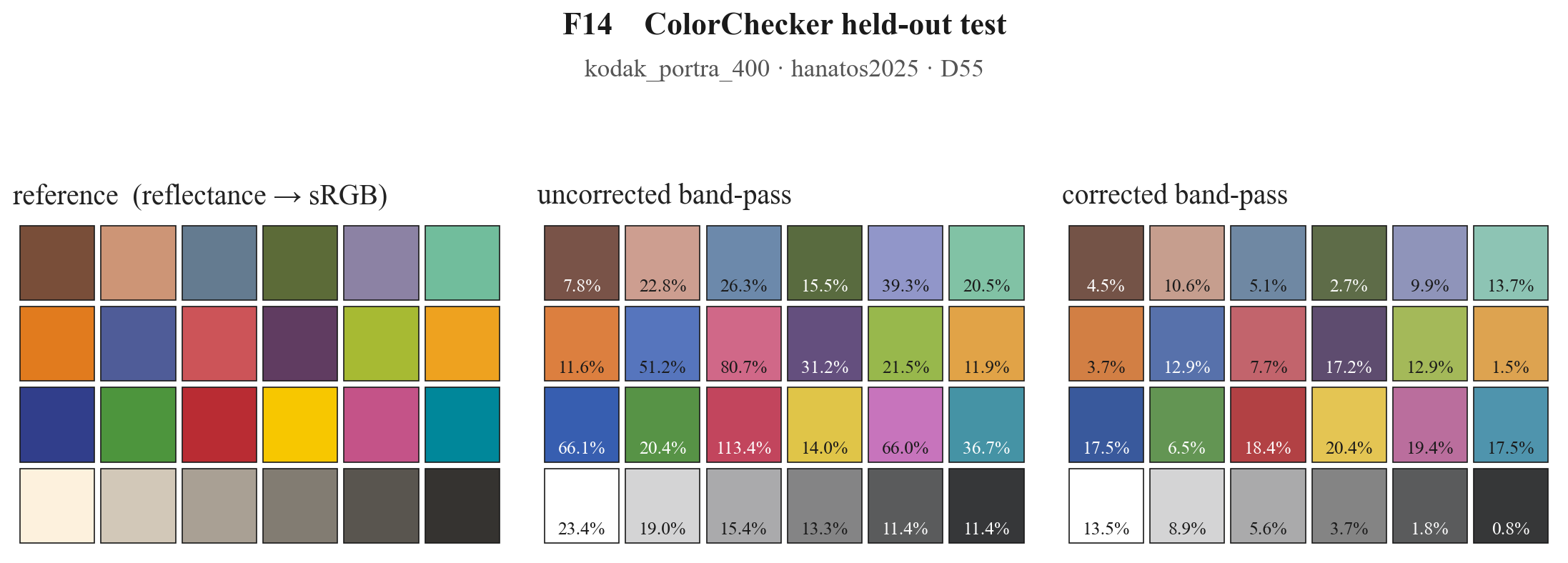
where H^true are the exposure of the real measured spectra and H^hat the exposure of upsampled bandpassed spectra. as a reference value we can use 1/20 of a stop as the minimum delta exposure that will produce a percievable difference that correspont to about 0.035 in the rho_i scale (rho_i < tau_phot = 0.035 should be excelent). also we can define the hard spectra as being rho_i > 8*tau_phot for the uncorrected case.
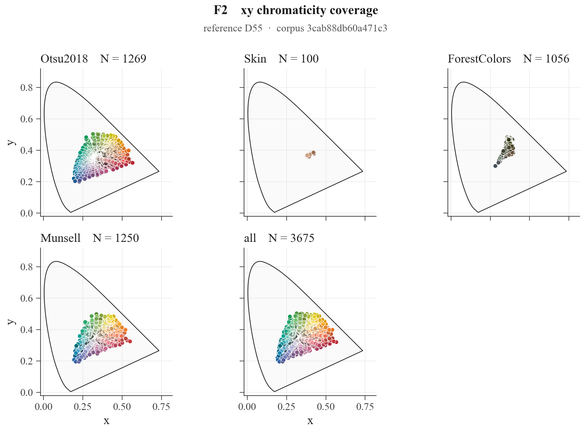
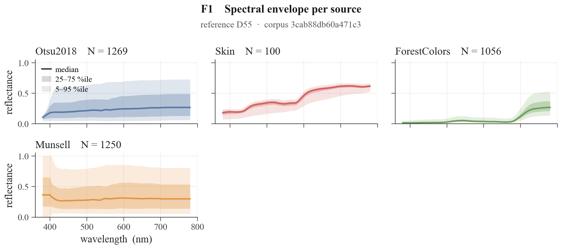
i am trying to inject knowledge on the behavior of typical spectra in the edge of the visible spectrum to tame the upsampler. the dataset is made by: (i) the otsu2018 raw spectra dataset that they used in their upsampling method, (ii) nist skin dataset and (iii) forest colors to anchor the two most important memory colors, and (iv) a Munsell dataset (50/20/20/10 share in the loss).
if we now optimize for kodak_portra_400 and compute the rho_i for all the spectra we get:
it works ok and as expected it is far from perfect, but generalizes well for typical non-spiky illuminants.
some film stocks behave a bit better, like for example fujifilm_velvia_100
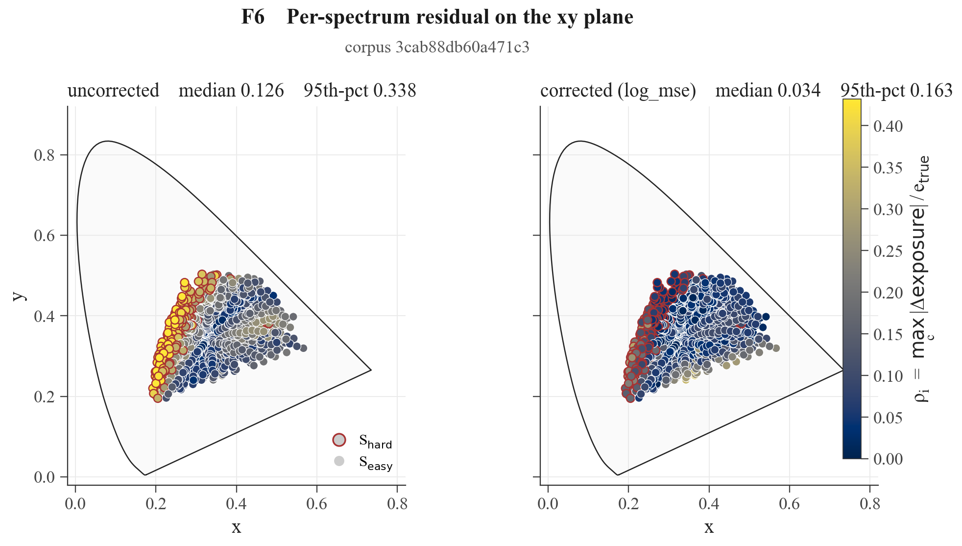
but you are right that purple will suffer the most and will loose exposure, and very saturated purple might be quite problematic:
 but shows the directions of the corrections in fixing the patches)
but for kodak_portra_400 we still see an improvement for the color-checker-purple:
[small update]
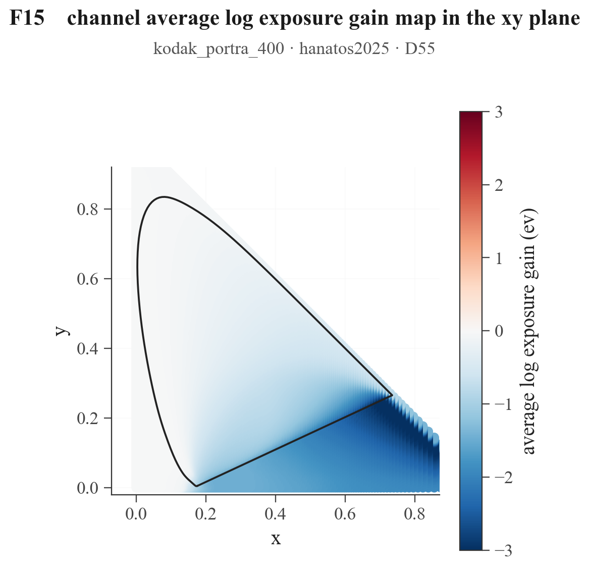
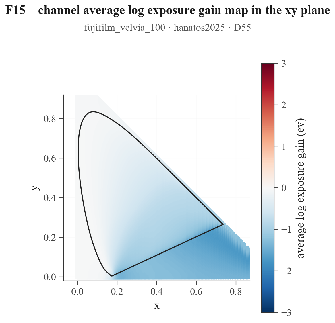
i quickly computed the channel-averaged log_exposure shift across the xy plane int(sensitivitiy x upsampled_spectra x windows) / int(sensitivity x upsampled_spectra))) to show better the exposure change along the purple line for the two example stocks. this is also the exposure improvement we want for blues/reds, i.e. we are exposing them less with the bandpass that is optimized on the round trip error evaluated on the corpus. underexposure might be too much for very pure colors that are not in the corpus and not influencing the problem. even adding them in the optimization would probably not change much the overall improvements. it might add a bias towards broader bandpass filters, reducing the gains for typical gamut colors. thus the corpus should mimic the typical spectra we want to image, and we might just tollerate the problem on narrow band spectra on the purple line. i am pretty sure there must be smart ways to go around any of this, adding more complexity to it, but for now i am happy getting any small improvement we can get.
One thing I see myself wanting to do when using the positive profiles is to change their white balance. I usually use the print filters when working with negatives. Would it be possible to do something similar for positives in the future?
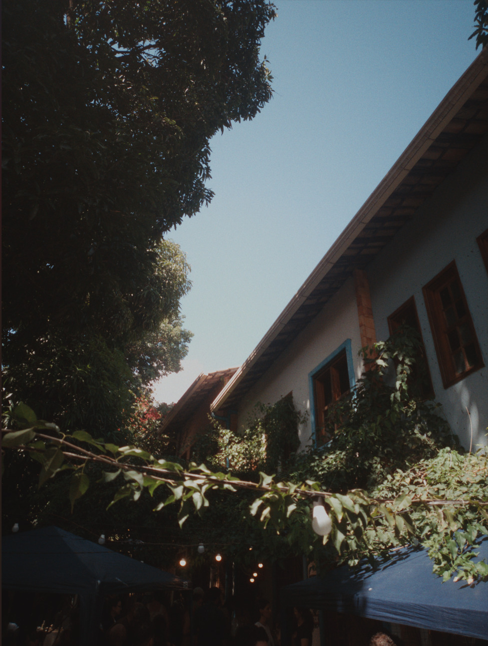
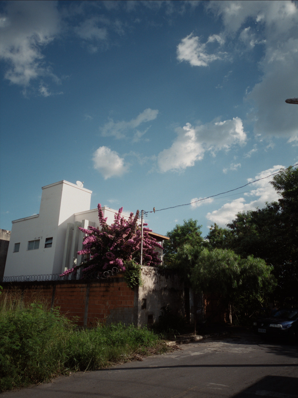
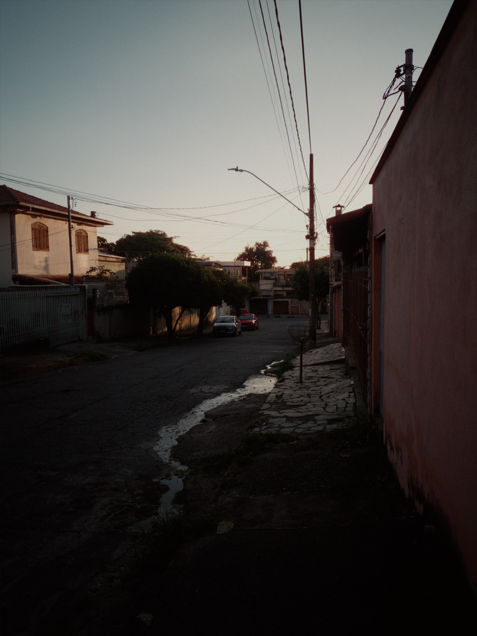
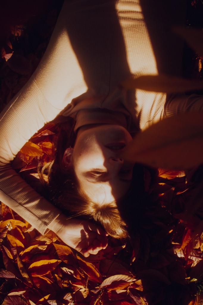
Btw here are some tests I ran these days, I’ve been loving the program. Taken in raw with a not so great smartphone:
even if printing of slide film is not (or was not  ) as diffused as the printing of negativea, positive print paper exists, and it is part of the plan to have it.
you can safely change the white balance when processing a raw for now, the printing process in the end is trying to solve a very similar problem but within the analog constraint of the analog media and analog tools. in my experience the results are fair, but since spektrafilm is following a purist approach, wb with the virtual enlarger will make me feel better.
great that you manage to get nice images with raw from a smartphone!
i just dumped on the main repo a few updates from the last couple of weeks:
not the cleanest development in the last weeks, but i was very driven and needed some fun. i will have to cleanup. i am not a real programmer, that was clear i guess 
since there were several upgrades in the last month i decided to do some quick edits of nice photos and play-raws that i had laying around in random folders of my hard drive. for many of them i remember struggling to get good results with agx-emulsion in the past. every edit is mostly default except a handful of parameters reported below each pic. all the raws were loaded directly in spektrafilm and edited in 10-20 seconds and saved as preview (computation is still a pain point, and would have been longer than the edit!). no lovely grain texture  .
.
i made extensive use of diffusion filters and I used only the kodak still family. they all share a very similar color soul, and the share the same dir couplers matrix. thus the saturation is somehow democratically distributed (I doubt this is the case for real life chemical recipes). after some use, you familiarize with the punchiness scale of the stocks. the constant dir coupler matrix is probably enhancing this gradient of saturation/contrast.
essentially in a scale of saturation and contrast they are roughly like this:
kodak portra 160
kodak portra 400
kodak portra 800
kodak gold - kodak ultramax
koadk ektar
and
kodak portra endura
kodak supra endura
kodak ektacolor edge (slightly older look)
kodak endura premier
kodak ultra endura (vintage look) is a bit of an outsider and it has a distinct character
a good ux would make this scale very explicit.
mix and matching film and paper according to need is a quick and dirty way to have an impressively immediate library of juicy looks. nothing new under the sun, I know, but familiarizing with them while editing makes you feel very confortable. for example portra film + portra paper is the most neutral and gentle. ektar + endura premier is super punchy on the opposite of the scale. when in need of even more or less saturation we still can cheat with virtual chemistry boosting or reducing of the couplers.
ektar + ultra endura is somehow surprised me, it’s a very good combination for photos that need a bit of character and are dull. gold + supra is the spektrafilm default and sits on the mid-upper of the punchiness stack.
here the edits:
it is difficult to pinpoint where the improvement is, and a lot can be placebo, but i feel more “satisfaction” in the images than before when the band pass filter in the spetral upsapling was arbitrarily set, and not under control.
sorry chief, you have a working program with continual enhancements, and users to boot. 
Thanks @arctic for the updates, colors look really good now! I wanted to ask, is there a way to tweak the grain behavior? Right now the blacks are, well, completely black, which isn’t something I see in my scanned images. I tried Glare, but it looks uniform and monochromatic. I’ll attach an example: the first is a digital image processed with Spektrafilm, the second is an inverted negative scanned on a Minolta Dimage Scan Elite 5400 II. I can provide more standalone examples, this is the only one where I shot the same scene on both digital and film.
Nice work! Colors look very good. But the texture and ‘feel’ is a bit hard to evaluate with the low image-resolution and the camera diffusion filters.
Do you have any non-diffused high-res examples from the new model?
These look stunning!
You changed my life and I am so grateful that I found this program.
Keep improving and exploring this at whatever pace you feel like
Again thank you very much for your work!
I think I have found a bug with DIR couplers when selecting different slide films on the newest main branch version. Posted issue on the github page!
got it matching my style of how i print somewhat! this is such a nice program.
very soon will have a 1 of 1 comparison of a raw image through this process with portra 400 and fuji type ii with the same image shot on REAL portra 400 and printed on fuji type ii, cant wait to share
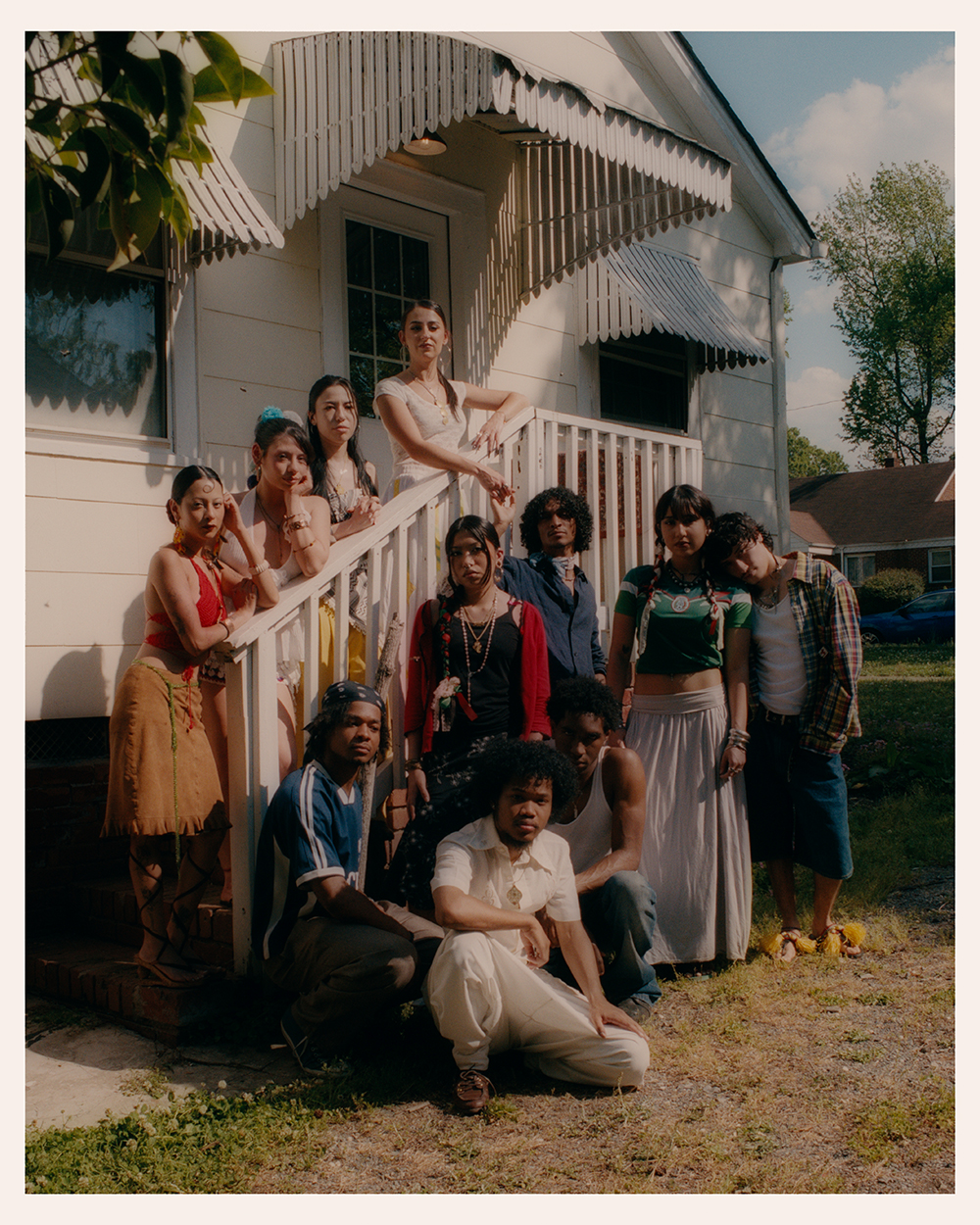
I really like the colors but I find it extremely dark???
Beautiful! Are you using the digital enlarger diffusion?
Nice! What settings did you use for that look?
A little dark, but a stylistic choice? In the age of digital many photographers (including me) are kind of stuck in distributing-the-data-over-the-histogram thinking, so to speak.
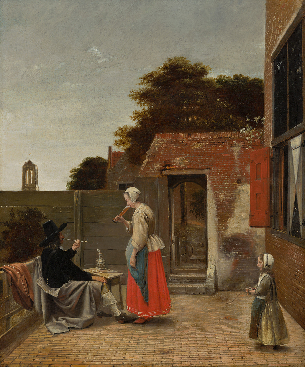
I think it’s fruitful to take more inspiration from traditional painters. Try to find anything even approaching the equivalent of 255/255/255 in Vermeer painting. The reasons for this are not only technical (aging, limited pigment range, cost of pigments).
It’s always a pleasure when restoration removes the 10 layer of varnish from these old paintings and the more natural hues show themselves.
“extremely” dark? Maybe I’m just so used to this type of look, I don’t see it extremely dark, hard sunlight you either commit to shadows or highlights and I’d rather commit to highlights.