Thank you Brian for posting and making it possible to edit a real life Thomas tank engine
My version is with colours but with a little bit more focused crop. DT4.0.1
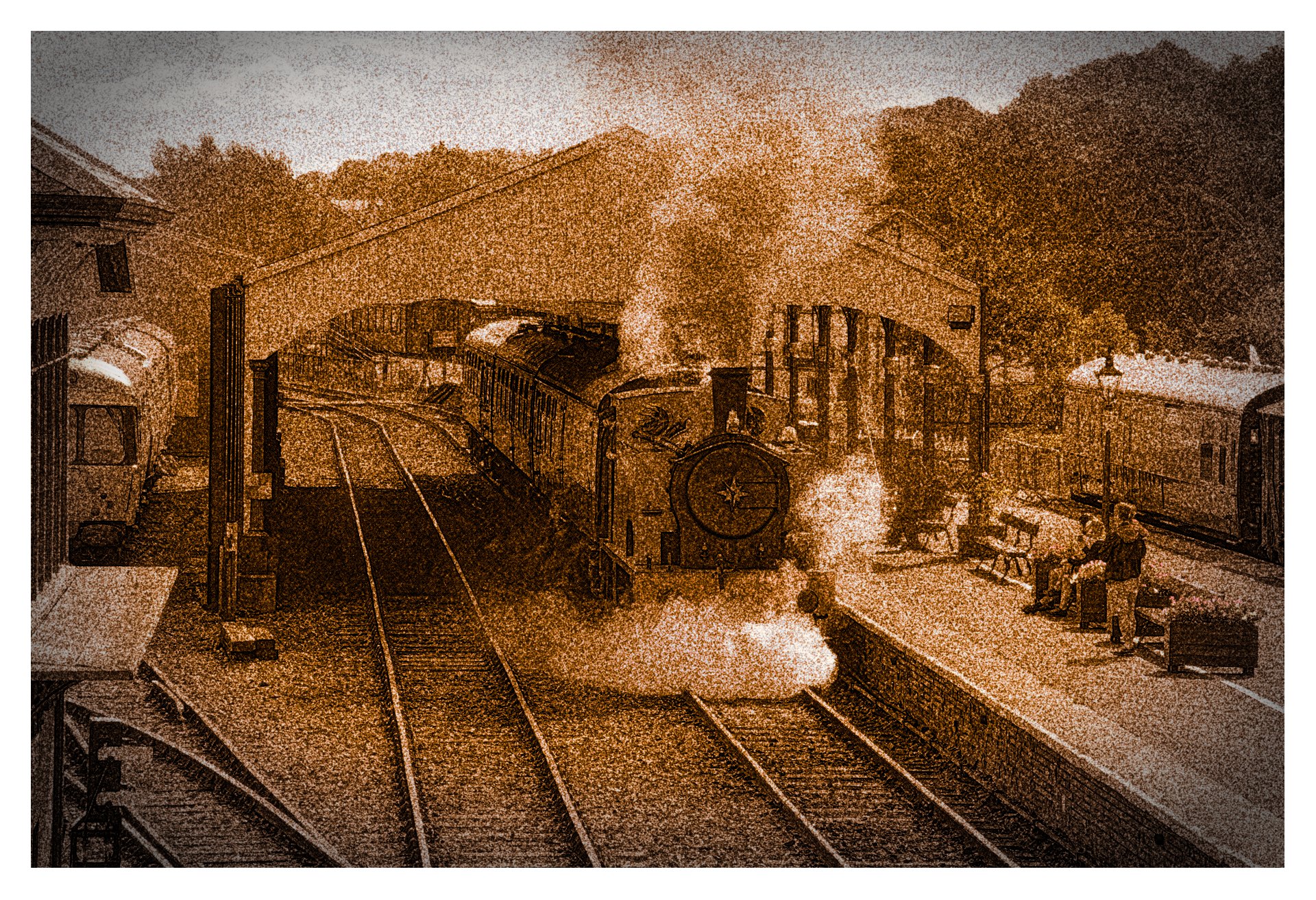
Ultimately as a judge we have to have a personal opinion. If I was to judge the original posted image I would have to say it looks unnatural. I thought it was trying to imitate an infrared look. It just looks surreal to me.
As a teacher of photography I do not impose my personal interpretations upon students but rather embrace their unique interpretation. I want to give them the skills to achieve what they want, not what I want. As a commercial photographer and portrait photographer I had a saying, “beauty is in the eye of the person with the wallet”. But as a judge I ultimately fall back on my personal opinion and that is why I have been asked to judge.
Have fun with your photography and ignore everyone’s opinion and listen to your own heart for what you like and enjoy.
Hi, thanks for sharing. I liked the overall composition so I didn’t crop. Old vehicles make photographs really look like a fragment of time. I added a bit of a retro Kodak Portra look.
did the judge talk about the image you just posted? Because there’s a lot of contrast. Also the image itself has a lot of contrast because it’s shot in harsh sunlight.
I guess the HDR look is deliberate and contain more detail than my interpretation. However, I’m not a fan of HDR as it usually looks false, largely a matter of personal taste.
Underexposed in the shadows.
It’s a bugbear with me as I cut my teeth on film negatives and black & white prints. It’s a conundrum of the times we live in. I still think in terms of printed images on paper which had a certain magic. Images on a computer screen seem to lack that quality which I can’t verbally describe. For me, there has always been an indescribable beauty in the black and white printed image which never left me and I always felt something was missing when I looked at a colour image. Even colour slide images projected on a screen lacked that certain something that a monochrome image had . Maybe that’s why I was such a fan of early Ansel Adams images.
If that lacks contrast, people saying so should check their eyes or their monitor!
Maybe the image is overly sharpened, but I think the contrast is nice. Sander Knopper’s version may be a bit better, however.