Edit: I watched the video. What I don’t understand is the off then on filmic part. The hue shift of blue is an addition of green to make cyan before all channels are blown or too bright for our eyes to see colour. Why does the image have more green when filmic is off? Does that mean the data has higher green values relative to blues prior to the application of filmic? My thought would be that blue would remain blue unless something shifted the colour at some point. I don’t always think clearly, so someone please elaborate. Thanks.
Are you masking it…you need to drop the threshold the right amount. Its not perfect but when things are completely blown it can remove the gray or magenta issues…
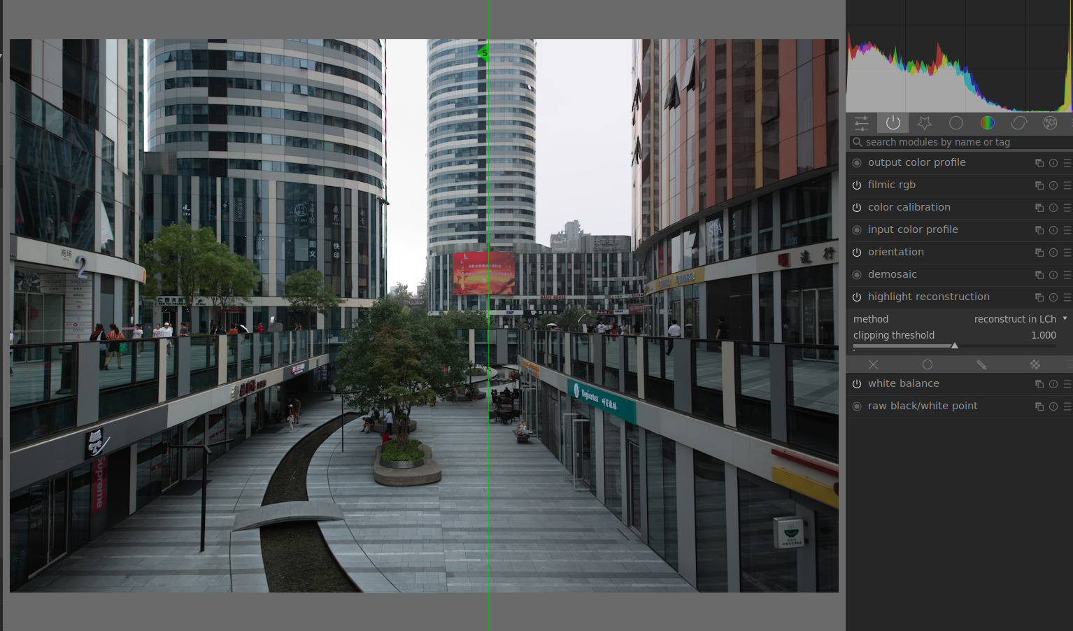
@priort So, it isn’t so much a cyan issue as a clipping one, and I suppose the cyan (and the yellow in the sunset PlayRaw thread) are examples where the non-clipping green contribute too much in bright(ened) areas. If that is the case, then I understand. My approach to processing doesn’t encounter these problems normally. Or at least, I don’t notice. Ha ha.
I really don’t know if it fits this specific case but I was just throwing it out as a possible contributor. for sure though also the norm will shift the individual color channels differently and so when you have clipped and near clipped channels you can see so things happen in an exaggerated way in those areas depending on which norm is in play
Ah this is the key for me.
For the set of images I am working on right now, none of the reconstruction sliders in filmic do much of anything useful, but the preserve chrominance modes filmic makes the big difference. Then just sliding the white relative exposure sliders if there is still any magenta.
Now I like the appearance with reconstruction in filmic (left snapshot) vs the highlight reconstruction mod.
thanks for the link Boris. even though I must have watched several other videos dealing with the subject, I think this one was particularly effective in transmitting the “message”. Also, it made me realize that I should stop being bothered by the overprocessing that I see in recent photographs, those that have traction on social media etc (I’m thinking about the photos that gets featured monthly on 500px or flickr), and perhaps go back and see what Fred Herzog and Galen Rowell did with colours.