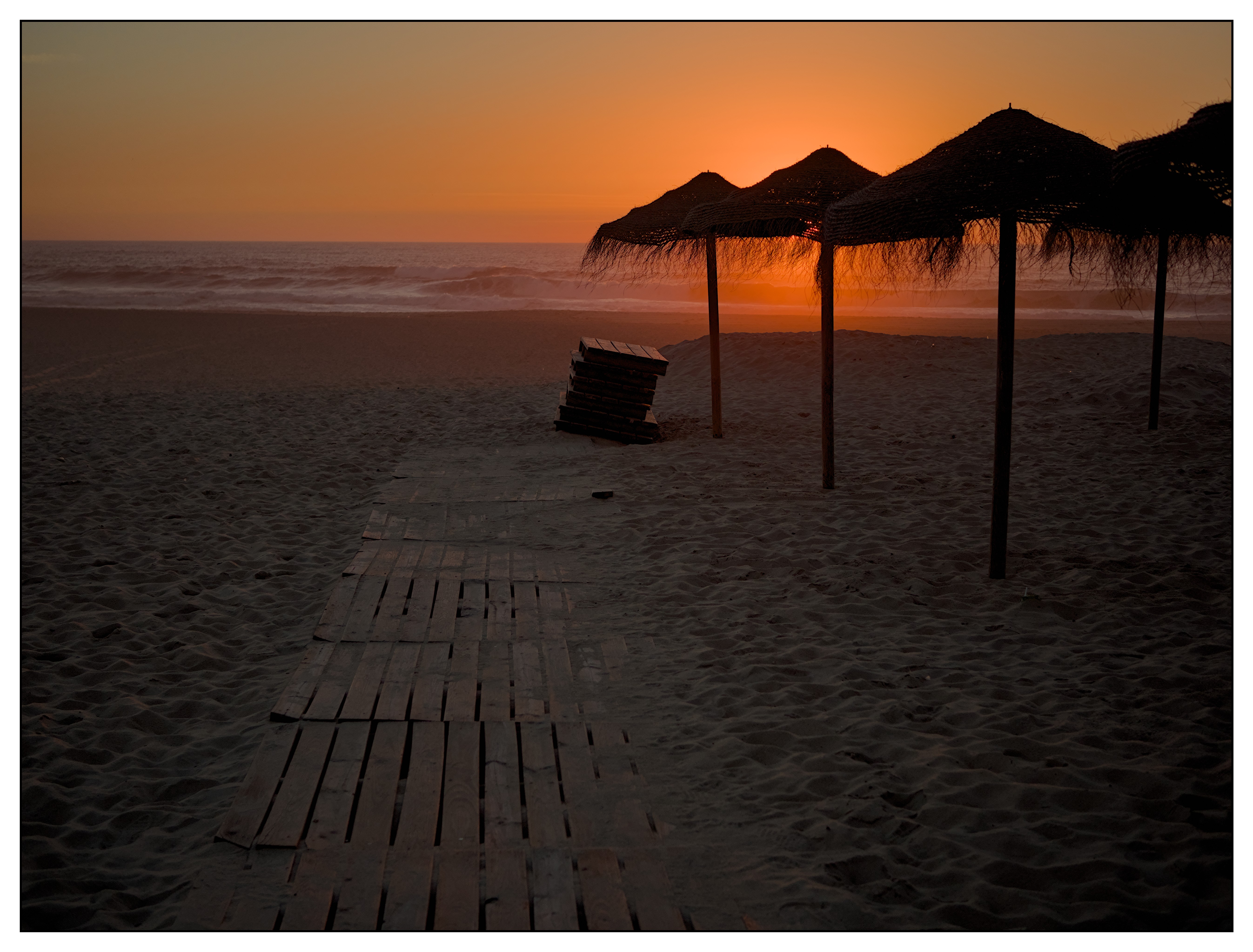
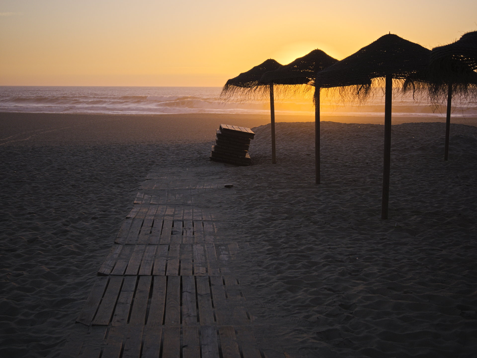
I lifted the brightness on the wood as I thought it led the eye but didn’t make the overall pic as dark as yours (assuming our screens are comparable…). You’ve managed to get similar orange from the sunset colours above and below the umbrella, whereas mine is pink below and more yellow orange above. The DT sigmoid above is also more unified but also quite dark.
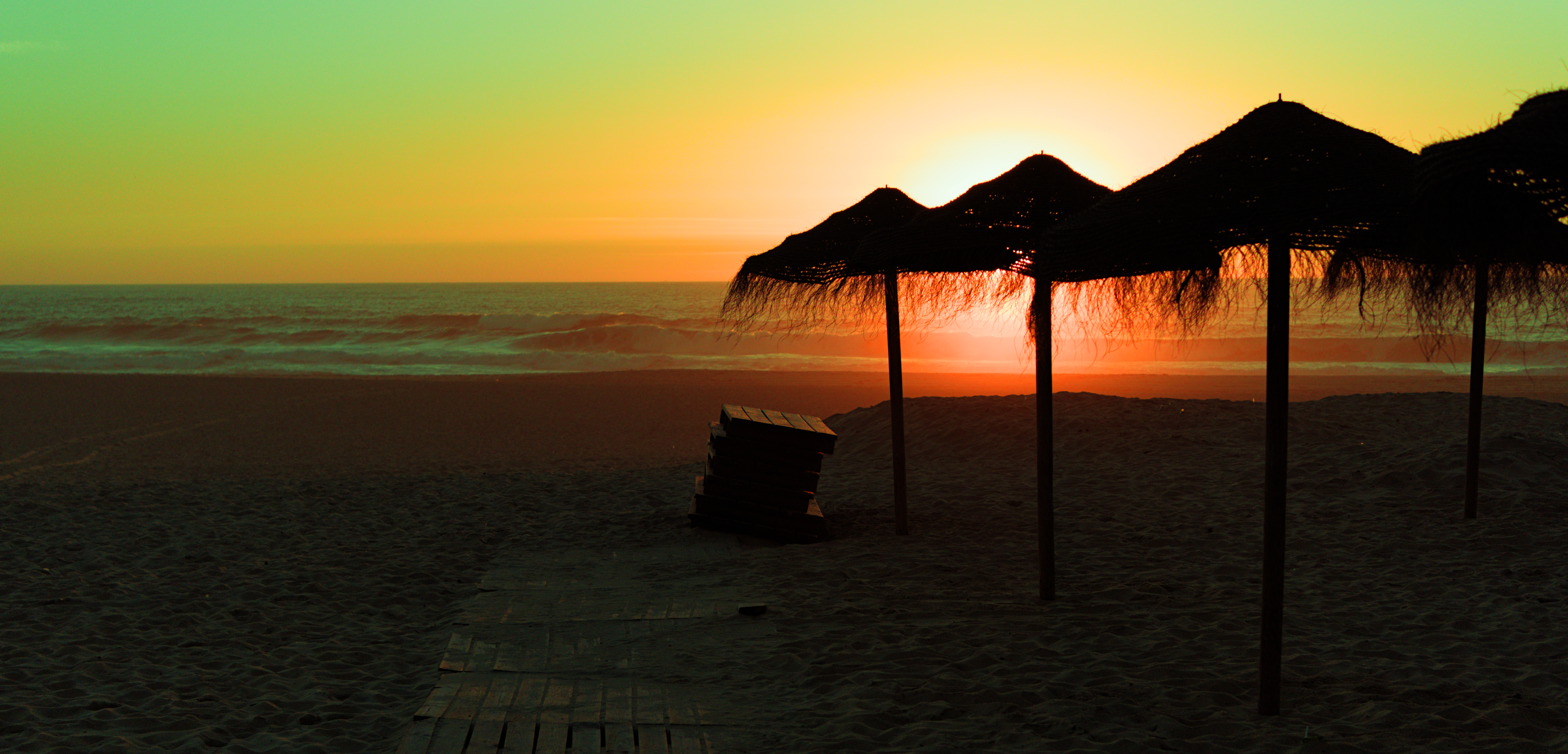
Your colours are really consistent across the sky. Looks good. Some people are going for a more obvious yellow sun fading into orange. Interesting to see different approaches
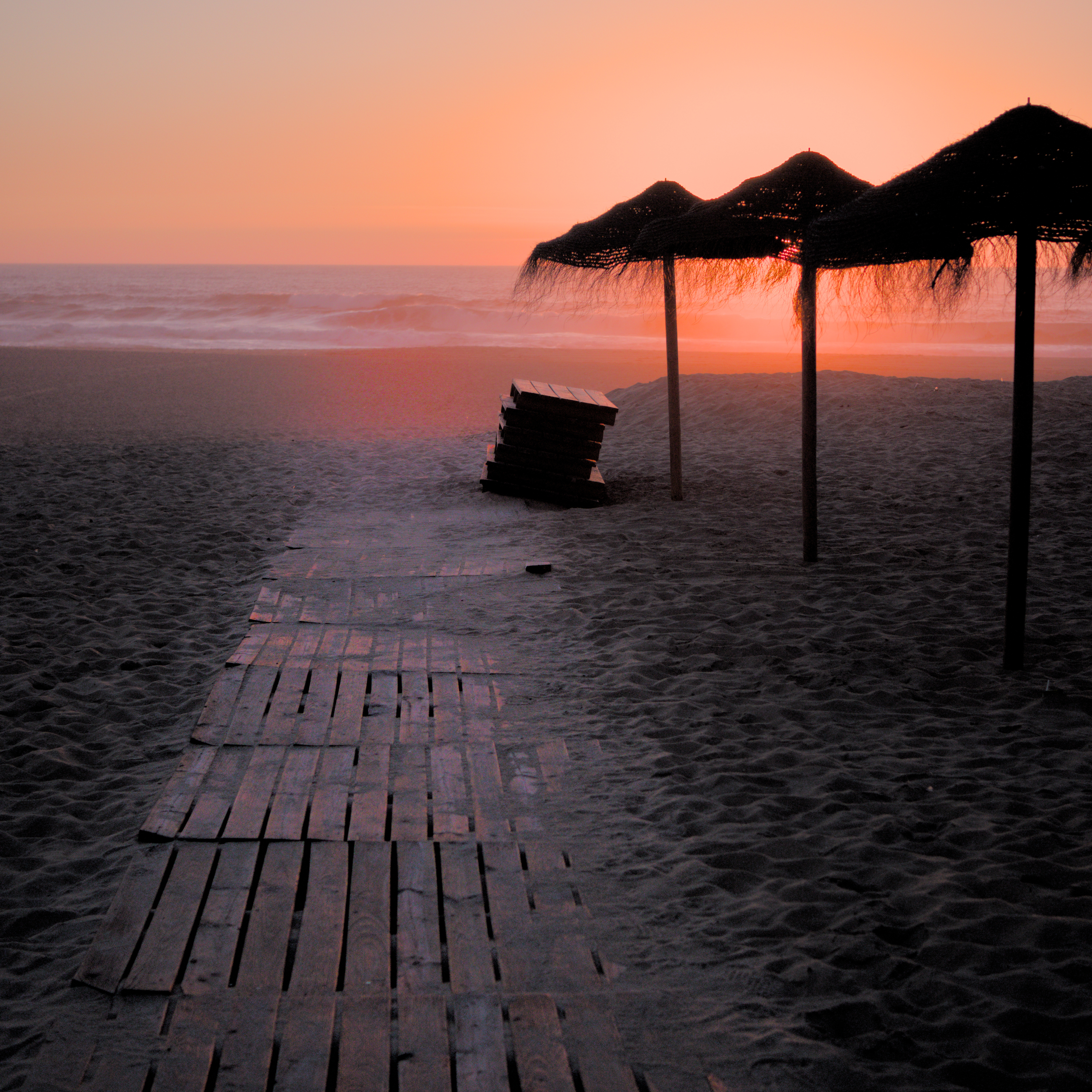
Thanks for the image
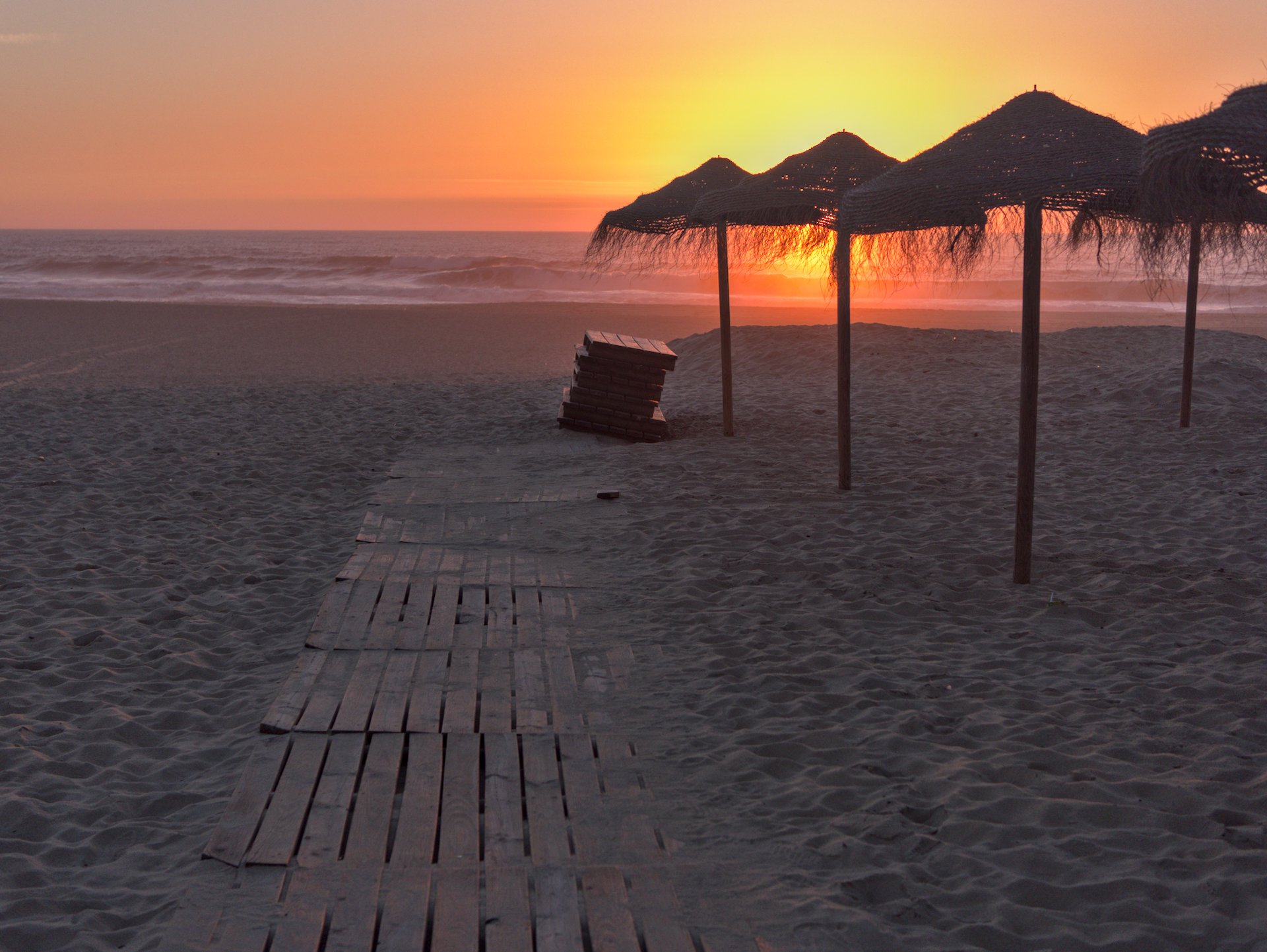
A 3 module edit: Exposure, sigmoid and tone EQ… ok, two instances of the last.
Using DT4.1 in a recent nightly build. 20221115_0110.RW2.xmp (10.9 KB)
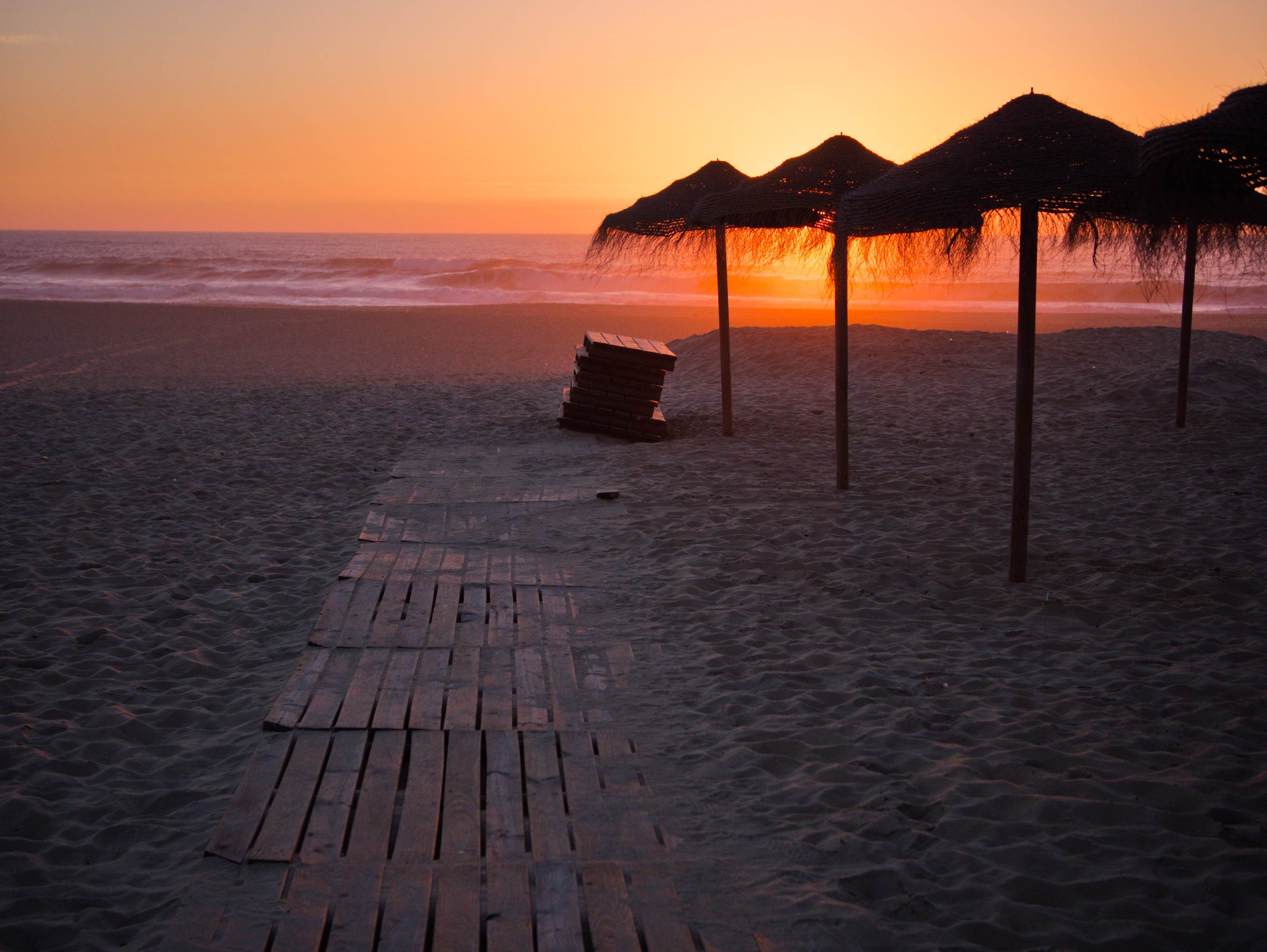
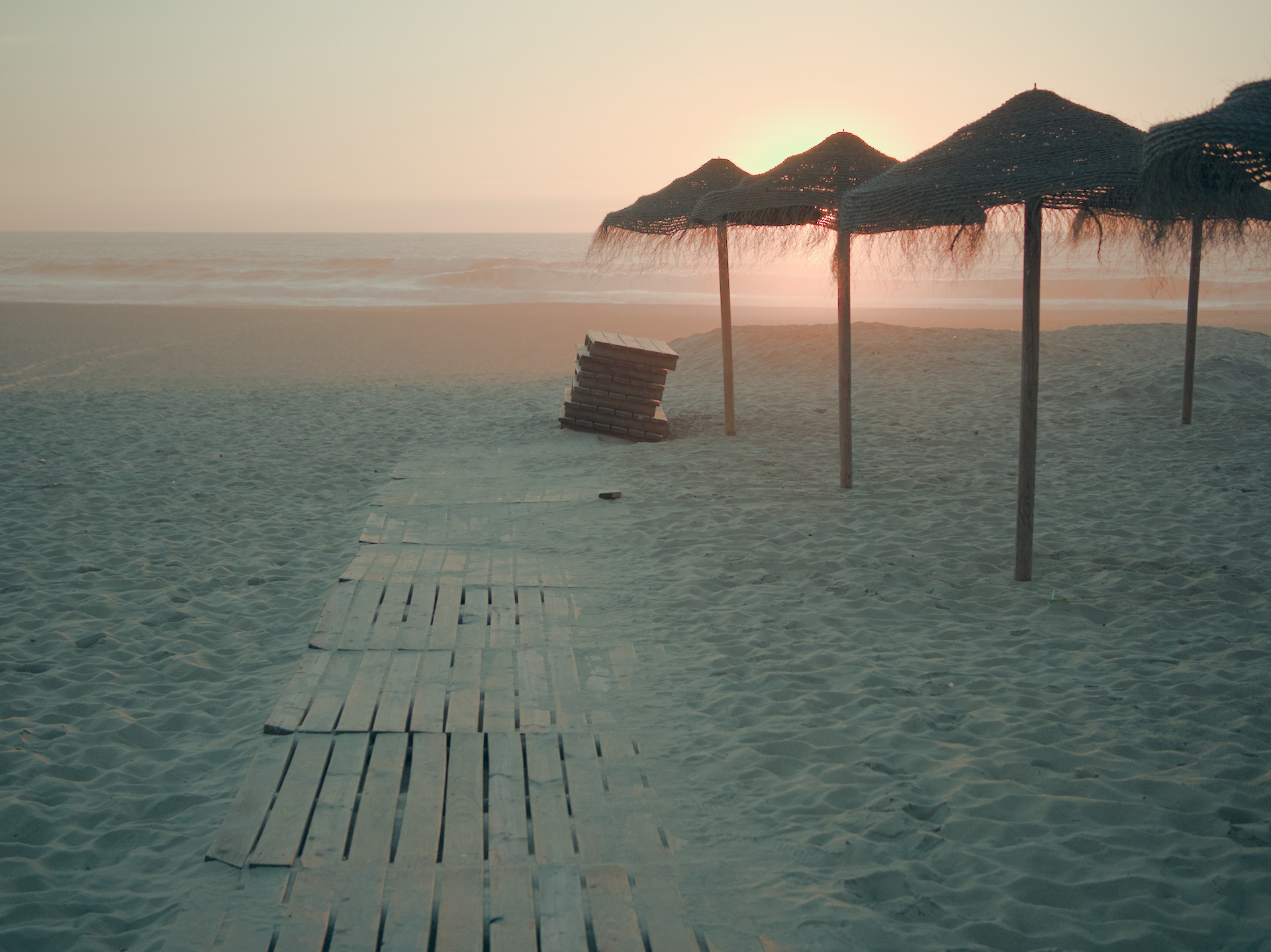
Here is my go at it. I used a slightly customized version of Darktable modified to remove the final stage RGB gamut mapping (which is what perceptually makes a lot of images like this look pink-salmonish). Other edits as follows:
Lower exposure overall a bit.
Use tone eq to tame the overall brightness of the sun and pull everything else up just a bit.
Darken upper right and upper left sky to add a bit of contrast.
Color grade the water so that it has a hint of teal to contrast with the sun.
Slightly color grade the lower half of the sun “orb area” so that it is not so red-orange compared to the region above the umbrellas.
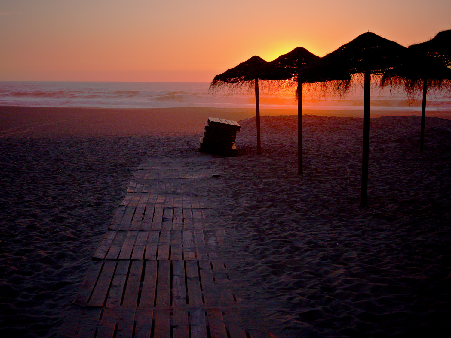
Color grade and brighten the highlights on the top of the stack of skids to accentuate the illumination/reflection from the sun.
Color grade the highlights on the planks so they are slightly orange instead of bluish, again to suggest a bit more illumination directly from the sun.