Yeah, I think that the saturation is a little too high for general use. You or I could always create a v2 DFS with lower saturation but the primary goal was just to show the thought process while going through the writeup, rather than creating an actually good DFS.
Thanks I don’t know if the way I am doing it is correct, but I figured that the input primaries should be used for setting the “balance” of color primaries, and the output primaries should be used for bringing the colors back up. But who know (@kofa probably knows )
You can also use the “disable adjustments” checkbox in the primaries tab in order to disable the primaries modifications.
It is interesting that I opened this post today and looked at the image I posted and it doesn’t look as bad as what I remembered. The problem was I had created a DT style using this image previously and liked the look, so this new preset from @thumper just looked over the top for saturation and yellow in the skin. But on its own without comparison it is acceptable.
I have started doing this and it helps speed up my workflow. I am not interested in replicating film stocks, but I am interested in creating my own ‘camera styles’ such as skintone, landscape and others.
The posted image actually needs the reds lifted not subdued to give a pleasing skin tone so as you say it comes down to picture style. I use this image a lot to test styles and presets because of the colors in it which include neutral tones, dark clothing and skin tone. However, I have found that I need a different preset in AgX for landscapes that don’t have skin tones to worry about. Hence why I intend to make my own ‘camera styles’. But your post was very inspirational and educational. So well done.
My approach to this problem is to have the camera shoot a jpg and a raw. I don’t use the JPG as my aim point but it does give me a comparison point. I want to get the colors as nice or better than the JPGs. This is a subjective comparison not an objective match to the JPG. This approach might horrify some people here but if I like the look of my cameras JPG then why not use it as a comparison. However, the raw gives a sharper more detailed image with improved shadow details especially.
I’m glad it inspired you to work on your own methods!
I think having your own methods for how you accomplish effects/looks is one of the most rewarding things. Self improvement, and putting the time in and all that…
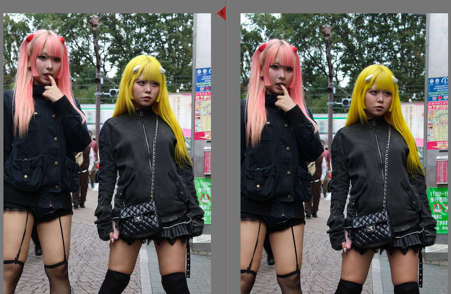
Thanks @kofa for sharing the link. I downloaded the styles based on fuji film and was really impressed. The provia style made my Canon R7 raw (right) look so similar to the cameras JPG (left). I look forward to exploring the other styles with different images.
Thx for the interesting workflow with AGX … easy to follow and well written !!!
Nice that you added the screenshots .
I will try to build my own … with your ideas implemented .
Your preset is not of great use for me personally … as it is over the top on everything . I do prefer to work way more conservative in tone and color .
But always cool to see how other people use various modules
I definitely understand. I think it is a little over the top for me I think over time with using it, I would naturally refine it and make it work better for a wider array of images.
Actually that is a very good idea for improving this whole DFS creation method:
Instead of testing on one image during creation, test on a set of images, all with a diverse set of subject matter and scene lighting, etc.
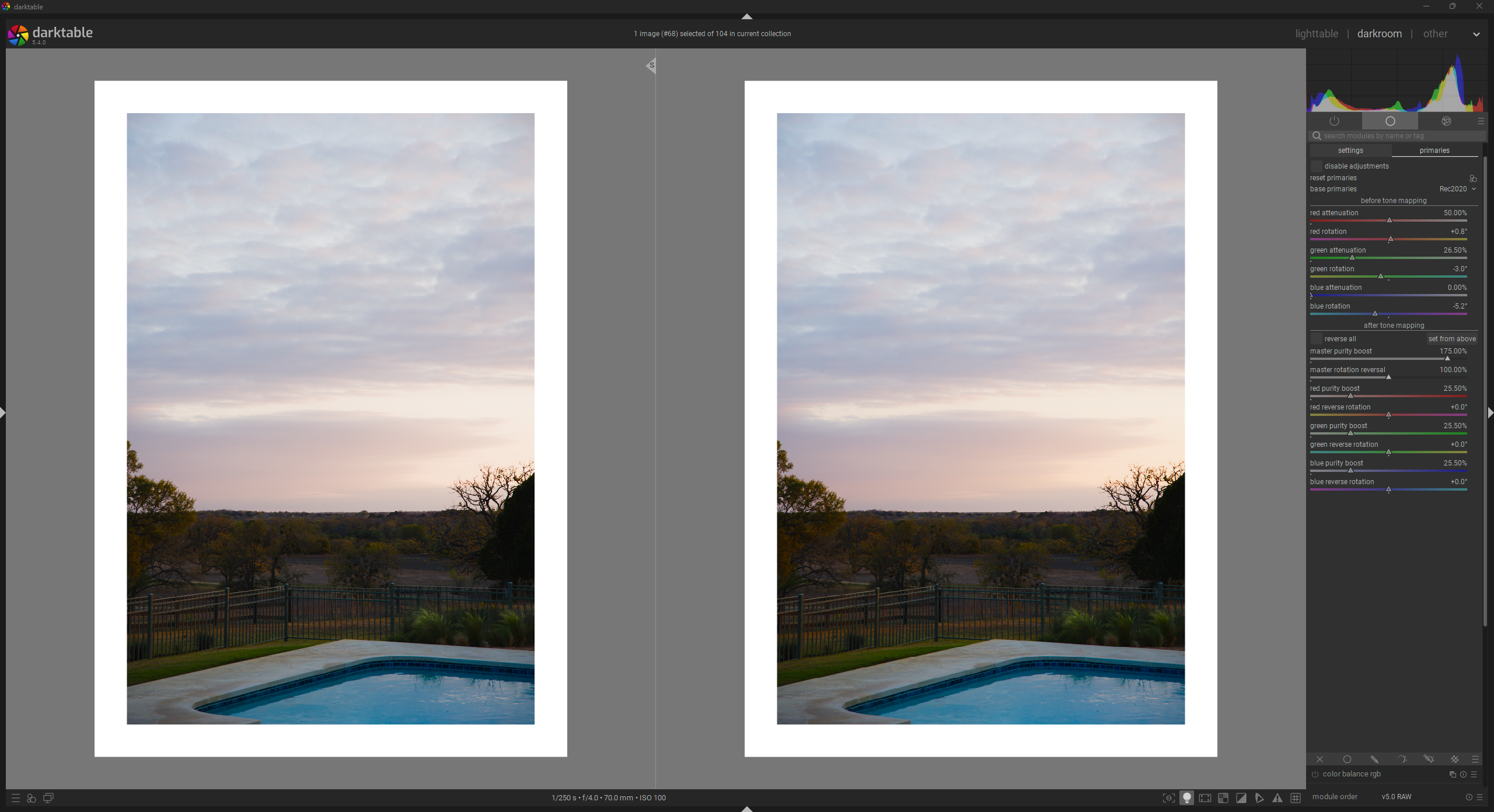
I want to add a quick correction to my original post.
In it I give a rough estimation of the primaries balance of Kodak Portra film. I was in a rush and messed that estimation up massively. It is still a very rough estimate, but I think it is much more correct.
Original Portra Estimation (Incorrect)
My estimation of Portra’s color balance in the OP:
R:G:B = 1:3:4
I implemented this ratio by setting the attenuation of each to the following amounts:
R: 75% (~25% sat.)
G: 25% (~75% sat.)
B: 0% (~100% sat.)
This is a total of 100% attenuation (out of 300% possible attenuation)
I then made up for this decrease in saturation by boosting each primary by 33.33%.
New Estimation (Slightly More Correct)
A far more correct estimation:
R:G:B = 1:1.47:2
So then the attenuation amounts would be:
R: 50% (50% sat.)
G: 26.5% (73.5% sat.)
B: 0% (100% sat.)
This is a total of 76.5% attenuation, meaning each primary should be boosted by 25.5% to recover the lost saturation.
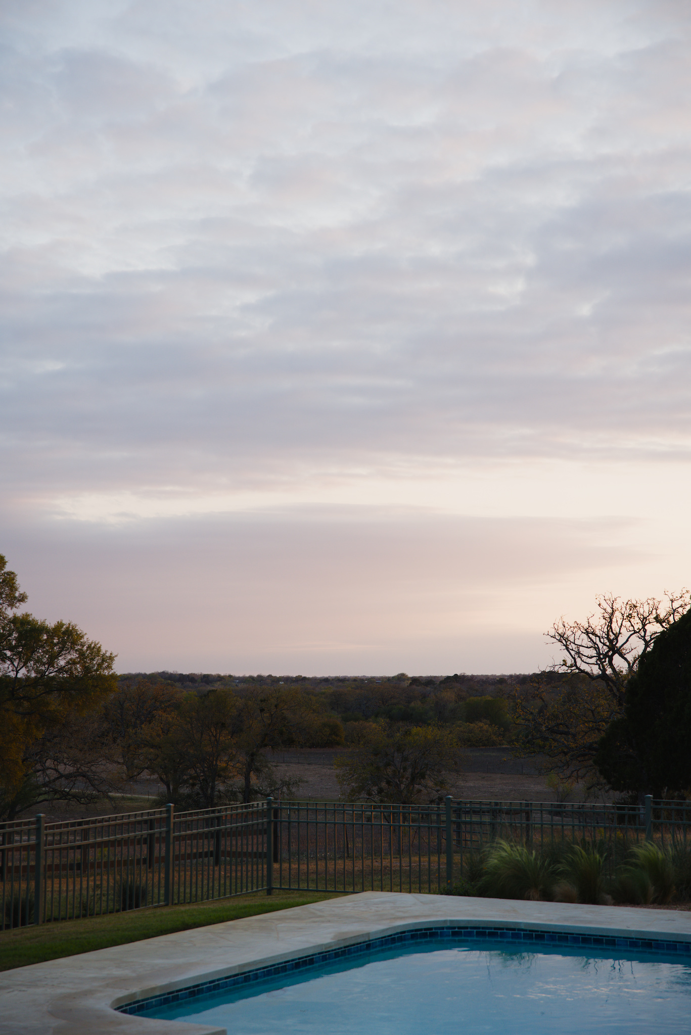
You can see in the updated version on the right, that there is more even color saturation throughout the image, more reds in the sky and landscape, and a brighter, more clear blue in the pool.
Please note that the saturation is still probably too high for general use, but feel free to reduce the output purity boost or saturation control and create a new DFS preset for yourself. I didn’t want to change that as well, because I wanted to focus on the primaries balance fix: agx_dfs_ex_corrected_portra_colors.dtpreset (1.2 KB)
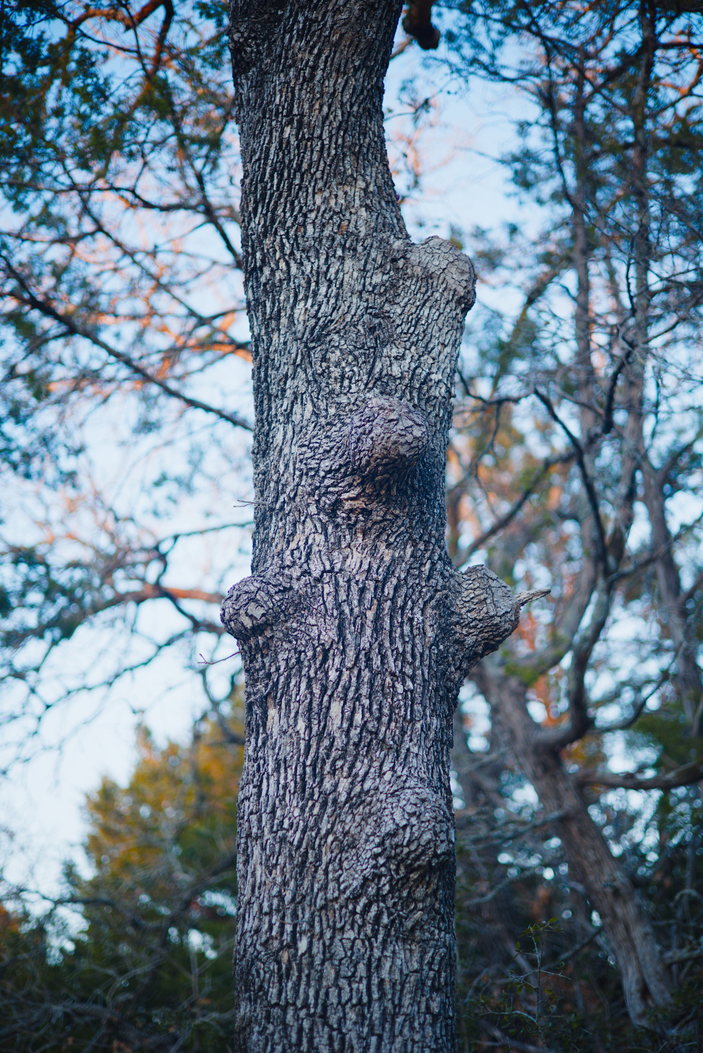
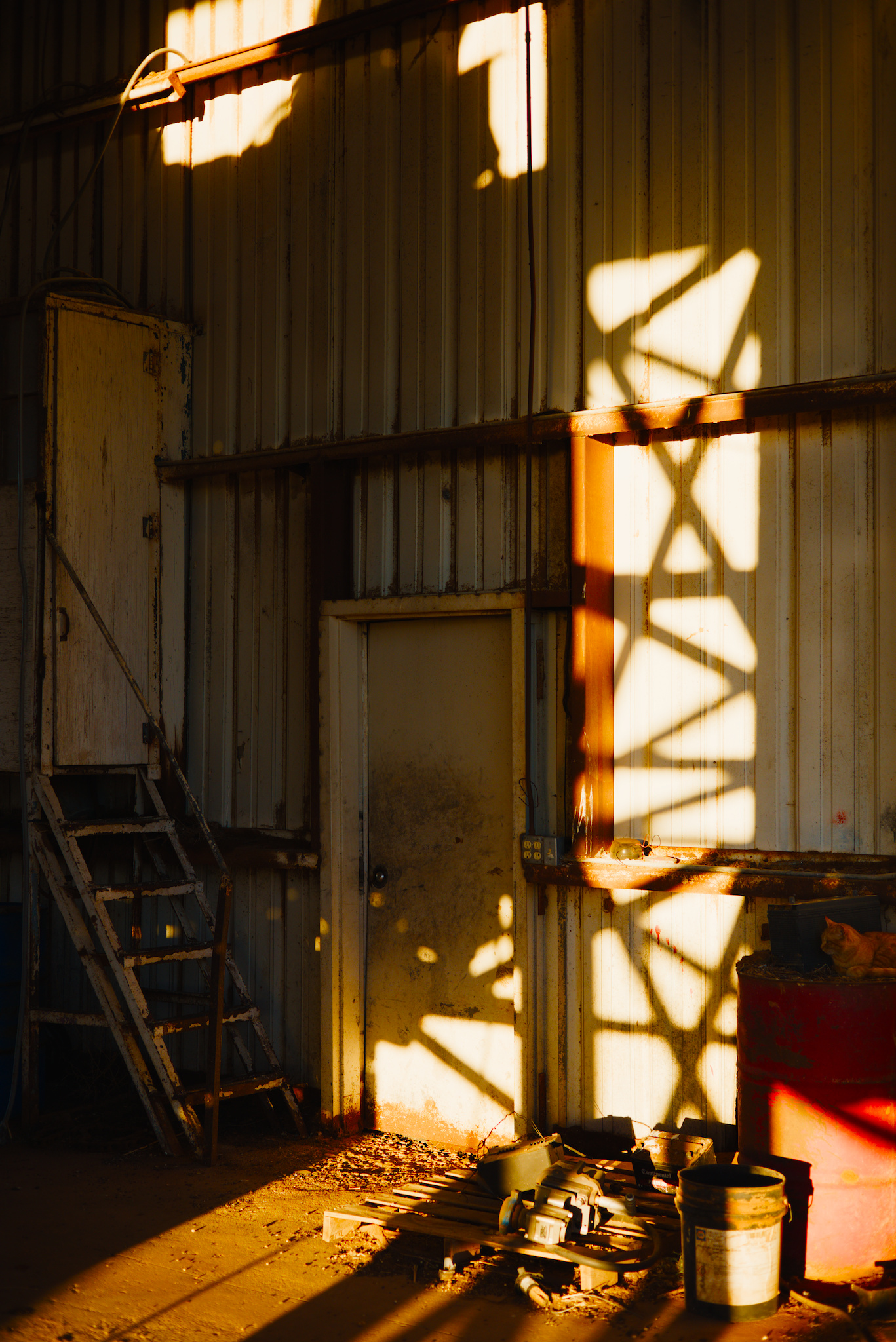
Just for completeness, here are some of the images from the OP, edited with the corrected version of the example DFS:
This is the more accurate primaries balance ratio for portra that I shared above:
I am mapping the largest number in the ratio (Blue=2 in this case) to 0% attenuation, and then scaling everything else based on the ratio. I realize I might not be thinking about it correctly, but that is my current methodology.
I also might not fully understand your question, sorry
Yes, I understand this. I am trying to offset any brightness/overall saturation change by equally increasing the output purity of each primary at the end. Again, I probably don’t have a perfect understanding of the inner workings
P.S. Can you share the link to that agx primaries visualizer?
I’ve merged my favorite preset from rgb primaries into AgX, adding some contrast etc since AgX does it so well. I’ve been using the default “rgb primaries” location in the pipeline prior to AgX, so I simply added the values from that module to AgX’s primaries “before tone mapping” (Blender-like base preset).
From what I can tell, the colors are equivalent to using Blender-like base defaults (with boosted contrast etc.) and rgb primaries with my preset for that module.
This is a one-step basic color grade plus AgX tone-mapping with its highlight management. I’m still a bit uncomfortable with doing both technical and “artistic” adjustments in one step, but at least here I can switch to a more-standard preset to turn the color-grading back off for comparison.
The first photo is a basic edit with AgX Blender base colors and some contrast enhancement, and the second has the preset with the same AgX contrast settings but with the color settings discussed above. It’s subtle, which is a good thing generally, but reds are more saturated and rotated and Blues are lighter and rotated which appears to change contrast, I think mostly from color separation. Even though the greens are hardly touched, they seem to “pop” more in the second photo.
I have been experimenting with using AgX as a “digital stock”.
My goal is to get a 99% solution for image development: develop some styles that I happen to like, for various scenarios, maybe a total of 3–5, and just apply them with the goal of not editing the image further (besides white balance, crop, rotate, exposure; and of course automatically applied lens correction etc).
I found that I prefer a maximum of 7–8 EV dynamic range, maybe +3 EV for white and -4 EV for black relative exposure. This gives me a look that reminds me of film.
I am still learning about primaries, not sure what I should base them on yet, I am revisiting multiple images under various conditions and see how they look, any guidance is appreciated.
I am also wondering if AgX should be enough for the approach above, or should I complement with something else, eg color balance rgb.
I am now using the rgb primaries module with +15% on both the red and blue purity sliders on almost all images, coupled with color balance RGB standard saturation style (forgot the appropriate name)
After some thought I decided to go back to rgb primaries for global color rotation/ purity prior to tonemapping. One can make color presets there of course.
It appears that such color adjustment in rgb primaries is additive with the pre-tonemapping settings in AgX. As best I can tell.
Why not do everything in AgX? Because I like to look at the color adjustments by turning the module on and off a few times to gauge the effect. It’s easier for me than taking a snapshot and using a slider. And turning AgX on and off isn’t helpful in this regard.
An alternative (for someone like me) would be to create two AgX presets for each “film look,” one with “standard” primaries but all of the tone curve settings for the film-look, and one with the primaries where you want them. But I figured that would become too cumbersome over time, unless there was a common tone curve for all desired film stocks.
I have also adopted some presets from a post by @age for a generic “Gold 200” type of look. I’ll update this post if I can find the link. I think it provides a very saturated film-like look, and I usually back off a bit on saturation to taste.
Edit: here is the post from a recent PlayRaw: PlayRaw example
Linear, scene-referred data arrives in the pipe’s working space, defined in the input color profile module (e.g. Rec 2020)
If needed, data is converted to the selected “base” space
Colors that are out-of-gamut for the “base” space (RGB triplets that have any negative component in that space) are “slid” into gamut (in-gamut colors are not modified, though it is possible that a previously out-of-gamut color “lands on top of” an in-gamut color). The sigmoid module performs a similar operation, but the method is different.
An input matrix is calculated and applied, based on the RGB attenuation and primaries rotation values. This desaturates the colors (mixing channels into each-other) and rotates the primaries. This is the same as with sigmoid.
they may not operate in the same space, see base space conversion
then there is the out-of-gamut compression
then come the AgX tweaks.
So, if the rgb primaries before AgX produces colours that become compressed, the overall effect will be different. And, because the base space may not match the working space (rgb primaries always uses the working space), the effects can’t simply be added (rotating/insetting Rec 2020 primaries vs sRGB primaries, for example).
I did try a few cases, including the one I mentioned earlier in this thread, and I did not observe a difference by eye. But my grading in these cases is relatively mild (IMO), so I would guess that within a reasonable range the effects are qualitatively additive.