I don’t think using hex colour / exact value for colour styling or colour grading would work, because the colour in an image/scene is relative to each other, so there’s always be a little tweak on the hue to make it “fit” to the scene. Even in the case of dealing with brand colour (e.g. photo for ads), there’s won’t be an exact match between brand colour value and colour presented on an image.
If it’s possible, why don’t you try to post the image on Play Raw, along with the referenced colour harmony/image, so we all could try to edit/achieve it? Because sometimes not all colour combination works on every image, it always depends on the raw photo/scene itself (especially on “unplanned” shots).
There is a color mapping module if you want to play with that. Also if you have the values you want in LAB then you could use the CLUT module…select the colors in your image that you want to change with the picker…it will select the closest patch and then you can change the drop down to absolute and enter the colors as lab values…you could then save this for later…I think some film simulations are saved in the module using a similar approach…
Good point. So you’re advising to pick a set of general colors (e.g. general shades of yellow and blue) and then set the specific colors in the image itself rather than trying to pick specific colors with the color wheel?
I was thinking the same thing - thread created here with one example image.
I remember reading this article about the color mapping module, however I don’t have a source image that I would like to clone. It would be interesting to try that with the image from the aforementioned kodachrome episode to see how well it can map those colors compared to doing it by hand.
I have played with color look up table before with mixed results. Often what happens is I can successfully adjust a specific color, but I really need to feather the change to apply to “surrounding” colors too or else I end up with a pixelated bad combination of colors. Maybe I just need to pick more custom swatches from the area and adjust all of them?
I think you would need to replace patches with several samples of your image and adjust those but this could be tedious…The fastest way is Davinci Resolves color match feature used to grab film looks…
Yes. You could also combine that with color zones module.
But the best results you get with several instances of color balance module.
You can take advantage of very advanced masking capabilities of the darktable (parametric and drawn).
Here is an example I made, with color combination made with Palleton
If i understand it correctly from your text (not a native English speaker here), then probably yes. When creating a colour plan from the wheel, you can pick the general colour or specific value (in case you’re sampling the colour from an image), but when applying it to the image, let’s say, I want this particular “blue” and “green”, rather than set it to the exact value, you set it at what will look like that particular “blue” and “green” in that image, a slight deviation in the degree of hue and saturation is common, after all, the same “green” under the shade or overcast is always slightly different (or maybe you want the image slightly warmer or cooler).
I think it’s mentioned as well in Joanna’s video when she explained the variation of the same skin under different lighting/grades, just like how we perceived the same “white” under different lighting conditions.
Will tried to play with it, thanks!
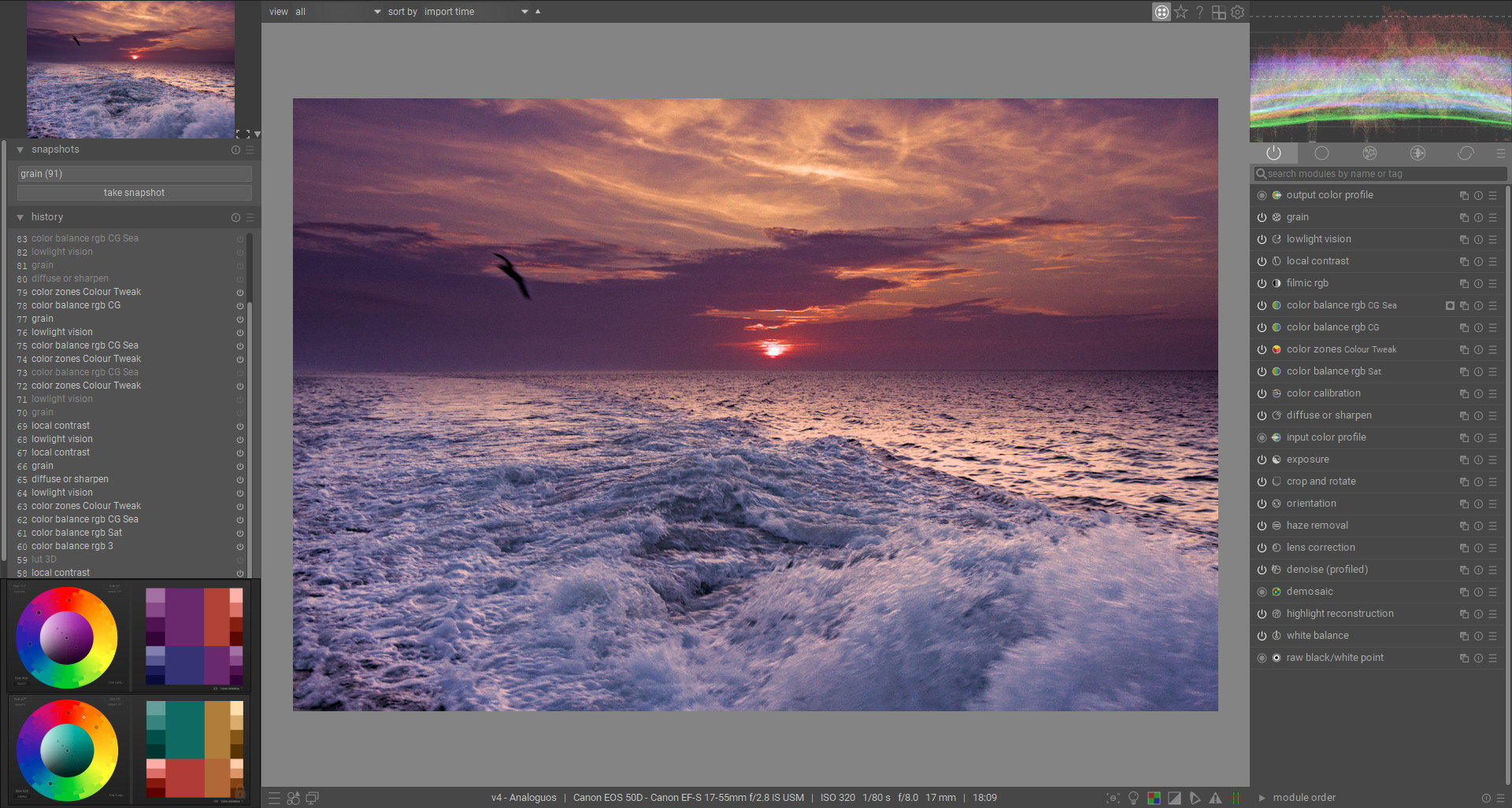
Edit: In case I’m not quite clear in my text above, here’s my screenshot when I’m editing your image, I’m just eyeballing the reference colour harmony and make an adjustment as needed
One idea to put color swatches on the screen, instead of using Paletton/Adobe Color + Inkscape + Watermark, could be to use the module colorize with a drawn mask and mix = 0%
I’ve also wondered about how to use colorize to add color to an image. For example, can you set a color with colorize and use a blend mode (which one?) and mask to add that color to the scene? I’ve played with this a little but want to try working with it more to see what is possible
I believe overlay would do, combined with masking if you want it local.
EDIT: however I found the color set to match the expectation only if I move the module after output color profile