It does take some time but I am sure you will end up with a medal ![]()
1 Like
Be very careful with that black level! There’s a reason it’s set to a small negative value by default. That adjustment works by subtracting the provided value from all pixels; therefore, it can lead to negative RGB coordinates. The recommended way is to use other controls (like the black level of filmic, tone curves and so on).
Use exposure to get the mid-tones right; don’t worry too much about the others: those will be taken care of using the different tone mapping modules.
So, for color calibration and color balance RGB: don’t worry too much about the histogram.
Brilliance grading: first, go to the masks tab, and auto-pick the white. Although the documentation says it’s only used on the 4 ways tab (darktable 4.2 user manual - color balance rgb), Aurélien (the developer of the module) said it is not the case; also, according to him it is a UI bug that one can set values higher than 20%, and one must never exceed that value for highlights, as the maths fall apart. Unfortunately, he used rather foul language to describe this, but if you are interested, read here: [DT Master 4.1.0] color balance rgb perceptual briliance grading highlight slider creates artifacts · Issue #12442 · darktable-org/darktable · GitHub.
sigmoid and filmic are tone mappers. If your input does not cover a wide dynamic range (already fits within the screen’s DR), you don’t need them. It is also possible to tame high DR via tone equalizer alone. sigmoid and filmic are pixel-wise operations (except for the highlight blooming controls of filmic): each pixel is processed individually. Therefore, reducing global contrast (compressing the dynamic range: brightening shadows and darkening highlights) leads to reduced local contrast (neighbouring darker and brighter pixels will be made more similar). tone equalizer divides the picture into parts, and uniformly adjusts exposure for each part. Therefore, if you brighten shadows (or darken highlights), neighbouring darker and brighter pixels will change together, their difference will not change. The trade-off is haloing: how do you determine if the brighter pixel really belongs to the ‘dark’ area, or if it’s already the start of the ‘bright’ part of the image. The controls on the masking tab deal with exactly that question.
I rarely adjust exposure at the end, or only by small amounts. Why that effects brightness has already been explained. Exposure adjustment works by simple multiplication (and subtraction of the black level). The formula is simple:
out = (in - black level) * scale
The scale comes from the black level and the selected exposure:
white = 2^(-exposure)
scale = 1 / (white - black)
So, if you set black = 0.01, exposure = 1.5 EV, white is 2^(-1.5) ~= 0.3536, and scale is about 2.911. A pixel coordinate of value 0.2 will be mapped to (0.2 - 0.01) * 2.911 ~= 0.5531 (red, green and blue are multiplied separately). However, a value of 0.001 is mapped to -0.0262 - negative!
3 Likes
First, some context: virtually all of my pics are portraits and are well exposed esp for the mid tones. For the most part I try to get it right with the camera. I use DT to primarily convert to B&W and produce stellar B&W portraits of those pics.
The videos from Boris and others show they use Exposure to (in my words) “blow out” the image, not just get the mid-tones right. I recall either Boris and/or others explaining it in their videos as “don’t worry, we want to get everything in…and processing the other modules would correct (for the blow out)”. So I adopted that technique and it seems to work. Am I misusing Exposure? Why are the others doing that makes them go past “getting the mid-tones right”?
for color calibration and color balance RGB: don’t worry too much about the histogram.
Istvan, let me ask the “negative” question: is there a reason we should not rely on the histogram in using these modules? I find the combination of looking at the image and the histogram (and how the changes affect them) powerful, irreplaceably valuable as the histogram tells me what my eye may miss.
Quick responses:
a) I shall read up on Aurelien’s post on brilliance grading/masks;
b) yes, sigmoid (and filmic) are not as relevant for images where there’s low dynamic range (e.g., some of my portrait pics) and it explains why after using sigmoid the local contrast module was mostly moot and if sigmoid was not used, adjusting the sliders in local contrast helped;
c) yes, the Exposure adjustment at the end is very minor. Thank you for the technical explanation, Istvan.
d) time for me to check out and play with Tone Eq. For my use of DT–conversion to and production of stellar B&W portraits–Tone Eq may be invaluable.
They don’t intend to blow out the highlights; it’s just they don’t worry about blowing them out. They target the midtones. filmic and sigmoid are centred around midtones (don’t modify midtones).
If your tone mapper (filmic, sigmoid) is not turned on, then you’ll see clipping, which is corrected later. So no point in worrying about the histogram at this point.
If you have the tone mapper turned out, they map scene-referred input to 0…1 display-referred output. You cannot get tones > 1. You can get colours that are out-of-gamut for the display / output colour space, but those you’ll deal with later. At least this is my understanding.
If your tone mapper (filmic , sigmoid ) is not turned on, then you’ll see clipping (i.e., in the histograms in the Color Balance RGB), which is corrected later. So no point in worrying about the histogram at this point.
Earlier the day yesterday I used Color Balance RGB first, made sure the histogram didn’t show any clipping as I adjusted the sliders. Then I used Sigmoid.
Steven yesterday suggested trying the reverse: Sigmoid first, Color Balance RGB after.
Indeed, when I did that, I found the histogram in Color Balance RGB was less material as the Sigmoid had already compressed the range and limited chances of clipping in the former. Similarly, I found after use of Sigmoid my use of Local Contrast was largely unnecessary as the former, in globally adjusting the tone also adjusted the local contrast.
So, I now understand better what Istvan, Steven, Todd, Miguel and others said in response to my Qs. I guess I’m graduating from kindergarten, ready for elementary school, and excited about it!
3 Likes
If you are not using the waveform histogram give that a try. Esp for BW conversions. If you take the approach as Boris does to do some work on the color image first and to analyze the color channels then the waveform will give you a really nice summary of the data mapped to the image location whereas the std histogram is just a binned presentation of the values…
Sigmoid and filmic do not adjust (preserve) local contrast.
This is how I usually use tone equalizer. Note that this is the complete editing history of a recent image of mine:

Until #11, it’s the workflow defaults, including filmic. I automatically apply lens correction via a preset, that’s #12, and my starting point.
I was reasonably happy with the exposure, but found that there were no details in the dark parts, that’s why I turned on tone equalizer to bring back some detail there.
I then turned on denoise (profiled) and adjusted rotate and perspective.

I then adjusted filmic, but probably did not like the outcome, as I backed out the change; however, the entry is still there in the history. I then tweaked tone eq again:

A comparison of the middle part between #15 and #17:

I then auto-tuned filmic in #18 (something I always try), but it produced artefacts, which I did not realise until later:

Then I cropped the image, and tried how it’d look with sigmoid.

In 23-24, I turned off sigmoid and turned filmic back on. That was when I noticed the artefact, so in #25 I lowered the white point in filmic (there were no details in the lamp to preserve, so I could just let it be my white point).

#26 - 29 were a back-and-forth between sigmoid and filmic, until I remembered we had a snapshot feature. ![]()
#30 was local contrast with the defaults, which basically finished the edit.
In #31 I enabled color balance rgb with the basic colorfulness: vibrant colors preset, but then decided against it and turned it off.
I don’t know what I did in #32 with color calibration. There seems to be no change.
In #33 I added another color calibration instance to try a few BW conversions, but then decided it was a festival of colourful lights, so I should keep the colours. Plus, I’m afraid of doing ‘art with a capital F’, as my English teacher once said.
Then I noticed a distracting bright spot on the left and cropped it out.
Unless I’m grossly mistaken, aren’t
reducing global contrast (compressing the dynamic range: brightening shadows and darkening highlights) leads to reduced local contrast (neighbouring darker and brighter pixels will be made more similar) and Sigmoid and filmic do not adjust (preserve) local contrast contrary?
I agree, Sigmoid/filmic don’t adjust local contrast. Their focus is global contrast. However, using Sigmoid, I find, requires minimal to no work on Local Contrast. Not using Sigmoid, for same image under similar circumstances, allows for more influence/effect through Local Contrast sliders.
Yes, the waveform histogram helps a lot more than the standard histogram in Color Calibration before converting to gray scale.
Istvan, I appreciate your detailed workflow and explanation of the steps involved in your use of the Tone EQ. I shall get to absorbing and using that information soon.
filmic and sigmoid reduce (compress) global contrast (from scene to display range). Being pixel-wise operations, they also reduce local contrast.
Let’s revisit our grey ramp:

Top: sigmoid, bottom: original.
Let’s supposed that those tones come from a photo that I intentionally underexposed to preserve the highlights (not clip them). This would mean that scene mid-tones are shifted to one of the darker shades; let’s pick the 3rd from the left. I’ll add exposure to bring it to L = 50. Without sigmoid:
I needed just over 2.2 EV:
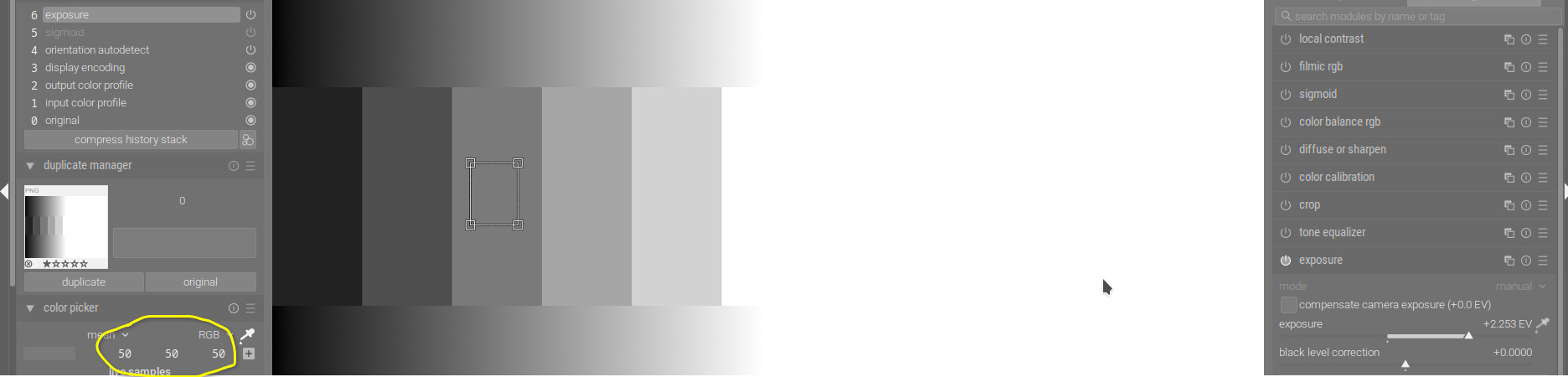
Check the output of sigmoid, and how the contrast was compressed in the highlights. Check out the rgb parade on the top right – the continuous curves represent the gradient, the horizontal lines the steps in the middle:

Using tone equalizer will produce a very different image:
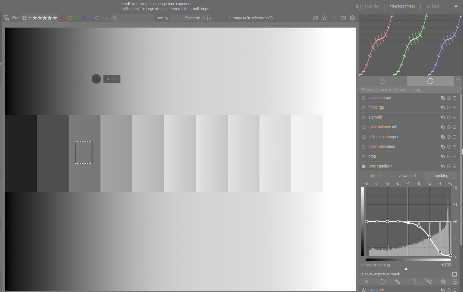
You’ll see that inside the steps, sigmoid kept the constant brightness (the lines in the parade are horizontal), while tone eq did not; however, it maintained contrast in highlights and shadows. Of course, tone EQ did not do well on this synthetic image.
Here’s a photo, which I did not develop, just grabbed it to demonstrate stuff.
Check the sails. Without tone mapping, they are blown:

sigmoid:

filmic:

tone eq:

Tone EQ handled the whole sail as the same, and applied the same darkening to all pixels. The other two darkened the brightest pixels most, and the less bright ones not so much.
Left: filmic, right: tone EQ:

Compare Tone EQ with simply reducing exposure - left: tone EQ, right: exposure:

The effect on the sail is very similar (since tone EQ applied very similar exposure adjustments to all pixels of the sail). You can see that on the water, on the background tone EQ applied a different adjustment, while exposure, of course, applied the same.
1 Like
I might add that on an image with a very low dynamic range from the camera, filmic or sigmoid can actually be used to stretch the image, and increase the contrast.
Happens less often maybe, but I thought it was a common enough case to point out. ![]()
Edit. I also find that with sigmoid, I use local contrast less often than I did with filmic. I haven’t quite worked out why!
Two points to remember perhaps:
-
filmic (and I think sigmoid) were designed to lower the contrast in shadows and highlights to mimic the behaviour of silver halide film. So with those modules, you set the input range and midtone contrast, what happens at the extremes follows from that (with a few more controls to tune the roll-off).
-
If you want to diminish the roll-off effect, you can lower the contrast in filmic/sigmoid and add local contrast with another module (“diffuse or sharpen”, though that can be slow, or “local contrast”).
@meaningfullyhappy you can highlight some text in a post, then the “quote” button should appear. That’ll give you a quoted reply, instead of copying and pasting italic text.
After reading, digesting the many comments, suggestions, do’s and don’ts, and watching Boris’s B&W (portrait) conversion video/tutorials again, I realized in essence there was a simpler way to achieve what I intended to do: convert a color image to B&W. [I’m sure there are other ways too]
Here’s my “simplified yet powerful” workflow (which surely can be improved…but that’s part of the learning and evolution…)
My workflow:
Set Scope to Waveform and monitor it for Steps 2 onward to insure no clipping (unless you want that).
Prep/fix the image.
- Denoise, Lens Correction.
- Exposure: Bump up. Note to myself: no need to “blow out” image by over-exposing; for portraits, get everything you want visible and exposed.
- Color Bal RGB: Bump up Vibrance and Chroma. Note to myself: adjusting colors (and channels) enables a better final B&W.
Now, convert to B&W. - Create new instance of Color Calibration. Move it above Color Bal RGB. That way, the adjustments to Vibrance and Chroma flow into this instance. In this new instance of Color Calibratioun: a) Under Gray, move Sliders (for R, G, B) to right. Note to myself: You’d need a mix of them, some more than others, some absent sometimes. For portraits, watch/get skin tone right. Should you need to darken or lighten a certain color, adjust under Brightness tab.
- Sigmoid: a) Turn on/off and see if you need it. Some images don’t seem to benefit from it; others do. b) If you need it, turn it on and adjust contrast and skew until image and waveform look good. Sigmoid indeed stretches the image (for portraits, the mid tone).
- Go back to Color Balance RGB: a) Under Perceptual Brilliance Grading: as appropriate increase global brilliance, shadows, mid-tones, and highlights.
- Local Contrast: a) Turn on and adjust details, shadows, highlights, mid-tone. For reasons beyond me, if I used Sigmoid earlier I find my use of Local Contrast coming down to merely adjusting Details (which seems to pop the image some).
- Go back to Exposure: a) micro-adjust exposure if necessary.
I’m able to convert good pics to good B&W in under 5-7 minutes per image. I believe I can do that because: a) the images are portraits; b) most if not all of the pics are good to go straight out of the camera; c) I’m not claiming my conversion is Pro-Grade; d) the workflow/pixel pipe/modules in darktable make good sense (after the initial and somewhat significant, even daunting, hump to get started); e) the feedback, comments in this forum are invaluable and helpful.
3 Likes
If you want to speed up the process a bit, you can create a style with (some of) the modules you describe and them in the proper order (activated or not). Then you can quickly activate that style, and you won’t have to create and move the second color calibration instance. And you can name the different instances…
You could also consider a second instance of color balance rbg for the brilliance adjustments (separation of concerns, each instance does one thing). Once again, be careful with the brilliance adjustments, total correction for any luminance range should be below ~20%.
The amount in which sigmoid (or filmic) “stretches” the image mid-tones will depend on the “contrast” setting. If you don’t want to change that setting, use the tone equaliser or extra instances of exposure to control your dynamic range.
1 Like
Excellent and timely suggestion!
So I spent the past 30+ minutes trying to do that and consulted the manual extensively. I created a style and gave it a name.
I ran into two issues:
#1: I’m not successful in renaming the modules e.g., giving a distinct separate name for the new instances of Color Calibration and Color Balance RGB. How may I do that? or where can I find the relevant details in the manual?
#2: Having created a style I go into darkroom to apply that style on an image and get working on the specific modules in that style. How do I do that? In darkroom I find a styles pulldown menu in lower LHS panel (under Export and above the Export button). I pull it down, find my new Style, and choose it. No effect. Plus, its location suggests that said style may be intended to be applied at time of export of a processed image. So…where in darkroom can I find the style I created (and its modules) and apply it to the image at hand and/or set it as a default for all images to be processed?
My apologies for these Qs…your responses help, take me a few strokes or more further, only for me to find I’m out of my depth…and calling for help!
Click the little double page icon…
Or ctrl click on the module header/name
Styles…
Use the little circles icon to create one from a history stack… and then the larger three circles… will bring up the list you can apply… Just be sure that in Lightable the mode is set as you wish ie to append or replace…
Todd, perfect, yes, I was able to apply your suggestions and get to where I needed to be.
I knew right-click on the double-page icon creates a new instance. Thank you.
Didn’t occur to me the left click would pop up a different menu where I could rename the newly created instance. Similarly, I didn’t know the “three circles” icon would pop up a menu showing the newly created style that I can then apply. [As a side comment: if I’m having these issues, wouldn’t others less technically inclined find the interface even more challenging, even daunting?]
My “Convert to B&W” Style has the following modules bottom to top: denoise->lens correction->exposure → tone eq->color calibration->color bal rgb Pre B&W Prep->color calibration B&W Convert->sigmoid->color bal rgb Post B&W Conversion ->local contrast->tone equalizer post B&W Conversion.
The modules with the extended/amended names are new instances: to prep/fix the original image, convert to B&W, and adjust the converted image.
Time and use/experience would guide me to whether the Tone Eq Post B&W should precede or follow (as now) the Local Contrast at the top of the pixel pipe.
Very excited, I could not have reached where I am but for help from this forum!
How you can rename module insurances, and how you can apply styles are both described in the manual. I suggest that you check it out, it’s really comprehensive and even has a built-in search facility, which means even if you don’t read it (virtual) cover-to-cover, you can quickly learn the bits most important to you.
Yes, I have the manual up and always available as I work with DT and the various modules. And, yes, it is helpful, comprehensive. And it is even more helpful after I get help from this forum, said help prompting me to search for specific keywords/dt jargon that I then find in the manual and understand better what’s otherwise left unsaid.
As an example, in the hope this clarifies what I’m saying, I searched the manual for “applying a style”, “apply style”, “style application” etc. and drew a blank or nothing that led me to the “three circles” icon. Once Todd mentioned “three circles”, I then use it, find it works, read up the manual to learn more.
And even on that the manual is confusing. The manual says, concerning the “three circles” icon: “Quick access menu for styles. Hover over a style name with your mouse to show a preview of the current darkroom image with the selected style applied.” Note that this does not say the equivalent of what I was looking for: e.g., “Lists available Styles. Choosing one applies chosen style to image. (etc.)”
So, I guess between using DT, using the manual, asking Qs and getting help here, going back to the manual…I make progress in not just using DT but also understanding the manual’s limitations. I guess what I’m trying to highlight is that to “quickly learn the bits most important (to me)”
the manual helps but not much; the manual is only good when supplemented or complemented by help on this forum. Hope this helps and clarifies…
yes, it is ass backwards sometimes but it works so I can’t “complain”. And, once I got over the hump, I find out "