Sigmoid and filmic do not adjust (preserve) local contrast.
This is how I usually use tone equalizer. Note that this is the complete editing history of a recent image of mine:

Until #11, it’s the workflow defaults, including filmic. I automatically apply lens correction via a preset, that’s #12, and my starting point.
I was reasonably happy with the exposure, but found that there were no details in the dark parts, that’s why I turned on tone equalizer to bring back some detail there.
I then turned on denoise (profiled) and adjusted rotate and perspective.

I then adjusted filmic, but probably did not like the outcome, as I backed out the change; however, the entry is still there in the history. I then tweaked tone eq again:

A comparison of the middle part between #15 and #17:

I then auto-tuned filmic in #18 (something I always try), but it produced artefacts, which I did not realise until later:

Then I cropped the image, and tried how it’d look with sigmoid.

In 23-24, I turned off sigmoid and turned filmic back on. That was when I noticed the artefact, so in #25 I lowered the white point in filmic (there were no details in the lamp to preserve, so I could just let it be my white point).

#26 - 29 were a back-and-forth between sigmoid and filmic, until I remembered we had a snapshot feature. ![]()
#30 was local contrast with the defaults, which basically finished the edit.
In #31 I enabled color balance rgb with the basic colorfulness: vibrant colors preset, but then decided against it and turned it off.
I don’t know what I did in #32 with color calibration. There seems to be no change.
In #33 I added another color calibration instance to try a few BW conversions, but then decided it was a festival of colourful lights, so I should keep the colours. Plus, I’m afraid of doing ‘art with a capital F’, as my English teacher once said.
Then I noticed a distracting bright spot on the left and cropped it out.
Unless I’m grossly mistaken, aren’t
reducing global contrast (compressing the dynamic range: brightening shadows and darkening highlights) leads to reduced local contrast (neighbouring darker and brighter pixels will be made more similar) and Sigmoid and filmic do not adjust (preserve) local contrast contrary?
I agree, Sigmoid/filmic don’t adjust local contrast. Their focus is global contrast. However, using Sigmoid, I find, requires minimal to no work on Local Contrast. Not using Sigmoid, for same image under similar circumstances, allows for more influence/effect through Local Contrast sliders.
Yes, the waveform histogram helps a lot more than the standard histogram in Color Calibration before converting to gray scale.
Istvan, I appreciate your detailed workflow and explanation of the steps involved in your use of the Tone EQ. I shall get to absorbing and using that information soon.
filmic and sigmoid reduce (compress) global contrast (from scene to display range). Being pixel-wise operations, they also reduce local contrast.
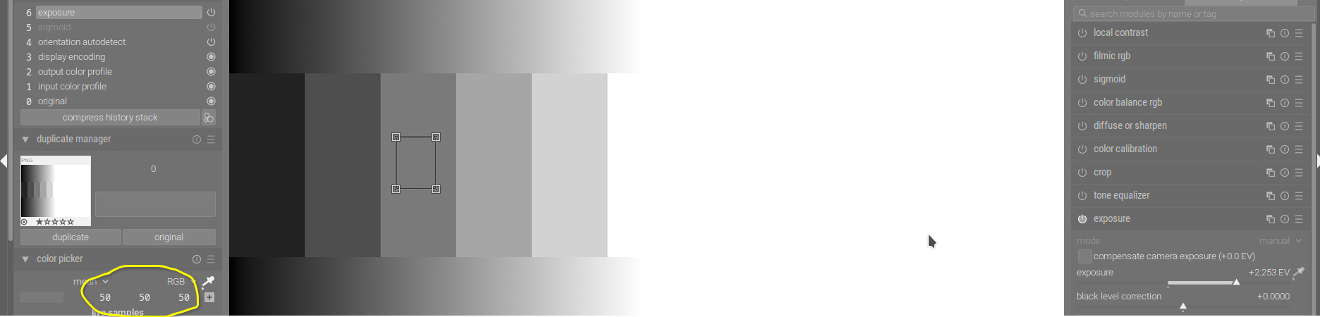
Let’s revisit our grey ramp:

Top: sigmoid, bottom: original.
Let’s supposed that those tones come from a photo that I intentionally underexposed to preserve the highlights (not clip them). This would mean that scene mid-tones are shifted to one of the darker shades; let’s pick the 3rd from the left. I’ll add exposure to bring it to L = 50. Without sigmoid:
I needed just over 2.2 EV:
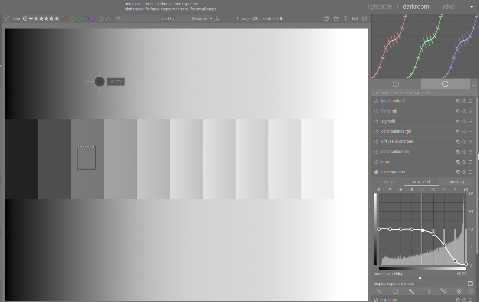
Check the output of sigmoid, and how the contrast was compressed in the highlights. Check out the rgb parade on the top right – the continuous curves represent the gradient, the horizontal lines the steps in the middle:

Using tone equalizer will produce a very different image:
You’ll see that inside the steps, sigmoid kept the constant brightness (the lines in the parade are horizontal), while tone eq did not; however, it maintained contrast in highlights and shadows. Of course, tone EQ did not do well on this synthetic image.
Here’s a photo, which I did not develop, just grabbed it to demonstrate stuff.
Check the sails. Without tone mapping, they are blown:

sigmoid:

filmic:

tone eq:

Tone EQ handled the whole sail as the same, and applied the same darkening to all pixels. The other two darkened the brightest pixels most, and the less bright ones not so much.
Left: filmic, right: tone EQ:

Compare Tone EQ with simply reducing exposure - left: tone EQ, right: exposure:

The effect on the sail is very similar (since tone EQ applied very similar exposure adjustments to all pixels of the sail). You can see that on the water, on the background tone EQ applied a different adjustment, while exposure, of course, applied the same.
1 Like
I might add that on an image with a very low dynamic range from the camera, filmic or sigmoid can actually be used to stretch the image, and increase the contrast.
Happens less often maybe, but I thought it was a common enough case to point out. ![]()
Edit. I also find that with sigmoid, I use local contrast less often than I did with filmic. I haven’t quite worked out why!
Two points to remember perhaps:
-
filmic (and I think sigmoid) were designed to lower the contrast in shadows and highlights to mimic the behaviour of silver halide film. So with those modules, you set the input range and midtone contrast, what happens at the extremes follows from that (with a few more controls to tune the roll-off).
-
If you want to diminish the roll-off effect, you can lower the contrast in filmic/sigmoid and add local contrast with another module (“diffuse or sharpen”, though that can be slow, or “local contrast”).
@meaningfullyhappy you can highlight some text in a post, then the “quote” button should appear. That’ll give you a quoted reply, instead of copying and pasting italic text.
After reading, digesting the many comments, suggestions, do’s and don’ts, and watching Boris’s B&W (portrait) conversion video/tutorials again, I realized in essence there was a simpler way to achieve what I intended to do: convert a color image to B&W. [I’m sure there are other ways too]
Here’s my “simplified yet powerful” workflow (which surely can be improved…but that’s part of the learning and evolution…)
My workflow:
Set Scope to Waveform and monitor it for Steps 2 onward to insure no clipping (unless you want that).
Prep/fix the image.
- Denoise, Lens Correction.
- Exposure: Bump up. Note to myself: no need to “blow out” image by over-exposing; for portraits, get everything you want visible and exposed.
- Color Bal RGB: Bump up Vibrance and Chroma. Note to myself: adjusting colors (and channels) enables a better final B&W.
Now, convert to B&W. - Create new instance of Color Calibration. Move it above Color Bal RGB. That way, the adjustments to Vibrance and Chroma flow into this instance. In this new instance of Color Calibratioun: a) Under Gray, move Sliders (for R, G, B) to right. Note to myself: You’d need a mix of them, some more than others, some absent sometimes. For portraits, watch/get skin tone right. Should you need to darken or lighten a certain color, adjust under Brightness tab.
- Sigmoid: a) Turn on/off and see if you need it. Some images don’t seem to benefit from it; others do. b) If you need it, turn it on and adjust contrast and skew until image and waveform look good. Sigmoid indeed stretches the image (for portraits, the mid tone).
- Go back to Color Balance RGB: a) Under Perceptual Brilliance Grading: as appropriate increase global brilliance, shadows, mid-tones, and highlights.
- Local Contrast: a) Turn on and adjust details, shadows, highlights, mid-tone. For reasons beyond me, if I used Sigmoid earlier I find my use of Local Contrast coming down to merely adjusting Details (which seems to pop the image some).
- Go back to Exposure: a) micro-adjust exposure if necessary.
I’m able to convert good pics to good B&W in under 5-7 minutes per image. I believe I can do that because: a) the images are portraits; b) most if not all of the pics are good to go straight out of the camera; c) I’m not claiming my conversion is Pro-Grade; d) the workflow/pixel pipe/modules in darktable make good sense (after the initial and somewhat significant, even daunting, hump to get started); e) the feedback, comments in this forum are invaluable and helpful.
3 Likes
If you want to speed up the process a bit, you can create a style with (some of) the modules you describe and them in the proper order (activated or not). Then you can quickly activate that style, and you won’t have to create and move the second color calibration instance. And you can name the different instances…
You could also consider a second instance of color balance rbg for the brilliance adjustments (separation of concerns, each instance does one thing). Once again, be careful with the brilliance adjustments, total correction for any luminance range should be below ~20%.
The amount in which sigmoid (or filmic) “stretches” the image mid-tones will depend on the “contrast” setting. If you don’t want to change that setting, use the tone equaliser or extra instances of exposure to control your dynamic range.
1 Like
Excellent and timely suggestion!
So I spent the past 30+ minutes trying to do that and consulted the manual extensively. I created a style and gave it a name.
I ran into two issues:
#1: I’m not successful in renaming the modules e.g., giving a distinct separate name for the new instances of Color Calibration and Color Balance RGB. How may I do that? or where can I find the relevant details in the manual?
#2: Having created a style I go into darkroom to apply that style on an image and get working on the specific modules in that style. How do I do that? In darkroom I find a styles pulldown menu in lower LHS panel (under Export and above the Export button). I pull it down, find my new Style, and choose it. No effect. Plus, its location suggests that said style may be intended to be applied at time of export of a processed image. So…where in darkroom can I find the style I created (and its modules) and apply it to the image at hand and/or set it as a default for all images to be processed?
My apologies for these Qs…your responses help, take me a few strokes or more further, only for me to find I’m out of my depth…and calling for help!
Click the little double page icon…
Or ctrl click on the module header/name
Styles…
Use the little circles icon to create one from a history stack… and then the larger three circles… will bring up the list you can apply… Just be sure that in Lightable the mode is set as you wish ie to append or replace…
Todd, perfect, yes, I was able to apply your suggestions and get to where I needed to be.
I knew right-click on the double-page icon creates a new instance. Thank you.
Didn’t occur to me the left click would pop up a different menu where I could rename the newly created instance. Similarly, I didn’t know the “three circles” icon would pop up a menu showing the newly created style that I can then apply. [As a side comment: if I’m having these issues, wouldn’t others less technically inclined find the interface even more challenging, even daunting?]
My “Convert to B&W” Style has the following modules bottom to top: denoise->lens correction->exposure → tone eq->color calibration->color bal rgb Pre B&W Prep->color calibration B&W Convert->sigmoid->color bal rgb Post B&W Conversion ->local contrast->tone equalizer post B&W Conversion.
The modules with the extended/amended names are new instances: to prep/fix the original image, convert to B&W, and adjust the converted image.
Time and use/experience would guide me to whether the Tone Eq Post B&W should precede or follow (as now) the Local Contrast at the top of the pixel pipe.
Very excited, I could not have reached where I am but for help from this forum!
How you can rename module insurances, and how you can apply styles are both described in the manual. I suggest that you check it out, it’s really comprehensive and even has a built-in search facility, which means even if you don’t read it (virtual) cover-to-cover, you can quickly learn the bits most important to you.
Yes, I have the manual up and always available as I work with DT and the various modules. And, yes, it is helpful, comprehensive. And it is even more helpful after I get help from this forum, said help prompting me to search for specific keywords/dt jargon that I then find in the manual and understand better what’s otherwise left unsaid.
As an example, in the hope this clarifies what I’m saying, I searched the manual for “applying a style”, “apply style”, “style application” etc. and drew a blank or nothing that led me to the “three circles” icon. Once Todd mentioned “three circles”, I then use it, find it works, read up the manual to learn more.
And even on that the manual is confusing. The manual says, concerning the “three circles” icon: “Quick access menu for styles. Hover over a style name with your mouse to show a preview of the current darkroom image with the selected style applied.” Note that this does not say the equivalent of what I was looking for: e.g., “Lists available Styles. Choosing one applies chosen style to image. (etc.)”
So, I guess between using DT, using the manual, asking Qs and getting help here, going back to the manual…I make progress in not just using DT but also understanding the manual’s limitations. I guess what I’m trying to highlight is that to “quickly learn the bits most important (to me)”
the manual helps but not much; the manual is only good when supplemented or complemented by help on this forum. Hope this helps and clarifies…
yes, it is ass backwards sometimes but it works so I can’t “complain”. And, once I got over the hump, I find out "
It’s not a Google-like intelligent search engine. ![]() Next time, simpler searches, and the scroll through the results. For example, if you just search for style, and scroll down, you’ll see:
Next time, simpler searches, and the scroll through the results. For example, if you just search for style, and scroll down, you’ll see:

And then
https://docs.darktable.org/usermanual/4.2/en/darkroom/darkroom-view-layout/#bottom-panel
In the v4.0 docs, that does not work, and you have to search for styles (told you, it’s no Google), but even then, the description is not detailed – it still points you to the icon to click.
https://docs.darktable.org/usermanual/4.0/en/darkroom/darkroom-view-layout/#bottom-panel
One Google trick: if you use site:some.domain in your query (e.g., site:com foobar or site:darktable.org foobar), you can restrict the search for foobar to sites within that domain (so, anything.com or (anything.)darktable.org).
Try this: https://www.google.com/search?q=site%3Adarktable.org+4.0+darkroom+apply+style
Istvan, this may be a matter of nuance that a newbie is unlikely to get but makes sense to those familiar with DT.
The manual says, concerning the “three circles” icon: “Quick access menu for styles. Hover over a style name with your mouse to show a preview of the current darkroom image with the selected style applied.” Ditto for the content re darkroom view layout (which you highlighted in your previous post).
Note that this does not say the equivalent of what I was looking for: e.g., “Lists available Styles. Choosing one applies chosen style to image. (etc.)” The nuance being: “Hover over a style name to see preview…” hardly registers for someone untrained in DT as the way to apply a style.
My comment(s) in this regard, including this response, are intended to help improve things so others that will (soon) be in the shoes I was in a few hours ago have a better experience with the manual. Thanks to Todd’s tips I’ve now outgrown those shoes…but, the experience being so recent, can empathize with those soon to be in those shoes.
1 Like
Thanks for pointing that out. Yes, the manual is not perfect, and feedback is important. If you open an account on Github, you can easily propose changes in a web-based editor. I think it was assumed that users would try clicking a quick-access menu button (“When you assume, you make an ass out of you and me.”).
Off-topic: I’ve just found this funny XKCD: xkcd: When You Assume
1 Like
I know it seems funny at times. It does require a lot of time. Infact finding my way around DT a number of years ago almost made me give up. I then at the time stumbled on to two sets of very different videos. FIrst was Bruce Williams (thank you many times over @Bruce_Williams ). He was doing a run through from start to finish of the UI and the modules. He has a very fantastic knack for knowledge translation and after following a number of the videos I got to where I could get around. So then my next thing was I didn’t know enough about color science and so I would end up with these massive history stacks full of modules that I had assembled pushing and pulling colors… It was a long and not so rewarding process. Then I stumbled on the videos made by @s7habo Boris Hadjukovic and I was floored by what he was able to produce in an edit. I think there was a video he did of an exterior of a plant or industrial area with all this metal pipe and he made it look other worldly…not in an omg HDR way but just so full of life detail and color. It became art. So I watch him. In the early days he didn’t do voice over so it was some basic text and a run through in stages so I took notes and I did a lot of pausing and copied the settings into presets… I still can’t edit anywhere near what Boris can do but I did get much better and just seeing that it was possible was the carrot to keep me trying and learning. Boris thanks for your time and your feedback. You are so very giving of your time and skills. Finally, a collective shout out to the people here that continue to help me learn and put up with my dumb queries… The support and fellowship esp though the first part of the pandemic from the users here was a really nice escape and very enjoyable place to spend time…so stick with it @meaningfullyhappy and if you do…quirky as it may be the power and features packed into that UI are pretty amazing and continue to be improved and refined… once you master where things are you can begin to focus on the image editing …
3 Likes
@priort, thanks so much for the kind words.
Thanks also to You for your help on deciphering some of the new features here and there!
1 Like
Or setting you back to where you might need a drink… ![]()