I’ve worked on the design of several. To get to that position you have to have visited some. (understatement)
I’m sorry this is just absurd. Some did some didn’t Constable springs to mind but there are so many and anyone just thinking briefly should remember one, by a famous artist or just a print in a toilet. I think you are getting unnecessarily stuck in your head forgetting things you’ve actually experienced.
The fact that most landscape photography on the web is overcooked is a different issue.
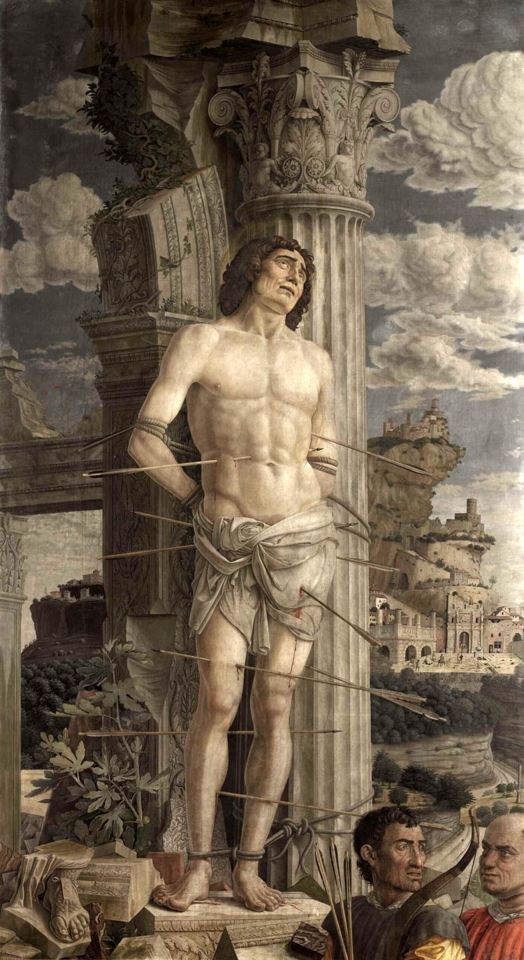
I know that Mantegna is an extreme (not unique though) example and he had an different background than we have today. But what I want to say here is that we have different references for depicting clouds and that the beauty of darktable and modules you made is that they give us greater possibility to imitate them as we like.
What you are talking about is not the Mantegna but the picture which I found on the internet and reluctantly posted here just for your reference, aren’t you? It doesn’t represent well what we can see in Paris, let alone the original appearance of the painting in the 15th century which could not be so “dull”. I can show you a more colorful image of the painting although it is still not a good reproduction. You may also refer to the version of the same subject in the Kunsthistorisches Museum in Vienna which preserves the vivid colors from the Renaissance era better and shows you Mantegna’s unique depiction of clouds as well.
You can use masking to achieve contrast in highlights. For one example, assuming ETTR, create new instance of exposure module and lower exposure. Then in parametric mask, luminance channel, move the black sliders right so the shadows and midtones are not being affected. Then, to create contrast, move the top white slider left towards the top black slider. So the darker parts of the highlights have exposure reduced more than the lighter parts - thus creating contrast. If you want this to only effect a certain portion of the image (eg. the sky), then you can then draw a shape mask around the sky.
For me the need for damage control (this coming from the „inventor“ of the module is making this even worse) means that something is fundamentally wrong with the whole concept of the filmic module… I don’t think that a module should “damage” the contrast that late in the pipeline that it needs major repair work - it means that the module basically is destroying a lot of decisions the photographer has made beforehand, either in camera or in basic development settings.
Contrast and contrast distribution regarding our output media is a thing we photographers - unlike snapshooters - have always in mind and decide very early on in the photographic process by deciding our exposure and the way we light or scene. The larger RAW capabilities protect us from mistakes we make to a certain degree but compressing or tone mapping the captured data late in the edit is completely the wrong way to approach this unless you want to have a HDR image (yuck, I hate HDR look thoroughly) and only then this module behaviour IMHO would be acceptable.
To the OP: switch from scene referenced to display referenced mode and forget about filmic module. The whole scene referenced malarkey is a misconception that only benefits camera users (they aren’t photographers in my regard) who care more about technically not losing signal rather than creating a result according their vision/perception of a scene. It’s the difference between technically measuring something and visualizing it so that every nuance is visible as needed for documentary purposes as compared to capturing a scene in an artistic way.
If I were a forensic detective I may need the former but as a photographer I must have the latter, Darktable will probably be not viable for that in the long run since many of the needed filters fr the display referenced workflow have been sacrificed on the altar of technical correctness and are deprecated…
You’ve already said this several times in other places, but you have only made an emotional argument that seems to stem from the fact that you do not understand the new workflow. That is fine and you should use whatever tool works for you, but showing up to continually malign something you clearly do not understand is not cool and you should stop. Stop until you can provide a logical and technical argument to prove your point.
Again you’re confusing position in the pipeline with the order in which you turn the module on. Filmic is the third module one uses, so plenty of time to shape the look one wants.
The pipe is largely nondestructive, so no, nothing is destroyed.
This is true if you’re shooting film or jpegs, but not if you’re shooting raw. The general recommendation to use scene referred is to ETTR.
Good thing you don’t get to define who is and isn’t a photographer. Its a wonder you can see anything with your head that far up your own posterior.
I don’t necessarily think it’s a question of oversharpening or even realism, but rather a creative choice. Maybe those painters didn’t want clouds to distract from their primary subject. Their clouds were probably background elements.
But sometimes as photographers we want the clouds to be the primary focus.
If this Filmic malarkey is the third module one uses - what about the „scene referenced“ workflow, after that damaging module you no longer are in scene referenced mode, you are in a film simulation tone mapped mode. So either this whole „scene referenced“ thing is just a buzzword or the module is late in the pipeline but must be configured and fixed early (idiotic and unintuitive workflow at the very least!) because otherwise you keep running into the endless back and forth of the edit requiring changes to the contrast which requires changes to the filmic settings which requires changes to the contrast because the „damage limitation“ is insufficient. A module that requires a „damage limitation“ setting IMHO is fataly flawed in concept and the developer should go back to the drawingboard and fix the concept instead of tieing a big unsightly dressing on the open wound!
I don‘t want to have to decide on a tone map that early in any workflow, I don‘t care about tone maps - I make decisions on the target dynamic range depending on my target media, whether it is a traditional print , an offset print, a web presentation or a HDR display, often several which is why all of these must have a common edit, because my subject will always be smack bang in the available dynamic range of the most limited one of the ones I currently need (often large format metal prints which have 5-6 EV dynamic range with some discontinuities in the highlights). That will also require different sharpening (so sharpening is an export setting) and different handling of shadows, color ranges and highlight handling. This is easily handled in the „old“ workflow but impossible in the new one which enforces decisions much too early to be viable!
Darktable now is an unintuitive joke of an ego project since the switch to the „must not drop technically recorded infos at all cost, even if it looks shite“ mode…
I think you need to read other people’s responses more carefully. The order in which you use a module is entirely unconnected to the order in which they are executed in the processing pipeline.
Then don’t. Nobody is forcing a workflow on you. Disable filmic, do your edits and then enable it at the end. Or not at all.
If you do not like darktable please stop using it now.
After pretty much a quarter century of digital master printing for anything from websites over books to exhibitions and everything inbetween I have never ever edited an individual image for a certain device. NEVER.
Once an image or a series has been mastered - I use the word in the same sense as a musical recording is being mastered - there is a clear batch job to get those into the final output colorspace including all corrections neccessary for the final appearance. And that last conversion can be done from the same master for any medium available.
What a scene referred workflow provides is more adjustments in a linear fashion which makes editing much easier, because things like exposure changes do not sqeeze your image data into some corner, introducing banding or other nasty artifacts and unpredictable behaviour. We’ve gone from mostly edge cases to almost no edge cases at all.
But learning that way of editing requires you to forget all that working around edge cases from the olden days. I know I still have a lot of images to edit before that becomes second nature like the display referred tooling has been for years.
Please post at least a single shot of yours as playraw, showing your typical edit… Or better - showing an edit that clearly shows “display refered” is better than “scene”.
Others would take a stab at editing it and seeing/learning first hand that you’re right.
So you never had saturated colors that lose their distiction and nuances when shown or printed which require (not optional) device specific postprocessing (like a Ferrari or a vivid red rose)? Or which require processing to limit the amount of ink to be below the threshold of soaking the paper to a point where it loses structural integrity because it can‘t cope with the amount of solvents? That‘s hardly believable or you must have been very bad at your job!
That is exactly my point, filmic requires early fixing of properties but that also puts a straight jacket on the processing you can do because it does way too much damage late in the processing because at the end it tightens that straight jacket. It‘s the „damage limitation“ as the main developer has called one of the settings that shows how wrong and flawed this whole approach is, because those early fixed settings do only make sense if you want to color grade a video because in video you can‘t have frame to frame discrepancies, thus the straight jacket is needed. In photography that is not the case. I often shoot different subjects in differing light (provided by nature or myself) right after each other. Every shot will require different processing with different settings and intents - so putting a straight jacket like filmic in place does hamper my creative visual process massively, the concept is and stays fatally flawed as photographers are visual editors, not color graders!
Put a period after believable and hit enter. Why the personal insult tagged… Let your comment stand on its own without a petty insult…really come on?? Why do people have to communicate this way…
You seem to have latched onto the word “damage” as proof that you’re right and the filmic module is killing your image. You really should read the context in which this was discussed. As I understand from the context of the original post, the act of compressing a wide dynamic range into a lower dynamic range reduces contrast in the image (this is the “damage”). The contrast and related sliders allow you to mitigate this by reintroducing contrast into the mid-tones while protecting shadows and highlights. This is, in concept, no different to the standard “S” curve approach in a tone curve module, and in fact is not all that different to the sort of curve the base curve applies.
Again, you don’t need to do this. You can disable filmic, or still use the base curve and display-referred processing if you like. But you’re not interested in a discussion, just in making the same point again and again in multiple threads.
Some people really like to argue online, and a mild insult is the best way to elicit a response.
@charlyw64 I’m all for keeping this forum a place for all opinions to be discussed and not limited to praising the software and developers, but the criticism has to be constructive. You’ve made your point about filmic and the scene-referred workflow in multiple threads, but I’m left wondering what your intentions are for repeating the point over and over again that you don’t like the direction darktable is going in.
If you sincerely believe that the display-referred workflow is superior, and you want to convince others of this, please post to play raw with examples as @johnny-bit mentioned. If you simply don’t like darktable anymore, then surely it’s best for you to just move on and leave it behind. If you have ideas for improving darktable, then then are feature requests you can make and this forum to discuss ideas.
But it sounds like you’re just having a bit of a rant. If you’re frustrated, then be honest about what you’re trying to achieve with your posts, because you’ve probably noticed that the community is losing its patience and less inclined to help. Whatever message you want to convey is just getting lost in the rant.
Nope. Well, I might have had them, but some things can just be ignored. That’s the job of the printer to take care of those details.
To stick with the music analogy: I can make the music sound really good for pretty much everything but if your phone can’t play a 20Hz Bassdrum it ain’t my effin’ problem.
He doesn’t need help - at least not from the darktable community. If he‘d need help he‘d provide a playraw to point out the issue he‘s facing.
There’s no need to use scene referred workflow if on is fully satisfied with display referred workflow - and ditching filmic doesn’t kill kittens