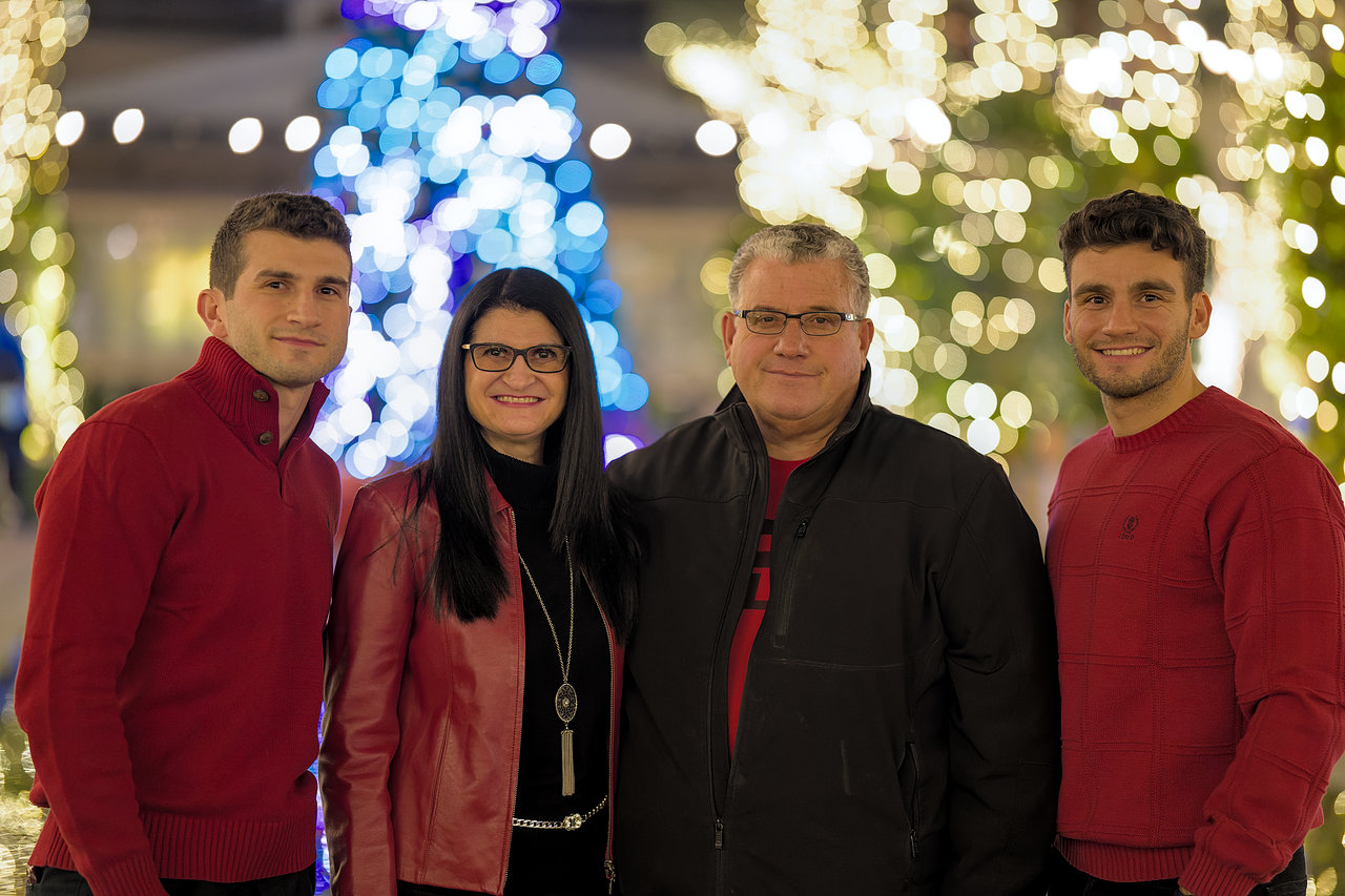
That red fringe is completely artificial. There are some ways to mitigate this with some post-processing tricks, but I would like to figure out why it happens in the first place…
Here’s the same image with “blend” highlight recovery:
ART
exposure -1.3EV, tone curve, some local contrast on heads
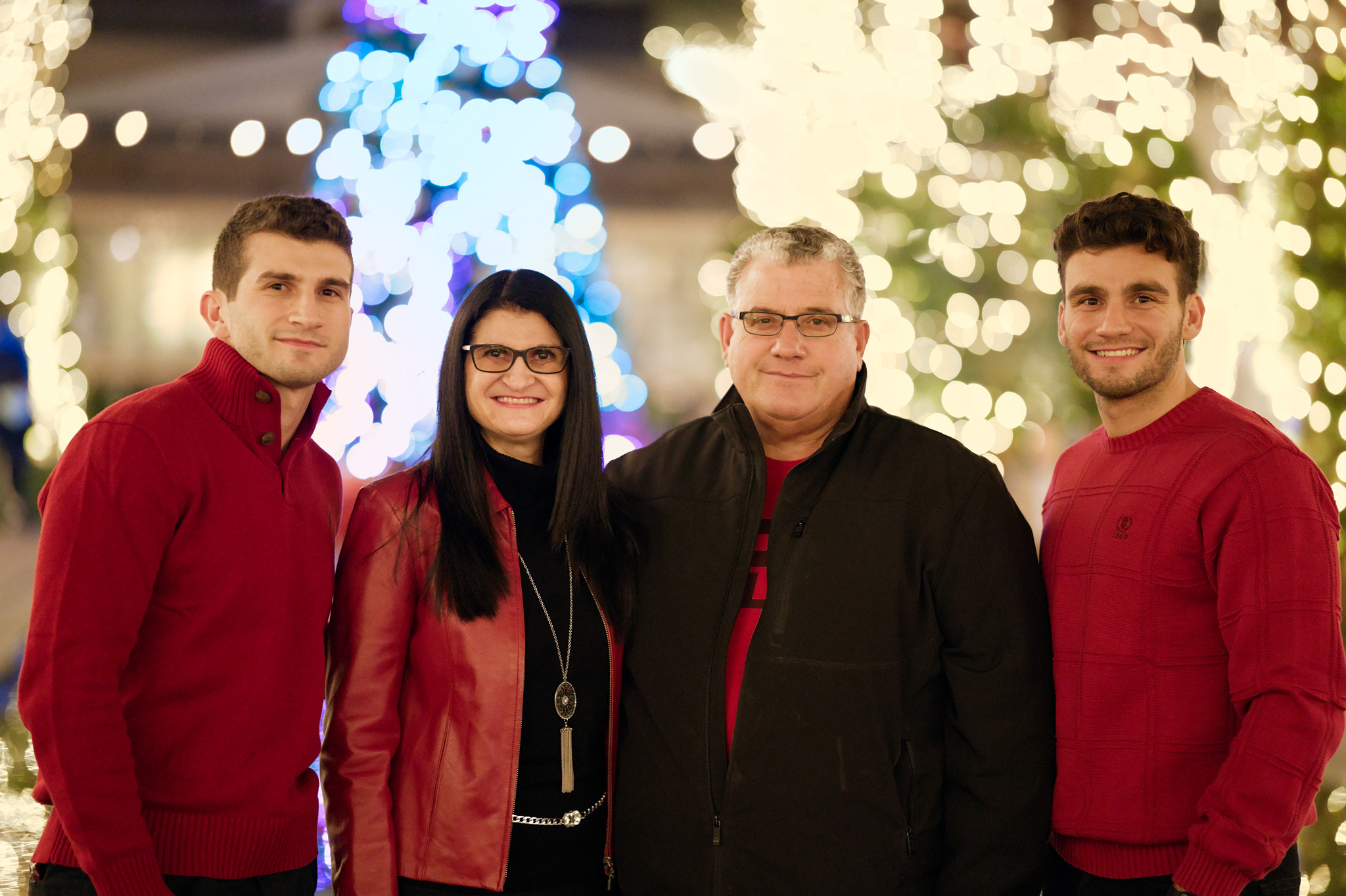
Thanks, I found this to be very interesting. Best result in this thread (subjective, I know). I’ve been attempting too leave Lightroom, at least for my personal projects. I need local adjustmens, so I’ve ended up with darktable (I know ART has it too). I’ve found that highlight recovery in darktable is not on par with the “competition”. As demonstrated in this thread there are at least 10 ways of achieving the same thing with sliders and options all over the place. Still, I have not been able to replicate the quality of the highlight reconstruction in RawTherapee. It would be more than awesome if the hilite_recon code in RawTherapee could be used to better the reconstruction in darktable.
It’s not only a trick to avoid division by zero, it’s also a gradient thresholding, since the (hipass_norm + epsilon) denominator defines the pivot where hipass_sum gets increased (so (hipass_norm + epsilon) < 1.0) or decreased (so (hipass_norm + epsilon) > 1.0). You find that kind of regularization a lot in numeric variational methods.
I’d like to get that fixed too. If you unclip the channels in that raw, it appears that the clipping transition is very smooth, but the reconstruction algorithm doesn’t preserve that.
What makes me suspicious is that the nominal range for values here is [0,65535] (as usual in RT), and not the more common [0,1]. So, that epsilon just looks too small to make any difference… But I say it again, I might just be wrong
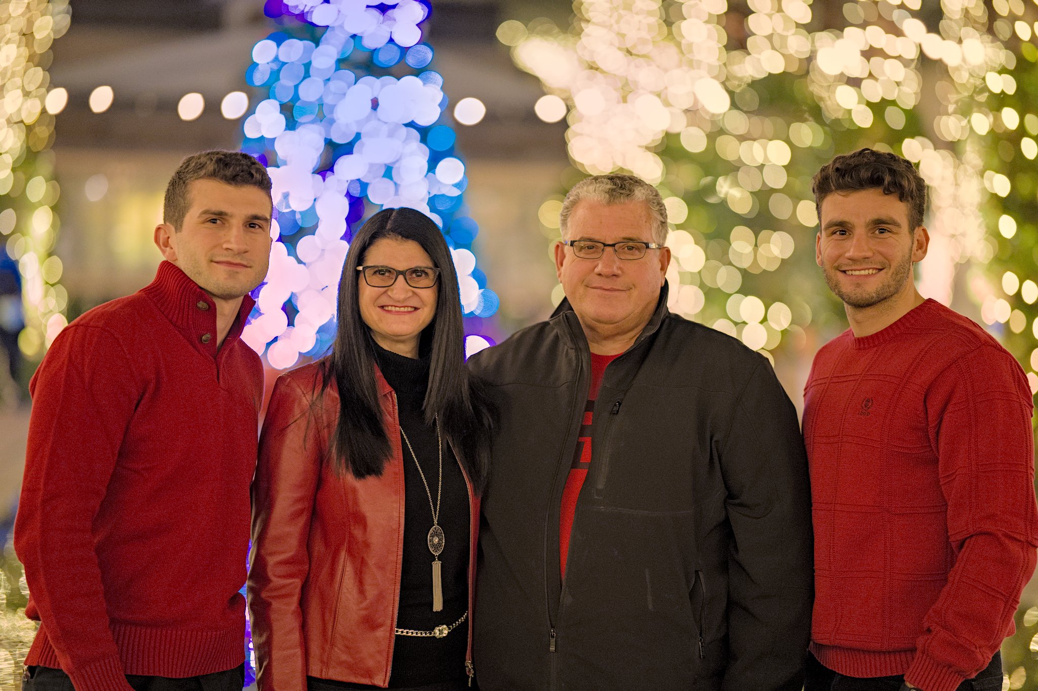
Nice edit…I was looking at your edit. In filmic I see you have power norm set…For me I set it to none…not sure how that alters the bokeh to everyones taste but for met the reds pop and the contrast seems a bit nice on the people…just one example of playing with that setting…again may be just to my eyes but setting produces a nicer image to me than the power norm…
Working on non-normalized values is going to make many things fail. Maybe start with that: divide everything by 2^16-1 first, work on normalized values, and multiply back at the end.
I don’t have a scientific way of choosing which setting to use on the preserve chrominance, I just go with what looks good for a particular image. I the none setting on this one seemed to make the red in their shirts too strong compared to power norm.
I agree AP has said they are just norm but it is interesting that it can be part of the filmic setup to consider and I think many people don’t really. I also agree. I had been playing a bit and had bumped the exposure a bit when I reloaded your xmp it did look a bit oversaturated on the reds still I did like the skin tones better. I took a run at it …no filmic though. just used color balance…
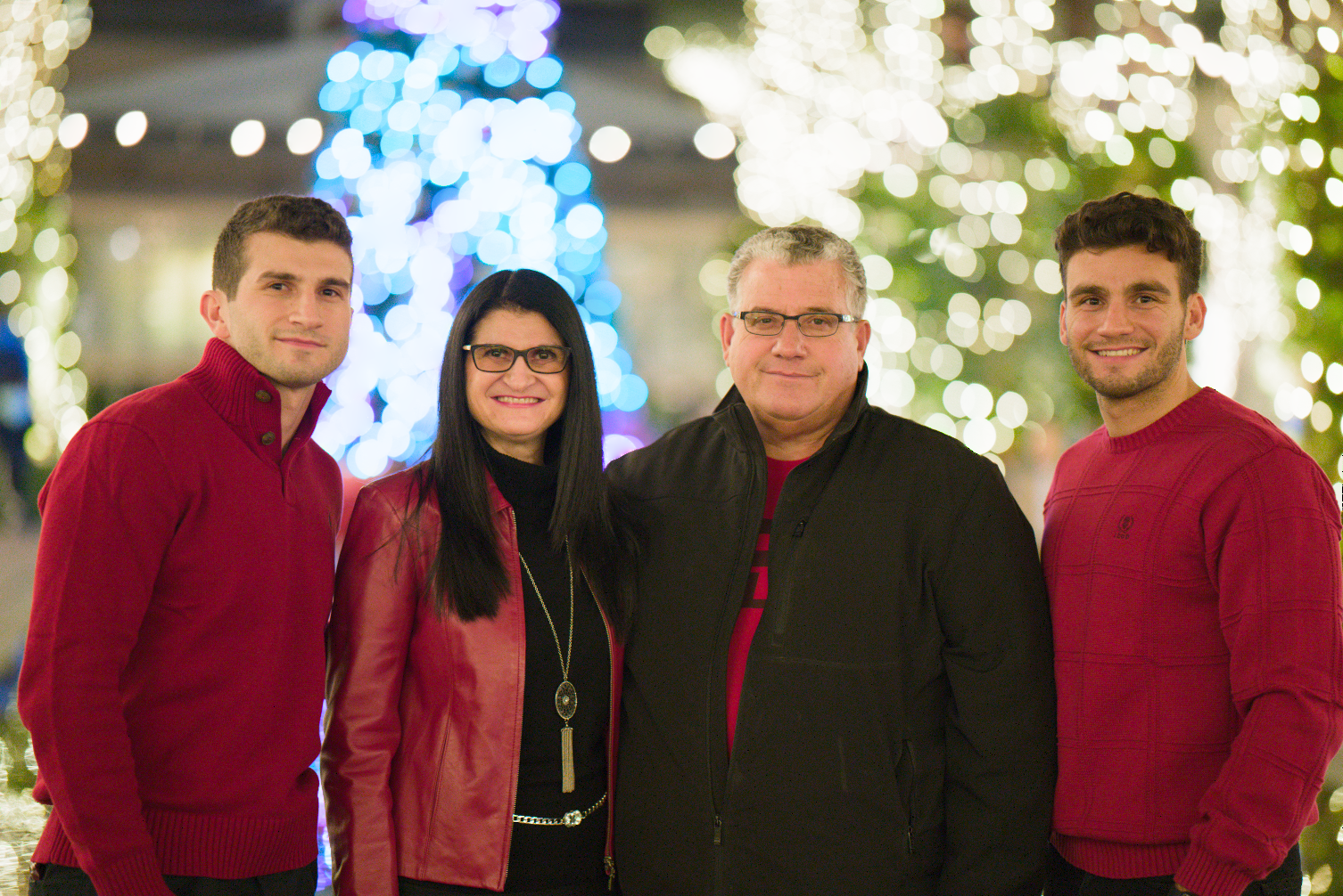
Also took a stab at the OP picture, just to have a test.
Probably cheated a bit by first running it through DxO Photolab to do the vignetting / distortion / chromatic-abberation / denoising and apply a -1.75 EV. That was saved as linear-DNG and opened in Darktable.
Put on Filmic (with default options, RGB power norm) and start raising exposure (quite a bit!) to get the skin exposed how I would like it. Raise the gamut-compression quite a bit until I see too much desaturation happening, and bring it back a bit. Now lower Filmic white-point till the lights aren’t ‘clipped’ (not as white), and set the black-point to a level where the jack was visible enough and the scene had enough of a bit of contrast. Played around between Filmic ‘preserve chroma’ options but kept it default. In the color-calibration tab I tried the ‘AI’ options but quickly dismissed them (too warm / yellow). Clicked the white-balance dropper in color-balance with its default ‘select-all-of-the-picture-mode’ and noticed a small but better improvement, left it at that. Add local-contrast with default options, sharpening with default options, export as tiff.
In Affinity Photo (or any tool), scale to 1280px wide side, apply output compression, sRGB and done.
Changing the color-calibration between keeping the warmth of going for neutral skin is a big artistic choice with this picture I’m guessing.
I had no problems what so ever with the bokeh balls, even have highlight-reconstruction completely off in the end.
I’ve been toying with the ARW directly… and I have to say, it’s not as easy (as I thought).
I’m messing with highlight reconstruction mode (and off), turning filmic on and off (changes the bokeh balls a lot), messing with the white-slider and messing with filmic’s highlight-reconstruct.
I can’t match the DNG → DT output (notice that around the woman’s hair I have some kind of sharpening artifacts because of the blue/purple glow after it). I have them in DT as well if I try to sharpen stuff.
I slammed the ‘latitude’ in filmic down to make the bokeh-balls more ‘predictable’ to me. But there was still some noisiness in them. So I tried denoising, but it didn’t do that much (and it made everything quite slow).
In the end I remembered some Rawtherapee wisdom, and I go to the demosaicing settings and switch it to VNG4 and plop, the last bit of highlight-noisiness in the bokeh balls is gone. After testing from scrach again it seems this is only needed when using ‘reconstruct color’. Reconstruct ‘LCh’ doesn’t seem to need it that much.
So the principle is still the same: raise exposure wit filmic enabled till the skin tones are as bright as you want. Turn the gamut-compression up until you see saturation going away in places where you don’t want it. Then set latitude down and move the filmic-white slider down till you see enough color in the bokeh-balls but they still have enough ‘pop’. Move the black slider to control contrast and the visible detail in the black jacket. You can bring the latitude back in to see what it does to the color of the bokeh balls and if it’s something you want or not.
But first: Set highlight-reconstruction to something else (experiment) and set demosaicing to VNG4.
I’m pretty much doing aurelien did first.
This is all very ‘situational’ for this picture of course.
I redid the filmic highlights reconstruction to fix a bug leading to black spots in some crazy synthetic images, and took the opportunity to improve the algo.
I think the bokeh balls between the young man’s and lady’s shoulders on picture left got a red tint, something I did not see in the other versions:
Of course I was not there, so I cannot tell whether you managed to reveal more of reality or if it’s an artefact (colour propagation from the red sweater, jacket and the red light right between their shoulders).
No, it’s the red sweater and jacket that start leaking in the reconstruction. One has to input just enough iterations, and not more, to avoid that. Anyway, these blown highlights should be turned into white through the log tonemapping, that example is exaggerated for illustrative purpose.
Thank you for the great play raw, really brings out the worst in all raw converters!
I’m working on a completely new image processing software since I have learnt how awful, broken and wrong all software is from a colour perspective (thanks to @troy_s). Processing using RGB channels (for curves, highlight roll-off etc) is 100% wrong and should be avoided. RGB curves produce very recognisable ‘digital’ hue shifts we are all too used to seeing since the 90s and don’t even notice anymore, however, it takes all images much further away from ever looking like film!!! All curve effects can be replicated using linear exposure and perceptual saturation as building blocks, without ugly hue problems!
I have processed this image with my new software (no it’s not in any usable or releasable state yet). No work at all, just exposure, white balance/tint, a touch of saturation and gentle base curve. Handles just about every aspect of the image perfectly as far as I can see …
A member messaged me to ask about how I am doing curves, here is the explanation I wrote in response:
The saturation method works like this: I essentially use the gradient for saturation, except with a large ‘d’ to simulate the way channels are far apart from each other in value… so, I generate two points above and below the Y value to emulate a couple of channels, then I apply the curve to the those two points. The difference between the two points with curve applied divided by the difference between the two original points gives the saturation factor. I find the way to generate these points doesn’t matter much, if you want, you can just use the gradient after applying the curve as the saturation factor (which is logically equivalent to the two points being extremely close to Y), but I believe having the points further apart simulates the saturation amount of per-channel curves closer than just using gradient.
Here’s pseudocode:
// calculate luminance factor
new_Y = curve(pixel.Y)
lum_fac = new_Y/pixel.Y

// here, I generate 2 points assuming the range is 0-1, if you are
// not working in limited 0-1 range, use a different way to generate
// p_above, like Y*1.5 instead
p_below = 0.5 * pixel.Y
p_above = (pixel.Y - 1)*0.5 + 1
sat_fac = (curve(p_above)-curve(p_below)) / (p_above-p_below)

// apply luminance factor like linear exposure
pixel *= lum_fac

// apply saturation, use a perceptual space like Oklab IPT or Jzazbz
// for slightly better hue linearity (not CIELAB though, that is much
// worse than simple linear saturation)
pixel = saturate(pixel, sat_fac)
This sums up most of it. I am replicating existing processing techniques, using mostly linear exposure and perceptual colour spaces as building blocks (this example demonstrates both of these), and other things that are can be justified in terms of colour science, like Von-Kries chromatic adaptation, which is per-channel gains inside a CAT space like CIECAT02. Just avoid CIELAB, that screws things up more than it fixes, at least with hue.