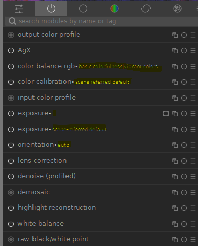
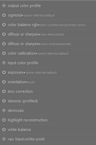
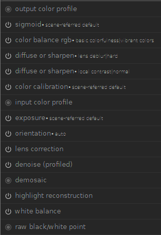
darktable 5.4 on Windows 11. I have a 2.5k display running at the native resolution and 100% scaling. The extra text AFTER the module name is hard to read (e.g. auto, scene referred default, 1, basic colorfulness vibrant colors, etc).
No. I was using the full install of 5.2.1 and had no issues reading the extra descriptions of the modules. Poor readability of 5.4.0 I noticed in my first edit after upgrade. The portable apps version was just a way of going back in time to be able to capture how I remember it looked.
I’m seeing this problem on Windows as well–it’s not unreadable but looks bad. A larger font increases readability but still looks fairly bad, especially because it messes up other UI elements. The font hinting isn’t working–the vertical lines are thinner than the horizontal lines.
I fixed this by changing the font in user.css (or adding it to the CSS override in the darktable settings, which is the same thing):
I’m not a web developer, but if I can get it looking better I’d like to fix this for everyone with a PR. It still looks too bold. Is there a way to restrict a CSS change to Windows and is there a consensus about which fonts are best in this situation? Here’s how it looks with the above change:
I had Noto already and I’ve just installed Roboto. It didn’t solve the issue.
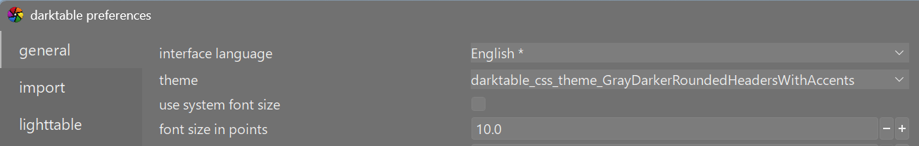
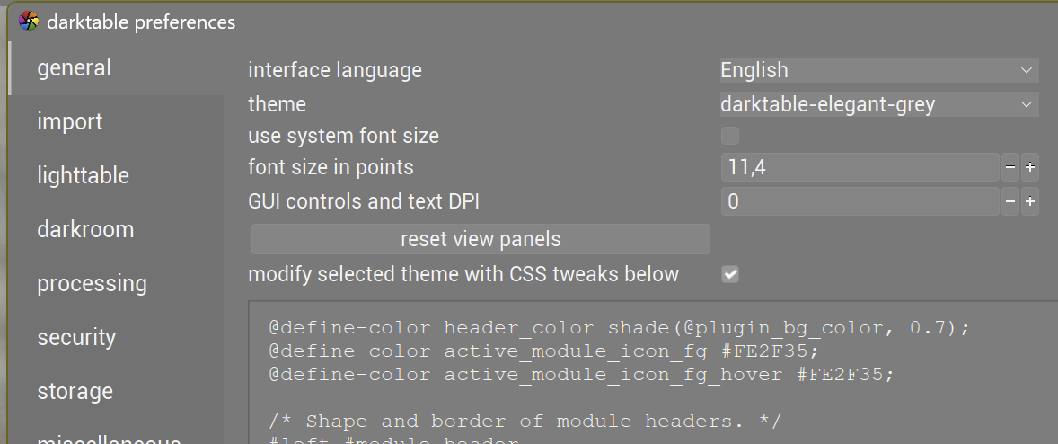
@akgt94 If you paste the above css code into “Settings → General → modify selected theme”, enable the checkbox, and restart DT, does it fix the problem?
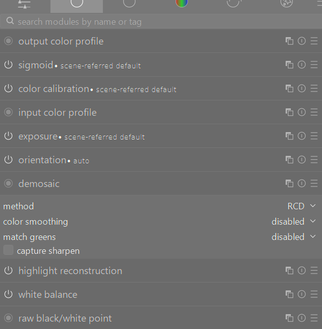
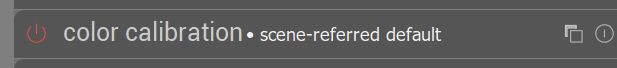
Does the current preset name look bad for any other Windows 11 users? It would be good to confirm that it’s not some installation problem.
I use a 43 inch 4K monitor for editing and have no problems with fonts which I have reduced to size 10. I even put DT on my 14" laptop screen which is 1920x1080 and I don’t have problems. But if others are having a problem and it can be improved so be it.
For those that have this problem, can you test with the css changes? It might be the best compromise with windows and linux. Similar to @finestructure suggestion. I will push a PR if this works.
#iop-module-name
{
  font-size: 0.8em;
}
I cant reproduce in my system, so please provide a screenshot if you are having this problem.
I’ve been experimenting more, and the problem is that sub-pixel hinting is active but not really visible with this color scheme. The simplest fix is to increase the font weight:
#iop-module-name
{
  font-weight: normal;
}
The next problem is that the kerning isn’t great. By trying multiple CSS style lines, I determined sans-serif is active by default.
That line is strange: first you tell darktable to use the system sans serif font and then you give “Arial Unicode MS” as a fallback. Usually, the order is inversed (first the font you really want to use, then the system font of that falily as fallback.
That’s why you would first specify a system-specific font and then the system default font. As it is now, “Arial Unicode MS” will not be used even if it’s present (unless it is set as system default…)
On a system where the Arial font isn’t available, the system default will be used whatever the order in the specification…
You are 100% right. While I was digging for this issue, I noticed this problem and others too. The file called darktable.css has most of the config, then darktable elegant darker (iirc) then has a modification for box with more fonts options. Then all the other themes seem to reference that theme.
The list of fonts for box in that theme are outdated. Im testing changes. I might split this into two PR, a bug fix for 5.4.1 and proper fix for 5.6.