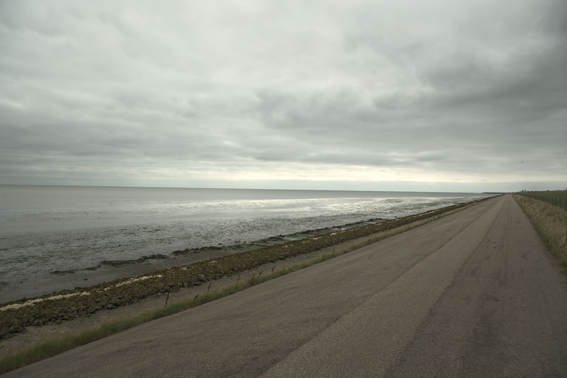
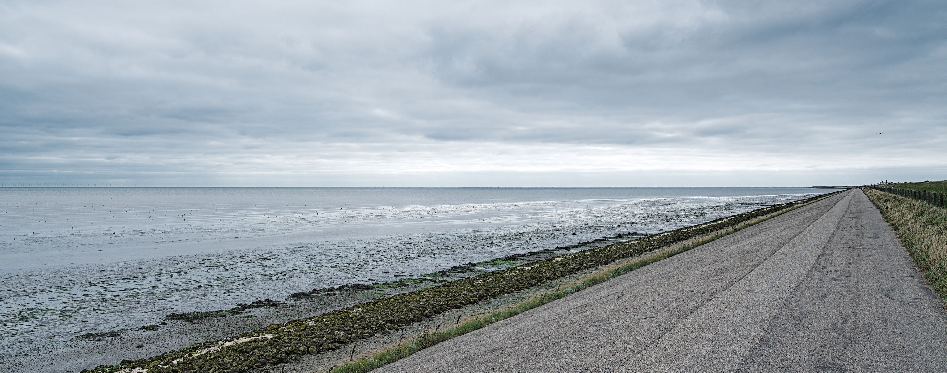
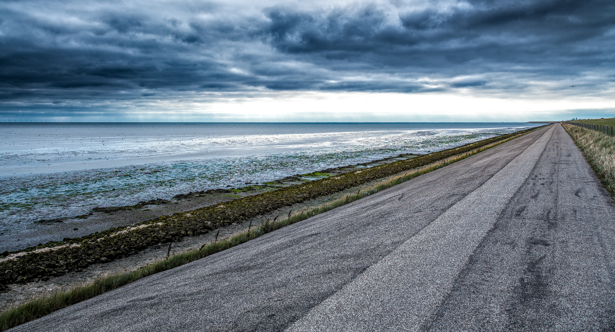
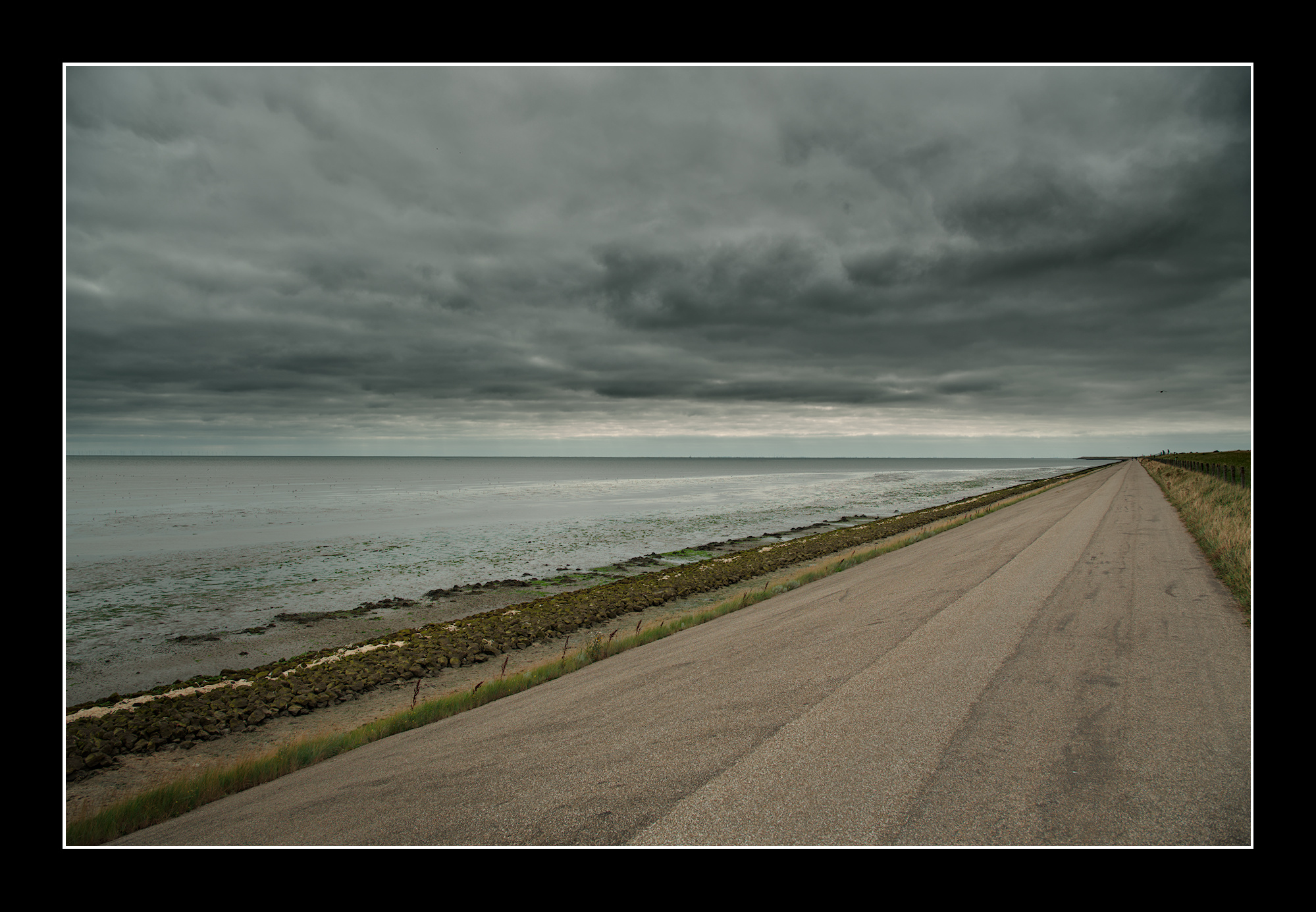
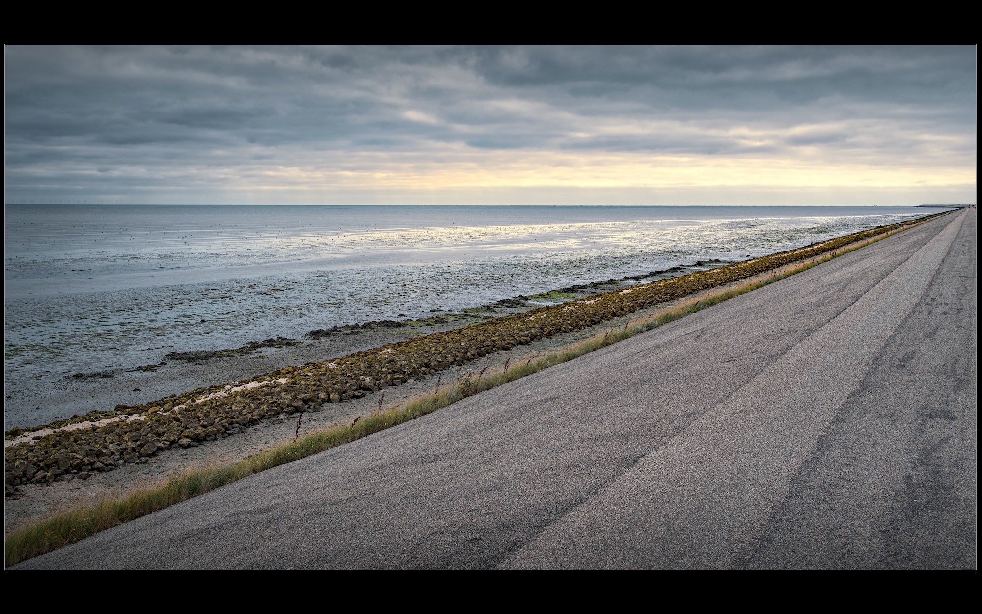
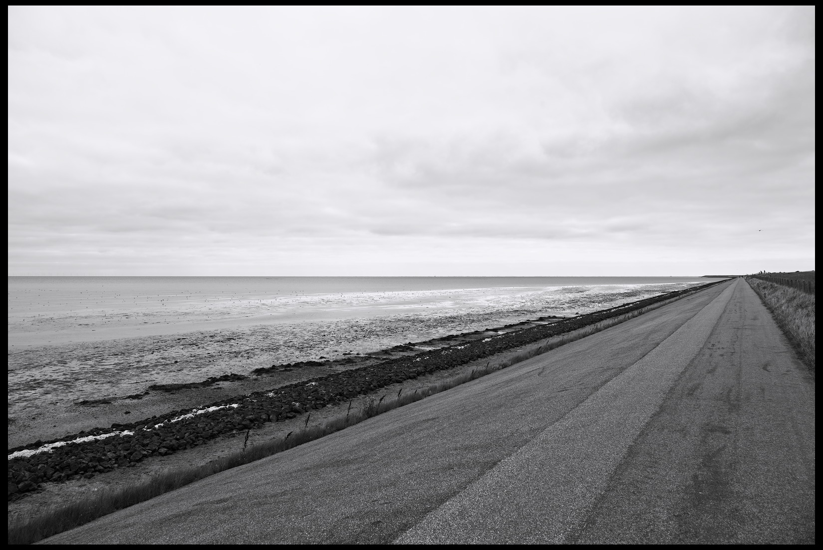
A bit boring except maybe for the lines

This file is licensed Creative Commons, By-Attribution, Share-Alike.

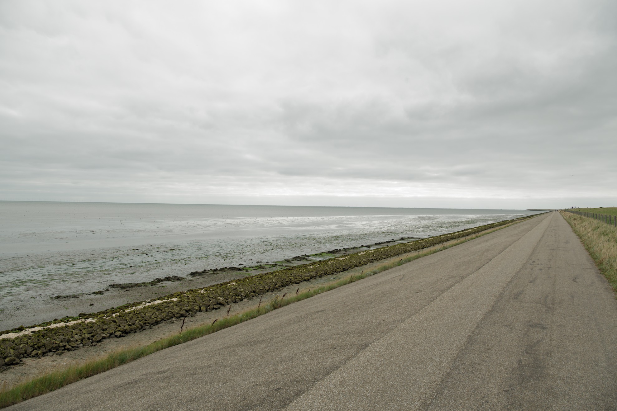
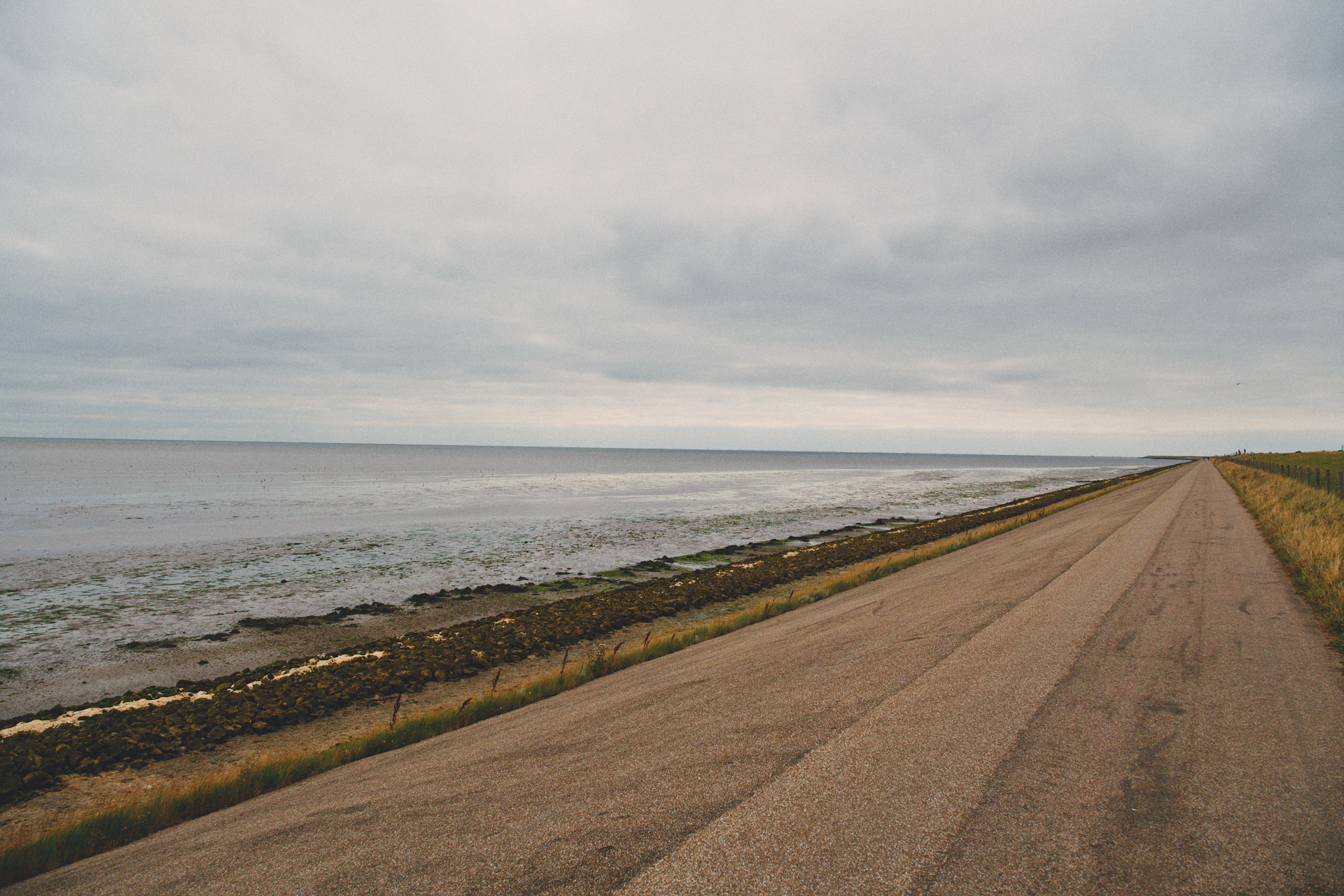
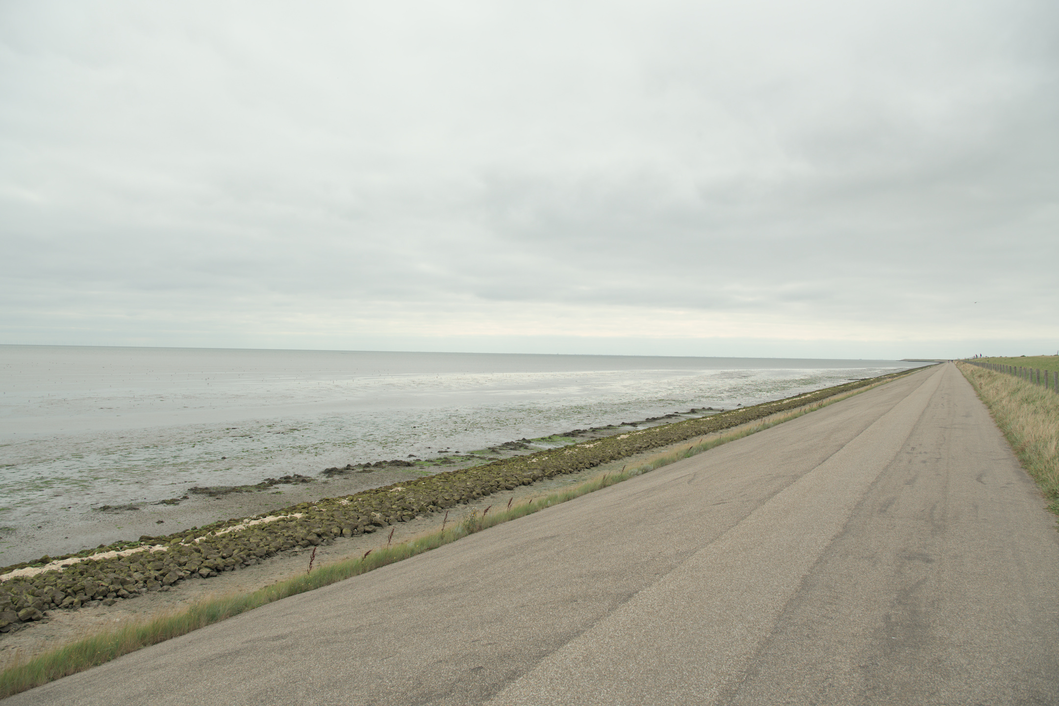
A picture I like a lot, but something has to be done with it… I’ve three versions now, so look forward to some more of yours…

This is the more or less ‘neutral’ version.

Have fun!


_K302121.DNG (35.8 MB)

8 Likes

I can understand why you like it… me too.
Worked with Ansel, in the stillness of the moment.

Cheers.

4 Likes

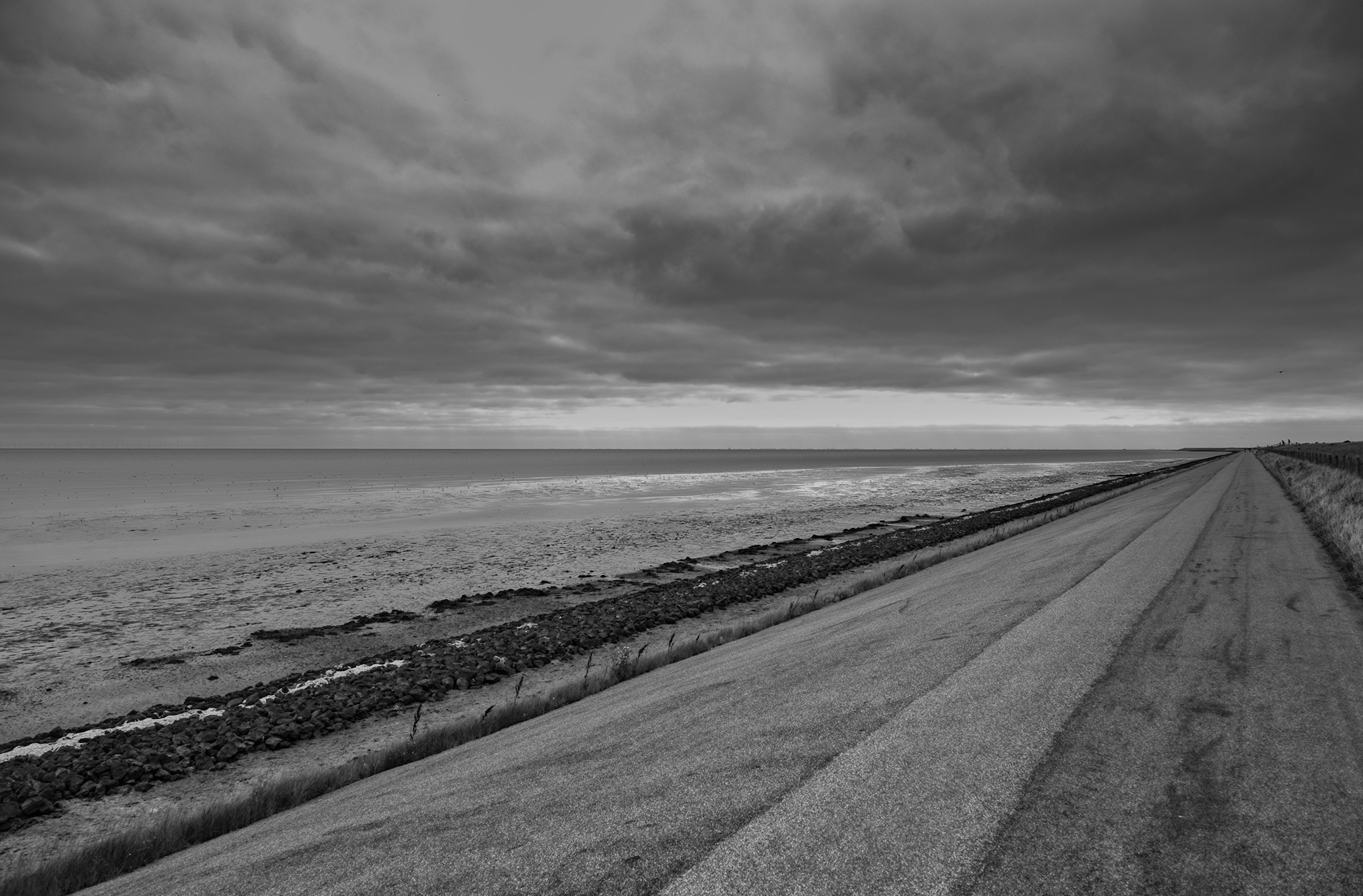
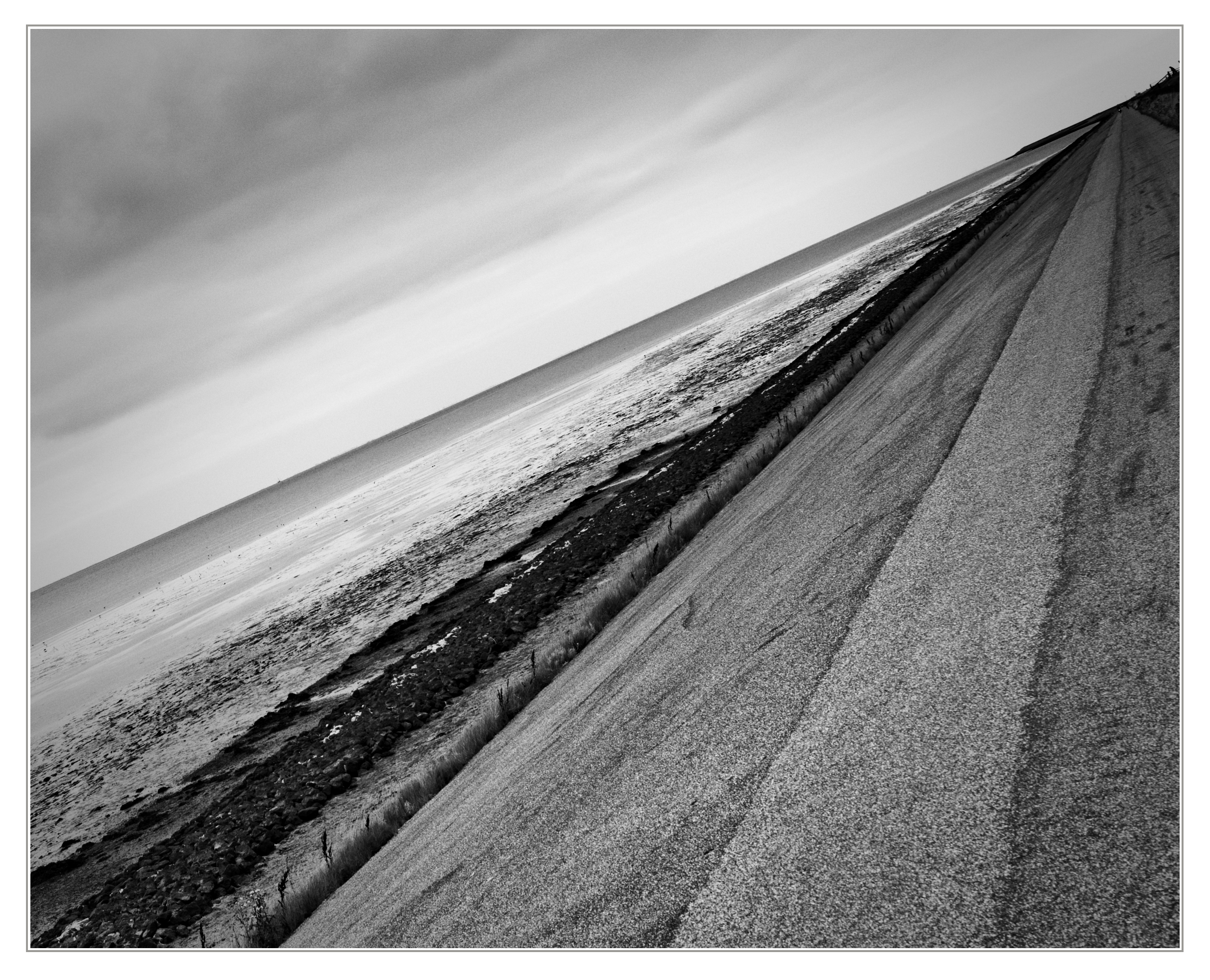
Although, in my opinion, if it’s any help, this image should be treated in black and white…

8 Likes


_K302121.DNG.xmp (9.0 KB)

5 Likes

_K302121.DNG.xmp (12.5 KB)

7 Likes


_K302121.DNG.xmp (17.7 KB)

Didn’t do much out of my ordinary stuff except for a heavy rotation and exposure multiply blend, as well as some extra tweaks to the contrast eq and generous over applications of the color rgb sliders.
Great sky in this scene.
dt 5.4 Windows

7 Likes

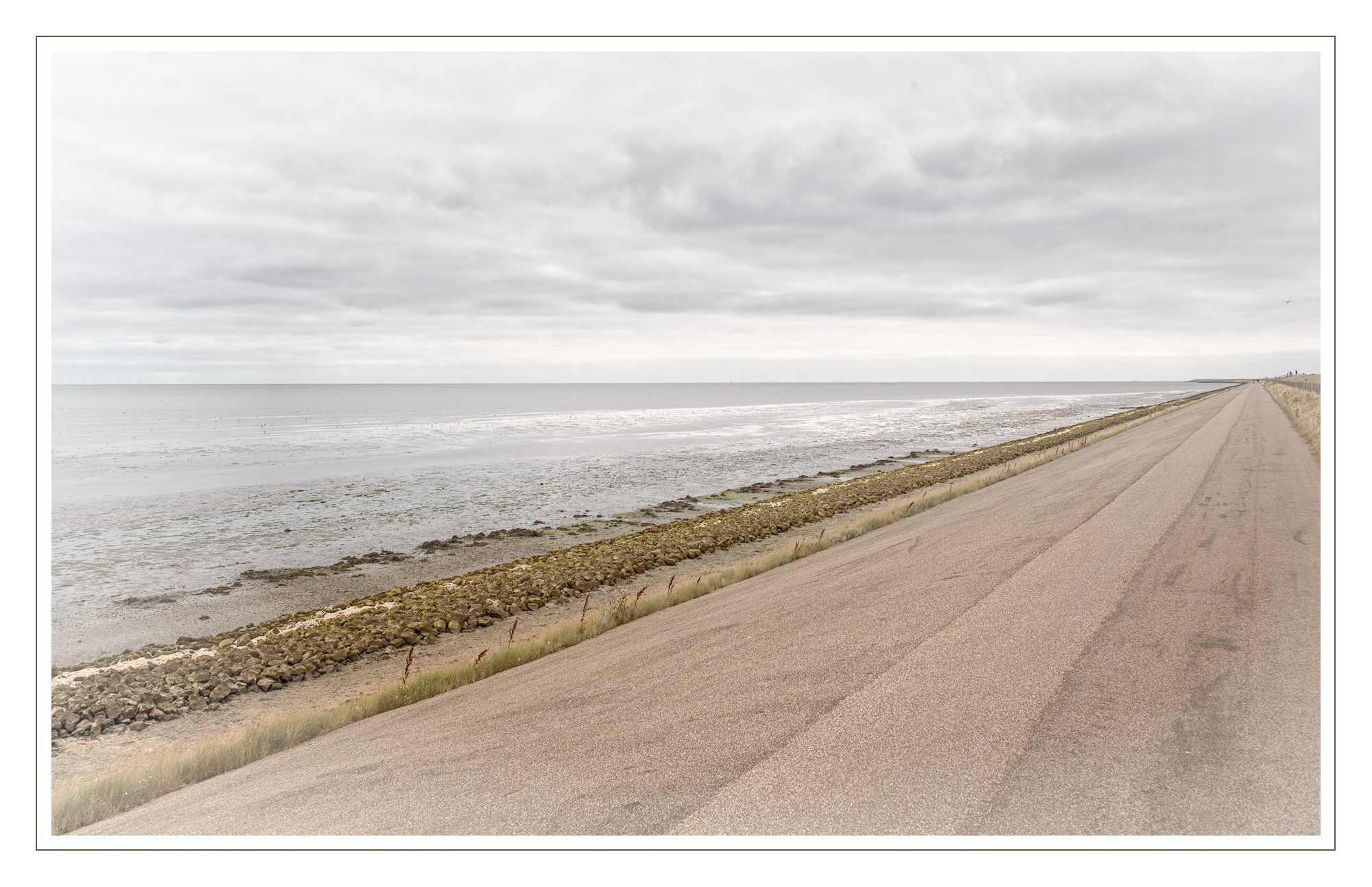
As I was going between sigmoid and AgX, just to see what might happen, I noticed that the picture looked so much better without both of them. They both killed the highlight area in the sea and the sky.

This is the first time I have processed a pic with neither!

The highlight looked great, so, never being one to leave well alone, I added a vignette, lol.

Darktable 5.5 . AI object mask helped me separate earth from sky.

_K302121_01.DNG.xmp (30.5 KB)

6 Likes

I spotted the wind turbines and tried to turn the contrast up on them.


_K302121.DNG.xmp (30.8 KB)

5 Likes

Well done! You brought out a lot more birds too.

2 Likes

_K302121.DNG.xmp (22,7 KB)

6 Likes

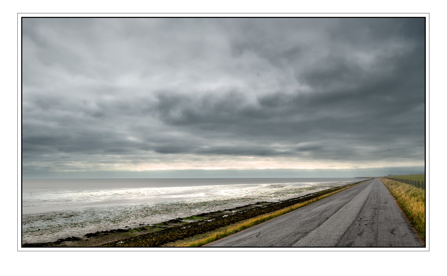
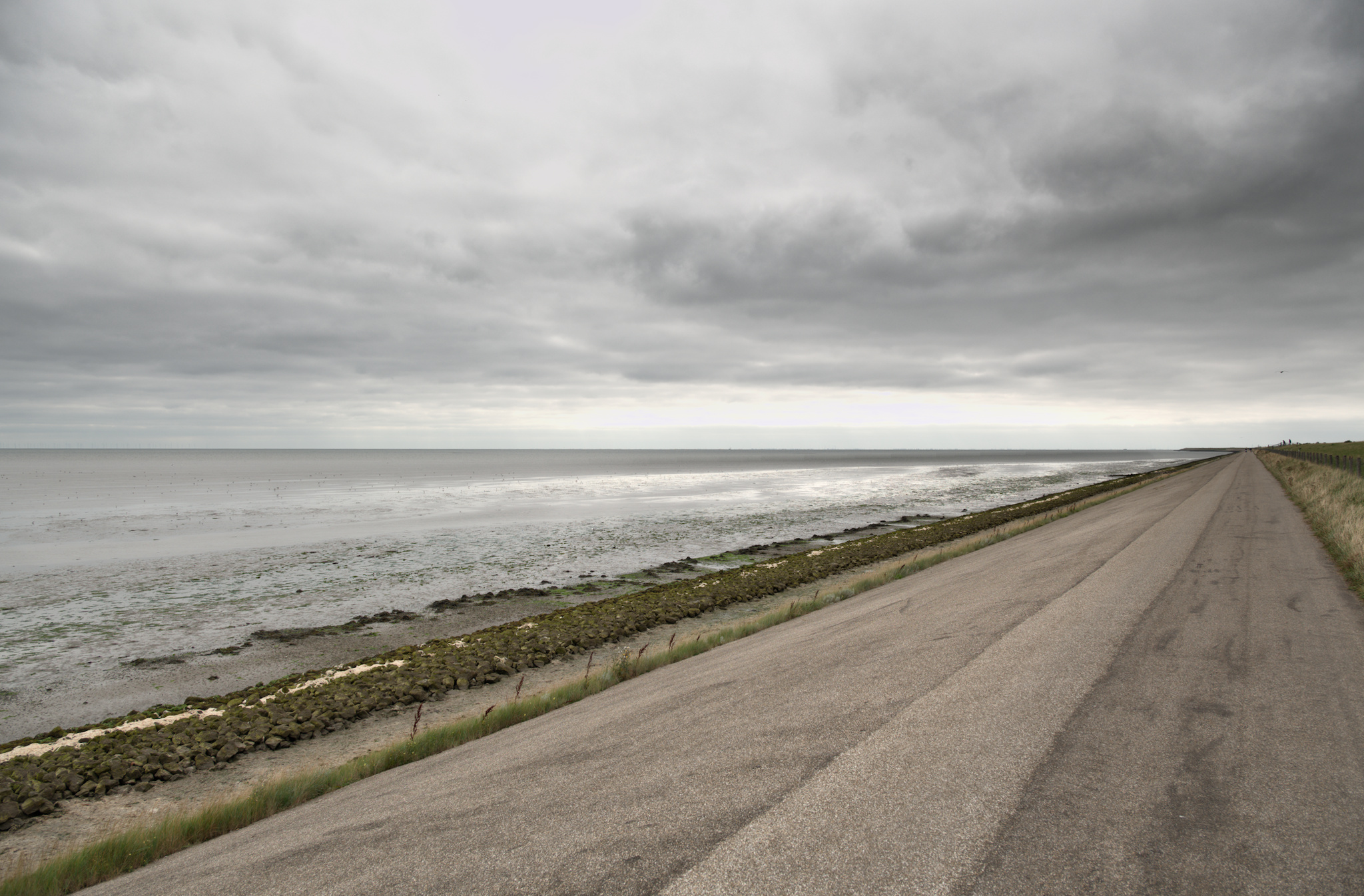
Trying for an impending storm look
_K302121.DNG.xmp (18.7 KB)

5 Likes


_K302121.DNG.xmp (19,5 KB)

5 Likes


20210904_1112_2121.dng.xmp (11.3 KB)

6 Likes


_K302121.DNG.xmp (16,8 KB)

4 Likes

Thanks all for joining in! I see a lot of very, very nice results - I would nearly say ‘as usual’! :slight_smile:

My first conclusion: Lots of us - me included - don’t like straight horizons. And I do love the horizons @AdamFromCanada and @iblazhko presented, beautiful! :wink:

I like this picture as it can both be treated gently and quite intense as well. And it likes b&w just as much.

Thanks all for joining in, hope there is still more to come…

@Jose_Figueres thanks for both versions, I like the balanced drama in both versions. I made a b&w too and just as with you interpretations I prefer the colored one.

Tanks @Tim You used a very nice soft touch in this one, I like it a lot! Same counts for @age 's interpretation!

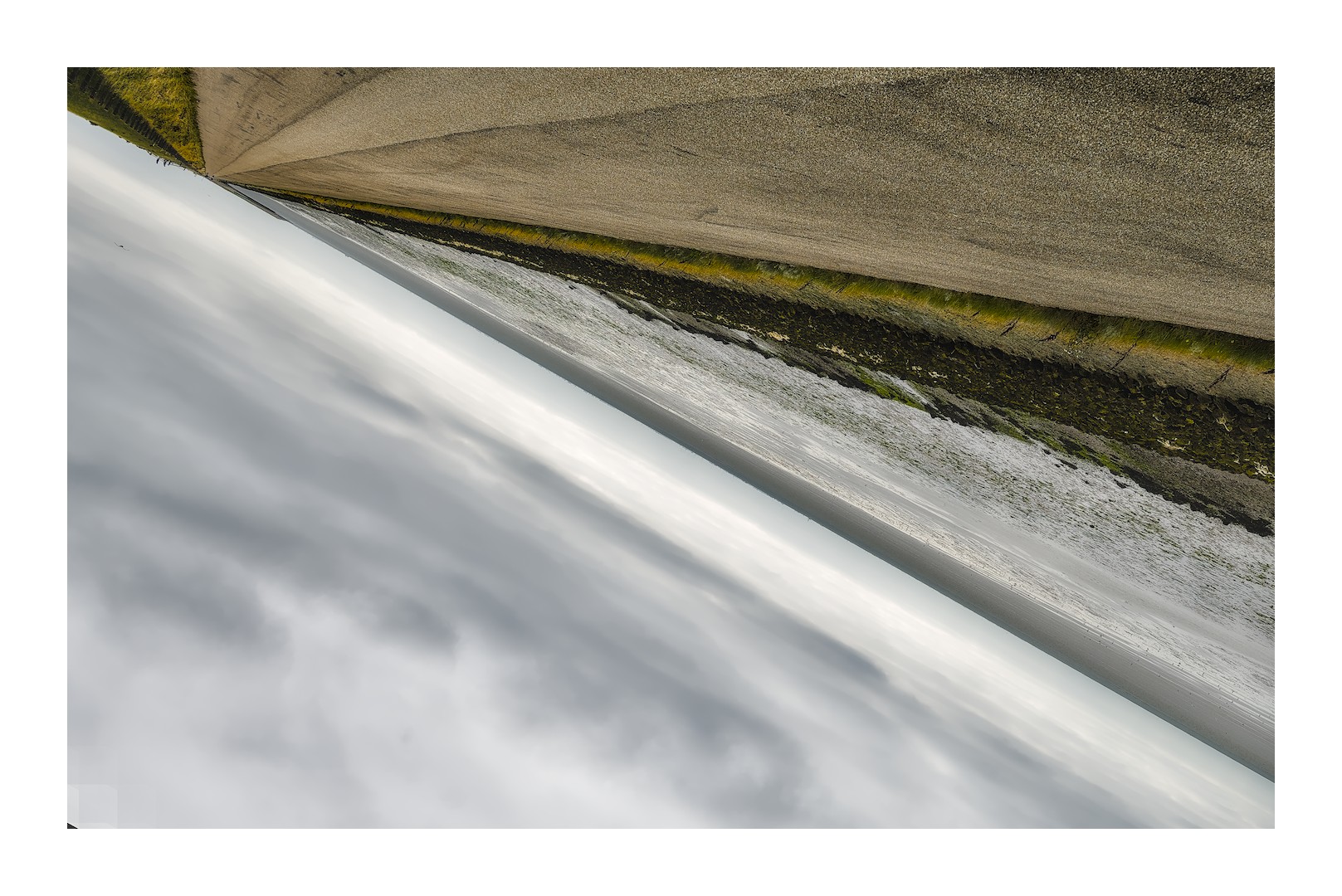
@AdamFromCanada : Whow, that’s a bold move and it works brilliantly! gave me lots of fun and an energy boost! Would never have done that myself. The surprise bonus is for you! Nice tonal softness upside down.

@Thad_E_Ginathom, lovely sphere in this interpretation. And it is - in my eyes - often very nice to start without tonemapper as parts of the details in the highlights get subdued often. Lots of pictures do not need one. Beautifull result.

@gwbarn well seen! and very nice cropping combined with nice tones and color!

@dqpcoxeas and here comes the drama! There’s a lot of modules and masks involved and I really love the results of all your work! I like the blues! The final touch is the last color calibration instance with multiply mode and altered fulcrum. heavy and effective! Thanks.

@Terry you succeeded in making it look like a storm. And actually it was such a quiet peaceful weather… In your version the band of light in the distant clouds maintained their structure.

@Popanz Thanks for both versions! I like both and will need a bit of time to finally study some details of your work. I’m fond both of the drama in the first version and the incredible lightness of the second with even a ‘negative’ vignette. I will dive into your loc con presets, col zone’s and ‘Razor sharp’ and ‘Glow’ presets. Fun. Thanks!

@iblazhko I love very much you both took a b&w approach and dynamically rotated the photo! You used something like an ‘Ilfort contrast cube’ in LUT 3D which I lack so I got a colored version on my pc after making a duplicate and attach your xmp. Have to look into that in order to see I can use that ‘cube’ too to really grasp the way you worked.
7 Likes

I kind of cherry picked the aspects of interpretations that I liked across many different users. It was difficult to get them to all work in balance (which is a good indication that they dont go together lol) and this is as close as I got:

7 Likes

As if the grass is in evening sunlight and a sudden surf arose in the quiet waters… Nice!

1 Like

Like this a great deal; thanks for sharing… I had a play with a few B&W HaldCLUT files with RT 5.12-369 dev… Ended up liking this best, using the Ilford HP5 400 (which I have never heard of), but I found it pleasing to my eye (on my screen…). Thanks


_K302121-1.jpg.out.pp3 (25.9 KB)

4 Likes

Thanks for joining in @SCHA , I like your edit!

Ilfords HP5 together with HP4 were Ilfords’ workhorses b&w negative emulsions way back in time. I’ve worked a lot with them…

Each b&w film emulsion, though being b&w - reacted differently on the colors. Some had red darker, others green. So it is interesting to compare present days LUT’s of different emulsions.

One can develop a picture having more reds or green to influence the b&w outcome after applying a LUT.

1 Like

Thanks @Jetze, there’s always so much to learn… I’ll download more LUTs and look for those differences… Also, in RT (or DT) can you still add more colour tone to B&W to achieve what you mentioned… I’ll have a play, but trying to understand the logic. Cheers

1 Like